Mantex

Tutorials, Study Guides & More

  • HOME
  • REVIEWS
  • TUTORIALS
  • HOW-TO
  • CONTACT
>> Home / Archives for Fonts

20th Century Type: Remix

May 26, 2009 by Roy Johnson

illustrated showcase of 20th century type designers

This book became an instant classic on font design when it first appeared. The second revised and enlarged edition is even more impressive. In structure, it’s quite simple. Ten chapters are split into periods of a decade each. It starts from the Art Nouveau type of the early 1900s then works its way to the present via a series of beautifully designed pages.
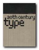
Font DesignLewis Blackwell has a very keen eye and a sharp sense of historical innovation in spotting the typographical innovations developed by designers such as Marinetti and the Italian futurists, El Lissitsky, Moholy-Nagy, and the Bauhaus workers.

All the examples are illustrated by type in practical use, set alongside a number of sample font sets of what have become modern classics. There are some particularly good reproductions of book pages and the use of typography as a design feature.

What he’s done is to distil the essential innovations of designers such as Jan Tschichold and Paul Renner, and he places them in a well developed historical context. Into the middle of the century the names become Saul Bass, Roger Excoffon, Paul Rand, and Adrian Frutiger.

The 1960s sees the first signs of the influence of computer technology on type design, as well as the explosion of pop psychedelia on design. Some of the rock music albumn covers might make you cringe if like me you lived through that period.

In the 1980s the major influence is Neville Brody – who is still very popular and influential – as well as the Emigreé designers Rudy Vanderlans and Zuzana Licko. Next comes the ‘expressive’ school of David Carson. He challenged the notion of type’s legibility to the point where the pages of his work in the influential Ray Gun became almost unreadable.

Yet this experimental approach to designing type forms continued unabated in the 1990s, alongside more traditional work in public signage done by designers such as Erik Spiekermann. All of this is given generous coverage, and the book ends with a section on type description and classification – the most modern examples of which become BC (Beyond Classification).

This is an excellent piece of work which well deserves its place in the list of favourite typography manuals amongst professional designers.

© Roy Johnson 2000

20th Century Type   Buy the book at Amazon UK

20th Century Type   Buy the book at Amazon US


Lewis Blackwell, 20th Century Type: Remix, London: Lawrence King, 1998, pp.191, ISBN: 1856691160


More on typography
More on design
More on media
More on web design

Filed Under: Graphic design, Typography Tagged With: 20th century type, Fonts, Graphic design, Typography

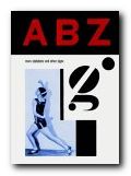
A B Z More Alphabets and Signs

May 21, 2009 by Roy Johnson

glamorous collection of font sets and graphic designs

This is a follow-up to the excellent 130 Alphabets and Other Signs – a fascinating collection of font sets, alphabet design, and attractively printed designs from the early part of the last century. The sources of this new collection are wonderfully assorted. There are plenty of straight font sets, but also monograms, letter headings, packaging labels, posters, shop signs, opticians’ eye test charts, book jackets, film posters, technical manuals, propaganda leaflets, magazine covers, and dingbats. The selection reflects mainly European modernism, and Art Deco – though there are also novelties from Mexican graffiti art and Asian medicine labels.

A B Z: More Alphabets & SignsThe materials are the products of the main centres of modernist design in the first third of the last century: largely French, German, Czech, and Russian. The selection of material comes from private collections in London, Paris, Amsterdam, Prague, New York, and Mexico City.

Many of the designs appear here for the first time since their first use. Some of the examples, such as Karel Tiegel’s photo-balletic alphabet of 1926 and a Spanish civil war manual for illiterate soldiers, have never been reproduced before since they first appeared.

I was slightly disappointed that there’s so little explanation or comment on the materials – except for some rather cryptic notes on sources in the index. This seems to have been done to keep the display area free of any visual clutter.

Each large page is striking in its muted, silkscreened colours, and the book itself is beautiful, with rounded corners, pre-faded yellow edges, and green splotchy endpapers.

It has to be said that the main charm of this book is its unashamed retro feel; but I would defy anyone not to be pleased with the result. It is beautifully designed and produced, well printed (in Hong Kong) and altogether a must-have for anybody interested in typography, design, or attractive books.

© Roy Johnson 2004

A B Z: More Alphabets and Signs   Buy the book at Amazon UK

A B Z: More Alphabets and Signs   Buy the book at Amazon US


Julian Rothenstein and Mel Gooding, A B Z: More Alphabets and Other Signs, London: Redstone Press, 2003, pp.221, ISBN: 1870003330


More on typography
More on design
More on media
More on web design

Filed Under: Graphic design, Typography Tagged With: Alphabets, Fonts, Graphic design, Symbols, Typography

An Essay on Typography

June 19, 2009 by Roy Johnson

classic study of the aesthetics and morals of good design

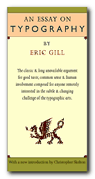
This is Eric Gill’s memorable and engagingly dogmatic work on unchecked commercialism, moral living – oh, and on typographic design too. An Essay on Typography is where Gill firmly established what he believed type design should be, what it should do, and how it should be done. I read Gill’s Essay from cover to cover, then I immediately read it again. It’s short, (133 pages, plus an introduction and afterword) but quite enjoyable.

An Essay on Typography The unassuming size of the book does not affect its flow as it is set in Gill’s own face, Joanna. Although the use of some odd contractions and word breaks may take a little warming up to, the book is a testament to book design and layout concerns as discussed in sections The Procrustean Bed and The Book.

In the section entitled Lettering, Gill lends his views on letter form history and follows their evolution from Trajan’s Column in Rome to the printed page of the 1930’s with his own engravings presented to illustrate the walk-through.

At times Gill is somewhat idealistic but many of the arguments he makes are timeless and most of his advice is practical- consisting of basic truths which will apply to the craft no matter what tools or level of technology are employed in the creation and implementation of letter forms.

In Typography, a clear line is drawn between mechanized industry, seen as the work of many as opposed to fine craftsmanship, being the work of the individual. With his focus more on the social aspect of these ‘two worlds’ of typography, Gill explores and defines the limits inherent to each:

…the commercial article at its best is simply physically serviceable and, per accidens, beautiful in its efficiency; the work of art at its best is beautiful in its very substance and, per accidens, as serviceable as an article of commerce

The exceptions to its usefulness are the occasional segue into what seems a little like preaching (this essay is thoroughly peppered with religious references) and some ideas he proposes, such as letter-spaced italics for emphasis, that have thankfully fallen by the typographic wayside. Or perhaps when he coyly proposes to abolish lettering as we know it in favor of what he calls ‘Phonography’ (a form of shorthand), in But Why Lettering. I would equate this to today’s practice of flame-baiting online.

© Delve Withrington 2000

An Essay on Typography   Buy the book at Amazon UK

An Essay on Typography   Buy the book at Amazon US


Eric Gill, An Essay on Typography, David R. Godine [1993], pp.144, ISBN: 0879239506


More on typography
More on design
More on media
More on web design

Filed Under: Individual designers, Typography Tagged With: An Essay on Typography, Eric Gill, Fonts, Graphic design, Typography

dot-font: talking about fonts

July 13, 2010 by Roy Johnson

essays on fonts, typography, and design

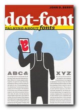
John Berry is the former editor and publisher of U&lc (Upper and lower case) the prestigious and influential typographical journal, and he has won awards for his book designs. This is a collection of short articles on fonts and typographic design he wrote for the portal website Creativepro.com. I first came across this book when it was announced that, in common with many other authors in the digital age, John Berry was giving the book away free of charge as a PDF download. I grabbed a copy, saw it was an attractive production, and immediately ordered a copy in print. By the time I had finished reading the first few chapters, I also ordered its sister production dot-font: talking about design.

dot-font: talking about fontsThe articles range widely across issues of typography and the design of fonts – starting with an interesting historical note on the short-lived era of typography using Letraset (remember that?) . He goes on to the pleasures of old type specimen books; a review of an exhibition catalogue featuring Sumner Stone’s designs for a ‘classical’ sans-serif font (Basalt); and an appreciation of the Dutch Type Library in Hertogenbosch.

Some of the essays are in-depth studies of a single typeface – Matthew Carter’s Monticello and Herman Zapfs Optima for instance. In both cases he comments on the changes made when translating these designs into digital type, a process which generally seems to increase enormously the number of weights and sizes at which they become available.

He is quite insistent that any true typeface worthy of a distinguished name must include the full range of variants, accidentals, and special characters:

An old-style text face, based on types that were first cut and used in books in the 15th to 18th centuries, should be accompanied by old-style figures, by a complete set of f-ligatures, and by true small caps. It ought to have a set of real fractions too, or the numerators and denominators to create them. Without these, it looks as unconvincing as a callow Hollywood actor pretending to be a Shakespearean prince.

It’s a beautifully designed and illustrated production in its own right. The text is set in MVB Verdigris, the display in HTF Witney, and there are generous page margins. Yet it’s not just a glamorous design portfolio: John Berry digs into some some funamental issues of typographic theory and the use of fonts, such as the question of where the originality in reviving old typefaces ends and copying begins. It’s a book that is pleasing to the eye – but also one that will make you think.

dot-font fonts   Buy the book at Amazon UK

dot-font fonts   Buy the book at Amazon US

© Roy Johnson 2010


John D. Berry, dot-font: talking about fonts, New York: Mark Batty Publishing, 2006, pp.126, ISBN: 0977282708


More on typography
More on design
More on media
More on web design

Filed Under: Graphic design, Typography Tagged With: Design, Fonts, Graphic design, Typography

DSOS1: Designer Shock

June 16, 2009 by Roy Johnson

avant-garde downloadable fonts and design styles

Here’s an unusual idea – a book which is an introduction to a web site. Well, not exactly – because there’s more to it than that. The print version shows you what’s on offer, but the site allows you interactive connection with the software. This is what used to be called in the world of rock music, a ‘concept albumn’. Still confused? Read on. DesignerShock is a German-based collective of graphic design artists. They’ve come up with the idea of making design software available online.

Designer Shock This comes in the form of downloadable fonts, screensavers, wallpaper, product packaging, undsoweiter. You’re with it so far? But they also offer an additional element. You buy the book – which illustrates their designs – and it comes with a CD which gives you access to their web site. So, you have access to unlimited free use. You can download then change, stretch, and adapt the basic information to suit your own taste, using morphing software.

But the problem is that the book is quite hard to read. It’s difficult to know what is main text matter and what is extraneous page decoration and book navigation details. Sometimes the book’s own system of presenting graphics seems to overwhelm its contents.

The examples they show are almost all avant-garde – that is, nearly unreadable. You’ve got to have a strong stomach to even take them seriously. There is one set of fonts in which the letters H and W are identical.

There are also examples of product package designs, icons, dingbats, and did I mention? – the book also doubles as a mousemat. It’s all wacky – but there is the germ of a good idea in here.

© Roy Johnson 2001

DSOS1: Designer Shock   Buy the book at Amazon UK

DSOS1: Designer Shock   Buy the book at Amazon US


Stefan Gandl, Alexander Dewhirst, Designershock, DSOS1 DesignerShock, Berlin: Die Gestalten Verlag, 2001, pp.180, ISBN: 3931126641


More on typography
More on design
More on media
More on web design

Filed Under: Graphic design, Typography Tagged With: DSOS1: Designer Shock, Fonts, Graphic design, Typography

Finer Points in the Spacing and Arrangement of Type

June 15, 2009 by Roy Johnson

advanced topics in type design and good page layout

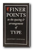
As the title implies, this is not a beginner’s book on typography. Most of the techniques discussed by Geoffrey Dowding, although sound and well presented, may not be beneficial to the reader without a working knowledge of design and type. Experienced designers, be forewarned; Dowding is unavoidably influential in this tome – the result of his lifetime of experience in the typographic arts. At the same time, he cannot escape that experience. He is an unabashed traditionalist, a master of the craft.

Finer Points in the Spacing and Arrangement of TypeSo if you think you might already be too sensitive to type and layout, don’t read this book. I’m kidding, of course, but let me explain: illustrating with examples, Dowding discusses typographical layout solutions which often suffer from lack of attention to detail, then provides corrected versions for comparison. This method combined with a concise writing style and his authoritative voice, will undoubtedly heighten your typo-senses.

You will begin to see mistakes where you read in blissful ignorance before. You will know why a given passage is harder to read than another (and no, it’s not necessarily the writer’s fault). And you’ll begin to realize – there are lots of layouts floating around out there that could use more than a little tweaking.

I don’t think that everything he proposes is necessarily right. For example, in the context of setting type for text – the omission of spaces after full points when followed by the capitals A, J, T, V, and Y. Although this is still logically consistent with his other principles, a possible sacrifice of legibility for color defeats what he wanted to achieve.

Still, I enjoyed reading this book and can safely say I will never look at another paragraph, sentence, or word, quite the same again. Having never seen the previous editions of this book, I cannot compare them, but this revised edition suits me just fine. The pages were faithfully composed employing Dowding’s own principles, which makes ‘Finer Points’ a pleasure to behold.

© Roy Johnson 2000

Buy the book at Amazon UK

Buy the book at Amazon US


Geoffrey Dowding, Finer Points in the Spacing and Arrangement of Type (Revised edition), Vancouver: Hartley & Marks, 1995, pp.96, ISBN 0881791199


More on typography
More on technology
More on digital media


Filed Under: Typography Tagged With: Finer Points in the Spacing and Arrangement of Type, Fonts, Graphic design, Page layout, Typography

Free fonts – a list of suppliers

September 15, 2009 by Roy Johnson

free Fontsa selection of free font suppliers

All these sites listed below offer free fonts. Some of the designs are weird and wacky, but they are all give-aways. Don’t expect miracles: font designers put a lot of love and devotion into their creations, but you cannot expect professional standards in something offered free of charge.

The other limitation in free fonts is that you have to accept that they might not include a full set of characters, including all the special figures such as lining and non-lining numbers, fractions, ampersands, accented letters, and dingbats which would be present in a full professional product. Font designers give away these free samples in the hope you will enjoy their designs and maybe purchase from their commercially available materials.

The good news for font lovers is that the price of these original designs has been dropping as a result of advances in digital type technology. If you use any of these fonts in your work, it would be a nice touch of courtesy to acknowledge where you obtained them. Let us know if you find any more.

Free fonts http://www.k-type.com

Blubtn http://www.ffonts.net

Blubtn http://www.misprintedtype.com/v3/fonts.php

Blubtn http://www.fontsite.com

Blubtn http://www.1001freefonts.com

Blubtn http://www.freefonts.org.uk

Blubtn Digital.com

Blubtn http://www.philsfonts.com

Blubtn http://www.fontopolis.com

Blubtn http://www.microsoft.com/truetype

Blubtn http://www.abcgiant.com

Blubtn http://www.chank.com

Blubtn http://www.mashy.com

Blubtn http://www.tyworld.com/download

Blubtn http://www.arttoday.com

Blubtn http://members.tripod.com/poeticwolf/fonts/

Blubtn http://www.arts-letters.com

Blubtn http://www.alteredegofonts.com/

Blubtn http://www.girlswhowearglasses.com

Blubtn http://www.fontfreak.com

Blubtn http://www.smackbomb.com/famousfonts/

Blubtn http://www.all-4-free.com/fonts

© Roy Johnson 2004


More on How-To
More on literary studies
More on writing skills


Filed Under: How-to guides Tagged With: Fonts, Graphic design, Typography, Web design

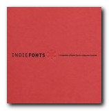
Indie Fonts

July 15, 2009 by Roy Johnson

compendium of digital type from independent foundries

This is a wonderful collection of over 2000 fonts from eighteen of the most innovative independent type designers. It’s essentially a typographic sample book, but some top class design and innovative presentation make it much more than that. Indie Fonts itself is an amazingly stylish production. It’s well designed, beautifully printed on good quality paper, and laid out in a way which displays full font sets without every page ending up the same. They don’t do the usual thing of simply showing the alphabet in upper and lower case over and over again. Every page is different, and the text often describes what the font is attempting to do.

Indie FontsThe font styles include serif, sans serif, script, display, non-Latin, and ornaments. They also include all sorts of page decorations, swashes, figures, icons, and dingbats. Another interesting feature is that almost all these fonts are actually usable for practical day-to-day applications. There are none of the scribbles, distortions, and virtually unreadable grunge fonts that sometimes wish to pass as clever modern typography. Even the wacky and avant-garde Chank studio of Minneapolis produces font sets that can be read and used commercially.

The foundries represented range from Letterror, PSY/OPS, and Test Pilot Collective, to P22 type foundry, Font Diner, and Astigmatic One Eye Typographic Institute. Each of them is introduced with the print equivalent of a colour splash page. There are also introductory notes on each foundry, and the entries for Matthew Carter for instance offer mini-essays in typeface construction and the practical reasoning behind design decisions.

Type styles range from the best of Carter’s classic designs to the latest irreverence of Chank Diesel. Any designer searching for unique typefaces will find what they are looking for, from historical revivals to futuristic techno faces.

The book comes with a CD-ROM which features a selection of thirty-three font sets which are free for you to use – but not distribute. Anybody who is interested in typography ought to see this book. Serious designers will want to own it.

© Roy Johnson 2002

Buy the book at Amazon UK

Buy the book at Amazon US


IndieFonts, Buffalo, NY: P-Type Publications, 2002, pp.408, ISBN: 0963108220


More on typography
More on technology
More on digital media


Filed Under: Typography Tagged With: Digital type, Fonts, Graphic design, Indie Fonts, Typography

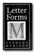
Letterforms

July 10, 2009 by Roy Johnson

essays on type classification, history, and bibliography

Stanley Morison (1889-1967) was an English typographer, designer and historian of printing. Self-taught, having left school after his father abandoned his family, Morison became an editorial assistant on Imprint magazine in 1913. As a conscientious objector he was imprisoned during the First World War but became design supervisor at the Pelican Press in 1918. In 1922 he founded the Fleuron Society dedicated to typographical matters and edited the society’s journal The Fleuron from 1925 to 1930. Letterforms contains two of his scholarly essays on the classification of type designs.

Letterforms The quality of the publication’s artwork and printing was considered exceptional. From 1923 to 1967 Morison was typographic consultant for the Monotype Corporation where his research and adaptation of historic typefaces in the 1920s and 1930s, including the revival of the Baskerville and Bembo types. He pioneered the great expansion of the company’s range of typefaces and hugely influenced the field of typography to the present day.

Morison was also typographical consultant to The Times from 1929 to 1960 and in 1931 he was commissioned by the newspaper to produce a new easy to read typeface for the publication. The typeface Morison developed with graphic artist Victor Lardent, Times New Roman was first used by the newspaper in 1932 and was published by Monotype in 1933.

He edited the History of the Times from 1935 to 1952 and was editor of the Times Literary Supplement between 1945 and 1948, and he was a member of the editorial board of Encyclopaedia Britannica from 1961 until his death.

This slender and beautifully produced volume contains two of his essays. The first, from 1961, is on the classification of typographical variations and was written as the introduction to a collection of type examples which is not yet complete. The second is from 1962 and concerns fifteenth and sixteenth century Italian scripts.

It’s a pity that the first longer essay is not (yet) illustrated by examples, because it forms a magisterial introduction to its subject. Morison’s writing is spare, compressed, and authoritative – and he moves effortlessly between texts in Italian, French, German, and Latin to make his argument.

What he traces is not only the history of type design, but also writing on it as a subject worthy of study. For it was almost two centuries after the advent of printing with moveable type that people began to take it seriously as an art rather than just a technical process of transferring writing into print.

He traces all the important names – Aldus, Caslon, Fournier, Baskerville, Boldoni, Clarke, Blades, Hart (of Hart’s Rules fame) and Updike, up to his own work on Fleuron. It’s an odd text – an introduction to a set of typographical examples which does not yet exist. But it is of obvious historical significance, giving as it does a synoptic view of a whole discipline.

The second essay is also an introduction – but this time to a set of writing books which had been produced in 1962. This essay too traces the state of what could and could not be known about typography in the fifteenth and sixteenth century – but in this case there are excellent illustrations from the works in question.

He inspects the history and development of chancery cursive writing and the roman capital lettering in Italy with a scholarship with is at once astonishingly modest and breathtakingly thorough. This is a book for typography specialists from publishers who specialise in such works. Thank goodness they exist.

© Roy Johnson 2001

Buy the book at Amazon UK

Buy the book at Amazon US


Stanley Morison, Letterforms, Montreal: Hartley and Marks, 1997, pp.128, ISBN 0881791369


More on typography
More on technology
More on digital media


Filed Under: Typography Tagged With: Fonts, Graphic design, Letterforms, Typography

Paul Renner: the art of typography

July 16, 2009 by Roy Johnson

illustrated critical biography of modernist typographer

German typographer Paul Renner is best known as the designer of the typeface Futura, which stands as a landmark of modern graphic design. This title is the first study in any language of Renner’s typographic career. It details his life and work to reveal the breadth of his accomplishment and influence. Renner was a central figure in the German artistic movements of the 1920s and 1930s, becoming an early and prominent member of the Deutscher Werkbund while creating his first book designs for various Munich-based publishers. As the author of numerous texts such as Typografie als Kunst (Typography as Art) and Die Kunst der Typographie (The Art of Typography) he created a new set of guidelines for balanced book design.

Paul Renner: the art of typographyRenner taught with Jan Tschichold in the 1930s and was a key participant in the heated ideological and artistic debates of that time. Arrested and dismissed from his post by the Nazis, he eventually emerged as a voice of experience and reason in the postwar years. Throughout this tumultuous period he produced a body of work of the highest distinction.

Christopher Burke’s biography is a PhD thesis which has been transformed into an elegant commercial publication – designed and typeset by the author himself. It follows a chronological structure, tracing the relationship between the history of Germany and Renner’s theories and practice as an artist. He helped lead German print out of the conservative Gothic or Blackletter tradition into the use of modern fonts such as his own best-selling Futura. His life also parallels German cultural history in the twentieth century.

Burke is very good at revealing the political, economic, and social forces which influenced the development of the new aesthetic movements of the period. For instance, he details the post-inflation shortages of the 1920s which gave the Bauhaus its impetus to link art and technology to produce machine-made objects. (Renner participated actively in this movement, developing alongside people such as Mies van der Rohe and Walter Gropius.)

Another wonderfully revealing instance is his discussion of the Nazis’ 1941 ban on the use of gothic script. What was once part of national identity was suddenly denounced as a ‘Jewish abomination’ – when in fact the truth was that the Germans had occupied much of France, Netherlands, Belgium, Denmark, and Norway, and they needed to make their propaganda understandable to people in these countries.

Burke sometimes seems to bury Renner’s theoretical and aesthetic work under lots of historical data. I was amazed that he gives so little attention to Typografie als Kunst (1922). But fortunately he traces the development of Futura in great detail, complete with reproductions of preliminary sketches of the letter forms and their variants.

He discusses the interesting notion that this essentially modernist font actively suppressed the differences between lower and upper case in the pursuit of a purely ‘rational’ design. Yet a weighted stroke emerged as it developed – because it was quite clear that the purely geometric form looked ugly.

Sometimes the politics and typography are not so comfortably integrated. After forty pages of letter forms, we’re suddenly jerked back into the political crises of the time – though it has to be said that part of Burke’s argument is to rescue Renner from the taint of Nazism which might be attached to any survivors of the period who stayed within Germany. Renner maintained a humanitarian stance against the Nazis, which he expressed significantly in his Kulturbolschewismus?, for which he as arrested in 1933 and then went into a period of ‘internal exile’.

Renner was obviously a survivor. The book ends with his post-war contributions to a debate between typographic modernisers and conservatives, in which he characteristically took the middle ground. He even saw a relationship between book design and political ideology:

In Renner’s view, the taste for large volumes, which equated weight with prestige, betrayed a potential flaw in the German character: ‘the “fatal desire for greatness”, by which Hitler was also notoriously motivated

This is a very attractive book which will appeal to both typographists and cultural historians. It will also have a passing attraction for bibliophiles who will appreciate the sheer pleasure of a beautifully illustrated and carefully designed book printed on high quality paper. If this is the level of work done in the department of typography and graphic communication at Reading University, then Christopher Burke is a very good advert for it.

© Roy Johnson 2002

Paul Renner   Buy the book at Amazon UK

Paul Renner   Buy the book at Amazon US


Christopher Burke, Paul Renner: the art of typography, London: Hyphen Press, 1999, pp.223, ISBN: 1568981589


More on typography
More on design
More on media
More on web design


Filed Under: Individual designers, Typography Tagged With: Biography, Fonts, Graphic design, Paul Renner, Typography

  • 1
  • 2
  • Next Page »

Get in touch

info@mantex.co.uk

Content © Mantex 2016
  • About Us
  • Advertising
  • Clients
  • Contact
  • FAQ
  • Links
  • Services
  • Reviews
  • Sitemap
  • T & C’s
  • Testimonials
  • Privacy

Copyright © 2025 · Mantex

Copyright © 2025 · News Pro Theme on Genesis Framework · WordPress · Log in