Mantex

Tutorials, Study Guides & More

  • HOME
  • REVIEWS
  • TUTORIALS
  • HOW-TO
  • CONTACT
>> Home / Archives for Fonts

Stop Stealing Sheep

July 19, 2009 by Roy Johnson

best-seller on the basics of typography and page design

Don’t worry about the quirky title. Just pay attention to what’s on offer. This is a popular beginner’s guide to the appreciation of type which teaches by good example. Every page is a mini-tutorial in good design – an elegant balance of body text, pull quotes, graphics, and a interesting variety of fonts, weights, and sizes. Spiekermann and Ginger start with the issue of appreciating and selecting typefaces for specific purposes. There are guidance notes on the provenance of the typefaces they discuss, and they take the line that context is all.
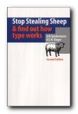
Stop Stealing SheepThat is, the value of a font can only be seen when it is put into use, and is seen where it will be used – on the page or screen. A lot of their exposition is conducted via extended metaphors – families, music, driving, and human character – which sometimes seem rather strained. But they do cover all the basics of typography: selection of font type, size, and weight; word and line spacing; and page design.

Make sure you get the second edition. It’s a big improvement on the first. Lots of colour has been added to the pages, and the topics they discuss now include the latest developments in font technology. They also explain how to choose type for the best effects on Web pages, email, and writing for the screen.

The emphasis is on visually exciting graphic examples, rather than a ponderous lecture on typography. That’s probably what has made this book such a best-seller. It’s an introduction which is entertaining and breathes enthusiasm for the subject of tasteful design. It’s also an elegant production in its own right.

© Roy Johnson 2002

stop stealing sheep Buy the book at Amazon UK

stop stealing sheep Buy the book at Amazon US


Erik Spiekermann & E.M. Ginger, Stop Stealing Sheep & find out how type works, Mountain View (CA) Adobe Press, 2nd edition 2002, pp.192, ISBN 0201703394


More on typography
More on technology
More on digital media

Filed Under: Typography Tagged With: Design, Fonts, Graphic design, Information design, Stop Stealing Sheep, Typography

The Complete Manual of Typography

June 18, 2009 by Roy Johnson

encyclopedia of type and typography

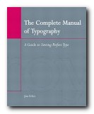
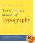
This is a very elegantly-produced book which sets out the basic principles of type design and page layout. It bids to stand as a classic alongside the reigning Bible of typography – Robert Bringhurst’s The Elements of Typographic Style, which always comes top of typography favourites lists. It includes the basic concepts and anatomy of good typography: how type came about, how to set type, and the difference between type and fonts.

The Complete Manual of Typography Then comes how to manage fonts – techniques for working with leading, kerning, and managing indentation and alignment. There are sections which deal with setting type in language-specific instances such as using foreign character sets, which specialists will find useful. There’s even a chapter on dealing with style sheets – something which really does bridge the gap between print and digital culture. What’s interesting about this book is that it’s not just a historical survey. It covers all aspects of type design and applications of them in print and screen. It’s packed with illustrative examples, and anybody who has the slightest interest in typography will find something of interest in its detailed exposition of the basics. It’s an ambitious book, because it seeks to deal with type from Gutenburg to digital fonts. And it does it very well. There’s an extensive glossary and a very good index. Only the bibliography was rather disappointing.

For those who are still interested in using type for print rather than on screen, Felici covers all the niceties of font weight, ligatures, letter-spacing, hyphenation, and wrapping text around graphics. There are plenty of examples of well presented typesetting, with detailed analyses showing the subtle differences between them. This is like a mastercourse in the finer points of typography. He also covers issues such as footnotes, endnotes, picture captions, and bibliographies.

feliciThere’s some amazing detail. I hadn’t appreciated before the difference between a standard and a punctuating m-dash. This stuff will appeal to typography buffs – and it’s all beautifully illustrated.

I also enjoyed a section on document structure, in which he shows you how to arrange headings and various levels of sub-headings. This section could be useful for those people [like me] currently grappling with the possibilities of cascading style sheets.

For a book which covers the historical tradition as well as digital innovations, this is a remarkable achievement. As Frank Romano says in his introduction:

At this point, most people who work with type have to catch up with both what is old and what is new in typography. Fortunately, you have the solution in your hands: a concise, beautiful book that pulls together everything you need to produce great typography.

© Roy Johnson 2003

Buy the book at Amazon UK

Buy the book at Amazon US


James Felici, The Complete Manual of Typography, Berkeley (CA): Peachpit Press, 2003, pp.360, ISBN 0321127307


More on typography
More on technology
More on digital media

Filed Under: Typography Tagged With: Fonts, Graphic design, The Complete Manual of Typography, Typefaces, Typography

The Elements of Typographic Style

May 31, 2009 by Roy Johnson

Best-selling classic manual – the typographist’s Bible

Subscribers to Internet lists dealing with fonts and typography often ask “Which books would you recommend as a guide to good design principles?”. And no matter how many responses emerge, one book comes out on top every time – Robert Bringhurst’s The Elements of Typographic Style. It’s a book packed with design wisdom. Bringhurst has produced what is essentially a first principles of typography – a grammar of good taste based on the relationship between form and content of printed matter.

The Elements of Typographic StyleIt’s also a very beautiful book in its own right. You will not fail to discover visual pleasures on almost every page, and the text is illustrated with such an astonishing variety of beautiful fonts, that this almost doubles as a catalogue of type designs. It is obvious from almost every word that he’s thought profoundly about the fundamental issues of printed words on the page, and he often has insights to offer on topics most of us take for granted. He can conjour poetry out of the smallest detail, and he offers a scholarly yet succinct etymology of almost every mark that can be made – from the humble hyphen to the nuances of serifs on Trajan Roman or a Carolingian Majuscule.

The well-made page is now what it was then: a window into history, language and the mind: a map of what is being said and a portrait of the voice that is silently speaking.

As you would expect, he traces the development of type from its origins in eleventh century China to the present, and he deals with such extremely subtle distinctions as the differences in quality of letter forms produced by pressing hot metal onto paper, by offset litho (laying the letter on top of the paper) or by the digital means of charged electrons on the screen. he doesn’t actually have much to say about computers and typography, and yet his brief comments summarise almost everything there is to say about digital type:

Good text faces for the screen are therefore as a rule faces with low contrast, a large torso, open counters, sturdy terminals, and slab serifs or no serifs at all. [And he might have added – ‘a large x-height’.]

He does seem to become a little fanciful when discussing the mathematics of page proportions, especially when maintaining an extended comparison with the musical scale, and he misses the chance to give historical examples of page design, rather than the mathematical tables which populate this part of the book. But it seems almost churlish to complain when everything is so beautifully presented.

He ends with two very useful chapters – one of which analyses commonly available fonts (“prowling the specimen books” as he calls it). Paragraph-length potted histories are followed by suggestions on how the font is best used. This is typical of the manner in which he very elegantly combines scholarship and a cultivated taste with the requirements of a practical guidance manual.

Bringhurst is also a novelist, and he brings a prose style of some distinction to the subject, ornamenting his text with the lyrical jargon of typography, and quite obviously relishing terms such at the pilcrow, the octothorpe, the virgule, guillemets and chevrons, and the solidus; as well as the romance of small caps, analphabetic symbols, the shape of pages, the order of footnote symbols, the ‘looser dressing’ and the ‘larger torso’ of a font.

The book ends with a fascinating tour of sorts and characters, revealing the subtle functions of the cedilla and the ogonek; the umlaut and the diaeresis; the ligatures aesc, and oethel; the prime, the macron, and the vinculum. He completes this tour de force with several more appendices: a glossary of typographic terms; a listing of type designers; another of typefoundries; a recapitulation of the main recommendations in the text; and a list of further reading.

This is a wonderful book which fully deserves its widespread reputation as a classic and the ultimate guide for laying out pages in print of on screen. Anyone who wishes to gain insights into the aesthetics and the finer details of good design should read this book. Anyone with a serious typographic intent should own it.

© Roy Johnson 2000

The Elements of Typographic Style   Buy the book at Amazon UK

The Elements of Typographic Style   Buy the book at Amazon US


Robert Bringhurst, The Elements of Typographic Style (2nd edn), Toronto: Hartley & Marks, 1996, pp.351, ISBN: 0881791326


More on typography
More on design
More on media
More on web design


Filed Under: Graphic design, Typography Tagged With: Fonts, Graphic design, Information design, Printing, Typographic style, Typography

The Fundamentals of Typography

May 21, 2009 by Roy Johnson

The Fundamentals of Typography

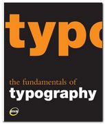
I like books explaining typography, because they are forced to illustrate the points they are making, and the result is usually pages with plenty of visual interest. That’s what makes books such as Eric Spiekermann’s Stop Stealing Sheep and James Felici’s The Complete Manual of Typography so popular. The Fundamentals of Typography covers similar ground in a historically comprehensive fashion. Its first part covers the development of language and the history of writing systems.

The Fundamentals of Typography This shows the gradual evolution of alphabets and the gestation of typefaces or font families. These expand after the invention of printing in the Renaissance then explode into a galaxy of styles following industrialisation. Gavin Abrose and Paul Harris trace this in detail during the second part of the last century, following each step of recent type design.

Every page is fully illustrated. In fact the explanatory text is almost an extended caption on each graphic. This keeps the pages lively, but sometimes sinks to the level of triviality when presenting a major item. The influential Swiss typographer Jan Tschichold for instance is summarised in a three sentence paragraph.

The next part of the book deals with the basic issues of typography – font selection, the spacing of letters and type, page design, kerning, small capitals, text alignment, and leading. I was glad to see that they consider type on screen as well as in print, and they end with a consideration of very basic design issues such as the use of grids, page texture, and legibility.

There’s quite an interesting section mid-book on the nature of page proportions (something the aforementioned Tschichold discusses in The Form of the Book) and the disposition of type on a page.

The latter part of the book offers a lot of interesting advice on the use of diacritical marks (accents), numbers, fractions, ligatures, diphthongs, small capitals, and also examples showing some incredibly subtle adjustments of the alignment of bullet points and hyphens. All the arguments being made are illustrated with real life examples from the commercial world of brochures and advertising design.

In fact that is probably one of the strongest features of this book, even though it is given a low profile. It’s important that young designers see not only a theoretical possibility, but its implementation in the real world in which they are probably seeking work. I was also glad to see that there was a webliography listing the designers represented, because these guys often get missed out in a general survey of this kind.

The last part of the book deals with digital typography – font sets which can be generated from a basic style. It also covers issues of readability and legibility (not the same thing) and type as image and graphic symbol.

© Roy Johnson 2008

Buy the book at Amazon UK

Buy the book at Amazon US


Gavin Ambrose & Paul Harris, The Fundamentals of Typography, Lausanne: AVA, 2006, pp.176, ISBN 2940373450


More on typography
More on technology
More on digital media

Filed Under: Typography Tagged With: Fonts, Graphic design, Typography

The Graphic Language of Neville Brody

May 31, 2009 by Roy Johnson

best-selling illustrated  guide to popular typographist

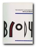
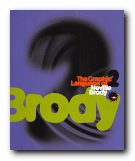
Neville Brody is a now-famous UK graphic designer who shot to prominence in the 1970s. He became artistic director of The Face – a youth and fashion magazine which he revamped – and in doing so set the pace for magazine cover design which persists to this day. Many UK magazines are still designed on the principles he established – of a bold, typographically interesting title at the top of the page (Maxim, Loaded, Mojo,) surmounting a single photographic portrait. In fact he is part graphic designer and part typographer.

The Graphic Language of Neville BrodyAdvertising and logos throughout the world sport his typefaces and their variants. Only the other day I noticed an ad for shoes on the back of a bus which was composed entirely of one of his fonts. He comes up with designs which draw their inspiration from constructivist, modernist, and expressionist designs of the inter-war years, but he gives them a contemporary twist. These are two very stylish publications celebrating his achievement – and very attractive publications in their own right. Even if you are put off by the fact that Brody applies his undoubted talents to the ephemeral products of the worlds of pop and fashion, it’s impossible to escape his harmonious sense of form and crisp sense of design on every page.

The Graphic Language of Neville BrodyThere are pop adverts, albumn and magazine covers, corporate logos and design, fashion magazine plates, book dust jackets, letterheads, and even humble business cards amongst the designs illustrated here. The accompanying text by Jon Wozencroft is enthusiastic without being sycophantic, and there is a good scholarly apparatus which gives full details of sources. However, the principal value of these two volumes is that they are beautifully designed books, full of good page layouts, vivid illustrations, and well-chosen typography. If they are out of print by the time you read this, make the effort to track them down. You will not regret it.

© Roy Johnson 2002


Volume 1

Jon Wozencroft, The Graphic Language of Neville Brody, London: Thames and Hudson, 1988, pp.160, ISBN: 0500274967

The Graphic Language of Neville Brody   Buy the book at Amazon UK
The Graphic Language of Neville Brody   Buy the book at Amazon US


Volume 2

Jon Wozencroft, The Graphic Language of Neville Brody 2, London: Thames and Hudson, 1994, pp.176, ISBN: 0500277702

The Graphic Language of Neville Brody   Buy the book at Amazon UK
The Graphic Language of Neville Brody   Buy the book at Amazon US


More on typography
More on design
More on media
More on web design


Filed Under: Graphic design, Individual designers, Typography Tagged With: Fonts, Graphic design, Neville Brody, Typography

Typography bibliography

October 30, 2009 by Roy Johnson

Typography bibliography   Gavin Ambrose & Paul Harris, The Fundamentals of Typography, Lausanne: AVA, 2006, pp.176, ISBN 2940373450.

Typography bibliography   Tom Arah, Web Type: Start Here!, Lewes: ILEX, 2004, pp.192, ISBN: 1904705189.

Typography bibliography   Jeff Bellantoni and Matt Woollman, Type in Motion: Innovations in Digital Graphics, 2nd edn, London: Thames and Hudson, 2005, pp.176, ISBN 0500512434

Typography bibliography   John D. Berry, dot-font: talking about fonts, New York: Mark Batty Publishing, 2006, pp.126, ISBN: 0977282708

Typography bibliography   Charles Bigelow, Paul Hayden Duensing, and Linnea Gentry (eds) Best of Fine Print on Type and Typography, San Francisco: Fine Print/Bedford Arts, 1988.

Typography bibliography   Lewis Blackwell, Twentieth Century Type, Rizzoli International Publications/Calmann & King, 1992, pp.256, ISBN 084781596X

Typography bibliography   Lewis Blackwell, 20th Century Type: Remix, London: Lawrence King, 1998, pp.191, ISBN 1856691160. New edition of a historical survey of 100 years of innovation in typographic design – presented in elegantly publication which has become a favourite amongst designers.

Typography bibliography   Lewis Blackwell and David Carson, The End of Print: The Graphic Design Of David Carson, Chronicle, 1995, pp.160, ISBN: 0811811999. California dreaming. Father of ultra-distressed type. Carson came to fame by designing Raygun and has remained popular with the avant garde ever since.

Typography bibliography   Lewis Blackwell and David Carson, David Carson: 2nd Sight: Grafik Design After the End of Print, Universe Books, 1997, pp.176, ISBN: 0789301288. Follow-up to best-selling title above. More of Carson’s influential work – where type and graphics begin to merge with each other.

Typography bibliography   Joseph Blumenthal, The Printed Book in America, Boston: David R. Gondine, 1997.

Typography bibliography   Alexander Branczyk et al, Emotional Digital: A sourcebook of contemporary typographics, London: Thames & Hudson, 2001, pp.312, ISBN 0500283109. Showcase presentation of modern type design from the best of today’s studios – both traditional and avant-gard. Examples shown in wide range of applications. Beautifully produced book.

Typography bibliography   Robert Bringhurst, The Elements of Typographic Style (2nd edn), Vancouver: Hartley & Marks, 1996, pp.351, ISBN 0881791326. The Bible of typography. Beautifully designed and poetically written encyclopedia of all things typographic. Impossible to recommend this book too highly.

Typography bibliography   Christopher Burke, Paul Renner: the art of typography, London: Hyphen Press, 1999, pp.223, ISBN 1568981589. Scholarly biography of the designer of the Futura typeface. Mixes graphic design issues with politics and social history. Elegantly produced and well illustrated.

Typography bibliography   Sebastian Carter, Twentieth Century Type Designers, New York: W.W.Norton, (new edition) 1995.

Typography bibliography   Warren Chappell, A Short History of the Printed Word, New York: Alfred A. Knopf, 1970.

Typography bibliography   Carl Dair, Design With Type, Toronto: University of Toronto Press, 1982.

Typography bibliography   Geoffrey Dowding, Finer Points in the Spacing and Arrangement of Type, (Revised edition), Vancouver: Hartley & Marks, 1995, pp.96, ISBN 0881791199. Does what it says on the tin. Dowding reflects on the more subtle points of punctuation and letter spacing. Elegant, restrained, and well-produced.

Typography bibliography   William Addison Dwiggins, Layout in Advertising, New York: Harper and Brothers, 1948.

Typography bibliography   James Felici, The Complete Manual of Typography, Berkeley (CA): Peachpit Press, 2003, pp.360, ISBN 0321127307.

Typography bibliography   Adrian Frutiger, Type, Sign, Symbol, Zurich: ABC Verlag, 1980.

Typography bibliography   Simon Garfield, Just My Type, London: Profile Books, 2010, pp.352, ISBN: 1846683025

Typography bibliography   Eric Gill, An Essay on Typography, London, 1936, reissued Boston: David R. Godine 1993, pp.144, ISBN: 0879239506. Gill’s essay is a slightly quirky plea for the aesthetics and morals of good design principles. This has become a design classic. Produced in Gill’s own typeface – Johanna.

Typography bibliography   Bob Gordon and Maggie Gordon, The Complete Guide to Digital Graphic Design, London: Thames and Hudson, 2002, pp.224, ISBN 050028315X. Typography is only one part of this survey of contemporary design – but the book is so beautifully illustrated and produced, it acts as an excellent example of page structure and layout.

Typography bibliography   Bob Gordon, Making Digital Type Look Good, London: Thames and Hudson, 2001, pp.192, ISBN 0500283133. Beautifully designed and elegantly printed study. Includes the anatomy of type, rendering, technology, and fine tuning. Clarifies all the complexities of font technology in a very straightforward manner – showing how tracking, kerning, and hyphenation can be used to good effect.

Typography bibliography   Nicolette Gray, A History of Lettering: Creative Experiment and Letter Identity, Boston: David R. Gondine, 1986.

Typography bibliography   Robert Harling, The Letter Forms and Type Designs of Eric Gill, Boston: David R. Gondine, 1977.

Typography bibliography   New Hart’s Rule for Compositors and Readers, London: Oxford University Press, 1999, pp.182, ISBN 019212983X. Compact style guide to typographical and presentational niceties – from punctuation and spacing, to hyphenation, foreign words, symbols, and proof-correction.

Typography bibliography   Oldrich Hlavsa, A Book of Type and Design, New York: Tudor Publishing, 1960.

Typography bibliography   Richard Hollis, Graphic Design: a concise history, London: Thames and Hudson, 1994, pp.224, ISBN: 0500202702. Compact, well-illustrated, and good-value history of twentieth century design – including graphics and typography.

Typography bibliography Sally Hughes, Design and Typography, Computer Step, 1998, pp.193, ISBN 1840780045. Well-illustrated and simple introduction to typography and desk top publishing – every point illustrated by examples.

Typography bibliography   Indie Fonts, Buffalo, NY: P-Type Publications, 2002, pp.408, ISBN: 0963108220. Beautifully produced collection of over 2000 fonts from eighteen of the most innovative independent type designers.

Typography bibliography   W. Pincus Jaspert, W. Turner Berry, and A.F. Johnson, The Encyclopaedia of Type Faces, New York: Blandford Press, 1986.

Typography bibliography   Rob Roy Kelly, American Wood Type, New York: Van Nostrand Rheinhold, 1969.

Typography bibliography   Robin Kinross, Modern Typography: An Essay in Critical History, Chronicle Books/Princeton Architectural Press, 1996, pp.208, ISBN 0907259057.

Typography bibliography   Alexander Lawson, Anatomy of a Typeface, London: Hamish Hamilton, 1990, pp.428, ISBN 0241132673.

Typography bibliography   Alexander Lawson, Printing Types: An Introduction, Boston: Beacon Press, 1971.

Typography bibliography   Ellen Lupton, Thinking with Type: A critical guide for designers, editors, and students, New York: Princeton Architectural Press, 2004, pp.176, ISBN 1568984480

Typography bibliography   Mac McGrew, American Metal Typefaces of the Twentieth Century, New Castle Delaware: Oak Knoll Press, 1993.

Typography bibliography   Ruari McLean, The Thames and Hudson Manual of Typography, Thames and Hudson, 1980, ISBN 0500680221. Popular, good-value, and well illustrated general introduction to typography. Covers all aspects of the craft, but ends with focus on book design.

Typography bibliography   Ruari McLean, Jan Tschichold: Typographer, Boston: David R. Gondine, 1975.

Typography bibliography   Stanley Morison, Letterforms, Montreal: Hartley and Marks, 1997, pp.128, ISBN 0881791369

Typography bibliography   Stanley Morrison, First Principles of Typography, New York: The Macmillan Company, 1936.

Typography bibliography   Stanley Morrison, A Tally of Types, Cambridge: Cambridge University Press, 1973.

Typography bibliography   Robert Norton, Types Best Remembered/Types Best Forgotten, Parsimony Press, 1993, ISBN 1884606008. Collection of well-known typefaces, complemented by negative and positive criticism.

Typography bibliography   Bruce Rogers, Paragraphs on Printing, New York: Dover Publications, 1979.

Typography bibliography   Julian Rothenstein and Mel Gooding (eds), 130 Alphabets and Other Signs, London: Thames and Hudson, 1993, pp.183, ISBN 0500277419. A charming sample book of signs, symbols, alphabets, rules, swashes, and pictograms. Highly recommended.

Typography bibliography   Julian Rothenstein and Mel Gooding (eds), A B Z: More Alphabets and Other Signs, London: Redstone Press, 2003, pp.221, ISBN:1870003330. Another charming sample book of font sets, signs, symbols, alphabets, rules, swashes, and pictograms. Highly recommended.

Typography bibliography   Rosemary Sassoon, Computers and Typography, Oxford: Intellect, 1993, pp.164, ISBN 1871516234. Articles on text massage; layout and readability; new alphabets using bitmapped fonts; the history of typography and its effects; the visual analysis of a page of text; and Sassoon’s essay on perception and type design related to writing for children.

Typography bibliography   Rosemary Sassoon, Handwriting of the Twentieth Century, London: Routledge, 1999, pp.208, ISBN 0415178827. Developments in the teaching and study of handwriting over the course of the 20th century. A historical record of techniques, styles and methods. Beautifully illustrated with examples – from guidance manuals, schoolbooks, clerks’ registry entries, and personal handwriting.

Typography bibliography   Erik Spiekermann & E.M. Ginger, Stop Stealing Sheep and find out how type works, Adobe Press/Hayden Books, 1993, ISBN 0672485435. Very popular introduction to the general principles of typography. Well designed and illustrated.

Typography bibliography   Walter Tracy, Letters of Credit: A View of Type Design, Boston: David R. Godine, 1986, ISBN 0879236361.

Typography bibliography   Jan Tschichold, Asymmetric Typography, London: Faber & Faber, 1967.

Typography bibliography   Jan Tschichold, The Form of the Book: Essays on the Morality of Good Design, Vancouver: Hartley & Marks, 1991, pp.181, ISBN 0881791164. Short essays from Tschichold’s ‘late’ period on some of the most fundamental issues of arranging type on paper. Eloquent opinions on page shape, margins, text spacing, and even blank pages.

Typography bibliography   Jan Tschichold, The New Typography: A Handbook for Modern Designers, Berkeley: University of California Press, 1995, pp.236, ISBN: 0520071476. Manifesto of the modernist movement. Tschichold’s ‘early’ period, politically committed argument for ‘form follows function’. Original illustrations, and printed in period style.

Typography bibliography   Jan Tschichold, Treasury of Alphabets and Lettering: A Source Book, W.W. Norton, 1995, pp.236, ISBN 0393701972.

Typography bibliography   D.B. Updike, Printing Types: Their History, Forms and Use, New York: Dover Publications, 1980.

Typography bibliography   Hugh Williamson, Methods of Book Design: The Practice of an Industrial Craft, New haven: Yale University Press, 1985.

Typography bibliography   Adrian Wilson, The Design of Books, San Francisco: Chronicle Books, 1995, pp.159, ISBN 081180304X.

Typography bibliography   Jon Wozencroft, The Graphic Language of Neville Brody, London: Thames & Hudson, 1988, pp.160, ISBN 0500274967. Comprehensive survey of Brody’s graphics and typography – in two very popular and well-illustrated volumes. Best-seller.

© Roy Johnson 2009


More on typography
More on technology
More on digital media

Filed Under: How-to guides, Typography Tagged With: Bibliographies, Design, Fonts, Typography

  • « Previous Page
  • 1
  • 2

Get in touch

info@mantex.co.uk

Content © Mantex 2016
  • About Us
  • Advertising
  • Clients
  • Contact
  • FAQ
  • Links
  • Services
  • Reviews
  • Sitemap
  • T & C’s
  • Testimonials
  • Privacy

Copyright © 2025 · Mantex

Copyright © 2025 · News Pro Theme on Genesis Framework · WordPress · Log in