Mantex

Tutorials, Study Guides & More

  • HOME
  • REVIEWS
  • TUTORIALS
  • HOW-TO
  • CONTACT
>> Home / Archives for Graphic design

Designing the 21st Century

June 18, 2009 by Roy Johnson

contemporary world product design and designers

This is a block-busting compendium of design and designers which is as smack up to date as it’s possible to be. It’s arranged in alphabetical order, allocating individual or group designers a few pages each to demonstrate work produced in the current century. The designers are each given a short profile and a list of exhibitions and clients, plus well-photographed examples of their work. They are also asked to respond to the question “What is your vision for the future of design?” The materials are those of everyday products – chairs, lighting, shelving, cutlery, computers (the Mac, naturally) motor cars, mobile phones, kettles, and settees.

Designing the 21st CenturyDesigners run from Werner Aisslinger and Ron Arad via the amazing Jonathan Ive, through to Helen Yardley and Michael Young. I was surprised by two things: how many of these designers had all come up with basically the same coffee table; and how many of the best designers were British.

Charlotte and Peter Fiell are a two-person encyclopedia of modern design, with a string of publications on the subject. If this doorstep size tome is not for you, try their pocket-book sized Design of the 20th Century and Industrial Design A—Z, both of which are short introductions to the same subject.

This is a visually rich collection which is doing its best to look ahead to what might happen next. Like most of Taschen’s other publications it’s well designed, well printed and produced, and amazingly good value.

It’s a pity the individual designer’s contact details are not given, but anyone with an interest could click on Google and track people down with a search word or two.

© Roy Johnson 2005

Designing the 21st Century   Buy the book at Amazon UK

Designing the 21st Century   Buy the book at Amazon US


Charlotte and Peter Fiell , Designing the 21st Century, London: Taschen, 2005, pp.576, ISBN: 3822858838


More on design
More on media
More on web design
More on information design

Filed Under: Product design Tagged With: Designing the 21st Century, Graphic design, Product design

Designing Web Graphics

July 23, 2009 by Roy Johnson

comprehensive tutorials on web site design

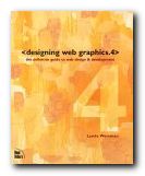
Don’t make any mistake. This is not just a book about designing web graphics. It’s the fourth edition of guru Lynda Weinman’s best-selling compendium of web design tutorials. She offers a manual of digital design which deals with far more than its title suggests. It covers all the basics of graphic design for the web – typography, browser safe colours, and the differences between HTML and XHTML. Almost every point is illustrated with a coloured screenshot; there are lots of tips and tricks in callout boxes; and she gives sources for free software such as XHTML editors, clip art, JavaScripts, and downloadable fonts.

Designing Web Graphics 4Serious designers will be interested in the fact that she includes lots of advice about getting work as a freelance designer. There’s also guidance on web project management, usability, and content architecture. She offers a particularly good explanation of how to organise the structure of a site and design its navigation system. And for anyone who wants to make their web design politically correct, there’s a clear account of current ‘accessibility’ requirements.

On graphics, she favours Photoshop and Fireworks in her coverage of all aspects of graphic files. These include JPGs, GIFs, scalable vector graphics, Flash, and PNG. She also covers colour pallets and compression techniques, plus effects such as transparency.

She’s very keen on rollovers, and devotes a lot of effort to explaining the JavaScript and Flash approaches to creating them, complete with examples of code.

She also explains tables, frames, and cascading style sheets, arguing for the advantages and disadvantages of each one, and she has lots of tips and tricks.

She finishes with the elements of audio files and animations using Flash, Macromedia Director, and Quicktime, then how to promote your site using newsletters, blogs, scripts, and search engine submissions.

This is the latest edition of a very popular guide. These New Riders publications are expensive but exceptionally good quality – packed with screenshots, links to websites, and recommendations for further reading.

© Roy Johnson 2004

artie shaw Buy the book at Amazon UK

artie shaw Buy the book at Amazon US


Lynda Weinman, Designing Web Graphics 4, Indianapolis IN: New Riders, 2003, pp.512 ISBN 0735710791


More on web design
More on technology
More on digital media


Filed Under: Web design Tagged With: Designing Web Graphics, Graphic design, Web design

Desktop publishing terms – a glossary

September 15, 2009 by Roy Johnson

the language of word-processing and DTP

Desktop publishing terms

Attributes
Attributes are the stylistic properties of an object. Attributes of text include size, case, boldness. Attributes of graphics include line thickness, fill colour and line colour. A set of attributes applied to an object is called a style.

Backup
A duplicate of electronic files (programs. data or operating systems). It is available in place of the original in case of corruption/loss/availability problems. A wise person creates backups frequently.

Base line
The imaginary line that characters rest on in a line of text (see also line spacing).

Bit Map Image
A dot matrix image where each dot is represented by one bit in the digital memory. Complex images are built up using these dots. Resolution of about 300 dots per inch may require approximately I Mbyte for a complete A4 page.

Body text
The main text in a document, in distinction from headlines and captions.

Bold
In printing, a heavier version of a particular typeface. An enhancement of the text.

Bubble jet printer
Generically applied brand name for an Ink Jet Printer.

Bullet
In printing, a graphic symbol usually in the form of a large dot marking the commencement of a new paragraph. Used to attract the reader’s attention.

Byte
A byte is 8 bits. The storage capacity of computers (ROM and RAM) and disks is generally given in kilobytes, (1024 bytes), megabytes or gigabytes. Approximately one byte is required to store one character.

Caption
Text placed under an illustration to describe it.

CD-ROM
A way of distributing programs and data on a disk very like an audio CD which allows large amounts of storage and is very portable. ROM indicates data can be copied from the CD but that the contents cannot be changed or deleted. In DTP this media is particularly useful for Font and Clip-Art libraries.

Central Processing Unit [CPU]
This term is used variously to describe the base unit of the computer system or the main chip within it.

Character
A symbol used in a writing system. In most western languages the letters A to Z, a to z, 0 to 9 and punctuation characters such as : ; , ? etc.

Clip-Art
Pictures of general use which are provided in a library for easy inclusion in publications. Clip art libraries are usually provided without copyright restrictions.

Clipboard
A temporary storage area in computer memory to which objects are cut or copied and from which they can be posted directly into a position into a page or a DTP work area. The clipboard holds one object at a time.

Copy
(1) To reproduce an object by placing it into the clipboard then pasting it elsewhere in the same publication or into a document belonging to another program.
(2) To reproduce a file by renaming it or placing it on another drive or directory. Often done as a form of data security. [See Backup.]

Copyright
The exclusive rights to, and control of, the reproduction, sales, copying or distribution of creative works of art. music, literature or coded programs for computing.

Corruption
The inadvertent destruction of electronic data which causes data received or read to differ from that transmitted or originally recorded.

Crop
To cut the edges of an illustration to fit in a given space or to show a particular detail.

Cut
In electronic text or graphic production, the transfer of objects from one file to a temporary storage area in memory called the clipboard from where they can be pasted into a different page, file or into the DTP work area.

Default
An option that is used automatically unless an alternative is specified. For example a default font of Times New Roman 12 is very common.

Directory (or Folder)
A software division of a disk, usually used to keep similar files together, rather in the manner of a drawer in a filing cabinet. A disk may contain many directories. A directory often contains several other directories called sub-directories.

Digital camera
A camera which stores images as digital information rather than on photographic film. This allows images to be easily displayed and edited on computer.

Disk
In computing, a thin disk coated with magnet material, on which information can be recorded. Sometimes spelled disc.

Dot matrix
Usually applied to printer and screen output devices which make up character/images from a matrix of dots. Quality depends on dot density and size. (See also resolution). Historically a type of printer that used inky ribbons and mechanical contact.

Draft
(1) A rough layout of a page, document or publication.
(2) Used to describe print quality – particularly with respect to dot matrix printers, where draft quality is synonymous with poor quality but high speed output.

EPS
Encapsulated postscript, a very versatile file format used for sending files to commercial printers, and thus avoiding the cost of typesetting. [See postscript.]

File
An organised and structured collection of information. In computing it is the basic unit of stored or accessible user data held in auxiliary storage. Programs as well as data are held in file format.

File names
The names used by the Operating system to identify files. Two files cannot have the same name and occupy the same storage location on a disk.

File type (or extension)
The part of the filename which indicates which program created it, and therefore which system it is written in. This is essential information in DTP which is very concerned with file transfer. Typical file types are DOC (for a word processor document) and BMP (for Bitmap image). Some Operating Systems do not always display file types, but will have the facility to do so.

Floppy disk
A thin portable plastic disk usually 3.5″ in diameter on which electronic files can be recorded. Typically holds over I Megabyte of data.

Folder
See Directory.

Font
A complete collection of letters, punctuation marks, numbers, and special characters with a consistent and identical typeface, weight (Roman or bold), posture (upright or italic) and font size.

Technically, font still refers to one complete set of characters in a given typeface, weight, and size, such as Helvetica italic 12 – but the terms has come to be used interchangably for refering to typefaces or font families.

Footer
Information that appears at the bottom of every page (within the normal bottom margin) of a document – for instance, page number. (See also Header)

Format
(1) The system used for storing a file on disk. Different programs use different methods of recording identical information.
(2) The layout and arrangement of tracks and sectors on a disk.
(3) Sometimes also applied to the layout or arrangement of graphics and/or text on a page or screen.

Gigabyte
About a thousand megabytes.

Global
Relating to anything in computing that extends over the whole system. For example, a ‘global search and replace’ means that any occurrence of a specified word will be found, and replaced by another specified word.

Graphic
In computing, the presentation of information which is not in character form. Picture information as distinct from textual. Some characters may be constructed in graphic form, these are considered to be graphics.

Greeking
The use of dummy text that looks like Greek script and is used to give an impression of the appearance of the finished document. This is used to make it easy to judge the overall appearance of a document without being distracted by the meaning of the text.

Guide (in DTP)
A non-printing line used to aid the positioning of text or graphics.

Gutter
The space between columns of text on a page.

Hard disk
An auxiliary storage device able to store very large quantities of data that is usually mounted inside the System unit. Typically holds greater than I Gigabyte of data.

Header
Information that appears at the top of every page (within the normal top margin) of a document – for instance, the title of a report, or page number. (See also Footer)

Import
Bring an object (graphic or text) into a DTP page.

Indent
The position of text in from the margin.

Ink jet printer
A non-impact printer which prints by spraying a finely controlled jet of ink from a nozzle onto paper. The electrically charged ink droplets are moved by electrical fields to form the characters in dot matrix form.

Input device
A unit of hardware from which the computer reads data.

Inter-line spacing
Space between lines in a paragraph. (See also leading.)

Internet
A system of connecting computers together via telephone lines managed by network management computers. Enables transmission of data around the globe, and is a rich source of graphic material.

Intranet
A communicating system of computers that is theoretically confined to one place – in an organisation, or even a single office.

Italic
A typeface variation in which letters slope forward.

Justification
To format text so that lines are of equal length producing vertical columns of space at the left and right margins. Spaces between words are enlarged so that text characters always touch both left and right margins.

Kerning
The space between characters. Now used to define proportional spacing between characters which is dependent upon the character width.

Landscape
Describes the paper orientation – in this case the width is greater than the height and so often referred to as wide. (See Portrait.)

Laser printer
A non-impact printer which uses a laser beam and toner applied to paper to produce fast, quiet, high density (typically 75 to 1600 dpi or greater) dot matrix images.

Leading
The distance in points between lines of text – pronounced as in ‘ledd-ing’ (see also Inter-line spacing.)

Line spacing
(See Inter-line spacing.)

Logo
A visual image used as a company trade mark or instead of the company name.

Lowercase
The set of 26 characters ‘a’ to ‘z’. Not capital (uppercase) characters.

Master page
A page which contains objects (such as headers, page numbers or borders) which will be reproduced on every other page of a document.

Megabyte
About a thousand kilobytes (actually, 1,048,576 bytes)

Network
Computers connected together for the purpose of sharing resources and communication.

Non proportional spacing
Fonts in which letter spacing which does not vary for different width of character. Rarely used except in tables and text processing assessments where it gives the appearance of work produced on a manual typewriter.

Object
A graphic or piece of text treated as a single item. Word processing treats text as a set of characters. DTP usually treats text as an object.

OCR (Optical Character Recognition)
Software which converts pictures of, printed text (acquired by a scanner) into an text file for further editing or formatting.

Operating system (OS)
Programs which run the computer, and without which the computer would not work. The OS allows the programs we use to run. The various Windows, Mac System7 and its successors and the various OS2 products may all be considered operating systems.

Orphan
The first line of a paragraph appearing by itself at the bottom of a page as the last line of the page.

Output device
A device to which the computer writes data. Often converts the data into a human readable form. A printer is an output device.

Pagination
The process of defining where page breaks will occur. Involves setting page length, size or number of lines and, where required, the setting of page numbering.

Paragraph
A piece of text terminated by a hard return. Thus a title or a heading can be a paragraph.

Paste
A command which transfers an object from the clipboard into the DTP work area.

Pitch
The measure of horizontal character spacing. Now very rarely used outside of typing classes the word is a contraction of ‘per inch’ and assumes every character, be it a W or an 1. is of the same width.

Pixel
The smallest addressable point on a VDU. One pixel is one of the dots forming the dot matrix on the screen of a VDU. The commonest monitors use a 640 by 480 pixel grid.

Plotter
A mechanical device which produces printout using vector or co-ordinate graphics often by using a pen moved about on rails.

Point size
A measurement of the size of type; one point is equal to one-seventy-second of an inch. On systems that use millimetres 3 points to one rnillimetre is a useful approximation.

Portrait
A piece of paper, an image or page which is turned so that the height is greater than the width. Often simply called tall.

Postscript
A print description language used as a way of communicating with printers that is not dependent on program, operating system or model of computer. Desk Top Publishing can produce EPS (encapsulated postscript) files on disks which can then be sent to high volume print companies, thereby saving the expense of typesetting and allowing the small system user access to professional quality publication.

Property
The stylistic features of an object. (See also Attribute.)

Proof reading
Checking text in detail for errors.

Proportional spacing
Characters are allocated horizontal spacing in proportion to their size, thus an ‘m’ would have more space than an ‘i’. Most fonts are of this type. (See also non-proportional spacing.)

Publication
The product of a DTP program. That is, a completed work for sale or distribution. Also applied to a work in progress.

Overzoom
A zoom setting of greater than 100%. Used for accurate placement of objects and working with small details.

RAM (Random Access Memory.)
The part of a computer’s memory in which information is stored. RAM is volatile; its contents are lost when power is removed.

Resolution
The amount of detail visible in any display or copy. Most computer system output devices produce images from a matrix of small dots. Resolution then depends on the size and number of dots per unit length or area.

ROM (Read Only Memory)
Memory which can be read repeatedly, but cannot be changed. ROM is non-volatile, its contents are retained when power is switched off. (See CD-ROM)

Rulers
Guides on screen display to enable accurate measurements.

Sans serif
Characters which do not have serifs. (Sans is French for ‘without’).

Scale
The ratio between something real and the represented image of it. For example a scale of 1:4 represents something a quarter of its original size.

Scanner
A device which reads (in dot matrix form) a document and can reproduce it as a bit map on an electronic file. Scanners may be handheld, suitable for scanning small amounts of text or small graphics, or Flatbed, which usually take a single sheet of A4 paper. Monochrome and colour versions are available. Colour is more expensive. (See OCR)

Search and replace
A facility whereby a specified sequence of characters can be located and replaced by another sequence.

Serif
The short cross lines at the end of characters. These are intended to make letters more easily recognized and text easier to read.

Spellchecker
A facility that reads text and compares it with a word bank, querying any words it does not recognize. Very useful for the detection of typing errors.

Storage device
A device from which the computer reads data, and to which the computer writes data. Therefore an input/output device. Most often a disk drive, either local or on a network.

Stylesheet
A list of standard type styles which can be applied to paragraphs in a publication. This feature of DTP allows consistent layout and presentation.

System unit
The main unit of a computer system into which peripherals are connected. Sometimes called the CPU.

Text editor A simple word processor with limited facilities.

Text wrap
A feature whereby text flows round a graphic object. Wrap can be set off, so text flows over the object, square, so that it forms a rectangular frame, or set to follow the contours of the object.

Typeface
(See Font)

Typestyle
A defined and named set of attributes which can be applied to text objects.

Uppercase
The set of 26 characters ‘A’ to ‘Z’. THIS IS UPPERCASE (not lowercase).

VDU (Visual Display Unit)
Also called monitor or screen. An output device on which text or graphics is displayed in dot matrix form.

Zoom
The feature of a system which varies the size of the screen display of a publication. These setting between 400% (4 times actual size) and 10% (a tenth of actual size)

© Roy Johnson 2004


More on How-To
More on literary studies
More on writing skills


Filed Under: How-to guides, Study Skills Tagged With: Desktop publishing, DTP, Glossary, Graphic design, Publishing, Reference

Device: Art, Commercial

June 27, 2009 by Roy Johnson

portfolio of contemporary graphic design

Rian Hughes is a designer who has captured very accurately a retro look of the 50s and 60s – flat colours, comic-book style, cocktail glasses, kidney-shaped ‘contemporary’ coffee tables, abstract design wallpaper. He has also been influenced by Japanese Pokemon design and more than a little by the British typographist Neville Brody. This collection of his work Device: Art, Commercial is from Die Gestalten Verlag – high quality design, print, paper, and production.

Device: Art, CommercialHughes’ designs are for exhibition and travel posters, CD covers, comics, magazines, product advertising, font sets, dingbats, and book jackets. There are strong affinities with the French style of bandes dessinées, and some of the more intriguing examples here are visual narratives – stories told in a series of pictures without words.

There’s an amazing variety of material here – greetings cards, packaging, carrier bags, graphic novels, logos, stationery – though he seems at his strongest to me in his designs for adult comics and font sets. Every page is a treat in terms of colour and composition – and I’m sure this compilation will be a rich source of visual stimulation for graphic designers in all fields.

He also does a nice line in parodies. Dare is a satirically downbeat ‘controversial memoirs’ of Dan Dare from the Eagle comic, and TumTum and the Forged Expenses is a wonderful take-off of Tintin.

As a nice bonus, Device comes with a CD-Rom featuring a mini-Flash presentation, through which you can access free fonts and desktop wallpaper, and watch a selection of animated commercials and presentations, all designed by Hughes.

This is a very handsome production – except the supporting text is set at six points and printed on mid-grey paper. You’ll need a magnifying glass if you want to read any of the details.

© Roy Johnson 2002

Device: Art, Commercial   Buy the book at Amazon UK

Device: Art, Commercial   Buy the book at Amazon US


Rian Hughes, Device: Art, Commercial, Berlin: Die Gestalten Verlag, 2002, pp.288, ISBN: 3931126862


More on design
More on media
More on web design


Filed Under: Graphic design Tagged With: Art, Commercial, Device: Art, Graphic design

Dictionary of Graphic Design

July 4, 2009 by Roy Johnson

illustrated encyclopedia of all matters related to design

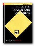
This is a comprehensive guide to international developments in graphic design. From pre-industrial printing presses and medieval typography to computer graphics and avant-garde stylistic advances. The Dictionary of Graphic Design provides information about graphic designers, typographers, journals, movements and styles, organisations and schools, printers and private presses, art directors, technological advances, design studios, graphic illustrators, and poster artists. The entries are in alphabetical order ranging from the ABC system of standard paper sizes via Mackintosh and John Maeda to typographists Hermann Zapf and Piet Zwart.

Dictionary of Graphic DesignEntries are cross-referenced, and there’s also a chronological chart which outlines the relationship between movements, technology and designers around the world.This second edition has been completely revised, updated, and completely redesigned by Derek Birdsall. It includes 485 wonderfully varied illustrations which give a stunning visual record. It’s a shame they are mainly in black and white, but in such a bargain-price book I don’t suppose we can have everything.

They cover a wide range of media, including advertising, corporate identity, posters, packaging, magazine and book design, as well as fine art and illustration.

It’s very well informed and clearly based on in-depth knowledge of the subject. The authors cover all aspects of graphic design from 1840 to the present day – from William Morris, inspired by nature, and El Lissitzky’s Constructivist design, to the Designer Republic’s visuals for the music and club scene and John Maeda’s computer graphics.

There’s an illustration of almost every individual designer mentioned, and they are particularly generous towards younger contemporaries such as Mark Farrow and Peter Saville, whose work has been in CD and LP record cover design industry.

I checked out their entries on popular designers such as Neville Brody, David Carson, and Paul Rand, and all of them were spot on. The collection also introduced me to many designers whose work I recognised but who I had never heard of before.

© Roy Johnson 2004

Dictionary of Graphic Design   Buy the book at Amazon UK

Dictionary of Graphic Design   Buy the book at Amazon US


Alan and Isabella Livingston, Dictionary of Graphic Design and Designers, London: Thames & Hudson, 2003, pp.239, ISBN: 0500203539


More on design
More on media
More on web design
More on information design


Filed Under: Dictionaries, Graphic design, Product design Tagged With: Design history, Dictionaries, Dictionary of Graphic Design, Graphic design, Product design

Dictionary of Modern Design

July 28, 2009 by Roy Johnson

design, designers, products, movements, influences

This Dictionary of Modern Design is a serious textual resource on design matters, written by somebody who is quite clearly steeped in his subject. Jonathan Woodham is Professor of the History of Design at the University of Brighton, and this compendium has all the hallmarks of being a summation of a lifetime’s work. It’s an A to Z compendium of entries which run from architects and designers Alvar and Aino Aalto, through to typographer and book designer Hermann Zapf. It covers the period from the mid-nineteenth century to the end of the twentieth.

Dictionary of Modern Design There are over 2,000 entries on names and movements from the past 150 years of design. The only weakness is that there are hardly any illustrations – something they might rectify in a second edition. Individual entries are a mixture of individual designers – Paul Rand, Milton Glaser, and Jan Tschichold, plus movements such as Bauhaus, Omega workshops, and Wiener Werkstatte, to specific products such as The Dyson vacuum cleaner, Levi Strauss jeans, and the bathroom fittings suppliers Villeroy and Boch.

There are also entries on materials (polypropylene) places (Museum of Modern Art) events (Festival of Britain) institutions (the Design Institute) and even individual products such as Barby, the wonder doll, plus entries on companies (Habitat, IKEA) product strategies (flatpacks) materials (Formica) typographists (Eric Gill) and even shops (Biba and Healds).

Individual entries are punctuated by occasional pull-out boxes which define movements and general terms – such as art deco, constructivism, kitsch, neo-modernism, and streamlining. The entries are presented in a plain and uncluttered prose style, with cross references to related items:

Lissitsky, El (Lazar Markovich Lissitsky 1890—1941) The Russian *Constructivist typographer, graphic designer, architect, painter, photographer and theorist El Lissitsky was influential in the dissemination of *Modernism both through his work and his theoretical writings. He studied architecture and engineering under Joseph Maria *Olbrich and others at the Technical School at Darmstadt between 1909 and 1914, visiting Paris, the hub of avant-garde artistic activity, in 1911. He moved back to Russia to practise architecture in 1914, but also worked in the fine arts and illustration, underlining notions of his concept of the ‘artist-engineer’…
[and so on]

It’s a shame there aren’t more illustrations, but there’s a huge bibliography which reflects the scholarly provenance, a timeline which puts design events from 1840 to the present into a social and political context, and a comprehensive bibliography.

© Roy Johnson 2006

Dictionary of Modern Design   Buy the book at Amazon UK

Dictionary of Modern Design   Buy the book at Amazon US


Jonathan M. Woodham, A Dictionary of Modern Design, Oxford: Oxford University Press, 2006, pp.544, ISBN: 0192806394


More on design
More on media
More on web design
More on information design

Filed Under: Design history, Dictionaries, Graphic design, Product design Tagged With: Design, Dictionaries, Dictionary of Modern Design, Graphic design, Product design, Reference

Digital Magazine Design

June 27, 2009 by Roy Johnson

magazine design principles – plus practical examples

Digital Magazine Design is a guide to computer-based graphic design principles based on modern magazine production and its requirements. The manual provides detailed descriptions of all the necessary rules of design, and uses these rules to cast a critical eye over a selection of contemporary high-street magazines. It starts off by emphasising the need for understanding basic interface metaphors. If we know our way around one desktop, we can usually work out how to find our way round another. The same is true of print publications.

Digital Magazine DesignThere is a convention to the order of items in a magazine of which casual readers are often unaware. Then Paul Honeywell goes through the elements of page design – using grids to structure graphics and text; controlling the density and appearance of the text by using line-spacing, hyphenation, and tracking. There’s also quite a lot of technical detail pertaining to colour mixing and the use of images.

A couple of chapters deal with the details of digital type design – though more illustrations would have been useful in demonstrating the issues at point here. There’s also advice on using a bureau when it is appropriate to outsource work. This goes into the details of file types, pre-press document checks, and keeping an accurate account of work flow.

The second part demonstrates how the tools of design can be applied to the
analysis and practice of contemporary magazine design. It’s a collection of case studies – ranging from Hi-Fi News, Kerrang!, She, and Empire, to Classic FM magazine.

These cover analysis of magazine design, with before and after accounts of layout and typography – complete with effects on sales and readership. There’s a lot of description here, where an illustration would have been far more effective.

These are post-graduate projects – revealed in the use of academic signposting (‘This essay aims to closely analyse …’) – which might easily have been edited out. This could easily be done if the book ever goes to a second edition.

© Roy Johnson 2003

Digital Magazine Design   Buy the book at Amazon UK

Digital Magazine Design   Buy the book at Amazon US


Paul Honeywell and Daniel Carpenter, Digital Magazine Design, Bristol: Intellect, 2003, pp.160, ISBN: 1841500860


More on publishing
More on journalism
More on creative writing
More on writing skills


Filed Under: Journalism, Publishing Tagged With: Digital Magazine Design, Graphic design, Journalism, Publishing, Writing skills

dot-font: talking about design

August 10, 2010 by Roy Johnson

essays on design, typography, and bibliography

John Berry is the former editor and publisher of U&lc (Upper and lower case) the prestigious and influential typographical journal, and he has won awards for his book designs. (Lowercase) dot-font is a collection of short articles on graphic design he wrote for the portal web site Creativepro.com. I first came across this book when it was announced that, in common with many other authors in the digital age, John Berry was giving the book away free of charge as a PDF download. Why not re-cycle your own work and give it away free? This was the new economics

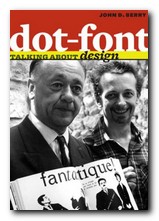
dot-font: talking about design I grabbed a copy, saw it was an attractive production, and immediately ordered a printed version from Amazon. By the time I had finished reading the first few chapters, I also ordered its sister production dot-font: Talking About Fonts. The original articles were basically his responses to exhibitions, lectures, and presentations he had attended. It sometimes feels a little odd to be reading about an event that took place some years ago and cannot be recalled. But his analyses and observations are those of a seasoned practitioner, and they retain their original value. Similarly, the formula of reproducing web essays as a printed book is quite successful. The original pages contained web links: those are missing here, but the structure remains, as well as illustrative graphics in the form of marginal thumbnails.

We get a lively introductions to design theorist Rick Poyner, then French book designer Massin, and a comparison of the signage in the underground rail systems of New York, Paris, and London.

There are a couple of chapters on the design and typography of American government ballot papers. These are offered as examples of bad design which have led to several disputed elections. So design really does have very practical consequences in the real world.

The central section of this collection comprises three chapters on book design and typography – from the shape and layout of the printed page, through the many choices that confront designers for presenting body text, even through to such details as the manner in which titles can appear on the spine of a book.

It’s a beautifully designed and illustrated production in its own right. The text is set in MVB Verdigris, the display in HTF Whitney, and there are generous page margins. Yet it’s not just a glamorous design portfolio: John Berry digs into some fundamental issues of design theory. It’s a book that is pleasing to the eye – but also one that will make you think.

dot-font design   Buy the book at Amazon UK

dot-font design   Buy the book at Amazon US

© Roy Johnson 2010


John D. Berry, dot-font: talking about design, New York: Mark Batty Publishers, 2006, pp.128, ISBN: 0977282716


More on typography
More on design
More on media
More on web design


Filed Under: Graphic design, Typography Tagged With: Design, Graphic design, Publishing, Talking About Design, Typography

dot-font: talking about fonts

July 13, 2010 by Roy Johnson

essays on fonts, typography, and design

John Berry is the former editor and publisher of U&lc (Upper and lower case) the prestigious and influential typographical journal, and he has won awards for his book designs. This is a collection of short articles on fonts and typographic design he wrote for the portal website Creativepro.com. I first came across this book when it was announced that, in common with many other authors in the digital age, John Berry was giving the book away free of charge as a PDF download. I grabbed a copy, saw it was an attractive production, and immediately ordered a copy in print. By the time I had finished reading the first few chapters, I also ordered its sister production dot-font: talking about design.

dot-font: talking about fontsThe articles range widely across issues of typography and the design of fonts – starting with an interesting historical note on the short-lived era of typography using Letraset (remember that?) . He goes on to the pleasures of old type specimen books; a review of an exhibition catalogue featuring Sumner Stone’s designs for a ‘classical’ sans-serif font (Basalt); and an appreciation of the Dutch Type Library in Hertogenbosch.

Some of the essays are in-depth studies of a single typeface – Matthew Carter’s Monticello and Herman Zapfs Optima for instance. In both cases he comments on the changes made when translating these designs into digital type, a process which generally seems to increase enormously the number of weights and sizes at which they become available.

He is quite insistent that any true typeface worthy of a distinguished name must include the full range of variants, accidentals, and special characters:

An old-style text face, based on types that were first cut and used in books in the 15th to 18th centuries, should be accompanied by old-style figures, by a complete set of f-ligatures, and by true small caps. It ought to have a set of real fractions too, or the numerators and denominators to create them. Without these, it looks as unconvincing as a callow Hollywood actor pretending to be a Shakespearean prince.

It’s a beautifully designed and illustrated production in its own right. The text is set in MVB Verdigris, the display in HTF Witney, and there are generous page margins. Yet it’s not just a glamorous design portfolio: John Berry digs into some some funamental issues of typographic theory and the use of fonts, such as the question of where the originality in reviving old typefaces ends and copying begins. It’s a book that is pleasing to the eye – but also one that will make you think.

dot-font fonts   Buy the book at Amazon UK

dot-font fonts   Buy the book at Amazon US

© Roy Johnson 2010


John D. Berry, dot-font: talking about fonts, New York: Mark Batty Publishing, 2006, pp.126, ISBN: 0977282708


More on typography
More on design
More on media
More on web design


Filed Under: Graphic design, Typography Tagged With: Design, Fonts, Graphic design, Typography

DSOS1: Designer Shock

June 16, 2009 by Roy Johnson

avant-garde downloadable fonts and design styles

Here’s an unusual idea – a book which is an introduction to a web site. Well, not exactly – because there’s more to it than that. The print version shows you what’s on offer, but the site allows you interactive connection with the software. This is what used to be called in the world of rock music, a ‘concept albumn’. Still confused? Read on. DesignerShock is a German-based collective of graphic design artists. They’ve come up with the idea of making design software available online.

Designer Shock This comes in the form of downloadable fonts, screensavers, wallpaper, product packaging, undsoweiter. You’re with it so far? But they also offer an additional element. You buy the book – which illustrates their designs – and it comes with a CD which gives you access to their web site. So, you have access to unlimited free use. You can download then change, stretch, and adapt the basic information to suit your own taste, using morphing software.

But the problem is that the book is quite hard to read. It’s difficult to know what is main text matter and what is extraneous page decoration and book navigation details. Sometimes the book’s own system of presenting graphics seems to overwhelm its contents.

The examples they show are almost all avant-garde – that is, nearly unreadable. You’ve got to have a strong stomach to even take them seriously. There is one set of fonts in which the letters H and W are identical.

There are also examples of product package designs, icons, dingbats, and did I mention? – the book also doubles as a mousemat. It’s all wacky – but there is the germ of a good idea in here.

© Roy Johnson 2001

DSOS1: Designer Shock   Buy the book at Amazon UK

DSOS1: Designer Shock   Buy the book at Amazon US


Stefan Gandl, Alexander Dewhirst, Designershock, DSOS1 DesignerShock, Berlin: Die Gestalten Verlag, 2001, pp.180, ISBN: 3931126641


More on typography
More on design
More on media
More on web design


Filed Under: Graphic design, Typography Tagged With: DSOS1: Designer Shock, Fonts, Graphic design, Typography

  • « Previous Page
  • 1
  • 2
  • 3
  • 4
  • 5
  • …
  • 13
  • Next Page »

Get in touch

info@mantex.co.uk

Content © Mantex 2016
  • About Us
  • Advertising
  • Clients
  • Contact
  • FAQ
  • Links
  • Services
  • Reviews
  • Sitemap
  • T & C’s
  • Testimonials
  • Privacy

Copyright © 2025 · Mantex

Copyright © 2025 · News Pro Theme on Genesis Framework · WordPress · Log in