Mantex

Tutorials, Study Guides & More

  • HOME
  • REVIEWS
  • TUTORIALS
  • HOW-TO
  • CONTACT
>> Home / Design / Information Design

Information Design

information architecture and design

information architecture and design

Ambient Findability

July 10, 2009 by Roy Johnson

why designers must keep users in mind

Peter Morville was co-author (with Louis Rosenfeld) of one of the essential books on information architecture, Information Architecture for the World Wide Web. This is his solo follow-up, which looks at the latest features of on-line life and tries to see what lies ahead. Ambient Findability is a very positive, almost excited, view of the last decade in web development. His central thesis is that information literacy, information architecture, and usability are all critical components of a new world order.

Ambient Findability He believes we have almost an ethical imperative to design the best possible software and web services to enhance the quality of our online life. All this has come about because of the unprecedented developments in data manipulation, connectivity, hyperlinking, and interactive services which have emerged in the last few years.

His new take on arranging information and navigational systems insists that they must be constructed around what the user requires, not the designer, and that they must be constructed with maximum findability in mind. The users, purchasers, or consumers are now Kings – because of their experiences on sites such as eBay and Amazon.

Never before has the consumer had so much access to product information before the point of purchase.

He looks at wayfinding systems in the natural world, then considers the relationship between language and information retrieval, including how we define meta-data. He sets great store by the theory of information analyst Calvin Moores, who suggested that people will not seek information that makes their jobs harder, even if it might benefit the organisation they work for.

For this reason, he has positive things to say about gossip and browsing. We are conditioned by evolution to pick up signals and recognise what he calls ‘textual landmarks’ in our search for information and our interpretation of the world. “Technology moves fast. Evolution moves slow.”

Because computers are becoming smaller and smaller, he then moves on to an encomium for the mobile device. This is followed by the technology which comes closest to fulfilling his desire for maximum findability – GPS (Global Positioning Systems).

He then looks at the issues of reconciling good web design with the competing demands of usability and efficient marketing – and solves the problem with a mantra that summarises his principal thesis: “Findability precedes usability. You can’t use what you can’t find.”

This leads into what I take to be the heart of the book – his take on the state of information architecture today. First he explains the competing views regarding the ‘semantic web’, which centre around definitions of meta-data so far as I understand it. Then he argues that these views can be reconciled if we accept the traditional roles of taxonomies for defining data – along with what he called ‘folksonomies’ whereby people put their own definitions on tagged objects.

This is not as important a book as Information Architecture for the World Wide Web, but it’s a thought-provoking guide to recent web developments and what might happen next in the online world. It’s full of interesting and provocative ideas, relevant graphics (first time I’ve seen colour in an O’Reilly publication!) and all the references are fully sourced.

© Roy Johnson 2005

Ambient Findability   Buy the book at Amazon UK

Ambient Findability   Buy the book at Amazon US


Peter Morville, Ambient Findability, Sebastopol, CA: O’Reilly, 2005, pp.188, ISBN: 0596007655


More on information design
More on design
More on media
More on web design

Filed Under: Information Design, Web design Tagged With: Ambient Findability, Findability, Information design, Navigation, Search, Usability, Web design

Communicating in Style

June 30, 2009 by Roy Johnson

how to present text and data for publication

This is a style guide for writers who have produced the basic text but who need help laying it out effectively on the page – or on screen. It will be of particular interest to technical writers and those dealing with business documentation. Communicating in Style covers the basics of document design such as headings and subheadings; how to present dates, times, and email addresses; and how best to control spacing, indentation and margins to create effective pages.

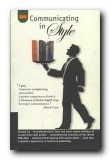
Communicating in StyleThere are lots of small but important details: acronyms first, followed by the full version; no full stops after contractions; headings closer to body text which follows than that which precedes. He also suggests that abbreviations should be explained anew in each chapter of a book – especially if they deal with different topics. Yateendra Joshi is good on the punctuation and spacing of lists; the kerning of small caps; (symbols have no plurals); and how to use the numeric keypad to produce special symbols and characters.

On tables there’s lots of good advice on alignment in columns and rows to simplify and clarify the presentation of data. Like Edward Tufte he believes in reducing any unnecessary lines, rules, and ‘chart junk’.

He deals with questions such as ‘Is the symbol for hour ‘h’ or ‘hr’?’ and ‘Are thousands separated by commas or with a space?’ plus lots of details on abbreviations, acronyms, contractions, and symbols.

There’s a section on OHP and PowerPoint presentations and how to lay out the display for maximum effectiveness; how to submit manuscripts to journals; and how to integrate charts, diagrams, maps, and photographs into documents; citing and referencing sources of information, including web pages and electronic documents.

The feature of the book I liked best was the use of quotations from other well-known style guides to illustrate the main points of his arguments. These are placed on almost every left-hand page, along with a picture of the jacket cover and bibliographic details of the book itself.

I can confirm his claim that the book has been extensively field-tested with earlier drafts. Many versions have been made available to the Information Design email discussion group in the past couple of years.

He finishes off with advice on spelling, fonts, and formats for postal addresses and telephone numbers. This is in fact very detailed and sophisticated advice on the presentation of information on screen and page. It encourages us all to be more attentive.

It’s good to see that this book has now found its way to Amazon.co.uk – but you might find it difficult to locate elsewhere. Be persistent however: it’s well worth the effort.

© Roy Johnson 2004

Communicating in Style   Buy the book at Amazon UK

Communicating in Style   Buy the book at Amazon US


Yateendra Joshi, Communicating in Style, New Delhi: The Energy and Resources Institute, 2003, pp.250, ISBN: 8179930165


More on information design
More on design
More on media
More on web design

Filed Under: Information Design, Publishing, Writing Skills Tagged With: Communicating in Style, Communication, Publishing, Style guides, Writing skills

Designing Instructional Text

June 26, 2009 by Roy Johnson

how to create effective documentation

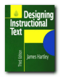
This is a practical guide for designing instructional texts. It describes each stage in the process very thoroughly – from the selection of paper size and page layout, through composition of clear text, to the use of diagrams and illustrations. Although a number of these issues might seem straightforward, what makes James Hartley’s treatment of them interesting is the persuasive psychological reasons given for making one choice rather than another on vocabulary, line length, or paragraph spacing.

Designing Instructional TextThe third edition has been produced with the advances in word-processors in mind, and Web users might be particularly interested in the section dealing with electronic text and some of the tips for producing screen layouts which people will actually read. There is a comprehensive analysis of the visual presentation of information – with subtle distinctions noted between pie charts and bar charts.

A couple of chapters dealing with writing for the elderly and those with impaired sight reinforce the psychological importance of good layout and spatial coherence in writing. There are also some interesting details offered en passant – such as the fact that most readers ignore questions posed after instructions, the psychological advantage of the bulleted list, and the fallibility of Flesch Reading Ease scores.

On questionnaire design, it deals with the danger of ambiguity, citing the example of a job application with the question ‘Give previous experience with dates’ which was answered by ‘Moderately successful in the past, but I am now happily married.’ Each chapter has a full bibliography and suggestions for further reading, and on the whole it bears all the hallmarks of work which is now a standard text. No wonder it’s in its third edition.

© Roy Johnson 2001

Designing Instructional Text   Buy the book at Amazon UK

Designing Instructional Text   Buy the book at Amazon US


James Hartley, Designing Instructional Text, London: Kogan Page, (3rd edn) 1994, pp.183 ISBN: 074941037X


More on information design
More on design
More on media
More on web design

Filed Under: Information Design Tagged With: Communication skills, Designing Instructional Text, Information design, Instructional text, Writing skills

Designing Interfaces

July 20, 2009 by Roy Johnson

navigation, interactivity, and graphic design techniques

O’Reilly have recently taken to adding colour to their publications – and it works. The pages are more visually interesting, and the reader gets a more accurate picture of what will appear on screen. This book is attempting to get down to the fundamentals of interface design – How many clicks, how many screens do you need to see before you get to what you want? In fact Jenifer Tidwell starts of with usability issues, showing what real users do and ask of interfaces. Then she starts considering design, starting from the top and most general level – the organisation of content, or information architecture. This also includes consideration of the user interface or screen.

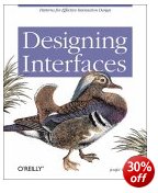
Designing InterfacesThe main strength of her approach is that she is very thorough. Her examples include different types of software and hardware. A design that works on a computer screen will have to be adapted if it’s going to be read on a mobile phone, and if viewed on a TV screen, you won’t have a mouse for navigation. She deals with web pages, installation programs, spreadsheets, and even graphic design packages – but keeps these issues in mind at all times.

Next comes navigation which deals with methods for leading the user through the contents. These include navigation panels, sequence maps, breadcrumb trails, and colour coding.

The next level down in terms of detail is page layout. This introduces elements of graphic design in arranging both content and navigation. This where the going can get rough. The layout part is easy if you’ve got a reasonable eye for design, but after that you need to choose between columns and tabs, and fixed width and liquid pages. She explains all the options, with the advantages and drawbacks of each.

Then comes what she calls the ‘verbs’ of the interface – objects such as buttons, action panels, and menus which make things happen. I was pleased to see that she gave as an example of bad design just how difficult it is to cancel a print job in Windows.

It’s fairly obvious that her principal interest is in information graphics – maps, tables, and graphs plus all their variants. Here she covers the ground which Edward Tufte has made his own – but you’ll find her prose easier to understand. She covers tooltips, expandable views, and what she calls ‘data brushing’ whereby the user can select which part(s) of a collection of information to view on screen.

Then comes a section on the much trickier issue of designing interactive choice lists. There are all sorts of possibilities here – forms, checkboxes, toggle buttons, dropdown lists, and so on – but the important point is that she illustrates them all, pointing to their advantages and weaknesses.

She even covers the design of interfaces for editors – such as text and image editing programs. Not many people outside a technological elite few will need to know these matters, but I found it instructive to see the general principles behind so many of the drag and drop or click and resize functions we come across all the time.

She finishes with a chapter any designer will enjoy – dealing with the graphic design of what appears on screen. This involves colour, spacing, typography, balance, and every other facet of visual rhetoric to make a visitor wish to stay on the site. I picked up some useful tips on hairlines and rounded corners here.

It’s a handsome, well-designed book – as befits its subject – and she includes a generous bibliography. O’Reilly have done her proud.

© Roy Johnson 2005

Designing Interfaces   Buy the book at Amazon UK

Designing Interfaces   Buy the book at Amazon US


Jenifer Tidwell, Designing Interfaces, Sebastopol, CA: O’Reilly, 2005, pp.331, ISBN: 0596008031


More on design
More on media
More on web design

Filed Under: Graphic design, Information Design Tagged With: Computers, Designing Interfaces, Graphic design, Information design, Navigation, Web design

Designing Web Navigation

June 30, 2009 by Roy Johnson

optimising the user experience

Anyone who has ever designed a web site will know that navigation of its contents is a key issue in the site’s usability. Visitors must be able to find their way around – otherwise they’ll leave, and they won’t come back again. Successful navigation systems require good screen design, well thought out information architecture, clear labelling, logical hierarchies, and effective linking. This book deals with all these issues of designing web navigation in an extremely thorough manner.

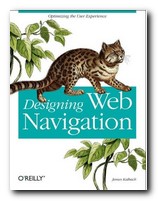
Designing Web NavigationEvery aspect of navigational design is examined in close detail – through both theoretical models and technical research, and a practical examination of a wide variety of large scale web sites from around the world. It’s a beautifully presented book, with elegantly designed pages, full colour illustrations, and scholarly yet unobtrusive footnotes leading to web references and recommendations for further reading.

The chapters are almost exhaustively thorough. On navigation mechanisms for instance, he covers every possibility – from tabs to breadcrumb trails, and from dropdown menus to sitemaps, tag clouds, A to Z indexes, and star trees. You couldn’t wish for anything more comprehensive. He discusses the advantages and the potential disadvantages of each system, showing examples of where they are used to good effect.

Although it is primarily concerned with the delivery of content over the Web and read in browsers on a computer, he also discusses the navigational consequences of content delivery via mobile phones, personal digital assistants (PDAs) and even car navigation systems.

On the issue of designing a navigation system he has a very sound piece of advice. “Don’t start by designing the navigation on the home page.” This might seem counter-intuitive, because for most designers the home page is the focus of their attention, and it’s the root, the index page of the entire site. But it’s not the most important page for visitors. Most of them will enter via a page deep within the site to which they have been referred by a link from a search engine.

Although there’s quite a lot on extensive usability testing, in general he strikes a reasonable balance between writing for professional designers of large scale corporate and ecommerce sites, and smaller sites which might be the work of an individual entrepreneur. There are certainly plenty of tips on the presentation of text on a page for instance which could help improve the work of an enthusiastic amateur.

He ends by discussing the relationship between navigation and searching, social tagging systems, and rich web applications. These latter post a new challenge to designers, because web pages are no longer static entities which appear in the order they are summoned via mouse clicks. Rich web applications can compose the content of a web page dynamically. Once the user has chosen a new set of data on screen, there is nowhere to go back to. The page URL remains the same, even though what is being displayed has changed. Fortunately, he provides ample guidance to designers on how to cope with such new problems.

I think this is a book which aspires to position itself alongside Louis Rosenfeld and Peter Morville’s Information Architecture for the World Wide Web and Jakob Nielsen’s Homepage Usability as modern classics of web design principles.

© Roy Johnson 2007

Designing Web Navigation   Buy the book at Amazon UK

Designing Web Navigation   Buy the book at Amazon US


James Kalbach, Designing Web Navigation, Sebastopol (CA): O’Reilly, 2007, pp.394, ISBN: 0596528108


More on information design
More on design
More on media
More on web design

Filed Under: Information Design, Web design Tagged With: Communication, Design, Designing Web Navigation, Information design, Web design

Designing Web-Based Training

June 27, 2009 by Roy Johnson

web-based course construction – from start to finish

This is a well-illustrated guide to every phase of designing, setting-up, and managing a Web-based training site. It goes from graphics and content design, to finding students and assessing their needs; from hardware and software options, to usability testing. William Horton explains what Web Based Training (WBT) can do and how to get the best results from exploiting its technologies. And for ‘training’ you can also read ‘education’ – because as he argues, the distinction between the two is often negligible. His approach is practical and clear; the book is written in a no-nonsense manner; and he follows his own prescriptions by giving examples to illustrate every point he makes.

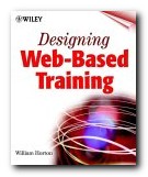
Designing Web-Based TrainingThe design of the book itself more or less imitates Web pages: there are lots of headings, subheadings, quick paragraphs, tabled checklists, call-out boxes, horizontal rules, screenshots, and bulleted lists. He is essentially gung-ho for WBT as a novel learning technology – but he does look at a lot of research evidence, both pro and contra. He discusses the tricky issues of how to put a cost on course construction, how to devise navigational metaphors, and how to deal with potential plagiarism.

He offers several explanations of how to organise the sequence of learning events (or ‘objects’) in a course of learning. Then he even demonstrates the design of an entire course in outline, with templates of all the important pages and the structure in which they are arranged. This is valuable material for anyone who might be coming to the writing of online learning materials for the first time.

He covers an amazing variety of approaches to teaching – including the use of Webcasts, presentations, guided research, case studies, and learning games. There are some particularly good examples of virtual laboratories for teaching mechanical engineering and HTML coding. Most importantly perhaps, he shows which approaches are best used for which type of problem or task.

There’s a good section on tests and exercises, including advice on setting true/false and multiple-choice questions, and when it’s best to use matching pair and drag and drop questions. A section on teaching by email and discussion groups contains all the usual advice about Netiquette which many people still ignore.

The book is aimed at professional designers, trainers, and teachers – but it’s written in a way which will make it useful at any level. I bought my copy to solve some design problems for one group of students – which it has done in no time at all. Now my business partner has grabbed it to do the same for another group.

© Roy Johnson 2000

Designing Web-Based Training   Buy the book at Amazon UK

Designing Web-Based Training   Buy the book at Amazon US


William K. Horton, Designing Web-Based Training : How to Teach Anyone Anything Anywhere Anytime, John Wiley & Sons, 2000, pp.640, ISBN: 047135614X


More on online learning
More on technology
More on digital media
More on web design
More on computers


Filed Under: Information Design, Online Learning Tagged With: Designing Web-Based Training, eLearning, Information design, Online learning, Training, Writing skills

Dust or Magic

June 27, 2009 by Roy Johnson

secrets of successful multimedia design

Dust or Magic is a book for people who want to know about or work in the new media. It takes the line of revealing the truth about how multimedia projects really work – pointing to both successes and complete turkeys. Bob Hughes has been active in the field over its last decade, and he discusses a fascinating range of examples – from websites and CD-ROMs to kiosk programs and interactive video.

Dust or MagicHe starts with an account of digital technology from Alan Turing onwards – but the chronology darts backwards and forwards from Russian constructivists to Greek theatre and back again to Richard Wagner. Later, he settles down to a slightly smoother chronology, but without sacrificing his wide range of reference. He offers Vannevar Bush, Douglas Engelbart, and Ted Nelson as key pioneers and presents excellent accounts of their work.

This is followed by detailed sketches of the pioneers of Virtual Reality, Interactive Video, and early hypertext programs such as Guide, Toolbook, and Hypercard – including developments which have been passed by which he claims could be revived with the development of new technology.

There’s something of an intellectual dip in the middle of the book when he compares English revolutionaries of the seventeenth century with the Guerilla Girls, and he celebrates web sites and Hyperstacks which are not much more than collections of idiosyncratic enthusiasms. Fortunately, the level rises again with a whole chapter devoted to Voyager, which he claims made innovations with the bare tools [Hypercard] available at the time.

The latter parts of the book are devoted to accounts of working on multimedia projects – one for the Nationwide Building Society, of all people – and he covers the disaster of the Microsoft ‘Sendak’ project, before passing on to discuss theories of ‘creativity’ and report on forays into the world of advertising. He discusses the psychology of idea-generation, its relation to programming and the world of computer games, the advantages of motion and sounds on screen, and there are some interesting observations on the need for visual ‘transitions’ between one screen of information and another.

Reading all this, you get an invigorating sense of intellectual excitement, the downside of which is that no single idea is pursued to any depth. This is a weakness occasionally reinforced by a surprisingly cavalier attitude towards his readers – ‘sorry – I’ve lost the URL’.

And yet he’s actually gone to the trouble of locating the original authors of some of these programs – an admirable trait in an age when a lot of software has a lifespan of five years or less. He’s very fond of using metaphors to explain his arguments, and there are lots of interesting historical anecdotes woven as side-bars into the text. At its best, he throws up novel connections from different media and sources of technology; at its weakest, he flits from one unexamined generalisation to another.

Apart from concluding that projects are best carried out by small teams, he never seems to get round to explaining the ‘secret’ in his sub-title, but this is a lively and stimulating introduction to the history of software development which should go onto the reading list of anyone who wants to know what happens on real-life projects. It’s a revelation of the costly disasters as well as a celebration of the often unsung heroes of new technology during the last thirty years.

© Roy Johnson 2000

Dust or Magic   Buy the book at Amazon UK

Dust or Magic   Buy the book at Amazon US


Bob Hughes, Dust or Magic: Secrets of Successful Multimedia Design, London: Addison-Wesley, 2000, pp.264, ISBN: 0201360713


More on online learning
More on technology
More on digital media
More on web design
More on computers


Filed Under: Information Design, Media, Online Learning Tagged With: Communication, Media, Multimedia, Online learning, Technology

Dynamics in Document Design

July 17, 2009 by Roy Johnson

information layout and management for professionals

Karen Schriver’s Dynamics in Document Design is another strong entry in the Wiley series of books about writing in the marketplace. Schriver does not intend yet another ‘how to’ book for beginning document designers. Such books are plentiful. She assumes her audience is acquainted with the fundamentals of document design and wants more information about the complexities and subtleties of document design. In this area – and many others – Schriver succeeds admirably.

Dynamics in Document DesignSchriver’s book is so rich in insight, information, and innovation that no review will do it justice. One of the book’s many virtues is its presentation of heuristics for making decisions about typography and page-layout grids. A heuristic, as Schriver explains, “is a way of thinking systematically about the key features of a problem.” Schriver’s heuristic for grids includes taking an inventory of all the text elements (photographs, descriptions, captions, etc.) in the document, organizing these text elements into rhetorical clusters, measuring the actual print or display area, dividing the print or display area into columns and rows, considering exceptions and deviations, trying out some optional spatial arrays for the document, and applying the grid to longer sections of the document to see how it works. For someone who has to design a longer document or complicated web site, Schriver’s heuristics are very useful.

Schriver has not neglected design issues on the Internet. Her 18-page discussion of a student’s case study of the effectiveness of a web site is worth the entire price of the book. As a practitioner of feedback-driven audience analysis, Schriver had taught the student, Daphne van der Vlist of Holland, procedures for studying user responses to document design. Van der Vlist studied the reactions of seven users to the Virtual Tourist web site.

As happens often in Schriver’s book, real users have rich and informative critiques of real documents. In her study, van der Vlist found that users had trouble with incomplete and illogically clustered headings, information that violated users’ expectations, underdeveloped information, poorly laid out lists, and pictures that narrowed content inappropriately. To aid her readers in understanding the users’ problems, Schriver used a four-page spread of eight screens from the web site, with user annotations in the margins surrounding the centered screen representations. Schriver’s analysis and graphic presentation of her student’s case is exceptionally informative and effective. People designing web sites should read this section.

Another strong section of her book describes one of her own projects-
evaluating government-created drug education brochures aimed at teenagers. Using feedback-driven audience analysis, Schriver and her collaborators gathered 297 students ranging from 11 to 21 years old and asked them to respond to the text and graphics in the brochures that they provided. The students’ responses were very sophisticated and revealing. Schriver presents the responses to several brochures by using the format mentioned earlier. She reproduces the brochure in the center of a single page or a two-page spread and surrounds it with student responses in the margin. She draws lines to connect student responses to specific passages and graphics.

The student responses are very constructive and sophisticated. One complained that a brochure was cliched and suggested that a more effective approach would be to present stories about how drug users died or destroyed their lives. Another student complained of the long paragraphs and suggested a list, which other young people would be more inclined to read. Another said the impact of a brochure would be improved if the authors “use pictures of a dead guy.” The students were especially fond of realism. Many of them disliked the line drawings and preferred photographs of actual drug users suffering the effects of drug abuse.

Schriver also discussed the constraints that the government writers and graphic designers operated under when they developed the drug education literature. Many were reluctant to talk about what they did. Bureaucracy and politics stifle the effectiveness of documents and of open communication between researcher/designers like Schriver and her subjects. A quotation from one person eloquently revealed the stress that some government writers and designers felt:

That brochure is not attributable to anyone. We receive lots of assignments, that was just one of them. We can’t say who wrote it. There are so many hands in the process. And we can’t say that what was printed was what anyone in this office wrote. We have to go now.

Schriver offers an important innovation to document design teachers – her protocol-aided audience-modeling method (PAM), which allows document designers to better anticipate problems that users have with documents. PAM has two steps: (1) The student reads a sample document and lists the problems she thinks the intended audience will have with the text and graphics. (2) The student reads a transcript of a think-aloud protocol created by one of the intended users of the same document. A think-aloud protocol has a user think aloud about any difficulties she or he encounters while reading a document (form, instruction, etc.). In her research, Schriver has found that students using PAM were 62% more accurate than a control group in predicting readers’ problems. PAM, in short, is much better than such traditional methods as audience heuristics, peer-group critiquing, role-playing, and purpose oriented audience analysis.

Yet another valuable innovation is Schriver’s timeline of document design from 1900 to 1995. She devotes forty-four pages to tracing the evolution of five design contexts: education and practice in writing and rhetoric; professional developments in writing and graphic design; education and practice in graphic design; science, technology, and the environment; and society and consumerism. On twenty-two sets of facing pages, Schriver has columns devoted to each of the aforementioned contexts in a given decade of the twentieth century.

The evolution of education and practice in writing and rhetoric is fascinating by itself. Schriver begins in 1900 with the instructional emphasis on usage, grammar, and mechanics. “Students are expected to adapt their texts for an audience and to find an original thesis, but they are not taught explicit ways to do so.” In 1904, one of the first technical writing courses in the twentieth century was taught at Tufts College. In 1939, “teaching technical writing or composition at the college level is considered ‘professional suicide’.” In the 1950’s, college instructors finally begin to pay some attention to audience analysis and the relations between writers and readers. In 1955 and later, technical communication courses begin to show interest in teaching graphics. In the 1970’s, some technical communications professors finally begin to get tenure for work in their specialties. In 1994, academics and industry experts express concern that literature professors have too much say in tenuring and promoting writing, rhetoric, and technical communication faculty.

Again, this review cannot pretend to do justice to the many virtues and innovations in Karen Schriver’s excellent book. Even though she aims her book more at experienced document designers and information architects, beginners and students can also profit from reading it. If you design documents for paper or electronic publication, buy this book. You will not be disappointed.

© Patrick Moore 1997

Dynamics in Document Design   Buy the book at Amazon UK

Dynamics in Document Design   Buy the book at Amazon US


Karen A. Schriver, Dynamics in Document Design, NewYork/London: John Wiley & Sons: 1997, pp.560, ISBN: 0471306363


More on information design
More on design
More on media
More on web design


Filed Under: Information Design Tagged With: Data management, Data visualization, Document design, Information design

Envisioning Information

July 20, 2009 by Roy Johnson

best-selling illustrated essays on presenting information

Over the last twenty years, Edward Tufte has published three impressive volumes setting forth his ideas on information design. The first, The Visual Display of Quantitative Information was designated as ‘pictures of numbers’ and dealt with statistical charts, graphs, and tables. This second volume deals with ‘pictures of nouns’, which is his metaphorical way of describing the ‘strategies for high-dimensional data, and how to increase information depth on paper and computer’.

To envisage information…is to work at the intersection of image, word, number, art

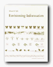
Envisioning InformationHe makes a persuasive case for layering, colour, and separation as a means of clarifying information when it is rendered in two dimensions – principally on the printed page. What he calls an ‘escape from flatland’ is illustrated in a series of wonderfully complex diagrams: a Javanese railway timetable shows departures and arrivals, distance, altitude, and even facilities at each station.

He explores the interesting notion that in a world of marks on paper, good presentation is affected by the rule that ‘1 + 1 = 3 or more’. That is, even two simple lines become three visual units because of the space between them – and he provides plenty of information to prove his case, illustrated with such diverse materials as old maps, musical notation, and even medical records.

His argument that small multiple images are the best way to reveal differences is beautifully illuminated by photographs of Chinese calligraphy and nineteenth century engravings of fly fishing lures, but it doesn’t seem altogether convincing – and as in the other volumes of this trilogy, some of the bad examples are just as visually attractive as the good – which appears to spoil the point he’s trying to make.

He’s much more persuasive on the use of colour to impart information, although at some points, even if the prints and engravings are stunning, the reading is not easy:

Transparent and effective deployment of redundant signals requires, first, the need – an ambiguity or confusion in seeing data display that can in fact be diminished by multiplicity – and, second, the appropriate choice of design technique (from among all the various methods of signal reinforcement) that will work to minimize the ambiguity of reading.

For somebody who claims to be aiming for clarity in communication, this reads like a bad example out of a writer’s style manual.

He keeps coming back, as do many other theorists of two-dimensional spatial design, to one of the most interesting challenges of all – the notation of dance. Cue eighteenth-century engravings of dancing masters with fancy hats and weird hieroglyphics trailing out of their feet. Other examples in the book range from flight schedules from Czech airways to Japanese railway timetables, rowing contests, and even a diagram of Wagner’s operas.

If we want to take a robust line on someone who is obviously very successful, it’s possible to argue that Tufte designs more successfully than he writes. Much of the time, his text reads as if it has been badly translated from German; yet if ever he issues his books in paperback, they are so attractive he’ll be able to retire on the proceeds.

© Roy Johnson 2002

Envisioning Information   Buy the book at Amazon UK

Envisioning Information   Buy the book at Amazon US


Edward Tufte, Envisioning Information, Cheshire, CT: Graphics Press, 1990, pp.126, ISBN: 0961392118


More on information design
More on technology
More on digital media


Filed Under: Graphic design, Information Design Tagged With: Displaying information, Edward Tufte, Envisioning Information, Graphic design, Information design

Information Architecture

July 16, 2009 by Roy Johnson

large-scale Web site structure, navigation, and usability

When it first appeared in 1998, Information Architecture became an instant classic amongst information architects. It now appears in its third edition, much enlarged and updated. The new edition reflects the rapid expansion and technical sophistication of large interactive web sites in the last few years. Rosenfeld and Morville deal with all the issues raised in organising information and navigational systems in the design of large-scale sites. Their important starting point is a recommendation that big sites should use three types of information organisation, which they identify as hierarchical, database, and hypertext.

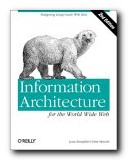
Information Architecture Visitors to a site should have more than one possible route to the same piece of information. They ask some quite fundamental and interesting questions in their updated chapters. These cover issues of organisation, labelling, navigation, and searching – plus new chapters on thesauruses and meta-data.

The new edition has been given many more case studies, and lists of resources on IA have been added, many of which did not exist at the time of the first edition, and there’s a very good bibliography which painlessly blends print and web-based information. Navigation has been expanded into global, local, and contextual systems, and there is a lot more detail on search engines.

Another section which has been considerably expanded is that on classification systems and ‘knowledge management’. That is – where to put things, how to arrange, label and store information.

There’s also a much-enlarged section on the management of web development projects – from the initial strategy meetings through content analysis and mapping, to delivery and maintenance.

They present real life case studies, including one which details how a strategy report was written for Weather.com. Anybody who needs help with report writing will profit from reading this chapter. ‘Information Architecture’ was a relatively new term only a few years ago, but now as you can probably guess, it is of use to anybody who needs to organise information, ideas, or even physical objects – such as books in a library.

There’s an excellent account of how to draw up site maps and flow diagrams which help to explain the deep level architecture of sites to those who are going to populate them with content.

The same is true for page layout diagrams – which they call ‘wireframes’. These test the arrangement of items on main pages before they are passed on to a graphic designer. Architecture and usability are tested before the application of a graphic. It’s rather like designing the layout of a web page with table borders switched on – before setting them to zero.

They take an enthusiastic line on the use of navigational metaphors (the shop, the office, the library) about which other commentators such as Barbara Fleming and Jakob Nielsen are more cautious. The argument against this approach is that the metaphor of an office or a library will not mean much to people who are not familiar with them. And of course the same is true for icons and symbols.

This is a book for serious designers, project managers, and of course information architects. It is also a contribution to design theory which, en passant, makes librarians into the heroes of the information age. The valuable experience embedded within it will make useful reading for anybody organising information, designing a site, or providing content for it. If you read the first or second edition, it’s worth reading the third for the wealth of new material.

© Roy Johnson 2006

Information Architecture   Buy the book at Amazon UK

Information Architecture   Buy the book at Amazon US


Louis Rosenfeld and Peter Morville, Information Architecture for the World Wide Web, Sebastopol (CA): O’Reilly, third edition, 2006, pp.461, ISBN: 0596527349


More on information design
More on design
More on media
More on web design


Filed Under: Information Design, Web design Tagged With: Information architecture, Information design, Navigation, Structure, Usability, Web design

  • 1
  • 2
  • 3
  • Next Page »

Reviews

  • Arts
  • Biography
  • Creative Writing
  • Design
  • e-Commerce
  • Journalism
  • Language
  • Lifestyle
  • Literature
  • Media
  • Publishing
  • Study skills
  • Technology
  • Theory
  • Typography
  • Web design
  • Writing Skills

Get in touch

info@mantex.co.uk

Content © Mantex 2016
  • About Us
  • Advertising
  • Clients
  • Contact
  • FAQ
  • Links
  • Services
  • Reviews
  • Sitemap
  • T & C’s
  • Testimonials
  • Privacy

Copyright © 2025 · Mantex

Copyright © 2025 · News Pro Theme on Genesis Framework · WordPress · Log in