Mantex

Tutorials, Study Guides & More

  • HOME
  • REVIEWS
  • TUTORIALS
  • HOW-TO
  • CONTACT
>> Home / Design

Design

design history, graphic design, information design, product design

design history, graphic design, information design, product design

design history, graphic design, information design, product design

Milton Glaser: Art is Work

June 19, 2009 by Roy Johnson

graphic design, interiors, objects and illustration

Don’t be put off by the cover design – this is a wonderful book. Milton Glaser is one of the most influential design and illustration gurus of the late 20th century in the USA. He was responsible for the “I love NY” logo and the poster of Bob Dylan with psychedelic hair which became a symbol of the 1980s. This is one of the few design books I have come across where the text is just as interesting as the graphics. Milton Glaser has thought a lot about the fundamentals of good design, and his ideas come through here via a series of interviews, plus his own commentary on the work illustrated.

Milton Glaser: Art is Work And there’s a big bonus. He doesn’t just show his finished designs, but includes his preliminary drafts and early attempts which lead up to a successful outcome. So it’s like being invited to sit in his studio whilst he thinks and works out loud. He’s astonishingly versatile. The book contains examples of poster design, record covers, freehand drawings (amazingly similar to David Hockney in style) book illustrations, interior design, product design, typography, and publicity materials.

His observations focus on the aesthetics of creativity – and yet he keeps his eye on the commercial and professional aspects of his work. He’s frank enough to admit that if the client’s budget is not big enough, he is prepared to discriminate between a ‘one hour’ idea and a ‘six hour’ design.

He’s a great believer in the idea that designers must continue to draw to develop their ideas, and he believes in creation as a form of work and process:

When you’re thinking you do a sketch and it’s fuzzy. You have to keep it fuzzy so that the brain looks at it and imagines another iteration that is clearer. Then you do another sketch that advances it again. It may take a number of these intermediate solutions before you arrive.

It’s a very instructive experience to see his rough sketches develop as he stretches and changes an idea until he comes up with what looks a fresh and spontaneous picture. That’s what he means by his book title. These designs do not just happen spontaneously: they are the result of hard work

He is very aware of modern painters – Klee, Mondrian, the much under-rated Sonia Delauney, Klimt, and Max Ernst. There’s also a portrait of Duke Ellington which has elements of Francis Bacon in its colouring and handling of paint, and a series of posters for the Venice Biennale which combine images of the city’s emblematic lion with ink spattering reflecting his appreciation of the work of Jackson Pollock

I found his book illustrations less successful, his restaurant designs inspired in terms of lighting, and his product design superb. There’s a whole page of sketches for a cocktail glass, any one of which you would be pleased to hold. But the finished product – complete with double-sided conical bowl with a vacuum to keep your Martini cold, fluted stem, and Art Deco collar uniting the two – well, my knees went weak when I turned the page, and I would pay substantial money to own a set.

© Roy Johnson 2003

Milton Glaser Buy the book at Amazon UK

Milton Glaser Buy the book at Amazon US


Milton Glaser, Art is Work, London: Thames and Hudson, 2000, pp.272, ISBN 0500510288


More on art
More on media
More on design


Filed Under: Art, Individual designers, Product design Tagged With: Art, Graphic design, Milton Glaser, Milton Glaser: Art is Work, Product design

New Systems in Design

July 2, 2009 by Roy Johnson

contemporary international web design

This portfolio presents a body of new systems in design work for the Web that is seeking to redefine the nature and scope of design practice. It is based on the productions of more than thirty-five international studios, and is presented in three categories.

New systems in DesignThe first – Code – shows how designers are using the computer as a tool to become creative programmers. The second – Generic – shows designers manipulating objects from the ordinary and everyday world to produce projects that are off-beat and refreshing. The third part – Disjunction – features work that aims to provoke, to question, and to advance a designer’s particular agenda, whether political, social, or even personal.

It is mainly composed of screenshots from avant guard web sites, samples of distressed modern typography, and reproductions from the pages of contemporary graphics display books. You may not be surprised to hear that this often means banal subjects, retro styling, and unreadable text.

There are also examples of architectural plans and sketches, maps, street signs, posters, fashion photography, book design and public signage, commercial advertising, and photography.

It represents what seems to me like a masochistic school of graphic design. In most cases, every effort seems to be made to alienate rather than to charm or please the viewer.

And yet just occasionally a gem shines through – such as the pictures of beautiful pleated garments created by the Japanese designer Issey Miyake, and the examples of public signage in Rotterdam.

It will probably appeal to young designers and those people who want something provocative for the coffee table.

© Roy Johnson 2001

New Systems in Design   Buy the book at Amazon UK

New Systems in Design   Buy the book at Amazon US


Christian Kusters and Emily King, Restart: New systems in graphic design, London: Thames & Hudson, 2001, pp. 176, ISBN: 0500282978


More on design
More on media
More on web design


Filed Under: Graphic design Tagged With: Graphic design, New Systems in Design, Web design

Numbers, Tables, and Charts

May 24, 2009 by Roy Johnson

practical guidance on the visual presentation of data

Have you ever seen a document containing numbers, tables, and charts – and been unable to understand the information being displayed. Of course you have; and the fault is not yours. The data has simply not been presented effectively. This book deals with the data presentation skills required to show numbers, tables, and graphs in documents and presentations. Many people assemble their data honestly enough when writing reports and giving presentations, but they often do so without thinking how incomprehensible it might be to the audience.

Numbers, Tables, and ChartsOxford University Press have just brought out a series of beginner’s manuals on communication skills. The emphasis is on no-nonsense advice directly related to everyday life. The authors show you how to present numerical data to make its outcomes more self-evident and more easily digestible. This is done by putting figures into a logical order, adding focus to the data, and using layout to guide the reader’s eye towards what is significant.

They cover how to design tables. It’s amazing how much clearer these can be made by removing unnecessary grid lines, aligning numbers and column headings, creating clear titles and headings, and removing any ‘chart junk’.

Graphs should be uncluttered, simple, non-misleading in terms of scale and numbers, and used to illustrate a clear message.

They show how to construct graphs and bar charts so that they immediately reveal the significance of the data they contain. There are also examples of when to use pie charts, scattergrams, and pictographs (small icons)

There’s also useful writing skills advice on how to integrate numbers and statistics into the text of documents. For instance, don’t start sentences with figures or digits, and how to mix the use of words and digits to clarify meaning, as in nine 6-inch rulers and three 5-a-side football matches.

Most presentation of data is these days done using office software packages, so it’s good that they give this a mention, with tips for creating good handouts.

They finish with a case study which tracks the raw data of some school exam results from gathering to final presentation. The grades and numbers can be presented in different ways, and the head teacher must choose the best way for a meeting with the governors.

The chapters of this book are short, but almost every page is rich in hints and tips. The strength of this approach is that it avoids the encyclopedic volume of advice which in some manuals can be quite frightening. This is a book which will reassure those who need it.

The all-time star in this field is Edward Tufte, on whose work they draw substantially. I was glad to see him listed in the bibliography. This is a cheap and cheerful version of the same layout principles he promotes in his beautifully designed books.

© Roy Johnson 2003

Numbers, Tables, and Charts   Buy the book at Amazon UK

Numbers, Tables, and Charts   Buy the book at Amazon US


Sally Bigwood and Melissa Spore, Presenting Numbers, Tables, and Charts, Oxford: Oxford University Press, 2003, pp.144, ISBN: 0198607229


More on information design
More on design
More on media
More on web design


Filed Under: Information Design, Study skills Tagged With: Charts, Communication, Data presentation, Information design, Numbers, Presenting information, Tables, Writing skills

Omega and After

May 21, 2009 by Roy Johnson

Bloomsbury and the decorative arts

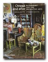
The Bloomsbury Group was largely composed of writers and intellectuals, but there were lots of artists and designers within their ranks too. This well illustrated guide focuses on the highpoint of their endeavours – the Omega Workshops which flourished in the period 1913—1919. This venture was the brainchild of Roger Fry, who recruited Vanessa Bell (his lover at the time) and Duncan Grant as co-directors for an opening in Fitzroy Square in 1913, deep in the heart of Bloomsbury.

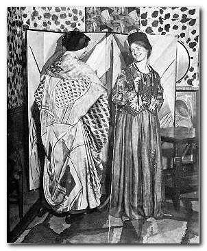
Omega and After That was not an auspicious date for the debut of an enterprise which sought to bring Post-Impressionist design to the general public. But in fact it survived throughout the whole of the first world war, even though it was never commercially successful. Fry organised painters, designers, and ceramicists to supply goods which were colourfully and playfully made to bring Modern Art into the home – of those who could afford it. Although the works were produced by people we now see as influential members of the modernist movement in the arts, individual productions were made anonymously, signed only with the letter omega.

A number of famous names were associated with the workshop: at one time or another Henri Gaudier-Brzeska, Paul Nash, David Bomberg, Dora Carrington, William Roberts, and Mark Gertler all had connections with the Omega.

At the launch of the project, artist and writer Wyndham Lewis was also a member; but he quickly split away from the group in a dispute over Omega’s contribution to the Ideal Homes Exhibition. Lewis circulated a letter to all shareholders, making accusations against the company and Roger Fry in particular, and pouring scorn on the products of Omega and its ideology. This subsequently led to his establishing the rival Vorticist movement and the publication in 1916 of its two-issue house magazine, BLAST.

The Omega workshops produced everything, from furniture and paintings to rugs, wallpaper, and children’s toys. All of these are wonderfully illustrated in this collection of photographs which are rarely seen anywhere else.

The text recounts the story of the enterprise and its shaky beginnings. A somewhat amateurish co-operative; the introduction of modernist clothes via Nina Hamnet (the Queen of Bohemia); and the tortured love triangle which existed between its directors.

Isabelle Anscombe devotes an entire chapter to Vanessa Bell, studiously avoiding for as long as she can the fact that she was Roger Fry’s lover; but she is forced to eventually concede that Fry was replaced by Duncan Grant. Her husband Clive Bell, who was friendly with all three of them, is kept out of the picture altogether.

The latter part of the book (the ‘After’ of her title) follows the fortunes of Vanessa Bell and Duncan Grant as they continued their work in decorative arts, at the same time as tracing developments in contemporary design taste in Britain. Both of them continued to put all their decorative efforts into their house at Charleston – which is now a museum to Bloomsbury and its visual culture.

But ultimately, it is the wonderful illustrations which are the centre of interest here: interiors, ceramics, fabrics, book jackets, and portrait photographs of the principal artists. This book is well worth tracking down for anybody with an interest in the decorative arts and the visually creative side of Bloomsbury.

© Roy Johnson 2000

Omega and After Buy the book at Amazon UK

Omega and After Buy the book at Amazon US


Isobelle Anscombe, Omega and After: Bloomsbury and the Decorative Arts, London: Thames and Hudson, 1984, pp.176, ISBN 0500273626


More on design
More on biography
More on the Bloomsbury Group
Twentieth century literature


Filed Under: Bloomsbury Group, Lifestyle, Product design Tagged With: Bloomsbury Group, Decorative arts, Design, Omega worshops

Open Here: instructional design

July 24, 2009 by Roy Johnson

illustrated and amusing instruction design graphics

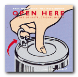
Have you ever tried to erect a wardrobe from the instructions in a self-assembly pack? Or followed the printed notes for programming your VCR? Open Here presents an entertaining collection of diagrams, graphics, and visual instructions for tackling the problems of everyday life which baffle us all. It includes such tricky examples as how to tie a bow tie whilst looking in a mirror, and what instructions to give people for the emergency evacuation of an aeroplane.

Open Here: instructional designMijksenaar and Westendorp achieve much of their effect from the vibrant colour reproductions of instructional design with which the book is packed. Every page is a visual treat. The examples they give are so wide-ranging that I often wished they had stayed longer on any one, providing a more extended analysis, rather than flitting so swiftly onto the next after a few comments.

There’s also an interesting historical overview which shows the presentation of instructions going from realistic photos or drawings of whole objects in the nineteenth century, to more recent depictions which tend to focus on specific parts or functions.

However, applying the principles they espouse to the book itself reveals a weakness as far as the serious sector of their potential market is concerned. Some pictures have explanatory captions, whilst others do not; and on the whole, rather too much space is devoted to visuals and too little to their textual commentary, which for the most part is tantalisingly cryptic.

In addition, they don’t always make a clear distinction between the good and bad examples, and I was disappointed that they didn’t provide a bibliography, because the book is obviously based on a lot of research. They also make little distinction between simple diagrams produced for the lay user and those expanded technical illustrations of cross-sections through a car engine which are produced for engineers. But then, this variety adds to the book’s visual appeal. I was yearning for more analysis, but read it with a permanent smile on my face.

This is a lively and refreshing publication which will make anyone reading it intensely conscious of instructional design. The text suggests that their examples are drawn from an archive of materials which has been built up over thirty years, so I hope that their next publication provides a more extended analysis using similar examples, but without sacrificing any of the graphic zest which makes this book so attractive.

© Roy Johnson 2000

Open Here   Buy the book at Amazon UK
Open Here   Buy the book at Amazon US


Paul Mijksenaar and Piet Westendorp, Open Here: the art of instructional design, New York: Joost Elffers Books, 1999, pp.144, ISBN: 1556709625


More on web design
More on technology
More on digital media
More on study skills
More on information design


Filed Under: Graphic design Tagged With: Graphic design, Information design, instructional design, Open Here

Paul Rand

June 26, 2009 by Roy Johnson

illustrated study of influential graphic designer

Paul Rand (1914 -1996) was one of the most successful figures in corporate American graphic design. He is best known for his IBM logo, which helped to resurrect the company in the 1970s, and led to its dominant position in computer manufacture. His early success in New York was founded – quite apart from his natural talent as an illustrator – on his appreciation of European modernism. He absorbed its influences quickly and, combining them with his precocious technical skills, produced a distinctive ‘American’ style. His basic approach is founded on photo-montage, collage, and elements of surrealism. But it’s a style which manages to look permanently modern.

Paul RandHe seems to have been particularly strongly influenced – as were many others at that time – by Jan Tschichold’s classic study of the relationship between politics and design in Die Neue Typografie. By the 1940s and 1950s, his combination of simple, abstracted forms contrasted with handwritten text came to be the template for many US book jacket and LP albumn designers – such as Milton Glaser and David Stone Martin. He coined the phrase ‘less is more’ – perhaps a summary of modernism in graphic design. He worked seven days a week, did all his own technical work, and he even designed his own house.

This beautifully illustrated biography traces his early work, which still looks fresh today; it covers the book jackets which set design pace in the 1950s and 1960s; and then the centre of the study is taken up with the development of the IBM corporate image and its famous Venetian blind logo. The conclusion is an illustrated gallery tour of his best commercial contracts – Westinghouse, United Parcels Service, ABC, and even re-designs such as Ford for which he was not actually awarded the contract.

Steven Heller, his biographer, is art director of The New York Times and the author of several influential books on graphic design. His account is even-handed on the whole, though it becomes a little whimsical in places – such as when describing Rand’s illustrations for children’s books written by his wife Anne. However, this book is exquisitely designed and elegantly printed from first page to last – which is why it is already a best-seller. The new paperback edition should help to bring the vivacity of Rand’s work to a wider audience.

© Roy Johnson 2002

Paul Rand   Buy the book at Amazon UK

Paul Rand   Buy the book at Amazon US


Steven Heller, Paul Rand, London: Phaidon, 2000, pp.255, ISBN: 0714839949


More on design
More on media
More on web design
More on typography


Filed Under: Individual designers, Typography Tagged With: Design, Graphic design, Paul Rand, Typography

Paul Renner: the art of typography

July 16, 2009 by Roy Johnson

illustrated critical biography of modernist typographer

German typographer Paul Renner is best known as the designer of the typeface Futura, which stands as a landmark of modern graphic design. This title is the first study in any language of Renner’s typographic career. It details his life and work to reveal the breadth of his accomplishment and influence. Renner was a central figure in the German artistic movements of the 1920s and 1930s, becoming an early and prominent member of the Deutscher Werkbund while creating his first book designs for various Munich-based publishers. As the author of numerous texts such as Typografie als Kunst (Typography as Art) and Die Kunst der Typographie (The Art of Typography) he created a new set of guidelines for balanced book design.

Paul Renner: the art of typographyRenner taught with Jan Tschichold in the 1930s and was a key participant in the heated ideological and artistic debates of that time. Arrested and dismissed from his post by the Nazis, he eventually emerged as a voice of experience and reason in the postwar years. Throughout this tumultuous period he produced a body of work of the highest distinction.

Christopher Burke’s biography is a PhD thesis which has been transformed into an elegant commercial publication – designed and typeset by the author himself. It follows a chronological structure, tracing the relationship between the history of Germany and Renner’s theories and practice as an artist. He helped lead German print out of the conservative Gothic or Blackletter tradition into the use of modern fonts such as his own best-selling Futura. His life also parallels German cultural history in the twentieth century.

Burke is very good at revealing the political, economic, and social forces which influenced the development of the new aesthetic movements of the period. For instance, he details the post-inflation shortages of the 1920s which gave the Bauhaus its impetus to link art and technology to produce machine-made objects. (Renner participated actively in this movement, developing alongside people such as Mies van der Rohe and Walter Gropius.)

Another wonderfully revealing instance is his discussion of the Nazis’ 1941 ban on the use of gothic script. What was once part of national identity was suddenly denounced as a ‘Jewish abomination’ – when in fact the truth was that the Germans had occupied much of France, Netherlands, Belgium, Denmark, and Norway, and they needed to make their propaganda understandable to people in these countries.

Burke sometimes seems to bury Renner’s theoretical and aesthetic work under lots of historical data. I was amazed that he gives so little attention to Typografie als Kunst (1922). But fortunately he traces the development of Futura in great detail, complete with reproductions of preliminary sketches of the letter forms and their variants.

He discusses the interesting notion that this essentially modernist font actively suppressed the differences between lower and upper case in the pursuit of a purely ‘rational’ design. Yet a weighted stroke emerged as it developed – because it was quite clear that the purely geometric form looked ugly.

Sometimes the politics and typography are not so comfortably integrated. After forty pages of letter forms, we’re suddenly jerked back into the political crises of the time – though it has to be said that part of Burke’s argument is to rescue Renner from the taint of Nazism which might be attached to any survivors of the period who stayed within Germany. Renner maintained a humanitarian stance against the Nazis, which he expressed significantly in his Kulturbolschewismus?, for which he as arrested in 1933 and then went into a period of ‘internal exile’.

Renner was obviously a survivor. The book ends with his post-war contributions to a debate between typographic modernisers and conservatives, in which he characteristically took the middle ground. He even saw a relationship between book design and political ideology:

In Renner’s view, the taste for large volumes, which equated weight with prestige, betrayed a potential flaw in the German character: ‘the “fatal desire for greatness”, by which Hitler was also notoriously motivated

This is a very attractive book which will appeal to both typographists and cultural historians. It will also have a passing attraction for bibliophiles who will appreciate the sheer pleasure of a beautifully illustrated and carefully designed book printed on high quality paper. If this is the level of work done in the department of typography and graphic communication at Reading University, then Christopher Burke is a very good advert for it.

© Roy Johnson 2002

Paul Renner   Buy the book at Amazon UK

Paul Renner   Buy the book at Amazon US


Christopher Burke, Paul Renner: the art of typography, London: Hyphen Press, 1999, pp.223, ISBN: 1568981589


More on typography
More on design
More on media
More on web design


Filed Under: Individual designers, Typography Tagged With: Biography, Fonts, Graphic design, Paul Renner, Typography

Penguin by Design

May 21, 2009 by Roy Johnson

a history of Penguin’s typography and graphic designs

If you’re interested in typography, graphic design, bibliography, collecting books, or just cultural nostalgia, this book is an absolute treat. It’s a beautifully illustrated history of the graphic design used for the Penguin imprint book jackets from its creation in 1935 to the present. Penguins were first sold for sixpence (2.5p) which was the price of a packet of ten cigarettes. That’s cheap by today’s standards when ten fags cost £2.70 but a typical Penguin costs twice that. Right from the start, Penguins were marketed via the elegance and consistency of their cover designs, with their easily recognisable orange covers and their perky logo. Its founder Allen Lane employed some of the most gifted graphic designers and typographists of the day.

Penguin DesignSo it’s no accident that Penguin was (and still is) such a successful imprint. Cover designs changed subtly to keep up with modern fashion, and even the famous penguin logo itself has changed shape, size, and even posture during its seventy year lifespan. It also morphed into the puffin for children and the pelican for the non-fiction series, the best-seller of which my father once urged on to me as a birthday present. Metals in the Service of Man was my bedtime reading as a child – which might explain a lot.

In the 1930s there were lots of polemical titles – not unlike Gollancz’s Left Book Club – and there were also lots of special ventures which are well presented here – children’s books during the war, American titles shortly after it, and books on art in the lead up to the Festival of Britain.

Jan Tschichold helped to bring the cover designs into the post-war world. He worked on the covers for a couple of years, but his attention to small details and his tight, conservative designs established a convention via a house style manual Penguin Composition Rules, which was a precursor to his essays in The Form of the Book.

The book is elegantly designed, set in Adobe Sabon and Monotype Gill Sans Display Bold, and laid out in what are largely double-page spreads. In addition to fiction, Penguin titles covered poetry, science, current affairs, architecture, the history of art, and even music scores – though these were dropped because they didn’t make enough money. The same was true of Pevsner’s famous Buildings of England, despite the fact that he waived his royalty payments.

Anyone who has been closely associated with the world of books during the last fifty years will feel that reading this book is like watching a moving picture of their own intellectual history. What’s more, it is difficult to imagine anybody not being overcome with an almost overwhelming desire to start their own collection – something quite easy with second-hand copies available for pennies in charity shops and online bookstores. And if you want to see an online gallery of cover designs, have a look at the collection Joe Kral has started in his picture collection at Flickr.

Phil Baines also traces the history progression of Penguin’s modern designers – Germano Facetti, Romek Marber, Alan Aldridge, and David Pelham, revealing en passant that all was not necessarily sweetness and light in the offices where design policies were made.

It is interesting to note that most of the designs look more attractive when viewed in groups – because this emphasises the unity of design, the form of the page, and the texture of patterns – such as the wallpapers and fabrics used in the poetry series.

There are some weak patches in the 1970s and 1980s, and I don’t think many of the current fiction cover designs will be remembered affectionately. But the downward trend has been reversed in two recent series: the reference books with their rounded corners, and the classics, which feature black covers and centred titles. In both cases there has been a return to two key elements of the classic Penguin: the horizontal division of the cover page into three distinct bands; and the reintroduction of the plucky little penguin itself – which had almost been sent to extinction in the previous decade.

© Roy Johnson 2006

Penguin by Design   Buy the book at Amazon UK

Penguin by Design   Buy the book at Amazon US


Phil Baines, Penguin by Design , London: Penguin, 2006, pp.256, ISBN: 0713998393


More on typography
More on technology
More on digital media


Filed Under: Graphic design, Typography Tagged With: Bibliography, Book jackets, Graphic design, Penguin Books, Penguin by Design, Typography

Practical Information Policies

July 13, 2009 by Roy Johnson

data management and information architecture

This is a study of information architecture and management – both in theory and practice. It is written with three groups of readers in mind – managers in libraries and information services; business managers and executives; and students of information science, librarianship, and information management. Elizabeth Orna starts Practical Information Policies by explaining why organizations need policies and strategies for managing information – outlining the benefits of having a policy, and the losses of not having one. She offers interesting definitions of the basic concepts she discusses, such as ‘information policy’, ‘knowledge management’, and ‘information management’.

Practical Information PoliciesWhen she moves on to look at how institutions are organized, she presents a very useful checklist of questions. These can be posed to query the efficiency of management systems. For instance, ‘What provision does the organization make for job handover and transfer of knowledge?’ These sorts of questions will be very useful to those people serious about systems analysis, just as they will strike fear into slack managers facing a quality assurance inspection.

These considerations form the basis for the next part of her study, which deals with making an information audit, then interpreting and presenting its findings. She sees individuals as repositories of skills and knowledge, and her basic argument is that they are both the prime asset of an organization and the agents for successfully managing change. The examples she discusses are drawn from real-life instances of ‘change’ such as ‘premises destroyed by bomb’ and ‘hostile takeover bid’.

The second part of the book is a series of case studies in corporate policy initiatives – including the introduction of a comprehensive IT policy at Amnesty International; the management of change at the British Library; and information strategies in the National Health Service, plus organizations as diverse as an advertising agency, the University of North London, and the Surrey Police.

Of course there are no guarantees that conducting even the most searching and intelligent audit of knowledge is going to save an organization from political or commercial doom. One of the case studies discussed here is NatWest bank, currently being swallowed up by the Royal Bank of Scotland. But as Orna finally observes, when dealing with information systems and large-scale corporate developments, ‘a degree of detachment, and a sense of humour are…useful assets.’

It’s worth saying that this is also a beautifully designed and elegantly produced book. It belongs in that rare category of publications which for book-lovers are interesting to contemplate, irrespective of their content. It follows the modern practice – which has its attractions – of placing short lists of suggested reading after each chapter, rather than in one long bibliography at the end of the book.

This is one for information professionals. The message of Practical Information Policies is that successful ‘knowledge management’ depends on knowledge in human minds, expressed in effective action, fed with appropriate information, and supported by the right blend of IT and systems. It offers readers a straightforward way of working out what their organization needs to know to survive and prosper; what information it requires to ‘feed’ its knowledge base; and how people need to interact in using knowledge and information effectively.

© Roy Johnson 2000

Practical Information Policies   Buy the book at Amazon UK

Practical Information Policies   Buy the book at Amazon US


Elizabeth Orna, Practical Information Policies, Hampshire: Gower, second edition, 1999, pp.375, ISBN: 0566076934


More on information design
More on design
More on media
More on web design


Filed Under: Information Design Tagged With: Data management, Information design, Information policies, Research

Roger Fry a biography

July 25, 2009 by Roy Johnson

portrait of Bloomsbury’s art theorist by premier writer

This is one of the last books Virginia Woolf wrote, and it is a tribute from one artist to another, an account of Fry’s aesthetics, and one of her many excursions into biography. Actually, Roger Fry A Biography is almost a joint production, because much of the text is direct quotations from Fry’s own journals and his letters to friends. It starts with his family background of radical Quakers, a quite strict upbringing, and his interest in science and the natural world.

Roger Fry A Biography He was a studious youth who blossomed when he went to Cambridge and was elected to the semi-secret society of Apostles who were what would be called free-thinkers (and coincidentally formed the basis of what would later be the Bloomsbury Group). He was older than the other members of this group, and always held in high regard by them. Despite getting a first in science, he switched to the study of Art and travelled to Italy and France on a sort of autodidactic Grand Tour to bring himself into contact with the masters.

Apart from her obvious sympathy with his artistic ideas, Woolf’s approach is largely descriptive. There is little attempt at analysis of her material. And we have to put up with her reticence on personal matters to a a degree which is almost infuriating. As a young man Fry forms a relationship with a woman old enough to be his mother, who teaches him ‘the art of love’, and they remain friends to the end of life. Yet this relationship is covered in less than a paragraph, and the woman isn’t even named.

Ever after Cambridge, his problem was how to earn a living from art, and even when he got married to fellow art-lover Helen Coombe, he was still living off an income from his father. But he found work as a lecturer, wrote art criticism, got nowhere as a painter, and was eventually employed by Pierpont Morgan to buy pictures for the Metropolitan Museum of Art.

Woolf makes a great deal of his organising the 1910 Post-Impressionist exhibition which caused such a rumpus (and which she claimed changed human nature). She sees this as a turning point in Fry’s life, and yet the strange thing is that at the very point that he joins the Bloomsbury Group (and where she has first-hand knowledge of his relationships with its members) she remains annoyingly coy about his personal life.

You would not know from her account that he had an affair with her sister Vanessa Bell. His life as a human being is replaced by the artistic debates which raged about Post-Impressionism, Fry’s own artistic theories, and the foundation of the Omega workshops.

Lots of well-known figures flit across the pages – George Bernard Shaw, Elgar, Lytton Strachey, André Gide – but we are as remote from his personal life as ever. Even his late life affair with Helen Anrep is mentioned almost parenthetically – though he was to live with her for the rest of his life (whilst his wife died slowly from a brain disease in a Retreat at York).

You can see why Woolf found his critical theory interesting. He was searching for a synthesis which would embrace visual art and literature, and he was modest enough to admit that his aesthetic opinions were subjective and limited:

But agreeing that aesthetic apprehension is a pre-eminently spiritual function does not imply for me any connection with morals. In the first place the contemplation of Truth is` likewise a spiritual function but is I judge entirely a-moral. Indeed I should be inclined to deny to morals (proper) any spiritual quality—they are rather the mechanism of civil life—the rules by which life in groups can be rendered tolerable and are therefore only concerned directly with behaviours.

She writes very appreciatively of his book on Cezanne, his life in London and St Remy de Provence, and his search for an all-embracing critical theory. All his life he had sought official recognition but it was denied him time and time again. Finally, in 1933 he was appointed Slade Professor of Art at Cambridge, but a year later he died.

© Roy Johnson 2005

Roger Fry biography Buy the book at Amazon UK

Roger Fry biography Buy the book at Amazon US


Virginia Woolf, Roger Fry: A Biography, London: Vintage, 2003, pp.314 ISBN: 0099442523


More on Virginia Woolf
Virginia Woolf – web links
Virginia Woolf – greatest works
Virginia Woolf – criticism
More on the Bloomsbury Group


Filed Under: Art, Biography, Bloomsbury Group, Individual designers, Virginia Woolf Tagged With: Art, Biography, Bloomsbury, Cultural history, Roger Fry, Theory, Virginia Woolf

  • « Previous Page
  • 1
  • …
  • 6
  • 7
  • 8
  • 9
  • 10
  • 11
  • Next Page »

Reviews

  • Arts
  • Biography
  • Creative Writing
  • Design
  • e-Commerce
  • Journalism
  • Language
  • Lifestyle
  • Literature
  • Media
  • Publishing
  • Study skills
  • Technology
  • Theory
  • Typography
  • Web design
  • Writing Skills

Get in touch

info@mantex.co.uk

Content © Mantex 2016
  • About Us
  • Advertising
  • Clients
  • Contact
  • FAQ
  • Links
  • Services
  • Reviews
  • Sitemap
  • T & C’s
  • Testimonials
  • Privacy

Copyright © 2025 · Mantex

Copyright © 2025 · News Pro Theme on Genesis Framework · WordPress · Log in