Mantex

Tutorials, Study Guides & More

  • HOME
  • REVIEWS
  • TUTORIALS
  • HOW-TO
  • CONTACT
>> Home / Design

Design

design history, graphic design, information design, product design

design history, graphic design, information design, product design

design history, graphic design, information design, product design

Romantic Moderns

October 14, 2011 by Roy Johnson

writers, artists, and the English sense of place

Romantic Moderns is a major piece of work by a young cultural historian with a free-ranging approach to her subject. It’s a study of a particular strain in English art that Alexandra Harris correctly describes as ‘romantic’, and illustrates as permeating every aspect of cultural life. The period she covers is the late 1930s through to the immediate post-war period. It would be interesting to know if the title of the PhD on which the book is based had a sub-title more specific than the one she provides here – because ‘from Virginia Woolf to John Piper’ is rather wide in scope. After all, Woolf was born in 1882, and Piper lived until 1992 – so that’s a span covering the late Victorian era, two world wars, and the digital age.

Romantic ModernsHer writing is certainly lively and entertaining. She throws off multiple references that explode like fireworks in almost every paragraph. A consideration of architecture leads to books on buildings, then pictures of buildings, and on to novels that feature them. This cultural enthusiasm is both a strength and a weakness, because whilst the names, titles, and references come thick and fast, it’s sometimes difficult to identify the main point of her argument.

She’s fizzing with information, but I was sometimes longing for an overview or a generalization. The nearest I spotted was that the people she discusses were all interested in the relationship between ‘art and place’.

She covers an astonishingly wide range of topics. Subjects include English country houses (of the Brideshead type) seascapes, Victorian revivalism, cuisine and gastronomy, the BBC, literary criticism, watercolour painting, music, travel writing, film, landscape gardening, and even the weather.

The artists whose work she discusses include John Betjemann, Eric Ravilious, Cecil Beaton, Edward Bawden, Paul Nash, Benjamin Britten, and Graham Sutherland – and those are just some of the best known. She also deals with a whole host of lesser figures – architects, film-makers, milliners, and interior designers,

It’s a world of country gardens, southern seascapes, churches, and images of a bucolic past. There are no cities, motor cars, iron foundries, or telephones in the iconography of this view of the world. Almost all topographical references come from below a line drawn between the Severn and the Wash. In fact you could be forgiven for thinking that the whole of English culture had been generated within the boundaries of Sussex.

The other worrying and recurrent problem in her approach is that modern English romantic art began much earlier than the late thirties in which she pitches most of her comment. The Georgian poets, water-colourists, and engravers all got under way in the second decade of the century, as a reaction to the brutality of the first world war and a sense that an idyllic past was being lost.

She makes a brave case for pastoral romanticism being an enduring feature in English culture, but it is based on selective (though widespread) evidence, and a nostalgic enthusiasm for a view of the world based on the village green. This can be seen as embarrassingly conservative at a time of Hitler’s extermination of Jews, Stalin’s show trials, and the onset of a fully mechanised second world war.

Her capacity for detail uncovers some interesting points – such as T.S. Eliot exchanging views on blood and soil with anti-Semitic and eugenics-supporting Viscount Lymington. It was but a small step from this to Eliot’s belief in religious notions of ‘continuity’ and nationhood. But the arguments on inherent (almost genetic) national feeling for pastoralism are somewhat dented when she cites the work of Bill Brandt, who was German, and Eliot himself, who came from St Louis, Missouri – not East Coker.

The latter part of the book deals with an unashamed celebration of the glamour and romance of the large English country house, focusing on its presence in the work of Elizabeth Bowen, Osbert Sitwell, and Evelyn Waugh. This doesn’t add a lot more to what has gone before, except to intensify an overt nostalgia for disappearing aristocratic worlds.

It might seem churlish to dwell on the weaknesses of such an enthusiastic and beautifully written study, but I think it would be patronising to a work pitched at this level not to take its arguments seriously enough to question them. Anyway, the book is already a runaway success, and its rich cream pages and high quality colour illustrations are sure to delight anyone who buys it.

Romantic Moderns Buy the book at Amazon UK

Romantic Moderns Buy the book at Amazon US

© Roy Johnson 2012


Alexandra Harris, Romantic Moderns: English Writers, Artists and the Imagination from Virginia Woolf to John Piper, London: Thames and Hudson, 2010, pp.320, ISBN: 0500251711


More on literature
More on the novella
More on literary studies
More on short stories


Filed Under: 20C Literature, Art, Bloomsbury Group, Design history, Literary Studies Tagged With: Art, Bloomsbury Group, Cultural history, English literature, Literary studies, Modernism, Romantic Moderns

Screen

June 26, 2009 by Roy Johnson

essays on graphic design, new media, and visual culture

Jessica Helfand is a critic of digital media and design matters. This collection of essays Screen first appeared in Eye, The New Republic, and Print Magazine. They deal with issues of visual design, digital culture, film, and media in general – including television, radio, and the Web. They are commendably short pieces, and it has to be said that they are elegantly written. Her formula is to take a single observation as a starting point, then spin it around with lots of cultural references to make gnomic statements about the state of culture in society.

ScreenThe problem is that they are basically personal opinions, and she very rarely examines concrete examples in any detail. This approach leads her into the marshy swamps of false generalisation. On our sense of space in a digital age, she claims:

The computer is our connection to the world. It is an information source, an entertainment device, a communications portal, a production tool … But we are also its prisoners: trapped in a medium in which visual expression must filter through a protocol of uncompromising programming scripts

Yes, it’s true that using computers requires mastery of complex techniques – but we are not its prisoners, because our sense of space is formed by many sources beyond the computer screen.

It’s obvious that she is well informed on digital technology. She discusses issues of web design, navigation buttons, splash screens, and the cultural significance of ‘rollovers’. Yet she confuses navigation with content, and even thinks that email has a homogenising effect:

In the land of email we all ‘sound’ alike: everyone writes in system fonts … Software protocols require that we title our mail, a leftover model from the days of interoffice correspondence, which makes even the most casual letter sound like a corporate memo.

That is simply not true. Anybody who receives more than a couple of dozen emails a day knows that most people generate their own ‘voice’ using this medium. And the titles of some of the messages I receive would certainly never make the ‘corporate memo’ file.

The fact is that there’s lot of techno-scepticism here. Underneath the glossy media guru carapace, she is actually digitally uncertain. Yet she’s not averse to patting herself on the back; she drops lots of Post-Modernist names, and at its most acute, her writing comes dangerously close to something from Pseud’s Corner. Encountering a consumer quiz on chicken nuggets, she reports

while I would like to report that my thoughts … drifted to Martin Heidegger or Giles Deleuze, to existentialism or metaphysics or even postmodernism, alas, they did not.

Fortunately, the collection is rescued by two excellent essays on the designer Paul Rand, where her analyses are much more meaningful because they are focused on concrete examples. The first is an analysis of his work as a commercial designer, and the second an interesting account of his methods as a teacher at Yale.

These two essays are first rate pieces of work. It’s a shame that the rest of the collection doesn’t match up. But having said that, the book comes larded with praise by other designers, and copies at my local bookshop have been flying off the shelves – so you will need to judge for yourself.

© Roy Johnson 2001

screen   Buy the book at Amazon UK

screen   Buy the book at Amazon US


Jessica Helfand, Screen: Essays on Graphic Design, New Media, and Visual Culture, New York: Princeton Architectural Press, 2001, pp.175, ISBN: 1568983107


More on design
More on media
More on web design


Filed Under: Graphic design, Media, Theory Tagged With: Design, Media, Media theory, New media, Screen, Theory

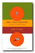
Small Things Considered

November 5, 2009 by Roy Johnson

reasons why there is no perfect design

Henry Petrowski is professor of civil engineering and history at Duke University, North Carolina. He writes extensively on engineering and design in a populist manner which helps to explain academic and scientific matters to the average reader. And he does it very well. He has a fluent and easy style which reads like someone talking to you over drinks on a veranda on a hot sunny afternoon. Small Things Considered is a good example of his work.

Small Things ConsideredHis main argument in this, one of his many books on the subject, is that considerations of design affect even the small matters of everyday life. And I mean small. Nothing is too insignificant in the running of a normal house to escape his attention – thirty pages on a glass of water, a whole chapter on coffee cup holders in cars, or on the design of paper bags. There’s even a chapter on the positioning of handles on doors.

The reason this is all spelled out at such length is that as part of his leisurely style, he looks at all the ways the design of something might have gone wrong, how the designers could have failed or overlooked some important requirement – before he goes on to look at the more essential element of how they got it right. Nevertheless, his sub-title is significant: even the best-designed objects can eventually be improved upon. As he points out, most patent applications carry ‘Improvement on …’ as part of their title.

The best parts of his accounts are where he delivers the history of a design or an invention, the practicalities of making something work and the financing of prototypes and commercial models. He’s also good the moment he strays into issues of patents, copyright, and ownership, because he obviously knows the history of his subject.

He waxes eloquently about very basic products such as duct tape, WD-40, and Teflon, pointing out just how much research and design went into these apparently simple items. Indeed, WD-40 even gets its name from the fact that the manufacturer’s previous thirty-nine attempts to develop a Water Displacement prototype had not been successful. It was the fortieth that delivered the goods – and then more so when people found all sorts of inventive uses for it. Now it is used for oiling squeaky hinges, loosening stubborn bolts, dissolving glue, and even killing insects.

The most successful chapters are those that consider the details of a specific and complex product. Office chairs are a good case in point. His account of how the Herman Miller Aeron displaced the Steelcase chair of the 1950s takes into account ergonomics, materials, design innovation, ecology, and even social attitudes, though curiously enough he doesn’t mention economics (the Aeron is formidably expensive – as I discovered when I tried to buy one recently).

This is a book to be read alongside Donald Norman’s The Design of Everyday Things and Victor Papanek’s Design for the Real World. It certainly warrants a place on the syllabus of any serious design course, though I doubt that it will reach the classic status of those other two texts, even though it attempts to do so.

Small Things Considered   Buy the book at Amazon UK

Small Things Considered   Buy the book at Amazon US

© Roy Johnson 2009


Henry Petrowski, Small Things Considered, New York: Vintage Books, 2003, pp.288, ISBN: 1400032938


More on design
More on media
More on web design
More on information design


Filed Under: Product design Tagged With: Cultural history, Design, Henry Petrowski, Product design

Specials

June 8, 2009 by Roy Johnson

graphic design examples from the stuff of everyday life

This is an eclectic assembly of graphic design stimulus material. It’s a handsomely printed samples book – if you’re interested in the scratchy-grunge school of typography and design. The examples are drawn from an amazing variety of everyday sources. If there’s a theme that emerges, it’s that a lot of the illustrations originate in one-off events. They come from exhibition catalogues; interactive software paint programs; advertising hoardings; and digitized typefaces.

Specials Some of the more interesting are from business cards; CD covers and record albumn sleeves; art gallery exhibition flyers; and print magazine pages. A lot of the ‘design’, it has to be said, is pretty flimsy. But amongst the more substantial offering are web site home portals; designs for promotional packaging; and some curious examples from public signage.

For trivia enthusiasts there are football score sheets; art college doodlings; some amusing, ultra-utilitarian birthday cards; a carrier bag design; three-dimensional postcards, and (I’m not kidding) instructions for making an origami snowball.

Some of the ideas behind the exhibits are more interesting than the finished work itself, but the book is packed with visual stimulation. In fact the dust cover inserts an interesting invitation to aspiring designers – “It’s about more than just typography. If your work isn’t here, let us know, and perhaps you’ll make it into our next book.”

© Roy Johnson 2002

specials   Buy the book at Amazon UK

specials   Buy the book at Amazon US


Claire Catterall (ed), Specials, London: Booth-Clibborn, 2001, pp. ISBN: 1861542208


More on design
More on media
More on web design


Filed Under: Graphic design Tagged With: Graphic design, Specials, Typography

Subject to Change

July 9, 2009 by Roy Johnson

creating products and services for an uncertain world

This book is about design theory for the digital age, and aspires to be read alongside Viktor Papanek’s Design for the Real Word and Donald Norman’s The Design of Everyday Things or his ‘revised’ views in Emotional Design. It’s written by four guys from Jesse James Garrett’s company, Adaptive Path, and draws heavily on their work in what they call ‘experience design’. They are challenging conventional wisdoms of commercial practice in the light of the new digital possibilities. For instance, piling more and more features into a product may not be a good thing – as users of VCR machines will confirm. Neither will building a novelty if nobody has a use for it – as the Segway proved. Subject to Change proposes radical alternatives.

Subject to ChangeThey suggest that designers must learn to empathise with the people whose interests they wish to serve. They should forget about consumers and learn to embrace the fact that the Customer is King. Their arguments stray into fields of business management, economics, and sales strategies – but they come back in the end to what these factors mean for design.

If there is a hidden sub-title to this work it’s “What is experience design?” – because the main thrust of their arguments is that whilst many companies have learned how to deliver a product, few of them have realised the importance of offering a rich and gratifying experience for their customers.

If there is a weakness, it’s a slightly Utopian notion that large businesses would allow experience design solutions policy to reach down to lower levels of company employees. It might be true that a postman or a sales clerk could offer a valuable suggestion for improving customer satisfaction – but can you imagine the directors of Royal Mail, British Gas, or – come to think of it – the government paying any attention? But of course, they would argue that this is the whole point of what they’re saying. It’s a shift in culture that’s required.

They are (quite rightly) great believers in the advantages of prototyping. James Dyson created more than 5,000 versions of his bagless vacuum cleaner before he came up with the definitive model. In fact they miss the opportunity to stress the huge advantages of prototyping in the digital world. A web site can be updated or remodeled unlike physical products such as cars or refrigerators, at virtually zero cost in no time at all by re-jigging a style sheet (CSS) or a content management system (CMS).

They are also advocates of ‘losing control’ – that is, giving customers (and even your competitors) access to tools to create their own experiences. The Internet world is littered with examples of companies who have made millions by giving away their product [Google, Linux, Mozilla]. It seems counter-intuitive, but that’s the way digital commerce works.

To conservatives, many of these ideas will seem quite impractical; but to anybody with even half a foot in the contemporary world of digital technology, they will seem like roadmaps to a New Future, employing methods which you might already be using – such as ‘managing with less’.

The latter part of the book becomes quite inspirational as they spell out their concept of ‘The Agile Manifesto’. This is a method of design and product development which does almost the exact opposite of conventional notions (which they call the ‘Waterfall Approach’). The only problem was that this section doesn’t carry any references to secondary sources – so it’s not possible to follow up their suggestions with any further reading.

Individuals and interactions not processes and tools
Working software not comprehensive documentation
Customer collaboration not contract negotiation
Responding to change not following a plan

The authors all work for the same firm (Adaptive Path) and there’s quite a lot of unashamed trumpet-blowing about their success which has drawn down severe criticism from some reviewers. But if you can stomach this (or ignore it) the book offers some useful pointers in the world of design theory and the New eCommerce.

© Roy Johnson 2008

Subject to Change   Buy the book at Amazon UK

Subject to Change   Buy the book at Amazon US


Peter Merholz et al, Subject to Change, Sebastopol, CA: O’Reilly, 2008, pp.178, ISBN: 0596516835


More on design
More on media
More on web design
More on information design


Filed Under: e-Commerce, Product design Tagged With: Design, e-Commerce, eCommerce, Subject to Change, Web design

The Design of Everyday Things

July 12, 2009 by Roy Johnson

classic design principles using everyday objects

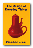
Donald Norman is a product design and usability guru who has teamed up recently with Jakob Nielsen to form the influential Nielsen-Norman Group. They specialise in advising businesses on the usefulness of their web sites. The Design of Everyday Things is the latest edition of what has become a classic in usability principles in the short time since it was first published. Norman discusses the problems we all have with the results of bad design in everyday life – doors which open the wrong way; telephone calls you can’t put on hold; washing machines with spaceship control panels. He clarifies the rules of good design as he goes along. These turn out to be – visibility, good conceptual model, feedback, and natural mapping.

Product DesignWhat this means is that the controls should be visually obvious, they should feel part of a natural process,they should tell you that an action has been performed, and they should reveal the connection between action and results. Every point of his argument is illustrated with practical examples and anecdotes drawn from the problems of normal life. These range from the trivialities of taking the wrong turn when driving, to the disastrous consequences of aircraft engine and nuclear reactor failure. One of the reasons this is such a charming and interesting book is that it’s written by an expert who admits to his own weaknesses and problems. This is the professor from MIT who can’t program his own video recorder, who says so, and who convinces you its not the user’s fault but that of the designer.

Click for details at AmazonHe’s also good at explaining the function and limitations of memory, and gives a clear account of one concept on which he relies heavily – mapping. This is the ability of good designers to arrange their controls, buttons, and switches in a way which corresponds to something we already know and have mentally internalised. He also offers interesting analyses of mistakes, breakdowns, and disasters – relating them to issues of both design and the relationship of humans to machines.

Donald Norman is a ‘usability’ guru who puts the user first. This is a witty and humane approach to the issues of good design – and it rightly deserves its reputation as a modern classic. You will never interact with the physical world in quite the same way again.

© Roy Johnson 2001

The Design of Everyday Things   Buy the book at Amazon UK

The Design of Everyday Things   Buy the book at Amazon US


Donald A. Norman, The Design of Everyday Things, London/New York: MIT Press, 2000, pp.257, ISBN: 0262640376


More on design
More on media
More on web design
More on information design


Filed Under: Product design Tagged With: Design, Donald Norman, Product design, The Design of Everyday Things, Usability

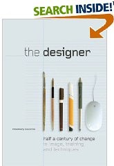
The Designer

July 17, 2009 by Roy Johnson

fifty years of change in image, training, and techniques

Rosemary Sassoon is a distinguished authority on typography, writing, and education – with publications as diverse as Computers and Typography, Signs, Symbols and Icons, and Handwriting of the Twentieth Century. What marks her out from many other writers on these issues is that she tends to test her ideas in the classroom – either by designing fonts to assist children’s reading [Sassoon Primary] or researching how children learn to write. It was she who came up with the observation that the way children hold a pen has no relation to or effect on the clarity of their writing.

The DesignerHer latest book is about the development and training of designers over the last half century. She begins just after the end of the second world war, when although design was harnessed to promote post-war recovery, designers were regarded as second-class citizens. The Festival of Britain (1951) did little to change matters, even though the exhibition was successful. Designers were labelled ‘commercial artists’. Now, fifty-odd years on, some designers are better known than [‘fine’] artists. How times change.

She considers the neglect of drawing skills in design training and sees this as a sad loss which began with the encouragement of ‘conceptual’ design in the 1970s – one which has accelerated with the arrival of computer-assisted deign (CAD).

Much of the evidence she produces for the changes in design education comes from interviews with professional designers and teachers who look back on their own educational history. Common themes include regret at the demise of the apprenticeship system; scepticism regarding the use of computers in the teaching of typography; regret that design students often avoid theory; and despair over class sizes which during this period have risen from 15-20 to 100+ – a phenomenon which results in such practices as ‘hot-desking’ and ‘elearning’ to cope with these numbers and spread scarce resources further and further.

The second part of the book is a series of essays on contemporary issues and prospects for the future written by distinguished practitioners. They reflect on their own professional development and the manner in which teaching design has changed all over the world in the last fifty years.

Then in the third part of the book (and I have to say its the best-written and illustrated) Rosemary Sassoon reflects on her own experience and practice as a designer. She went through quite a random but eminently practical training as a calligraphist and a textile designer. She gives a first hand account of what practical commercial design involved – working with different types of printing and reproduction, then negotiating with clients and sales representatives.

In a quite amazing career where one thing led to another, she became a regularly published writer on typography, a teacher, a government consultant on writing, with particular reference to children and stroke victims, and a book designer. And one supposes she will go on this way until one day she joins the Big Design Studio in the sky.

© Roy Johnson 2008

The Designer   Buy the book at Amazon UK

The Designer   Buy the book at Amazon US


Rosemary Sassoon, The Designer: half a century of change in image, training, and techniques, Bristol: Intellect, 2008, pp.144, ISBN: 1841501956


More on design
More on media
More on web design


Filed Under: Graphic design Tagged With: Design, Education, Graphic design, The Designer, Writing

The Elements of Typographic Style

May 31, 2009 by Roy Johnson

Best-selling classic manual – the typographist’s Bible

Subscribers to Internet lists dealing with fonts and typography often ask “Which books would you recommend as a guide to good design principles?”. And no matter how many responses emerge, one book comes out on top every time – Robert Bringhurst’s The Elements of Typographic Style. It’s a book packed with design wisdom. Bringhurst has produced what is essentially a first principles of typography – a grammar of good taste based on the relationship between form and content of printed matter.

The Elements of Typographic StyleIt’s also a very beautiful book in its own right. You will not fail to discover visual pleasures on almost every page, and the text is illustrated with such an astonishing variety of beautiful fonts, that this almost doubles as a catalogue of type designs. It is obvious from almost every word that he’s thought profoundly about the fundamental issues of printed words on the page, and he often has insights to offer on topics most of us take for granted. He can conjour poetry out of the smallest detail, and he offers a scholarly yet succinct etymology of almost every mark that can be made – from the humble hyphen to the nuances of serifs on Trajan Roman or a Carolingian Majuscule.

The well-made page is now what it was then: a window into history, language and the mind: a map of what is being said and a portrait of the voice that is silently speaking.

As you would expect, he traces the development of type from its origins in eleventh century China to the present, and he deals with such extremely subtle distinctions as the differences in quality of letter forms produced by pressing hot metal onto paper, by offset litho (laying the letter on top of the paper) or by the digital means of charged electrons on the screen. he doesn’t actually have much to say about computers and typography, and yet his brief comments summarise almost everything there is to say about digital type:

Good text faces for the screen are therefore as a rule faces with low contrast, a large torso, open counters, sturdy terminals, and slab serifs or no serifs at all. [And he might have added – ‘a large x-height’.]

He does seem to become a little fanciful when discussing the mathematics of page proportions, especially when maintaining an extended comparison with the musical scale, and he misses the chance to give historical examples of page design, rather than the mathematical tables which populate this part of the book. But it seems almost churlish to complain when everything is so beautifully presented.

He ends with two very useful chapters – one of which analyses commonly available fonts (“prowling the specimen books” as he calls it). Paragraph-length potted histories are followed by suggestions on how the font is best used. This is typical of the manner in which he very elegantly combines scholarship and a cultivated taste with the requirements of a practical guidance manual.

Bringhurst is also a novelist, and he brings a prose style of some distinction to the subject, ornamenting his text with the lyrical jargon of typography, and quite obviously relishing terms such at the pilcrow, the octothorpe, the virgule, guillemets and chevrons, and the solidus; as well as the romance of small caps, analphabetic symbols, the shape of pages, the order of footnote symbols, the ‘looser dressing’ and the ‘larger torso’ of a font.

The book ends with a fascinating tour of sorts and characters, revealing the subtle functions of the cedilla and the ogonek; the umlaut and the diaeresis; the ligatures aesc, and oethel; the prime, the macron, and the vinculum. He completes this tour de force with several more appendices: a glossary of typographic terms; a listing of type designers; another of typefoundries; a recapitulation of the main recommendations in the text; and a list of further reading.

This is a wonderful book which fully deserves its widespread reputation as a classic and the ultimate guide for laying out pages in print of on screen. Anyone who wishes to gain insights into the aesthetics and the finer details of good design should read this book. Anyone with a serious typographic intent should own it.

© Roy Johnson 2000

The Elements of Typographic Style   Buy the book at Amazon UK

The Elements of Typographic Style   Buy the book at Amazon US


Robert Bringhurst, The Elements of Typographic Style (2nd edn), Toronto: Hartley & Marks, 1996, pp.351, ISBN: 0881791326


More on typography
More on design
More on media
More on web design


Filed Under: Graphic design, Typography Tagged With: Fonts, Graphic design, Information design, Printing, Typographic style, Typography

The Elements of User Experience

June 19, 2009 by Roy Johnson

concise guide to navigational and usability theory

Usability has so far been dominated by the work of Jakob Nielsen – but now there are new voices emerging. John Lenker recently set out his ideas on what he calls ‘flowpaths’, and now here comes Jesse James Garrett with The Elements of User Experience, which is his pitch on the essence of navigational clarity in web design. First he argues the case for user-centred design. All sites must be organised to make it easy for visitors to find what they want. He has had a diagram on his web site for some time now illustrating the point.

The Elements of User Experience This book is an amplification of that basic concept. It’s an idea that the user experience is enacted at five levels. These correspond to the way in which a site is constructed: Surface – Skeletal – Structure – Scope – Strategy. They represent each part of our engagement in a web site – from the buttons we press, the way they are arranged, the design of pages, the links between them, and how all aspects of a site are co-ordinated to deliver its essential purpose. He is wise enough to realise that everything does not easily fit into such convenient categories, but he then explores each level in depth.

First comes the strategy document – a concise statement of the project’s objectives. He’s very keen on clarifying aims, drawing up specifications, and making content inventories. The idea of all this is to prevent ‘mission creep’.

Interestingly he doesn’t pad his argument out with lots of examples, but concentrates on explaining each level of his basic concepts in depth. He has an easy style, and he avoids jargon.

He’s very good on making subtle distinctions – between for instance information architecture and information design. And like many recent commentators, he argues the case for having multiple navigation systems. After all, why not give visitors to a site a variety of routes for getting from one place to another.

It’s at this point that the book becomes most interesting – when he looks at the details of information architecture and shows how they must be related to what appears on the page. There’s some excellent advice on using wireframes here for instance. These are the outline plans which show the underlying structure of a given page.

This is a clear and refreshingly concise account of planning, organising, and thinking through the design of a successful Web site. It’s a book which gives an overview of site-building concepts, and it will appeal to site designers as well as to project managers and usability consultants.

© Roy Johnson 2003

User Experience   Buy the book at Amazon UK

User Experience   Buy the book at Amazon US


Jesse James Garrett, The Elements of User Experience, Indianapolis (IN): New Riders, 2003, pp.189, ISBN: 0735712026


More on information design
More on design
More on media
More on web design


Filed Under: Information Design Tagged With: Information design, Navigation, Usability, Web design

The End of Print

June 8, 2009 by Roy Johnson

illustrated guide to  popular US avant-garde typographist

David Carson designs jarring and visually chaotic magazine spreads, posters, and print ads which have consistently challenged the boundaries of legibility and typography. His modest San Diego, California, studio has become the epicentre of a new graphic anti-aesthetic that has stirred ongoing debate among fellow designers such as Neville Brody, who observed that his work prophesies ‘the end of print’. This comment inspired the title of Carson’s new book, the first comprehensive collection of his decade-long output of graphic imagery.

The End of PrintIn past lives, Carson was a top-ranked competitive surfer and a high school sociology teacher. However, during a two-week workshop on graphic arts he discovered his calling. He landed his first major design assignment as art director of Transworld Skateboarding in 1983, and he later moved on to Surf magazine. In 1990, Carson headed the much-praised Beach Culture.

This is where his irreverent but often ingenious layouts consistently pitted editorial substance against graphic style. Carson’s creative vision came out on top – in its six-issue stint, Beach Culture won over 150 design awards. As the art director of Ray Gun, his unconventional look has been shamelessly emulated by a slew of similar start-up magazines.

Recently, Carson has shifted from spokesman for Left-Coast subculture to the corporate arena, taking on larger projects that include print ads for Nike and a television commercial for Citibank, as well as collaborations with musician David Byrne and photographer Albert Watson.

The End of Print was designed by Carson, and ironically, this proves to be the most disappointing aspect of the book. For those designers and readers who want to learn more about Carson’s graphic work and philosophy must do so on his terms. The text of the book is presented in the confusing and often incoherent typography typical of a Ray Gun layout. Those not willing to read the garbled introduction and inarticulate essays may surrender in frustration. However the book manages to stand on its own as a purely visual document, a fascinating chronicle of David Carson’s creative mind.

Like the collage artist Kurt Schwitters, who collected his materials from curbside rubbish, Carson finds much of his inspiration in the visual garbage of modern-day living. Handlettered signs, torn and layered poster kiosks and the eroded storefronts encountered in city streets serve as backdrops which Carson equates into the digital realm. Many of these found objects and photographs are reproduced in the book and they offer insight into Carson’s design approach.

One page reproduces a Carson ad selling a Beach Culture T-shirt sight unseen, with the premise that “if you like the look of the magazine, you probably would like the shirt.” Likewise, if you like the design of David Carson, you probably will like this book.

© Philip Krayna 2000

David Carson   Buy the book at Amazon UK

David Carson   Buy the book at Amazon US


Lewis Blackwell and David Carson, The End of Print: The Graphic Design Of David Carson, Chronicle Books, 1995, pp.160, ISBN: 0811830241


More on typography
More on design
More on media
More on web design


Filed Under: Individual designers, Typography Tagged With: David Carson, Graphic design, Media, The End of Print, Typography

  • « Previous Page
  • 1
  • …
  • 7
  • 8
  • 9
  • 10
  • 11
  • Next Page »

Reviews

  • Arts
  • Biography
  • Creative Writing
  • Design
  • e-Commerce
  • Journalism
  • Language
  • Lifestyle
  • Literature
  • Media
  • Publishing
  • Study skills
  • Technology
  • Theory
  • Typography
  • Web design
  • Writing Skills

Get in touch

info@mantex.co.uk

Content © Mantex 2016
  • About Us
  • Advertising
  • Clients
  • Contact
  • FAQ
  • Links
  • Services
  • Reviews
  • Sitemap
  • T & C’s
  • Testimonials
  • Privacy

Copyright © 2025 · Mantex

Copyright © 2025 · News Pro Theme on Genesis Framework · WordPress · Log in