The Fundamentals of Typography
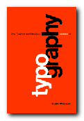
I like books explaining typography, because they are forced to illustrate the points they are making, and the result is usually pages with plenty of visual interest. That’s what makes books such as Eric Spiekermann’s Stop Stealing Sheep and James Felici’s The Complete Manual of Typography so popular. The Fundamentals of Typography covers similar ground in a historically comprehensive fashion. Its first part covers the development of language and the history of writing systems.
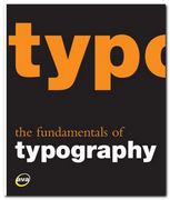 This shows the gradual evolution of alphabets and the gestation of typefaces or font families. These expand after the invention of printing in the Renaissance then explode into a galaxy of styles following industrialisation. Gavin Abrose and Paul Harris trace this in detail during the second part of the last century, following each step of recent type design.
Every page is fully illustrated. In fact the explanatory text is almost an extended caption on each graphic. This keeps the pages lively, but sometimes sinks to the level of triviality when presenting a major item. The influential Swiss typographer Jan Tschichold for instance is summarised in a three sentence paragraph.
The next part of the book deals with the basic issues of typography – font selection, the spacing of letters and type, page design, kerning, small capitals, text alignment, and leading. I was glad to see that they consider type on screen as well as in print, and they end with a consideration of very basic design issues such as the use of grids, page texture, and legibility.
There’s quite an interesting section mid-book on the nature of page proportions (something the aforementioned Tschichold discusses in The Form of the Book) and the disposition of type on a page.
The latter part of the book offers a lot of interesting advice on the use of diacritical marks (accents), numbers, fractions, ligatures, diphthongs, small capitals, and also examples showing some incredibly subtle adjustments of the alignment of bullet points and hyphens. All the arguments being made are illustrated with real life examples from the commercial world of brochures and advertising design.
In fact that is probably one of the strongest features of this book, even though it is given a low profile. It’s important that young designers see not only a theoretical possibility, but its implementation in the real world in which they are probably seeking work. I was also glad to see that there was a webliography listing the designers represented, because these guys often get missed out in a general survey of this kind.
The last part of the book deals with digital typography – font sets which can be generated from a basic style. It also covers issues of readability and legibility (not the same thing) and type as image and graphic symbol.
© Roy Johnson 2008
Gavin Ambrose & Paul Harris, The Fundamentals of Typography, Lausanne: AVA, 2006, pp.176, ISBN 2940373450
More on typography
More on technology
More on digital media
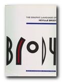
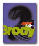 There are pop adverts, albumn and magazine covers, corporate logos and design, fashion magazine plates, book dust jackets, letterheads, and even humble business cards amongst the designs illustrated here. The accompanying text by Jon Wozencroft is enthusiastic without being sycophantic, and there is a good scholarly apparatus which gives full details of sources. However, the principal value of these two volumes is that they are beautifully designed books, full of good page layouts, vivid illustrations, and well-chosen typography. If they are out of print by the time you read this, make the effort to track them down. You will not regret it.
 There are chapters on the use of photographs; the standardisation of paper sizes [the origin of the DIN A4 we all use today] lots of carefully analysed examples of business stationery, and even film posters which evoke the visual ethos of the inter-war years. All this is illustrated by some crisp and still attractive reproductions of everyday graphics – letterheads, postcards, catalogues, and posters – in the red, black and white colour-scheme characteristic of the period.
 Gavin Ambrose & Paul Harris,
