Mantex

Tutorials, Study Guides & More

  • HOME
  • REVIEWS
  • TUTORIALS
  • HOW-TO
  • CONTACT
>> Home / Archives for Design

Omega and After

May 21, 2009 by Roy Johnson

Bloomsbury and the decorative arts

The Bloomsbury Group was largely composed of writers and intellectuals, but there were lots of artists and designers within their ranks too. This well illustrated guide focuses on the highpoint of their endeavours – the Omega Workshops which flourished in the period 1913—1919. This venture was the brainchild of Roger Fry, who recruited Vanessa Bell (his lover at the time) and Duncan Grant as co-directors for an opening in Fitzroy Square in 1913, deep in the heart of Bloomsbury.
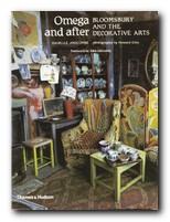
Omega and After That was not an auspicious date for the debut of an enterprise which sought to bring Post-Impressionist design to the general public. But in fact it survived throughout the whole of the first world war, even though it was never commercially successful. Fry organised painters, designers, and ceramicists to supply goods which were colourfully and playfully made to bring Modern Art into the home – of those who could afford it. Although the works were produced by people we now see as influential members of the modernist movement in the arts, individual productions were made anonymously, signed only with the letter omega.

A number of famous names were associated with the workshop: at one time or another Henri Gaudier-Brzeska, Paul Nash, David Bomberg, Dora Carrington, William Roberts, and Mark Gertler all had connections with the Omega.

At the launch of the project, artist and writer Wyndham Lewis was also a member; but he quickly split away from the group in a dispute over Omega’s contribution to the Ideal Homes Exhibition. Lewis circulated a letter to all shareholders, making accusations against the company and Roger Fry in particular, and pouring scorn on the products of Omega and its ideology. This subsequently led to his establishing the rival Vorticist movement and the publication in 1916 of its two-issue house magazine, BLAST.

The Omega workshops produced everything, from furniture and paintings to rugs, wallpaper, and children’s toys. All of these are wonderfully illustrated in this collection of photographs which are rarely seen anywhere else.
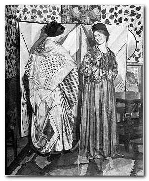
The text recounts the story of the enterprise and its shaky beginnings. A somewhat amateurish co-operative; the introduction of modernist clothes via Nina Hamnet (the Queen of Bohemia); and the tortured love triangle which existed between its directors.

Isabelle Anscombe devotes an entire chapter to Vanessa Bell, studiously avoiding for as long as she can the fact that she was Roger Fry’s lover; but she is forced to eventually concede that Fry was replaced by Duncan Grant. Her husband Clive Bell, who was friendly with all three of them, is kept out of the picture altogether.

The latter part of the book (the ‘After’ of her title) follows the fortunes of Vanessa Bell and Duncan Grant as they continued their work in decorative arts, at the same time as tracing developments in contemporary design taste in Britain. Both of them continued to put all their decorative efforts into their house at Charleston – which is now a museum to Bloomsbury and its visual culture.

But ultimately, it is the wonderful illustrations which are the centre of interest here: interiors, ceramics, fabrics, book jackets, and portrait photographs of the principal artists. This book is well worth tracking down for anybody with an interest in the decorative arts and the visually creative side of Bloomsbury.

© Roy Johnson 2000

Omega and After Buy the book at Amazon UK

Omega and After Buy the book at Amazon US


Isobelle Anscombe, Omega and After: Bloomsbury and the Decorative Arts, London: Thames and Hudson, 1984, pp.176, ISBN 0500273626


More on design
More on biography
More on the Bloomsbury Group
Twentieth century literature


Filed Under: Bloomsbury Group, Lifestyle, Product design Tagged With: Bloomsbury Group, Decorative arts, Design, Omega worshops

Paris Interiors

July 18, 2009 by Roy Johnson

interior design French capital city style

This is another of the very stylish and amazingly good value photographic studies from Taschen Books. It features fifty imaginatively conceived apartments and houses, the homes of prominent people such as Isabelle Adjani, Helena Christensen, and Christian and Francoise Lacroix. What then characterises the Parisian interior? Well, there are lots of elegant nineteenth century apartment buildings; rooms with high ceilings and tall windows reaching almost to the floor; marble staircases with wrought-iron banisters; light, pale colours; touches of art-nouveau; and polished wooden or tiled floors (rarely carpets). However, it’s not all tradition.

Paris Interiors There’s an apartment fashioned from an old warehouses, one with a vegetable garden on the roof, and another coaxed out of just two or three modest rooms. That’s another of the many good things about these books. They go beyond mere coffee table glamour by incorporating examples which demonstrate flair on a budget.

If you want to pick up some living tips from these pages, be prepared to use rooms for different purposes than they were originally intended. Bedrooms do not always need to be above living quarters. There are even examples of people putting buildings to different uses: there’s an excellent example of a stylish home on a Parisian barge, and another created from a converted attic.

Most of the owners (or occupants) whose homes are depicted tend to be fashion designers, couturiers, and visual consultants of one kind or another. In fact my favourite was an ultra minimalist art deco penthouse designed and owned by parfumier Thierry Mugler.

Two other things come through very strongly. First – lots of them offset whatever their taste and decorative arrangements with classical columns supporting a bust. No problems there: I’m a big fan of those myself. But second – many of them have rooms which are so piled up with books they look like auction rooms, ready for the bargain clearance sale. A few art books might look OK, but too many just looks very untidy – as if the owner has simply not yet tackled the issue of storage.

The other weakness here (which might simply reflect the taste of the author) is that rather a lot of the examples chosen are interesting for gimmicky reasons rather than for their good aesthetics. Rooms stuffed full of giant sized golliwogs or flea-market tat might be unusual, but they can easily make their owners look rather foolish.

But these are minor quibbles. Anyone interested in interior design will find something to stimulate their imagination here. Paris is still one of the most stylish cities in the world, and not just Capital of the Nineteenth Century as Walter Benjamin described it.

© Roy Johnson 2007

Buy the book at Amazon UK

Buy the book at Amazon US


Lisa Lovett-Smith, Paris Interiors, London: Taschen, 2007, p.320, ISBN 3822838055


More on lifestyle
More on biography
More on the Bloomsbury Group


Filed Under: Lifestyle Tagged With: Architecture, Design, Interior design, Lifestyle, Paris Interiors

Paul Rand

June 26, 2009 by Roy Johnson

illustrated study of influential graphic designer

Paul Rand (1914 -1996) was one of the most successful figures in corporate American graphic design. He is best known for his IBM logo, which helped to resurrect the company in the 1970s, and led to its dominant position in computer manufacture. His early success in New York was founded – quite apart from his natural talent as an illustrator – on his appreciation of European modernism. He absorbed its influences quickly and, combining them with his precocious technical skills, produced a distinctive ‘American’ style. His basic approach is founded on photo-montage, collage, and elements of surrealism. But it’s a style which manages to look permanently modern.

Paul RandHe seems to have been particularly strongly influenced – as were many others at that time – by Jan Tschichold’s classic study of the relationship between politics and design in Die Neue Typografie. By the 1940s and 1950s, his combination of simple, abstracted forms contrasted with handwritten text came to be the template for many US book jacket and LP albumn designers – such as Milton Glaser and David Stone Martin. He coined the phrase ‘less is more’ – perhaps a summary of modernism in graphic design. He worked seven days a week, did all his own technical work, and he even designed his own house.

This beautifully illustrated biography traces his early work, which still looks fresh today; it covers the book jackets which set design pace in the 1950s and 1960s; and then the centre of the study is taken up with the development of the IBM corporate image and its famous Venetian blind logo. The conclusion is an illustrated gallery tour of his best commercial contracts – Westinghouse, United Parcels Service, ABC, and even re-designs such as Ford for which he was not actually awarded the contract.

Steven Heller, his biographer, is art director of The New York Times and the author of several influential books on graphic design. His account is even-handed on the whole, though it becomes a little whimsical in places – such as when describing Rand’s illustrations for children’s books written by his wife Anne. However, this book is exquisitely designed and elegantly printed from first page to last – which is why it is already a best-seller. The new paperback edition should help to bring the vivacity of Rand’s work to a wider audience.

© Roy Johnson 2002

Paul Rand   Buy the book at Amazon UK

Paul Rand   Buy the book at Amazon US


Steven Heller, Paul Rand, London: Phaidon, 2000, pp.255, ISBN: 0714839949


More on design
More on media
More on web design
More on typography


Filed Under: Individual designers, Typography Tagged With: Design, Graphic design, Paul Rand, Typography

Screen

June 26, 2009 by Roy Johnson

essays on graphic design, new media, and visual culture

Jessica Helfand is a critic of digital media and design matters. This collection of essays Screen first appeared in Eye, The New Republic, and Print Magazine. They deal with issues of visual design, digital culture, film, and media in general – including television, radio, and the Web. They are commendably short pieces, and it has to be said that they are elegantly written. Her formula is to take a single observation as a starting point, then spin it around with lots of cultural references to make gnomic statements about the state of culture in society.

ScreenThe problem is that they are basically personal opinions, and she very rarely examines concrete examples in any detail. This approach leads her into the marshy swamps of false generalisation. On our sense of space in a digital age, she claims:

The computer is our connection to the world. It is an information source, an entertainment device, a communications portal, a production tool … But we are also its prisoners: trapped in a medium in which visual expression must filter through a protocol of uncompromising programming scripts

Yes, it’s true that using computers requires mastery of complex techniques – but we are not its prisoners, because our sense of space is formed by many sources beyond the computer screen.

It’s obvious that she is well informed on digital technology. She discusses issues of web design, navigation buttons, splash screens, and the cultural significance of ‘rollovers’. Yet she confuses navigation with content, and even thinks that email has a homogenising effect:

In the land of email we all ‘sound’ alike: everyone writes in system fonts … Software protocols require that we title our mail, a leftover model from the days of interoffice correspondence, which makes even the most casual letter sound like a corporate memo.

That is simply not true. Anybody who receives more than a couple of dozen emails a day knows that most people generate their own ‘voice’ using this medium. And the titles of some of the messages I receive would certainly never make the ‘corporate memo’ file.

The fact is that there’s lot of techno-scepticism here. Underneath the glossy media guru carapace, she is actually digitally uncertain. Yet she’s not averse to patting herself on the back; she drops lots of Post-Modernist names, and at its most acute, her writing comes dangerously close to something from Pseud’s Corner. Encountering a consumer quiz on chicken nuggets, she reports

while I would like to report that my thoughts … drifted to Martin Heidegger or Giles Deleuze, to existentialism or metaphysics or even postmodernism, alas, they did not.

Fortunately, the collection is rescued by two excellent essays on the designer Paul Rand, where her analyses are much more meaningful because they are focused on concrete examples. The first is an analysis of his work as a commercial designer, and the second an interesting account of his methods as a teacher at Yale.

These two essays are first rate pieces of work. It’s a shame that the rest of the collection doesn’t match up. But having said that, the book comes larded with praise by other designers, and copies at my local bookshop have been flying off the shelves – so you will need to judge for yourself.

© Roy Johnson 2001

screen   Buy the book at Amazon UK

screen   Buy the book at Amazon US


Jessica Helfand, Screen: Essays on Graphic Design, New Media, and Visual Culture, New York: Princeton Architectural Press, 2001, pp.175, ISBN: 1568983107


More on design
More on media
More on web design


Filed Under: Graphic design, Media, Theory Tagged With: Design, Media, Media theory, New media, Screen, Theory

Small Things Considered

November 5, 2009 by Roy Johnson

reasons why there is no perfect design

Henry Petrowski is professor of civil engineering and history at Duke University, North Carolina. He writes extensively on engineering and design in a populist manner which helps to explain academic and scientific matters to the average reader. And he does it very well. He has a fluent and easy style which reads like someone talking to you over drinks on a veranda on a hot sunny afternoon. Small Things Considered is a good example of his work.

Small Things ConsideredHis main argument in this, one of his many books on the subject, is that considerations of design affect even the small matters of everyday life. And I mean small. Nothing is too insignificant in the running of a normal house to escape his attention – thirty pages on a glass of water, a whole chapter on coffee cup holders in cars, or on the design of paper bags. There’s even a chapter on the positioning of handles on doors.

The reason this is all spelled out at such length is that as part of his leisurely style, he looks at all the ways the design of something might have gone wrong, how the designers could have failed or overlooked some important requirement – before he goes on to look at the more essential element of how they got it right. Nevertheless, his sub-title is significant: even the best-designed objects can eventually be improved upon. As he points out, most patent applications carry ‘Improvement on …’ as part of their title.

The best parts of his accounts are where he delivers the history of a design or an invention, the practicalities of making something work and the financing of prototypes and commercial models. He’s also good the moment he strays into issues of patents, copyright, and ownership, because he obviously knows the history of his subject.

He waxes eloquently about very basic products such as duct tape, WD-40, and Teflon, pointing out just how much research and design went into these apparently simple items. Indeed, WD-40 even gets its name from the fact that the manufacturer’s previous thirty-nine attempts to develop a Water Displacement prototype had not been successful. It was the fortieth that delivered the goods – and then more so when people found all sorts of inventive uses for it. Now it is used for oiling squeaky hinges, loosening stubborn bolts, dissolving glue, and even killing insects.

The most successful chapters are those that consider the details of a specific and complex product. Office chairs are a good case in point. His account of how the Herman Miller Aeron displaced the Steelcase chair of the 1950s takes into account ergonomics, materials, design innovation, ecology, and even social attitudes, though curiously enough he doesn’t mention economics (the Aeron is formidably expensive – as I discovered when I tried to buy one recently).

This is a book to be read alongside Donald Norman’s The Design of Everyday Things and Victor Papanek’s Design for the Real World. It certainly warrants a place on the syllabus of any serious design course, though I doubt that it will reach the classic status of those other two texts, even though it attempts to do so.

Small Things Considered   Buy the book at Amazon UK

Small Things Considered   Buy the book at Amazon US

© Roy Johnson 2009


Henry Petrowski, Small Things Considered, New York: Vintage Books, 2003, pp.288, ISBN: 1400032938


More on design
More on media
More on web design
More on information design


Filed Under: Product design Tagged With: Cultural history, Design, Henry Petrowski, Product design

Stop Stealing Sheep

July 19, 2009 by Roy Johnson

best-seller on the basics of typography and page design

Don’t worry about the quirky title. Just pay attention to what’s on offer. This is a popular beginner’s guide to the appreciation of type which teaches by good example. Every page is a mini-tutorial in good design – an elegant balance of body text, pull quotes, graphics, and a interesting variety of fonts, weights, and sizes. Spiekermann and Ginger start with the issue of appreciating and selecting typefaces for specific purposes. There are guidance notes on the provenance of the typefaces they discuss, and they take the line that context is all.

Stop Stealing SheepThat is, the value of a font can only be seen when it is put into use, and is seen where it will be used – on the page or screen. A lot of their exposition is conducted via extended metaphors – families, music, driving, and human character – which sometimes seem rather strained. But they do cover all the basics of typography: selection of font type, size, and weight; word and line spacing; and page design.

Make sure you get the second edition. It’s a big improvement on the first. Lots of colour has been added to the pages, and the topics they discuss now include the latest developments in font technology. They also explain how to choose type for the best effects on Web pages, email, and writing for the screen.

The emphasis is on visually exciting graphic examples, rather than a ponderous lecture on typography. That’s probably what has made this book such a best-seller. It’s an introduction which is entertaining and breathes enthusiasm for the subject of tasteful design. It’s also an elegant production in its own right.

© Roy Johnson 2002

stop stealing sheep Buy the book at Amazon UK

stop stealing sheep Buy the book at Amazon US


Erik Spiekermann & E.M. Ginger, Stop Stealing Sheep & find out how type works, Mountain View (CA) Adobe Press, 2nd edition 2002, pp.192, ISBN 0201703394


More on typography
More on technology
More on digital media


Filed Under: Typography Tagged With: Design, Fonts, Graphic design, Information design, Stop Stealing Sheep, Typography

Subject to Change

July 9, 2009 by Roy Johnson

creating products and services for an uncertain world

This book is about design theory for the digital age, and aspires to be read alongside Viktor Papanek’s Design for the Real Word and Donald Norman’s The Design of Everyday Things or his ‘revised’ views in Emotional Design. It’s written by four guys from Jesse James Garrett’s company, Adaptive Path, and draws heavily on their work in what they call ‘experience design’. They are challenging conventional wisdoms of commercial practice in the light of the new digital possibilities. For instance, piling more and more features into a product may not be a good thing – as users of VCR machines will confirm. Neither will building a novelty if nobody has a use for it – as the Segway proved. Subject to Change proposes radical alternatives.

Subject to ChangeThey suggest that designers must learn to empathise with the people whose interests they wish to serve. They should forget about consumers and learn to embrace the fact that the Customer is King. Their arguments stray into fields of business management, economics, and sales strategies – but they come back in the end to what these factors mean for design.

If there is a hidden sub-title to this work it’s “What is experience design?” – because the main thrust of their arguments is that whilst many companies have learned how to deliver a product, few of them have realised the importance of offering a rich and gratifying experience for their customers.

If there is a weakness, it’s a slightly Utopian notion that large businesses would allow experience design solutions policy to reach down to lower levels of company employees. It might be true that a postman or a sales clerk could offer a valuable suggestion for improving customer satisfaction – but can you imagine the directors of Royal Mail, British Gas, or – come to think of it – the government paying any attention? But of course, they would argue that this is the whole point of what they’re saying. It’s a shift in culture that’s required.

They are (quite rightly) great believers in the advantages of prototyping. James Dyson created more than 5,000 versions of his bagless vacuum cleaner before he came up with the definitive model. In fact they miss the opportunity to stress the huge advantages of prototyping in the digital world. A web site can be updated or remodeled unlike physical products such as cars or refrigerators, at virtually zero cost in no time at all by re-jigging a style sheet (CSS) or a content management system (CMS).

They are also advocates of ‘losing control’ – that is, giving customers (and even your competitors) access to tools to create their own experiences. The Internet world is littered with examples of companies who have made millions by giving away their product [Google, Linux, Mozilla]. It seems counter-intuitive, but that’s the way digital commerce works.

To conservatives, many of these ideas will seem quite impractical; but to anybody with even half a foot in the contemporary world of digital technology, they will seem like roadmaps to a New Future, employing methods which you might already be using – such as ‘managing with less’.

The latter part of the book becomes quite inspirational as they spell out their concept of ‘The Agile Manifesto’. This is a method of design and product development which does almost the exact opposite of conventional notions (which they call the ‘Waterfall Approach’). The only problem was that this section doesn’t carry any references to secondary sources – so it’s not possible to follow up their suggestions with any further reading.

Individuals and interactions not processes and tools
Working software not comprehensive documentation
Customer collaboration not contract negotiation
Responding to change not following a plan

The authors all work for the same firm (Adaptive Path) and there’s quite a lot of unashamed trumpet-blowing about their success which has drawn down severe criticism from some reviewers. But if you can stomach this (or ignore it) the book offers some useful pointers in the world of design theory and the New eCommerce.

© Roy Johnson 2008

Subject to Change   Buy the book at Amazon UK

Subject to Change   Buy the book at Amazon US


Peter Merholz et al, Subject to Change, Sebastopol, CA: O’Reilly, 2008, pp.178, ISBN: 0596516835


More on design
More on media
More on web design
More on information design


Filed Under: e-Commerce, Product design Tagged With: Design, e-Commerce, eCommerce, Subject to Change, Web design

The Design of Everyday Things

July 12, 2009 by Roy Johnson

classic design principles using everyday objects

Donald Norman is a product design and usability guru who has teamed up recently with Jakob Nielsen to form the influential Nielsen-Norman Group. They specialise in advising businesses on the usefulness of their web sites. The Design of Everyday Things is the latest edition of what has become a classic in usability principles in the short time since it was first published. Norman discusses the problems we all have with the results of bad design in everyday life – doors which open the wrong way; telephone calls you can’t put on hold; washing machines with spaceship control panels. He clarifies the rules of good design as he goes along. These turn out to be – visibility, good conceptual model, feedback, and natural mapping.

Product DesignWhat this means is that the controls should be visually obvious, they should feel part of a natural process,they should tell you that an action has been performed, and they should reveal the connection between action and results. Every point of his argument is illustrated with practical examples and anecdotes drawn from the problems of normal life. These range from the trivialities of taking the wrong turn when driving, to the disastrous consequences of aircraft engine and nuclear reactor failure. One of the reasons this is such a charming and interesting book is that it’s written by an expert who admits to his own weaknesses and problems. This is the professor from MIT who can’t program his own video recorder, who says so, and who convinces you its not the user’s fault but that of the designer.

Click for details at AmazonHe’s also good at explaining the function and limitations of memory, and gives a clear account of one concept on which he relies heavily – mapping. This is the ability of good designers to arrange their controls, buttons, and switches in a way which corresponds to something we already know and have mentally internalised. He also offers interesting analyses of mistakes, breakdowns, and disasters – relating them to issues of both design and the relationship of humans to machines.

Donald Norman is a ‘usability’ guru who puts the user first. This is a witty and humane approach to the issues of good design – and it rightly deserves its reputation as a modern classic. You will never interact with the physical world in quite the same way again.

© Roy Johnson 2001

The Design of Everyday Things   Buy the book at Amazon UK

The Design of Everyday Things   Buy the book at Amazon US


Donald A. Norman, The Design of Everyday Things, London/New York: MIT Press, 2000, pp.257, ISBN: 0262640376


More on design
More on media
More on web design
More on information design


Filed Under: Product design Tagged With: Design, Donald Norman, Product design, The Design of Everyday Things, Usability

The Designer

July 17, 2009 by Roy Johnson

fifty years of change in image, training, and techniques

Rosemary Sassoon is a distinguished authority on typography, writing, and education – with publications as diverse as Computers and Typography, Signs, Symbols and Icons, and Handwriting of the Twentieth Century. What marks her out from many other writers on these issues is that she tends to test her ideas in the classroom – either by designing fonts to assist children’s reading [Sassoon Primary] or researching how children learn to write. It was she who came up with the observation that the way children hold a pen has no relation to or effect on the clarity of their writing.

The DesignerHer latest book is about the development and training of designers over the last half century. She begins just after the end of the second world war, when although design was harnessed to promote post-war recovery, designers were regarded as second-class citizens. The Festival of Britain (1951) did little to change matters, even though the exhibition was successful. Designers were labelled ‘commercial artists’. Now, fifty-odd years on, some designers are better known than [‘fine’] artists. How times change.

She considers the neglect of drawing skills in design training and sees this as a sad loss which began with the encouragement of ‘conceptual’ design in the 1970s – one which has accelerated with the arrival of computer-assisted deign (CAD).

Much of the evidence she produces for the changes in design education comes from interviews with professional designers and teachers who look back on their own educational history. Common themes include regret at the demise of the apprenticeship system; scepticism regarding the use of computers in the teaching of typography; regret that design students often avoid theory; and despair over class sizes which during this period have risen from 15-20 to 100+ – a phenomenon which results in such practices as ‘hot-desking’ and ‘elearning’ to cope with these numbers and spread scarce resources further and further.

The second part of the book is a series of essays on contemporary issues and prospects for the future written by distinguished practitioners. They reflect on their own professional development and the manner in which teaching design has changed all over the world in the last fifty years.

Then in the third part of the book (and I have to say its the best-written and illustrated) Rosemary Sassoon reflects on her own experience and practice as a designer. She went through quite a random but eminently practical training as a calligraphist and a textile designer. She gives a first hand account of what practical commercial design involved – working with different types of printing and reproduction, then negotiating with clients and sales representatives.

In a quite amazing career where one thing led to another, she became a regularly published writer on typography, a teacher, a government consultant on writing, with particular reference to children and stroke victims, and a book designer. And one supposes she will go on this way until one day she joins the Big Design Studio in the sky.

© Roy Johnson 2008

The Designer   Buy the book at Amazon UK

The Designer   Buy the book at Amazon US


Rosemary Sassoon, The Designer: half a century of change in image, training, and techniques, Bristol: Intellect, 2008, pp.144, ISBN: 1841501956


More on design
More on media
More on web design


Filed Under: Graphic design Tagged With: Design, Education, Graphic design, The Designer, Writing

The Non-Designer’s Web Book

July 25, 2009 by Roy Johnson

best-selling Web design manual for beginners

Robin Williams is a top Web design guru, and this is one of her best-selling books. You can see why. The Non-Designer’s Web Book is clearly presented, beautifully designed, and lavishly illustrated with full colour screen shots and examples of successful Web pages. It’s a book for beginners. Everything is chunked into single or double-page spreads; all the main points of her advice are clearly illustrated; and she covers every stage of establishing a Web presence – from understanding how the Web works to designing, uploading, and promoting your own site. Users at an introductory level will like her approach, because she assumes you will want to use a web editor such as FrontPage, Netscape Composer, or Adobe PageMill.

The Non-Designer's Web BookThere are no details of coding – unless you must – and each chapter ends with a self-assessment quiz. You can check what you have understood, before moving on to the next step. She explains the advantages of Web over print publication – full colour at no cost; interactivity with customers; and instant updates.

She’s also very good on the need for page design basics – alignment, repetition, contrast, and proximity. That is, page elements should be arranged on a grid; topics should be tightly grouped, not scattered; and colour coding plus repetition should be used to create visual unity and coherence.

She shows why designing Web pages is different from designing printed pages, and why a site can look terrific on one monitor but terrible on another. There’s a lot on creating and controlling graphics, and plenty of examples of good and bad design. A couple of chapters describe how to avoid obvious mistakes that would otherwise make your work look amateurish.

The book also includes details of how to get a site up and running, register your domain name, and add it to search engines. After the design is finished and implemented, the site has to be uploaded and updated – and this is explained, too.

If you’re going to build Web sites, for either personal or professional use, but you don’t know where to begin, start with this book. It’s easy to read, avoids confusing jargon, and it’s full of do’s and don’ts to help you avoid common snags.

© Roy Johnson 2000

 Buy the book at Amazon UK

Buy the book at Amazon US


Robin Williams and John Tollett, The Non-Designer’s Web Book, Berkeley (CA): Peachpit, 2nd edn, 2000, pp.304, ISBN: 0201710382


More on web design
More on technology
More on digital media


Filed Under: Web design Tagged With: Design, Technology, The Non-Designer's Web Book, Web design

  • « Previous Page
  • 1
  • 2
  • 3
  • 4
  • 5
  • Next Page »

Get in touch

info@mantex.co.uk

Content © Mantex 2016
  • About Us
  • Advertising
  • Clients
  • Contact
  • FAQ
  • Links
  • Services
  • Reviews
  • Sitemap
  • T & C’s
  • Testimonials
  • Privacy

Copyright © 2025 · Mantex

Copyright © 2025 · News Pro Theme on Genesis Framework · WordPress · Log in