Mantex

Tutorials, Study Guides & More

  • HOME
  • REVIEWS
  • TUTORIALS
  • HOW-TO
  • CONTACT
>> Home / Archives for Graphic design

Specials

June 8, 2009 by Roy Johnson

graphic design examples from the stuff of everyday life

This is an eclectic assembly of graphic design stimulus material. It’s a handsomely printed samples book – if you’re interested in the scratchy-grunge school of typography and design. The examples are drawn from an amazing variety of everyday sources. If there’s a theme that emerges, it’s that a lot of the illustrations originate in one-off events. They come from exhibition catalogues; interactive software paint programs; advertising hoardings; and digitized typefaces.
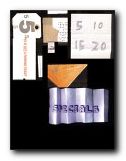
Specials Some of the more interesting are from business cards; CD covers and record albumn sleeves; art gallery exhibition flyers; and print magazine pages. A lot of the ‘design’, it has to be said, is pretty flimsy. But amongst the more substantial offering are web site home portals; designs for promotional packaging; and some curious examples from public signage.

For trivia enthusiasts there are football score sheets; art college doodlings; some amusing, ultra-utilitarian birthday cards; a carrier bag design; three-dimensional postcards, and (I’m not kidding) instructions for making an origami snowball.

Some of the ideas behind the exhibits are more interesting than the finished work itself, but the book is packed with visual stimulation. In fact the dust cover inserts an interesting invitation to aspiring designers – “It’s about more than just typography. If your work isn’t here, let us know, and perhaps you’ll make it into our next book.”

© Roy Johnson 2002

specials   Buy the book at Amazon UK

specials   Buy the book at Amazon US


Claire Catterall (ed), Specials, London: Booth-Clibborn, 2001, pp. ISBN: 1861542208


More on design
More on media
More on web design

Filed Under: Graphic design Tagged With: Graphic design, Specials, Typography

Stop Stealing Sheep

July 19, 2009 by Roy Johnson

best-seller on the basics of typography and page design

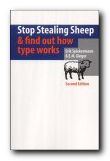
Don’t worry about the quirky title. Just pay attention to what’s on offer. This is a popular beginner’s guide to the appreciation of type which teaches by good example. Every page is a mini-tutorial in good design – an elegant balance of body text, pull quotes, graphics, and a interesting variety of fonts, weights, and sizes. Spiekermann and Ginger start with the issue of appreciating and selecting typefaces for specific purposes. There are guidance notes on the provenance of the typefaces they discuss, and they take the line that context is all.

Stop Stealing SheepThat is, the value of a font can only be seen when it is put into use, and is seen where it will be used – on the page or screen. A lot of their exposition is conducted via extended metaphors – families, music, driving, and human character – which sometimes seem rather strained. But they do cover all the basics of typography: selection of font type, size, and weight; word and line spacing; and page design.

Make sure you get the second edition. It’s a big improvement on the first. Lots of colour has been added to the pages, and the topics they discuss now include the latest developments in font technology. They also explain how to choose type for the best effects on Web pages, email, and writing for the screen.

The emphasis is on visually exciting graphic examples, rather than a ponderous lecture on typography. That’s probably what has made this book such a best-seller. It’s an introduction which is entertaining and breathes enthusiasm for the subject of tasteful design. It’s also an elegant production in its own right.

© Roy Johnson 2002

stop stealing sheep Buy the book at Amazon UK

stop stealing sheep Buy the book at Amazon US


Erik Spiekermann & E.M. Ginger, Stop Stealing Sheep & find out how type works, Mountain View (CA) Adobe Press, 2nd edition 2002, pp.192, ISBN 0201703394


More on typography
More on technology
More on digital media


Filed Under: Typography Tagged With: Design, Fonts, Graphic design, Information design, Stop Stealing Sheep, Typography

T.S.Eliot – Poems

October 3, 2009 by Roy Johnson

Hogarth Press first edition book jacket designs


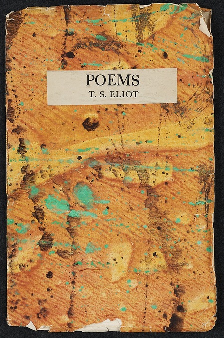
T.S.Eliot - Poems - first edition

 
T.S. Eliot, Poems (1918)

This was the third publication of the Hogarth Press. It includes the poems ‘The Hippopotamus’, ‘Le spectateur’, ‘Mélange adultère de tout’, ‘Lune de miel’, ‘Sweeney among the Nightingales’, ‘Mr. Eliot’s Sunday Morning Service’, and ”Whispers of immortality’. All seven of the poems had appeared previously in the Little Review.

“In 1918 we printed two small books: Poems by T.S. Eliot and Kew Gardens by Virginia. Of Tom’s Poems we printed rather fewer than 250 copies. We published it in May 1919 price 2s. 6d. and it went out of print in the middle of 1920.

We took a good deal of trouble to find some rather unusual, gay Japanese paper for the covers. For many years we gave much time and care to find beautiful, uncommon, and sometimes cheerful paper for binding our books, and, as the first publishers to do this, I think we started a fashion which many of the regular, old established publishers followed. We got papers from all over the place, including some brilliantly patterned from Czechoslovakia, and we also had some marbled covers made for us by Roger Fry’s daughter in Paris. I bought a small quantity of Caslon Old Face Titling type and used it for printing the covers.

Caslon Old Style Titling Font

Caslon Old Style Titling Font

The publication of T.S.Eliot’s Poems must be marked as a red letter day for the Press and for us … Tom showed us some of the poems which he had just written and we printed seven of them and published them in the slim paper covered book. It included three remarkable poems which are still, I think, vintage Eliot: ‘Sweeney among the Nightingales’, ‘Mr. Eliot’s Sunday Morning Service’. and ”Whispers of immortality’.”

Leonard Woolf, An Autobiography

previousnext


Hogarth Press studies

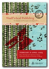
Woolf's-head Publishing Woolf’s-head Publishing is a wonderful collection of cover designs, book jackets, and illustrations – but also a beautiful example of book production in its own right. It was produced as an exhibition catalogue and has quite rightly gone on to enjoy an independent life of its own. This book is a genuine collector’s item, and only months after its first publication it started to win awards for its design and production values. Anyone with the slightest interest in book production, graphic design, typography, or Bloomsbury will want to own a copy the minute they clap eyes on it.

Woolf's-head Publishing Buy the book at Amazon UK
Woolf's-head Publishing Buy the book at Amazon US

The Hogarth Press Leonard and Virginia Woolf as Publishers: Hogarth Press, 1917-41 John Willis brings the remarkable story of Leonard and Virginia Woolf’s success as publishers to life. He generates interesting thumbnail sketches of all the Hogarth Press authors, which brings both them and the books they wrote into sharp focus. He also follows the development of many of its best-selling titles, and there’s a full account of the social and cultural development of the press. This is a scholarly work with extensive footnotes, bibliographies, and suggestions for further reading – but most of all it is a very readable study in cultural history.

The Hogarth Press Buy the book at Amazon UK
The Hogarth Press Buy the book at Amazon US

© Roy Johnson 2005


Filed Under: Hogarth Press Tagged With: Art, Bloomsbury, Graphic design, Hogarth Press, Literary studies, T.S.Eliot

T.S.Eliot – The Waste Land

October 4, 2009 by Roy Johnson

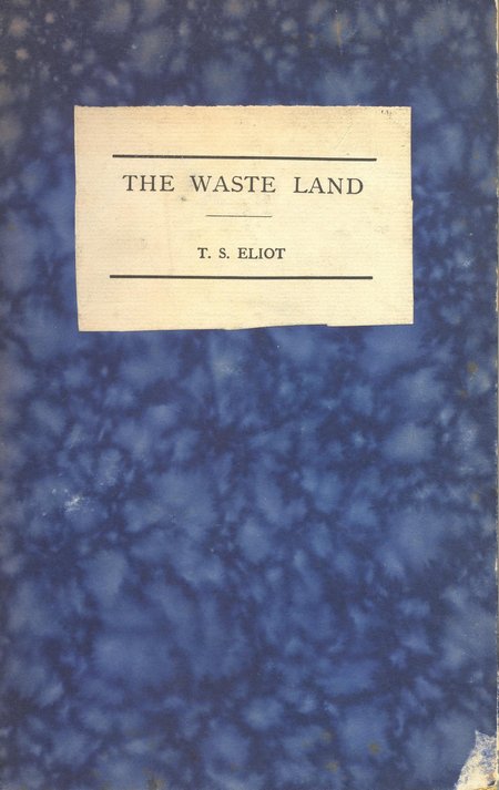
Hogarth Press first edition book jacket designs


The Waste Land - first edition

 
T.S. Eliot, The Waste Land (1923)

This was published three times in America before it appeared under the Hogarth Press imprint. First it had been published in Criterion (October 1922), the magazine of which Eliot himself was editor, which was funded by rich patroness Lady Rothermere. Then it was published in Dial the following month, still without the famous explanatory ‘notes’. Finally it was published in book form by Boni and Liveright in December 1922.

Eliot himself suggested that the explanatory notes were an addition of ‘bogus scholarship’ devised to bulk out the number of pages in an otherwise slim publication. Virginia Woolf set the entire poem in type herself. It was issued in an edition of 470 copies with blue marbled boards probably prepared by Vanessa Bell. T.S. Eliot earned £7 5s. in royalties.

The Waste Land went on to become one of the most famous texts of the modernist movement – along with Virginia Woolf’s Mrs Dalloway and James Joyce’s Ulysses – and an iconic publication for modern poetry.

previousnext


Hogarth Press studies

Woolf's-head Publishing Woolf’s-head Publishing is a wonderful collection of cover designs, book jackets, and illustrations – but also a beautiful example of book production in its own right. It was produced as an exhibition catalogue and has quite rightly gone on to enjoy an independent life of its own. This book is a genuine collector’s item, and only months after its first publication it started to win awards for its design and production values. Anyone with the slightest interest in book production, graphic design, typography, or Bloomsbury will want to own a copy the minute they clap eyes on it.

Woolf's-head Publishing Buy the book at Amazon UK
Woolf's-head Publishing Buy the book at Amazon US

The Hogarth Press Leonard and Virginia Woolf as Publishers: Hogarth Press, 1917-41 John Willis brings the remarkable story of Leonard and Virginia Woolf’s success as publishers to life. He generates interesting thumbnail sketches of all the Hogarth Press authors, which brings both them and the books they wrote into sharp focus. He also follows the development of many of its best-selling titles, and there’s a full account of the social and cultural development of the press. This is a scholarly work with extensive footnotes, bibliographies, and suggestions for further reading – but most of all it is a very readable study in cultural history.

The Hogarth Press Buy the book at Amazon UK
The Hogarth Press Buy the book at Amazon US

© Roy Johnson 2005


Filed Under: Hogarth Press Tagged With: Art, Bloomsbury, Graphic design, Hogarth Press, Literary studies, T.S.Eliot, The Waste Land

The Complete Manual of Typography

June 18, 2009 by Roy Johnson

encyclopedia of type and typography

This is a very elegantly-produced book which sets out the basic principles of type design and page layout. It bids to stand as a classic alongside the reigning Bible of typography – Robert Bringhurst’s The Elements of Typographic Style, which always comes top of typography favourites lists. It includes the basic concepts and anatomy of good typography: how type came about, how to set type, and the difference between type and fonts.

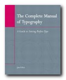
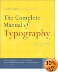
The Complete Manual of Typography Then comes how to manage fonts – techniques for working with leading, kerning, and managing indentation and alignment. There are sections which deal with setting type in language-specific instances such as using foreign character sets, which specialists will find useful. There’s even a chapter on dealing with style sheets – something which really does bridge the gap between print and digital culture. What’s interesting about this book is that it’s not just a historical survey. It covers all aspects of type design and applications of them in print and screen. It’s packed with illustrative examples, and anybody who has the slightest interest in typography will find something of interest in its detailed exposition of the basics. It’s an ambitious book, because it seeks to deal with type from Gutenburg to digital fonts. And it does it very well. There’s an extensive glossary and a very good index. Only the bibliography was rather disappointing.

For those who are still interested in using type for print rather than on screen, Felici covers all the niceties of font weight, ligatures, letter-spacing, hyphenation, and wrapping text around graphics. There are plenty of examples of well presented typesetting, with detailed analyses showing the subtle differences between them. This is like a mastercourse in the finer points of typography. He also covers issues such as footnotes, endnotes, picture captions, and bibliographies.

feliciThere’s some amazing detail. I hadn’t appreciated before the difference between a standard and a punctuating m-dash. This stuff will appeal to typography buffs – and it’s all beautifully illustrated.

I also enjoyed a section on document structure, in which he shows you how to arrange headings and various levels of sub-headings. This section could be useful for those people [like me] currently grappling with the possibilities of cascading style sheets.

For a book which covers the historical tradition as well as digital innovations, this is a remarkable achievement. As Frank Romano says in his introduction:

At this point, most people who work with type have to catch up with both what is old and what is new in typography. Fortunately, you have the solution in your hands: a concise, beautiful book that pulls together everything you need to produce great typography.

© Roy Johnson 2003

Buy the book at Amazon UK

Buy the book at Amazon US


James Felici, The Complete Manual of Typography, Berkeley (CA): Peachpit Press, 2003, pp.360, ISBN 0321127307


More on typography
More on technology
More on digital media


Filed Under: Typography Tagged With: Fonts, Graphic design, The Complete Manual of Typography, Typefaces, Typography

The Designer

July 17, 2009 by Roy Johnson

fifty years of change in image, training, and techniques

Rosemary Sassoon is a distinguished authority on typography, writing, and education – with publications as diverse as Computers and Typography, Signs, Symbols and Icons, and Handwriting of the Twentieth Century. What marks her out from many other writers on these issues is that she tends to test her ideas in the classroom – either by designing fonts to assist children’s reading [Sassoon Primary] or researching how children learn to write. It was she who came up with the observation that the way children hold a pen has no relation to or effect on the clarity of their writing.

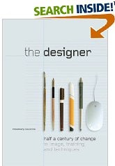
The DesignerHer latest book is about the development and training of designers over the last half century. She begins just after the end of the second world war, when although design was harnessed to promote post-war recovery, designers were regarded as second-class citizens. The Festival of Britain (1951) did little to change matters, even though the exhibition was successful. Designers were labelled ‘commercial artists’. Now, fifty-odd years on, some designers are better known than [‘fine’] artists. How times change.

She considers the neglect of drawing skills in design training and sees this as a sad loss which began with the encouragement of ‘conceptual’ design in the 1970s – one which has accelerated with the arrival of computer-assisted deign (CAD).

Much of the evidence she produces for the changes in design education comes from interviews with professional designers and teachers who look back on their own educational history. Common themes include regret at the demise of the apprenticeship system; scepticism regarding the use of computers in the teaching of typography; regret that design students often avoid theory; and despair over class sizes which during this period have risen from 15-20 to 100+ – a phenomenon which results in such practices as ‘hot-desking’ and ‘elearning’ to cope with these numbers and spread scarce resources further and further.

The second part of the book is a series of essays on contemporary issues and prospects for the future written by distinguished practitioners. They reflect on their own professional development and the manner in which teaching design has changed all over the world in the last fifty years.

Then in the third part of the book (and I have to say its the best-written and illustrated) Rosemary Sassoon reflects on her own experience and practice as a designer. She went through quite a random but eminently practical training as a calligraphist and a textile designer. She gives a first hand account of what practical commercial design involved – working with different types of printing and reproduction, then negotiating with clients and sales representatives.

In a quite amazing career where one thing led to another, she became a regularly published writer on typography, a teacher, a government consultant on writing, with particular reference to children and stroke victims, and a book designer. And one supposes she will go on this way until one day she joins the Big Design Studio in the sky.

© Roy Johnson 2008

The Designer   Buy the book at Amazon UK

The Designer   Buy the book at Amazon US


Rosemary Sassoon, The Designer: half a century of change in image, training, and techniques, Bristol: Intellect, 2008, pp.144, ISBN: 1841501956


More on design
More on media
More on web design

Filed Under: Graphic design Tagged With: Design, Education, Graphic design, The Designer, Writing

The Elements of Typographic Style

May 31, 2009 by Roy Johnson

Best-selling classic manual – the typographist’s Bible

Subscribers to Internet lists dealing with fonts and typography often ask “Which books would you recommend as a guide to good design principles?”. And no matter how many responses emerge, one book comes out on top every time – Robert Bringhurst’s The Elements of Typographic Style. It’s a book packed with design wisdom. Bringhurst has produced what is essentially a first principles of typography – a grammar of good taste based on the relationship between form and content of printed matter.

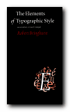
The Elements of Typographic StyleIt’s also a very beautiful book in its own right. You will not fail to discover visual pleasures on almost every page, and the text is illustrated with such an astonishing variety of beautiful fonts, that this almost doubles as a catalogue of type designs. It is obvious from almost every word that he’s thought profoundly about the fundamental issues of printed words on the page, and he often has insights to offer on topics most of us take for granted. He can conjour poetry out of the smallest detail, and he offers a scholarly yet succinct etymology of almost every mark that can be made – from the humble hyphen to the nuances of serifs on Trajan Roman or a Carolingian Majuscule.

The well-made page is now what it was then: a window into history, language and the mind: a map of what is being said and a portrait of the voice that is silently speaking.

As you would expect, he traces the development of type from its origins in eleventh century China to the present, and he deals with such extremely subtle distinctions as the differences in quality of letter forms produced by pressing hot metal onto paper, by offset litho (laying the letter on top of the paper) or by the digital means of charged electrons on the screen. he doesn’t actually have much to say about computers and typography, and yet his brief comments summarise almost everything there is to say about digital type:

Good text faces for the screen are therefore as a rule faces with low contrast, a large torso, open counters, sturdy terminals, and slab serifs or no serifs at all. [And he might have added – ‘a large x-height’.]

He does seem to become a little fanciful when discussing the mathematics of page proportions, especially when maintaining an extended comparison with the musical scale, and he misses the chance to give historical examples of page design, rather than the mathematical tables which populate this part of the book. But it seems almost churlish to complain when everything is so beautifully presented.

He ends with two very useful chapters – one of which analyses commonly available fonts (“prowling the specimen books” as he calls it). Paragraph-length potted histories are followed by suggestions on how the font is best used. This is typical of the manner in which he very elegantly combines scholarship and a cultivated taste with the requirements of a practical guidance manual.

Bringhurst is also a novelist, and he brings a prose style of some distinction to the subject, ornamenting his text with the lyrical jargon of typography, and quite obviously relishing terms such at the pilcrow, the octothorpe, the virgule, guillemets and chevrons, and the solidus; as well as the romance of small caps, analphabetic symbols, the shape of pages, the order of footnote symbols, the ‘looser dressing’ and the ‘larger torso’ of a font.

The book ends with a fascinating tour of sorts and characters, revealing the subtle functions of the cedilla and the ogonek; the umlaut and the diaeresis; the ligatures aesc, and oethel; the prime, the macron, and the vinculum. He completes this tour de force with several more appendices: a glossary of typographic terms; a listing of type designers; another of typefoundries; a recapitulation of the main recommendations in the text; and a list of further reading.

This is a wonderful book which fully deserves its widespread reputation as a classic and the ultimate guide for laying out pages in print of on screen. Anyone who wishes to gain insights into the aesthetics and the finer details of good design should read this book. Anyone with a serious typographic intent should own it.

© Roy Johnson 2000

The Elements of Typographic Style   Buy the book at Amazon UK

The Elements of Typographic Style   Buy the book at Amazon US


Robert Bringhurst, The Elements of Typographic Style (2nd edn), Toronto: Hartley & Marks, 1996, pp.351, ISBN: 0881791326


More on typography
More on design
More on media
More on web design

Filed Under: Graphic design, Typography Tagged With: Fonts, Graphic design, Information design, Printing, Typographic style, Typography

The End of Print

June 8, 2009 by Roy Johnson

illustrated guide to  popular US avant-garde typographist

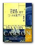
David Carson designs jarring and visually chaotic magazine spreads, posters, and print ads which have consistently challenged the boundaries of legibility and typography. His modest San Diego, California, studio has become the epicentre of a new graphic anti-aesthetic that has stirred ongoing debate among fellow designers such as Neville Brody, who observed that his work prophesies ‘the end of print’. This comment inspired the title of Carson’s new book, the first comprehensive collection of his decade-long output of graphic imagery.

The End of PrintIn past lives, Carson was a top-ranked competitive surfer and a high school sociology teacher. However, during a two-week workshop on graphic arts he discovered his calling. He landed his first major design assignment as art director of Transworld Skateboarding in 1983, and he later moved on to Surf magazine. In 1990, Carson headed the much-praised Beach Culture.

This is where his irreverent but often ingenious layouts consistently pitted editorial substance against graphic style. Carson’s creative vision came out on top – in its six-issue stint, Beach Culture won over 150 design awards. As the art director of Ray Gun, his unconventional look has been shamelessly emulated by a slew of similar start-up magazines.

Recently, Carson has shifted from spokesman for Left-Coast subculture to the corporate arena, taking on larger projects that include print ads for Nike and a television commercial for Citibank, as well as collaborations with musician David Byrne and photographer Albert Watson.

The End of Print was designed by Carson, and ironically, this proves to be the most disappointing aspect of the book. For those designers and readers who want to learn more about Carson’s graphic work and philosophy must do so on his terms. The text of the book is presented in the confusing and often incoherent typography typical of a Ray Gun layout. Those not willing to read the garbled introduction and inarticulate essays may surrender in frustration. However the book manages to stand on its own as a purely visual document, a fascinating chronicle of David Carson’s creative mind.

Like the collage artist Kurt Schwitters, who collected his materials from curbside rubbish, Carson finds much of his inspiration in the visual garbage of modern-day living. Handlettered signs, torn and layered poster kiosks and the eroded storefronts encountered in city streets serve as backdrops which Carson equates into the digital realm. Many of these found objects and photographs are reproduced in the book and they offer insight into Carson’s design approach.

One page reproduces a Carson ad selling a Beach Culture T-shirt sight unseen, with the premise that “if you like the look of the magazine, you probably would like the shirt.” Likewise, if you like the design of David Carson, you probably will like this book.

© Philip Krayna 2000

David Carson   Buy the book at Amazon UK

David Carson   Buy the book at Amazon US


Lewis Blackwell and David Carson, The End of Print: The Graphic Design Of David Carson, Chronicle Books, 1995, pp.160, ISBN: 0811830241


More on typography
More on design
More on media
More on web design


Filed Under: Individual designers, Typography Tagged With: David Carson, Graphic design, Media, The End of Print, Typography

The Fundamentals of Typography

May 21, 2009 by Roy Johnson

The Fundamentals of Typography

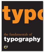
I like books explaining typography, because they are forced to illustrate the points they are making, and the result is usually pages with plenty of visual interest. That’s what makes books such as Eric Spiekermann’s Stop Stealing Sheep and James Felici’s The Complete Manual of Typography so popular. The Fundamentals of Typography covers similar ground in a historically comprehensive fashion. Its first part covers the development of language and the history of writing systems.

The Fundamentals of Typography This shows the gradual evolution of alphabets and the gestation of typefaces or font families. These expand after the invention of printing in the Renaissance then explode into a galaxy of styles following industrialisation. Gavin Abrose and Paul Harris trace this in detail during the second part of the last century, following each step of recent type design.

Every page is fully illustrated. In fact the explanatory text is almost an extended caption on each graphic. This keeps the pages lively, but sometimes sinks to the level of triviality when presenting a major item. The influential Swiss typographer Jan Tschichold for instance is summarised in a three sentence paragraph.

The next part of the book deals with the basic issues of typography – font selection, the spacing of letters and type, page design, kerning, small capitals, text alignment, and leading. I was glad to see that they consider type on screen as well as in print, and they end with a consideration of very basic design issues such as the use of grids, page texture, and legibility.

There’s quite an interesting section mid-book on the nature of page proportions (something the aforementioned Tschichold discusses in The Form of the Book) and the disposition of type on a page.

The latter part of the book offers a lot of interesting advice on the use of diacritical marks (accents), numbers, fractions, ligatures, diphthongs, small capitals, and also examples showing some incredibly subtle adjustments of the alignment of bullet points and hyphens. All the arguments being made are illustrated with real life examples from the commercial world of brochures and advertising design.

In fact that is probably one of the strongest features of this book, even though it is given a low profile. It’s important that young designers see not only a theoretical possibility, but its implementation in the real world in which they are probably seeking work. I was also glad to see that there was a webliography listing the designers represented, because these guys often get missed out in a general survey of this kind.

The last part of the book deals with digital typography – font sets which can be generated from a basic style. It also covers issues of readability and legibility (not the same thing) and type as image and graphic symbol.

© Roy Johnson 2008

Buy the book at Amazon UK

Buy the book at Amazon US


Gavin Ambrose & Paul Harris, The Fundamentals of Typography, Lausanne: AVA, 2006, pp.176, ISBN 2940373450


More on typography
More on technology
More on digital media


Filed Under: Typography Tagged With: Fonts, Graphic design, Typography

The Graphic Language of Neville Brody

May 31, 2009 by Roy Johnson

best-selling illustrated  guide to popular typographist

Neville Brody is a now-famous UK graphic designer who shot to prominence in the 1970s. He became artistic director of The Face – a youth and fashion magazine which he revamped – and in doing so set the pace for magazine cover design which persists to this day. Many UK magazines are still designed on the principles he established – of a bold, typographically interesting title at the top of the page (Maxim, Loaded, Mojo,) surmounting a single photographic portrait. In fact he is part graphic designer and part typographer.

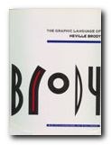
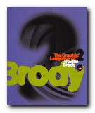
The Graphic Language of Neville BrodyAdvertising and logos throughout the world sport his typefaces and their variants. Only the other day I noticed an ad for shoes on the back of a bus which was composed entirely of one of his fonts. He comes up with designs which draw their inspiration from constructivist, modernist, and expressionist designs of the inter-war years, but he gives them a contemporary twist. These are two very stylish publications celebrating his achievement – and very attractive publications in their own right. Even if you are put off by the fact that Brody applies his undoubted talents to the ephemeral products of the worlds of pop and fashion, it’s impossible to escape his harmonious sense of form and crisp sense of design on every page.

The Graphic Language of Neville BrodyThere are pop adverts, albumn and magazine covers, corporate logos and design, fashion magazine plates, book dust jackets, letterheads, and even humble business cards amongst the designs illustrated here. The accompanying text by Jon Wozencroft is enthusiastic without being sycophantic, and there is a good scholarly apparatus which gives full details of sources. However, the principal value of these two volumes is that they are beautifully designed books, full of good page layouts, vivid illustrations, and well-chosen typography. If they are out of print by the time you read this, make the effort to track them down. You will not regret it.

© Roy Johnson 2002


Volume 1

Jon Wozencroft, The Graphic Language of Neville Brody, London: Thames and Hudson, 1988, pp.160, ISBN: 0500274967

The Graphic Language of Neville Brody   Buy the book at Amazon UK
The Graphic Language of Neville Brody   Buy the book at Amazon US


Volume 2

Jon Wozencroft, The Graphic Language of Neville Brody 2, London: Thames and Hudson, 1994, pp.176, ISBN: 0500277702

The Graphic Language of Neville Brody   Buy the book at Amazon UK
The Graphic Language of Neville Brody   Buy the book at Amazon US


More on typography
More on design
More on media
More on web design

Filed Under: Graphic design, Individual designers, Typography Tagged With: Fonts, Graphic design, Neville Brody, Typography

  • « Previous Page
  • 1
  • …
  • 7
  • 8
  • 9
  • 10
  • 11
  • …
  • 13
  • Next Page »

Get in touch

info@mantex.co.uk

Content © Mantex 2016
  • About Us
  • Advertising
  • Clients
  • Contact
  • FAQ
  • Links
  • Services
  • Reviews
  • Sitemap
  • T & C’s
  • Testimonials
  • Privacy

Copyright © 2025 · Mantex

Copyright © 2025 · News Pro Theme on Genesis Framework · WordPress · Log in