Mantex

Tutorials, Study Guides & More

  • HOME
  • REVIEWS
  • TUTORIALS
  • HOW-TO
  • CONTACT
>> Home / Archives for Typography

The Elements of Typographic Style

May 31, 2009 by Roy Johnson

Best-selling classic manual – the typographist’s Bible

Subscribers to Internet lists dealing with fonts and typography often ask “Which books would you recommend as a guide to good design principles?”. And no matter how many responses emerge, one book comes out on top every time – Robert Bringhurst’s The Elements of Typographic Style. It’s a book packed with design wisdom. Bringhurst has produced what is essentially a first principles of typography – a grammar of good taste based on the relationship between form and content of printed matter.
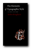
The Elements of Typographic StyleIt’s also a very beautiful book in its own right. You will not fail to discover visual pleasures on almost every page, and the text is illustrated with such an astonishing variety of beautiful fonts, that this almost doubles as a catalogue of type designs. It is obvious from almost every word that he’s thought profoundly about the fundamental issues of printed words on the page, and he often has insights to offer on topics most of us take for granted. He can conjour poetry out of the smallest detail, and he offers a scholarly yet succinct etymology of almost every mark that can be made – from the humble hyphen to the nuances of serifs on Trajan Roman or a Carolingian Majuscule.

The well-made page is now what it was then: a window into history, language and the mind: a map of what is being said and a portrait of the voice that is silently speaking.

As you would expect, he traces the development of type from its origins in eleventh century China to the present, and he deals with such extremely subtle distinctions as the differences in quality of letter forms produced by pressing hot metal onto paper, by offset litho (laying the letter on top of the paper) or by the digital means of charged electrons on the screen. he doesn’t actually have much to say about computers and typography, and yet his brief comments summarise almost everything there is to say about digital type:

Good text faces for the screen are therefore as a rule faces with low contrast, a large torso, open counters, sturdy terminals, and slab serifs or no serifs at all. [And he might have added – ‘a large x-height’.]

He does seem to become a little fanciful when discussing the mathematics of page proportions, especially when maintaining an extended comparison with the musical scale, and he misses the chance to give historical examples of page design, rather than the mathematical tables which populate this part of the book. But it seems almost churlish to complain when everything is so beautifully presented.

He ends with two very useful chapters – one of which analyses commonly available fonts (“prowling the specimen books” as he calls it). Paragraph-length potted histories are followed by suggestions on how the font is best used. This is typical of the manner in which he very elegantly combines scholarship and a cultivated taste with the requirements of a practical guidance manual.

Bringhurst is also a novelist, and he brings a prose style of some distinction to the subject, ornamenting his text with the lyrical jargon of typography, and quite obviously relishing terms such at the pilcrow, the octothorpe, the virgule, guillemets and chevrons, and the solidus; as well as the romance of small caps, analphabetic symbols, the shape of pages, the order of footnote symbols, the ‘looser dressing’ and the ‘larger torso’ of a font.

The book ends with a fascinating tour of sorts and characters, revealing the subtle functions of the cedilla and the ogonek; the umlaut and the diaeresis; the ligatures aesc, and oethel; the prime, the macron, and the vinculum. He completes this tour de force with several more appendices: a glossary of typographic terms; a listing of type designers; another of typefoundries; a recapitulation of the main recommendations in the text; and a list of further reading.

This is a wonderful book which fully deserves its widespread reputation as a classic and the ultimate guide for laying out pages in print of on screen. Anyone who wishes to gain insights into the aesthetics and the finer details of good design should read this book. Anyone with a serious typographic intent should own it.

© Roy Johnson 2000

The Elements of Typographic Style   Buy the book at Amazon UK

The Elements of Typographic Style   Buy the book at Amazon US


Robert Bringhurst, The Elements of Typographic Style (2nd edn), Toronto: Hartley & Marks, 1996, pp.351, ISBN: 0881791326


More on typography
More on design
More on media
More on web design

Filed Under: Graphic design, Typography Tagged With: Fonts, Graphic design, Information design, Printing, Typographic style, Typography

The End of Print

June 8, 2009 by Roy Johnson

illustrated guide to  popular US avant-garde typographist

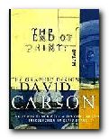
David Carson designs jarring and visually chaotic magazine spreads, posters, and print ads which have consistently challenged the boundaries of legibility and typography. His modest San Diego, California, studio has become the epicentre of a new graphic anti-aesthetic that has stirred ongoing debate among fellow designers such as Neville Brody, who observed that his work prophesies ‘the end of print’. This comment inspired the title of Carson’s new book, the first comprehensive collection of his decade-long output of graphic imagery.

The End of PrintIn past lives, Carson was a top-ranked competitive surfer and a high school sociology teacher. However, during a two-week workshop on graphic arts he discovered his calling. He landed his first major design assignment as art director of Transworld Skateboarding in 1983, and he later moved on to Surf magazine. In 1990, Carson headed the much-praised Beach Culture.

This is where his irreverent but often ingenious layouts consistently pitted editorial substance against graphic style. Carson’s creative vision came out on top – in its six-issue stint, Beach Culture won over 150 design awards. As the art director of Ray Gun, his unconventional look has been shamelessly emulated by a slew of similar start-up magazines.

Recently, Carson has shifted from spokesman for Left-Coast subculture to the corporate arena, taking on larger projects that include print ads for Nike and a television commercial for Citibank, as well as collaborations with musician David Byrne and photographer Albert Watson.

The End of Print was designed by Carson, and ironically, this proves to be the most disappointing aspect of the book. For those designers and readers who want to learn more about Carson’s graphic work and philosophy must do so on his terms. The text of the book is presented in the confusing and often incoherent typography typical of a Ray Gun layout. Those not willing to read the garbled introduction and inarticulate essays may surrender in frustration. However the book manages to stand on its own as a purely visual document, a fascinating chronicle of David Carson’s creative mind.

Like the collage artist Kurt Schwitters, who collected his materials from curbside rubbish, Carson finds much of his inspiration in the visual garbage of modern-day living. Handlettered signs, torn and layered poster kiosks and the eroded storefronts encountered in city streets serve as backdrops which Carson equates into the digital realm. Many of these found objects and photographs are reproduced in the book and they offer insight into Carson’s design approach.

One page reproduces a Carson ad selling a Beach Culture T-shirt sight unseen, with the premise that “if you like the look of the magazine, you probably would like the shirt.” Likewise, if you like the design of David Carson, you probably will like this book.

© Philip Krayna 2000

David Carson   Buy the book at Amazon UK

David Carson   Buy the book at Amazon US


Lewis Blackwell and David Carson, The End of Print: The Graphic Design Of David Carson, Chronicle Books, 1995, pp.160, ISBN: 0811830241


More on typography
More on design
More on media
More on web design

Filed Under: Individual designers, Typography Tagged With: David Carson, Graphic design, Media, The End of Print, Typography

The Form of the Book

July 20, 2009 by Roy Johnson

short essays on the finer points of book design

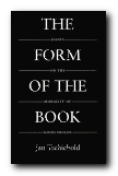
Jan Tschichold [pronounced ‘Chick-old’] is probably best known in the UK for his work in designing Penguin paperbacks in the late 1940s. He was a German refugee who had made his mark as a radical modernist in 1928 with the publication of Die Neue Typografie. The collection of short and elegantly written essays in The Form of the Book are however largely arguments in favour of traditional, hard-earned craftsmanship, artistic self-effacement, and typographical restraint. As Robert Bringhurst puts it with characteristic elegance in his introduction: ‘Like Stravinsky, after making his reputation as a rebel, [Tschichold] entered on a long and productive neo-classical phase.’

The Form of the BookWritten between 1937 and 1975, these essays discuss every element of the traditional printed book. Tschichold ranges from its shape and size, its cover and title page, via its typeface, margins, paragraphs and section headings, through to footnotes, its index, colophon, and even the blank pages before its final covers. This is the work of a master craftsman sharing a lifetime’s experience, and it’s a delight to read. The German tradition out of which these observations spring is betrayed by his habit of formulating arguments in the imperative mode as a series of abstract absolutes. He also sometimes poses his arguments as quite witty aphorisms:

Comfortable legibility is the absolute benchmark for all typography … Good typography can never be humorous … a truly beautiful book cannot be a novelty. It must settle for mere perfection instead.

It’s interesting that Tschichold, the author of the modernist New Typography, should take such a traditionalist line, with his concern for harmony, proportion, tact,balance, and good taste. This collection includes an essay on ‘The Importance of Tradition’ which is effectively a refutation of his own ideas written in 1928. He also has essay titles which are almost amusingly didactic: ‘Why the Beginnings of Paragraphs Must Be Indented’, and he has firm views on book design, page proportions, title pages, house rules, indentation, footnotes, punctuation marks, and even the colour of paper.

On the subject of the book page and its type area, there are some pages of quite mathematical minutiae, but this supports the overall impression one gains that the secret of typographical success – as with so much else – lies in the details. He loves the finer points of design and book production, and there are eloquent passages on the spacing of ellipses, the thickness of an em-dash, the positioning of illustrations, and – two of his pet hates – white paper and the design of book jackets.

For those with a serious interest in typography, this is a ‘must have’. It belongs alongside works such as Robert Bringhurst’s Elements of Typographic Style as a modern classic. Even if it’s out of print – order it, or keep looking. It’s worth the effort.

© Roy Johnson 2002

The Form of the Book   Buy the book at Amazon UK

The Form of the Book   Buy the book at Amazon US


Jan Tschichold, The Form of the Book: Essays on the Morality of Good Design, Vancouver, BC: Hartley & Marks, 1991, pp.180, ISBN: 0881791164


More on typography
More on design
More on media
More on web design

Filed Under: Graphic design, Typography Tagged With: Book design, Jan Tschichold, The Form of the Book, Typography

The Fundamentals of Typography

May 21, 2009 by Roy Johnson

The Fundamentals of Typography

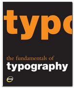
I like books explaining typography, because they are forced to illustrate the points they are making, and the result is usually pages with plenty of visual interest. That’s what makes books such as Eric Spiekermann’s Stop Stealing Sheep and James Felici’s The Complete Manual of Typography so popular. The Fundamentals of Typography covers similar ground in a historically comprehensive fashion. Its first part covers the development of language and the history of writing systems.

The Fundamentals of Typography This shows the gradual evolution of alphabets and the gestation of typefaces or font families. These expand after the invention of printing in the Renaissance then explode into a galaxy of styles following industrialisation. Gavin Abrose and Paul Harris trace this in detail during the second part of the last century, following each step of recent type design.

Every page is fully illustrated. In fact the explanatory text is almost an extended caption on each graphic. This keeps the pages lively, but sometimes sinks to the level of triviality when presenting a major item. The influential Swiss typographer Jan Tschichold for instance is summarised in a three sentence paragraph.

The next part of the book deals with the basic issues of typography – font selection, the spacing of letters and type, page design, kerning, small capitals, text alignment, and leading. I was glad to see that they consider type on screen as well as in print, and they end with a consideration of very basic design issues such as the use of grids, page texture, and legibility.

There’s quite an interesting section mid-book on the nature of page proportions (something the aforementioned Tschichold discusses in The Form of the Book) and the disposition of type on a page.

The latter part of the book offers a lot of interesting advice on the use of diacritical marks (accents), numbers, fractions, ligatures, diphthongs, small capitals, and also examples showing some incredibly subtle adjustments of the alignment of bullet points and hyphens. All the arguments being made are illustrated with real life examples from the commercial world of brochures and advertising design.

In fact that is probably one of the strongest features of this book, even though it is given a low profile. It’s important that young designers see not only a theoretical possibility, but its implementation in the real world in which they are probably seeking work. I was also glad to see that there was a webliography listing the designers represented, because these guys often get missed out in a general survey of this kind.

The last part of the book deals with digital typography – font sets which can be generated from a basic style. It also covers issues of readability and legibility (not the same thing) and type as image and graphic symbol.

© Roy Johnson 2008

Buy the book at Amazon UK

Buy the book at Amazon US


Gavin Ambrose & Paul Harris, The Fundamentals of Typography, Lausanne: AVA, 2006, pp.176, ISBN 2940373450


More on typography
More on technology
More on digital media


Filed Under: Typography Tagged With: Fonts, Graphic design, Typography

The Graphic Language of Neville Brody

May 31, 2009 by Roy Johnson

best-selling illustrated  guide to popular typographist

Neville Brody is a now-famous UK graphic designer who shot to prominence in the 1970s. He became artistic director of The Face – a youth and fashion magazine which he revamped – and in doing so set the pace for magazine cover design which persists to this day. Many UK magazines are still designed on the principles he established – of a bold, typographically interesting title at the top of the page (Maxim, Loaded, Mojo,) surmounting a single photographic portrait. In fact he is part graphic designer and part typographer.

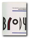
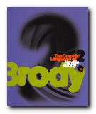
The Graphic Language of Neville BrodyAdvertising and logos throughout the world sport his typefaces and their variants. Only the other day I noticed an ad for shoes on the back of a bus which was composed entirely of one of his fonts. He comes up with designs which draw their inspiration from constructivist, modernist, and expressionist designs of the inter-war years, but he gives them a contemporary twist. These are two very stylish publications celebrating his achievement – and very attractive publications in their own right. Even if you are put off by the fact that Brody applies his undoubted talents to the ephemeral products of the worlds of pop and fashion, it’s impossible to escape his harmonious sense of form and crisp sense of design on every page.

The Graphic Language of Neville BrodyThere are pop adverts, albumn and magazine covers, corporate logos and design, fashion magazine plates, book dust jackets, letterheads, and even humble business cards amongst the designs illustrated here. The accompanying text by Jon Wozencroft is enthusiastic without being sycophantic, and there is a good scholarly apparatus which gives full details of sources. However, the principal value of these two volumes is that they are beautifully designed books, full of good page layouts, vivid illustrations, and well-chosen typography. If they are out of print by the time you read this, make the effort to track them down. You will not regret it.

© Roy Johnson 2002


Volume 1

Jon Wozencroft, The Graphic Language of Neville Brody, London: Thames and Hudson, 1988, pp.160, ISBN: 0500274967

The Graphic Language of Neville Brody   Buy the book at Amazon UK
The Graphic Language of Neville Brody   Buy the book at Amazon US


Volume 2

Jon Wozencroft, The Graphic Language of Neville Brody 2, London: Thames and Hudson, 1994, pp.176, ISBN: 0500277702

The Graphic Language of Neville Brody   Buy the book at Amazon UK
The Graphic Language of Neville Brody   Buy the book at Amazon US


More on typography
More on design
More on media
More on web design

Filed Under: Graphic design, Individual designers, Typography Tagged With: Fonts, Graphic design, Neville Brody, Typography

The Manual of Typography

July 9, 2009 by Roy Johnson

best-selling introduction to type and good page design

This book appears regularly in the Top Ten list of typography manuals – and rightly so. Although The Manual of Typography began life as one in a series of general introductions to arts and crafts, it has established its reputation on the strength of its scholarship, clarity, and beautiful presentation. McLean covers all the basics. First comes a brief historical survey; then the issues of legibility; practical considerations of paper types and composition methods; book design; and what he modestly calls ‘jobbing typography’. There are notes, a list of material suppliers, a brief index, and an excellent list of further reading. It’s easy to see why this book has become one of the standard texts on its subject.

The Manual of TypographyThe design of the book is based on a simple three-column grid, with a subtle rhythm of graphic illustration. This varies from full page blow-ups of a single letter design to marginal examples of icons, logos and glyphs accompanied by explanations of a scholarly density.

Yet despite craft origins, it’s a text which unites a profoundly sophisticated sense of taste with the practical aspects of typography. He ranges from the balance of page layout in art-books, to the nuances of letterspacing in railway timetables. From the analysis of six versions of the same font, to recommendations for clear systems of book illustration captions. It stops short of the computer age – but the range of reference and the elegance of the illustrations make this a must for anyone in visual presentation.

Almost every page of this book is a visual delight. Do yourself a favour. If you want to discover the the delight, the subtlety, and the craft of typographical presentation – this is the place to start. Whilst fashions in grunge and distressed type styles have come and gone in the last ten years, this book has remained in print and become a classic.

© Roy Johnson 2003

Buy the book at Amazon UK

Buy the book at Amazon US


Ruari McLean, The Thames and Hudson Manual of Typography, London: Thames and Hudson, 1980, pp.280, ISBN 0500680221


More on typography
More on technology
More on digital media


Filed Under: Typography Tagged With: Graphic design, The Manual of Typography, Typography

The New Typography

July 20, 2009 by Roy Johnson

classic design manifesto of the Modernist movement

Jan Tschichold [pronounced ‘Chick-old’] was a typographist and graphic designer whose life and work straddled two eras. He was born in Leipzig in 1902, and moved to Berlin to be part of the modernist (and left wing) artistic movement which centred round the Bauhaus in the 1920s. There he met and worked with all the important figures of the Modernist movement – Laszlo Moholy-Nagy, El Lissitzky, Kurt Schwitters – whose work in graphic design is used profusely throughout this book. In 1947 he emigrated to the UK and amongst other things designed the re-launch of the Penguin paperback series that became so successful.

The New TypographyDie Neue Typografie was first published in Berlin when Tschichold was only twenty-six years old, yet it represented – as Robin Kinross explains in an elegant and scholarly introduction – “the manifestation in the sphere of printed communication of the modern movement in art, in design … which developed in Central Europe between the two world wars.”

This is the first publication of an English language version. It has been reproduced in a physical form as closely as possible to the original – a square shape, black cover, glossy pages, sans-serif font, and greyscale illustrations with occasional red titles. Very futurist.

Tschichold looks at typography in a historical context, then explores the developments in twentieth century art and the rise of modernism. The principles of the new typography are then explained as a revolutionary movement towards clarity and readability; a rejection of superfluous decoration; and an insistence on the primacy of functionality in design.

tsch-01There are chapters on the use of photographs; the standardisation of paper sizes [the origin of the DIN A4 we all use today] lots of carefully analysed examples of business stationery, and even film posters which evoke the visual ethos of the inter-war years. All this is illustrated by some crisp and still attractive reproductions of everyday graphics – letterheads, postcards, catalogues, and posters – in the red, black and white colour-scheme characteristic of the period.

Tschichold writes in the vigorous and ‘committed’ manner common to left-wing prose of the time – full of exhortations and generalisations, mainly focussed on the heroes of the New Age:

The engineer shapes our age. Distinguishing marks of his work: economy, precision, use of pure constructional forms that correspond to the functions of the object. Nothing could be more characteristic of our age than these witnesses to the inventive genius of the engineer, whether one-off items such as: airfield, department store, underground railway; or mass-produced objects like: typewriter, electric light-bulb, motor cycle.

Tschichold is also part-responsible for the Modernist ditching of capital letters in favour of all lower-case. Typographic novelty was perhaps sought more vigorously in Germany, because of their continued use of Blackletter or Fraktur (even into the post 1945 period).

The ornate yet corseted ugliness of European typography at the beginning of the twentieth century needed vigorous cleansing and exercise, and functionalist modernism appeared to be the goad and caustic required.

This edition contains not only examples of Tschichold’s revisions to the original text and a multi-language bibliography, but an excellent introduction by the translator Robin Kinross which puts the book in its historical perspective. This is a historic document, a manifesto, a key theoretical document of Central European modernism, and an important reprint. It’s a must-have for anyone with a serious interest in typography or design.

© Roy Johnson 2002

The New Typography   Buy the book at Amazon UK

The New Typography   Buy the book at Amazon US


Jan Tschichold, The New Typography: A Handbook for Modern Designers, Berkeley: University of California Press, 1998, pp.236, ISBN: 0520071476


More on typography
More on design
More on digital media


Filed Under: Design history, Individual designers, Typography Tagged With: Die Neue Typografie, Graphic design, Jan Tschichold, Modernism, The New Typography, Typography

Thinking with Type

July 5, 2009 by Roy Johnson

critical guide for designers, writers, editors, students

Ellen Lupton’s new design guide is in three parts. The first of Thinking with Type deals with the range, choice, and nature of the typeface you can use; the second shows how it can be squeezed, adjusted, and re-arranged for effect; and the third deals with the underlying structures upon which good page design is built. Actually, there’s a fourth as well – an appendix offering a list of hints on editing and punctuation, plus a comprehensive bibliography.

Thinking with TypeEach part is accompanied by an essay explaining key concepts, and then a set of practical demonstrations illustrating that material. Part One delivers an excellent tutorial in the history and analysis of moveable type – from its origins in the Renaissance printing houses through to the designs for digital type which have arisen in the last twenty years. She writes in a light, rapid, and elegant style which packs a lot into a small space. What she has to say has obviously been distilled through many years teaching the subject.

Letters gather into words, words build into sentences. In typography ‘text’ is defined as an ongoing sequence of words, distinct from shorter headlines or captions. The main text is often called the ‘body’, comprising the principal mass of content. Also known as ‘running text’, it can flow from one page, column, or box to another. Text can be viewed as a thing—a sound and sturdy object—or a fluid poured into the containers of page or screen. Text can be solid or liquid, body or blood.

Part Two enters the semi-philosophic realm of the relationships between text and space. Here she explains how layout is used as an aid to comprehension, navigation, and structure. She also extends this discussion to include hypertext and human interface design.

This is followed by solidly reliable advice on the basic techniques of type kerning, line spacing, text alignment, and creating structure and hierarchies of significance in a text by spatial placement and visual emphasis.

Part Three deals with grids – the hidden systems for arranging content within the space of a page or a screen. In fact grids are shown in use in the presentation of information in a variety of media magazines and books, catalogues and newspapers, and she even quotes Edward Tufte’s example of railway timetables.

The book itself is beautifully designed and produced. Each topic is covered in a single or double page spread; marginal notes point to the sources of quotations and suggestions for background reading; and almost every other page includes a colour graphic illustrating the issue in question.

© Roy Johnson 2004

Thinking with Type   Buy the book at Amazon UK

Thinking with Type   Buy the book at Amazon US


Ellen Lupton, Thinking with Type: A critical guide for designers, editors, and students, New York: Princeton Architectural Press, 2004, pp.176, ISBN: 1568984480


More on typography
More on design
More on media
More on web design

Filed Under: Graphic design, Typography Tagged With: Ellen Lupton, Graphic design, Thinking with Type, Typography

Type in Motion

May 24, 2009 by Roy Johnson

typography in graphic animations for Web and video

This book sets itself an ambitious target – to depict graphic animations of typography on the static, printed page. Bellantoni and Woollman do reasonably well under these circumstances. It’s is a high-energy, brilliantly coloured coffee-table book [with a fairly dreadful cover] – but also a serious exploration of the latest trends in type design in commercial and fine art. Double-page spreads are devoted to the work of individual artists or design agencies in this field. They cover film credits, promotions, conceptual video, early TV ads, and cinema presentations.

Graphic AnimationThe collection starts with stills from the work of film title animator Saul Bass. [Remember ‘Psycho’ and ‘The Man with a Golden Arm’? – there’s a new site for him at www.saulbass.tv]. Unfortunately, even though some pages are covered in thumbnails of the sequences, the animation element has to be spelled out in words, which somewhat defeats the object.

Some cinema animations could just as easily have been illustrated with a single frame. The examples which look most interesting on the page are the shots of orthodox typography on promotional CDs (described in artsy-hype-speak as ‘interactive press kits’) and one page of ‘Shakespeare in 3D’ where text and footnotes intersect each other at ninety degrees.

Some of the video and TV sequences on the other hand are very difficult to follow because they are reproduced in small black and white thumbnails, and the pages in general are so crowded that we are not drawn in to contemplate the typeface. Perhaps the most surprising feature of all in a study of this kind is that the typefaces used in the examples are not explored in any technical detail, but are described in generic terms – ‘sans-serif, bold, outlined’.

This is an art book, with some of the pretentiousness which often goes with this genre – for instance: “270% Confessional explores the concept of multiple linearities, functioning at several levels simultaneously. The type sequence is an exploration of memory, verbal communication, and the visualization of a conscience.”

It’s a book which in fact deserves to be a film, or at least a website with .MPGs of the effects they discuss. Nevertheless, I imagine that those people working in graphic animation will welcome this as a convenient survey and a print resource. It’s a pity that there’s no index or bibliography, which might have given it more chance of being taken seriously.

© Roy Johnson 2005

Type in Motion   Buy the book at Amazon UK

Type in Motion   Buy the book at Amazon US


Jeff Bellantoni and Matt Woollman, Type in Motion: Innovations in Digital Graphics, 2nd edn, London: Thames and Hudson, 2005, pp.176, ISBN: 0500512434


More on typography
More on digital media
More on technology
More on theory


Filed Under: Media, Typography Tagged With: Animated graphics, Design, Media, Multimedia, Typography

Typography bibliography

October 30, 2009 by Roy Johnson

Typography bibliography   Gavin Ambrose & Paul Harris, The Fundamentals of Typography, Lausanne: AVA, 2006, pp.176, ISBN 2940373450.

Typography bibliography   Tom Arah, Web Type: Start Here!, Lewes: ILEX, 2004, pp.192, ISBN: 1904705189.

Typography bibliography   Jeff Bellantoni and Matt Woollman, Type in Motion: Innovations in Digital Graphics, 2nd edn, London: Thames and Hudson, 2005, pp.176, ISBN 0500512434

Typography bibliography   John D. Berry, dot-font: talking about fonts, New York: Mark Batty Publishing, 2006, pp.126, ISBN: 0977282708

Typography bibliography   Charles Bigelow, Paul Hayden Duensing, and Linnea Gentry (eds) Best of Fine Print on Type and Typography, San Francisco: Fine Print/Bedford Arts, 1988.

Typography bibliography   Lewis Blackwell, Twentieth Century Type, Rizzoli International Publications/Calmann & King, 1992, pp.256, ISBN 084781596X

Typography bibliography   Lewis Blackwell, 20th Century Type: Remix, London: Lawrence King, 1998, pp.191, ISBN 1856691160. New edition of a historical survey of 100 years of innovation in typographic design – presented in elegantly publication which has become a favourite amongst designers.

Typography bibliography   Lewis Blackwell and David Carson, The End of Print: The Graphic Design Of David Carson, Chronicle, 1995, pp.160, ISBN: 0811811999. California dreaming. Father of ultra-distressed type. Carson came to fame by designing Raygun and has remained popular with the avant garde ever since.

Typography bibliography   Lewis Blackwell and David Carson, David Carson: 2nd Sight: Grafik Design After the End of Print, Universe Books, 1997, pp.176, ISBN: 0789301288. Follow-up to best-selling title above. More of Carson’s influential work – where type and graphics begin to merge with each other.

Typography bibliography   Joseph Blumenthal, The Printed Book in America, Boston: David R. Gondine, 1997.

Typography bibliography   Alexander Branczyk et al, Emotional Digital: A sourcebook of contemporary typographics, London: Thames & Hudson, 2001, pp.312, ISBN 0500283109. Showcase presentation of modern type design from the best of today’s studios – both traditional and avant-gard. Examples shown in wide range of applications. Beautifully produced book.

Typography bibliography   Robert Bringhurst, The Elements of Typographic Style (2nd edn), Vancouver: Hartley & Marks, 1996, pp.351, ISBN 0881791326. The Bible of typography. Beautifully designed and poetically written encyclopedia of all things typographic. Impossible to recommend this book too highly.

Typography bibliography   Christopher Burke, Paul Renner: the art of typography, London: Hyphen Press, 1999, pp.223, ISBN 1568981589. Scholarly biography of the designer of the Futura typeface. Mixes graphic design issues with politics and social history. Elegantly produced and well illustrated.

Typography bibliography   Sebastian Carter, Twentieth Century Type Designers, New York: W.W.Norton, (new edition) 1995.

Typography bibliography   Warren Chappell, A Short History of the Printed Word, New York: Alfred A. Knopf, 1970.

Typography bibliography   Carl Dair, Design With Type, Toronto: University of Toronto Press, 1982.

Typography bibliography   Geoffrey Dowding, Finer Points in the Spacing and Arrangement of Type, (Revised edition), Vancouver: Hartley & Marks, 1995, pp.96, ISBN 0881791199. Does what it says on the tin. Dowding reflects on the more subtle points of punctuation and letter spacing. Elegant, restrained, and well-produced.

Typography bibliography   William Addison Dwiggins, Layout in Advertising, New York: Harper and Brothers, 1948.

Typography bibliography   James Felici, The Complete Manual of Typography, Berkeley (CA): Peachpit Press, 2003, pp.360, ISBN 0321127307.

Typography bibliography   Adrian Frutiger, Type, Sign, Symbol, Zurich: ABC Verlag, 1980.

Typography bibliography   Simon Garfield, Just My Type, London: Profile Books, 2010, pp.352, ISBN: 1846683025

Typography bibliography   Eric Gill, An Essay on Typography, London, 1936, reissued Boston: David R. Godine 1993, pp.144, ISBN: 0879239506. Gill’s essay is a slightly quirky plea for the aesthetics and morals of good design principles. This has become a design classic. Produced in Gill’s own typeface – Johanna.

Typography bibliography   Bob Gordon and Maggie Gordon, The Complete Guide to Digital Graphic Design, London: Thames and Hudson, 2002, pp.224, ISBN 050028315X. Typography is only one part of this survey of contemporary design – but the book is so beautifully illustrated and produced, it acts as an excellent example of page structure and layout.

Typography bibliography   Bob Gordon, Making Digital Type Look Good, London: Thames and Hudson, 2001, pp.192, ISBN 0500283133. Beautifully designed and elegantly printed study. Includes the anatomy of type, rendering, technology, and fine tuning. Clarifies all the complexities of font technology in a very straightforward manner – showing how tracking, kerning, and hyphenation can be used to good effect.

Typography bibliography   Nicolette Gray, A History of Lettering: Creative Experiment and Letter Identity, Boston: David R. Gondine, 1986.

Typography bibliography   Robert Harling, The Letter Forms and Type Designs of Eric Gill, Boston: David R. Gondine, 1977.

Typography bibliography   New Hart’s Rule for Compositors and Readers, London: Oxford University Press, 1999, pp.182, ISBN 019212983X. Compact style guide to typographical and presentational niceties – from punctuation and spacing, to hyphenation, foreign words, symbols, and proof-correction.

Typography bibliography   Oldrich Hlavsa, A Book of Type and Design, New York: Tudor Publishing, 1960.

Typography bibliography   Richard Hollis, Graphic Design: a concise history, London: Thames and Hudson, 1994, pp.224, ISBN: 0500202702. Compact, well-illustrated, and good-value history of twentieth century design – including graphics and typography.

Typography bibliography Sally Hughes, Design and Typography, Computer Step, 1998, pp.193, ISBN 1840780045. Well-illustrated and simple introduction to typography and desk top publishing – every point illustrated by examples.

Typography bibliography   Indie Fonts, Buffalo, NY: P-Type Publications, 2002, pp.408, ISBN: 0963108220. Beautifully produced collection of over 2000 fonts from eighteen of the most innovative independent type designers.

Typography bibliography   W. Pincus Jaspert, W. Turner Berry, and A.F. Johnson, The Encyclopaedia of Type Faces, New York: Blandford Press, 1986.

Typography bibliography   Rob Roy Kelly, American Wood Type, New York: Van Nostrand Rheinhold, 1969.

Typography bibliography   Robin Kinross, Modern Typography: An Essay in Critical History, Chronicle Books/Princeton Architectural Press, 1996, pp.208, ISBN 0907259057.

Typography bibliography   Alexander Lawson, Anatomy of a Typeface, London: Hamish Hamilton, 1990, pp.428, ISBN 0241132673.

Typography bibliography   Alexander Lawson, Printing Types: An Introduction, Boston: Beacon Press, 1971.

Typography bibliography   Ellen Lupton, Thinking with Type: A critical guide for designers, editors, and students, New York: Princeton Architectural Press, 2004, pp.176, ISBN 1568984480

Typography bibliography   Mac McGrew, American Metal Typefaces of the Twentieth Century, New Castle Delaware: Oak Knoll Press, 1993.

Typography bibliography   Ruari McLean, The Thames and Hudson Manual of Typography, Thames and Hudson, 1980, ISBN 0500680221. Popular, good-value, and well illustrated general introduction to typography. Covers all aspects of the craft, but ends with focus on book design.

Typography bibliography   Ruari McLean, Jan Tschichold: Typographer, Boston: David R. Gondine, 1975.

Typography bibliography   Stanley Morison, Letterforms, Montreal: Hartley and Marks, 1997, pp.128, ISBN 0881791369

Typography bibliography   Stanley Morrison, First Principles of Typography, New York: The Macmillan Company, 1936.

Typography bibliography   Stanley Morrison, A Tally of Types, Cambridge: Cambridge University Press, 1973.

Typography bibliography   Robert Norton, Types Best Remembered/Types Best Forgotten, Parsimony Press, 1993, ISBN 1884606008. Collection of well-known typefaces, complemented by negative and positive criticism.

Typography bibliography   Bruce Rogers, Paragraphs on Printing, New York: Dover Publications, 1979.

Typography bibliography   Julian Rothenstein and Mel Gooding (eds), 130 Alphabets and Other Signs, London: Thames and Hudson, 1993, pp.183, ISBN 0500277419. A charming sample book of signs, symbols, alphabets, rules, swashes, and pictograms. Highly recommended.

Typography bibliography   Julian Rothenstein and Mel Gooding (eds), A B Z: More Alphabets and Other Signs, London: Redstone Press, 2003, pp.221, ISBN:1870003330. Another charming sample book of font sets, signs, symbols, alphabets, rules, swashes, and pictograms. Highly recommended.

Typography bibliography   Rosemary Sassoon, Computers and Typography, Oxford: Intellect, 1993, pp.164, ISBN 1871516234. Articles on text massage; layout and readability; new alphabets using bitmapped fonts; the history of typography and its effects; the visual analysis of a page of text; and Sassoon’s essay on perception and type design related to writing for children.

Typography bibliography   Rosemary Sassoon, Handwriting of the Twentieth Century, London: Routledge, 1999, pp.208, ISBN 0415178827. Developments in the teaching and study of handwriting over the course of the 20th century. A historical record of techniques, styles and methods. Beautifully illustrated with examples – from guidance manuals, schoolbooks, clerks’ registry entries, and personal handwriting.

Typography bibliography   Erik Spiekermann & E.M. Ginger, Stop Stealing Sheep and find out how type works, Adobe Press/Hayden Books, 1993, ISBN 0672485435. Very popular introduction to the general principles of typography. Well designed and illustrated.

Typography bibliography   Walter Tracy, Letters of Credit: A View of Type Design, Boston: David R. Godine, 1986, ISBN 0879236361.

Typography bibliography   Jan Tschichold, Asymmetric Typography, London: Faber & Faber, 1967.

Typography bibliography   Jan Tschichold, The Form of the Book: Essays on the Morality of Good Design, Vancouver: Hartley & Marks, 1991, pp.181, ISBN 0881791164. Short essays from Tschichold’s ‘late’ period on some of the most fundamental issues of arranging type on paper. Eloquent opinions on page shape, margins, text spacing, and even blank pages.

Typography bibliography   Jan Tschichold, The New Typography: A Handbook for Modern Designers, Berkeley: University of California Press, 1995, pp.236, ISBN: 0520071476. Manifesto of the modernist movement. Tschichold’s ‘early’ period, politically committed argument for ‘form follows function’. Original illustrations, and printed in period style.

Typography bibliography   Jan Tschichold, Treasury of Alphabets and Lettering: A Source Book, W.W. Norton, 1995, pp.236, ISBN 0393701972.

Typography bibliography   D.B. Updike, Printing Types: Their History, Forms and Use, New York: Dover Publications, 1980.

Typography bibliography   Hugh Williamson, Methods of Book Design: The Practice of an Industrial Craft, New haven: Yale University Press, 1985.

Typography bibliography   Adrian Wilson, The Design of Books, San Francisco: Chronicle Books, 1995, pp.159, ISBN 081180304X.

Typography bibliography   Jon Wozencroft, The Graphic Language of Neville Brody, London: Thames & Hudson, 1988, pp.160, ISBN 0500274967. Comprehensive survey of Brody’s graphics and typography – in two very popular and well-illustrated volumes. Best-seller.

© Roy Johnson 2009


More on typography
More on technology
More on digital media


Filed Under: How-to guides, Typography Tagged With: Bibliographies, Design, Fonts, Typography

  • « Previous Page
  • 1
  • 2
  • 3
  • 4
  • 5
  • Next Page »

Get in touch

info@mantex.co.uk

Content © Mantex 2016
  • About Us
  • Advertising
  • Clients
  • Contact
  • FAQ
  • Links
  • Services
  • Reviews
  • Sitemap
  • T & C’s
  • Testimonials
  • Privacy

Copyright © 2025 · Mantex

Copyright © 2025 · News Pro Theme on Genesis Framework · WordPress · Log in