essays on fonts, typography, and design
John Berry is the former editor and publisher of U&lc (Upper and lower case) the prestigious and influential typographical journal, and he has won awards for his book designs. This is a collection of short articles on fonts and typographic design he wrote for the portal website Creativepro.com. I first came across this book when it was announced that, in common with many other authors in the digital age, John Berry was giving the book away free of charge as a PDF download. I grabbed a copy, saw it was an attractive production, and immediately ordered a copy in print. By the time I had finished reading the first few chapters, I also ordered its sister production dot-font: talking about design.
 The articles range widely across issues of typography and the design of fonts – starting with an interesting historical note on the short-lived era of typography using Letraset (remember that?) . He goes on to the pleasures of old type specimen books; a review of an exhibition catalogue featuring Sumner Stone’s designs for a ‘classical’ sans-serif font (Basalt); and an appreciation of the Dutch Type Library in Hertogenbosch.
Some of the essays are in-depth studies of a single typeface – Matthew Carter’s Monticello and Herman Zapfs Optima for instance. In both cases he comments on the changes made when translating these designs into digital type, a process which generally seems to increase enormously the number of weights and sizes at which they become available.
He is quite insistent that any true typeface worthy of a distinguished name must include the full range of variants, accidentals, and special characters:
An old-style text face, based on types that were first cut and used in books in the 15th to 18th centuries, should be accompanied by old-style figures, by a complete set of f-ligatures, and by true small caps. It ought to have a set of real fractions too, or the numerators and denominators to create them. Without these, it looks as unconvincing as a callow Hollywood actor pretending to be a Shakespearean prince.
It’s a beautifully designed and illustrated production in its own right. The text is set in MVB Verdigris, the display in HTF Witney, and there are generous page margins. Yet it’s not just a glamorous design portfolio: John Berry digs into some some funamental issues of typographic theory and the use of fonts, such as the question of where the originality in reviving old typefaces ends and copying begins. It’s a book that is pleasing to the eye – but also one that will make you think.
© Roy Johnson 2010
John D. Berry, dot-font: talking about fonts, New York: Mark Batty Publishing, 2006, pp.126, ISBN: 0977282708
More on typography
More on design
More on media
More on web design


 With the outbreak of the second world war however, these commissions dried up, so he returned to America. But because his reputation by that time was an English designer, he found it difficult to become established again in his homeland. As Peyton Skipwith explains in his introductory essay to this collection of Kauffer’s work, “Like many another expatriate, his reputation seems to have got stuck somewhere in mid-Atlantic”
 Some of the English book illustrations become slightly bucolic and whimsical, but wherever he asserts his appreciation of modernism (and the influence of
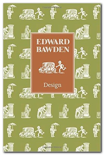


 But it’s amazing to realise in how short a creative lifespan artists like El Lissitzky (and Rodchenko) had when they exerted such a powerful influence on the modernist movement. The images, paintings, typography, and ‘designs for projects’ illustrated in this collection are almost all from the 1920s. By the following decade El Lissitzky had become little more than an exhibition organiser. He was working for the State – but by the 1930s the dead hand of totalitarian control had stifled all originality from the arts, and his interesting designs for the Kremlin were replaced by the sort of drab architecture that became the norm under Stalin.


 But the GPO has from its earliest years made a habit of commissioning artists to design posters to promote its services and reminding us to post early for Xmas. In fact there has been a quite deliberate campaign to both educate the public and promote an impression of efficient, modern technology driving communications at a national level. This has been coupled ideologically with folksy images of the village postman delivering letters in all weathers, and at the same time promoting an empire of connectivity that embraced the globe.
 The range of artists and designers they did use included
