Mantex

Tutorials, Study Guides & More

  • HOME
  • REVIEWS
  • TUTORIALS
  • HOW-TO
  • CONTACT
>> Home / Design / Graphic design

Graphic design

graphic design in theory and practice

graphic design in theory and practice

dot-font: talking about fonts

July 13, 2010 by Roy Johnson

essays on fonts, typography, and design

John Berry is the former editor and publisher of U&lc (Upper and lower case) the prestigious and influential typographical journal, and he has won awards for his book designs. This is a collection of short articles on fonts and typographic design he wrote for the portal website Creativepro.com. I first came across this book when it was announced that, in common with many other authors in the digital age, John Berry was giving the book away free of charge as a PDF download. I grabbed a copy, saw it was an attractive production, and immediately ordered a copy in print. By the time I had finished reading the first few chapters, I also ordered its sister production dot-font: talking about design.
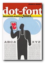
dot-font: talking about fontsThe articles range widely across issues of typography and the design of fonts – starting with an interesting historical note on the short-lived era of typography using Letraset (remember that?) . He goes on to the pleasures of old type specimen books; a review of an exhibition catalogue featuring Sumner Stone’s designs for a ‘classical’ sans-serif font (Basalt); and an appreciation of the Dutch Type Library in Hertogenbosch.

Some of the essays are in-depth studies of a single typeface – Matthew Carter’s Monticello and Herman Zapfs Optima for instance. In both cases he comments on the changes made when translating these designs into digital type, a process which generally seems to increase enormously the number of weights and sizes at which they become available.

He is quite insistent that any true typeface worthy of a distinguished name must include the full range of variants, accidentals, and special characters:

An old-style text face, based on types that were first cut and used in books in the 15th to 18th centuries, should be accompanied by old-style figures, by a complete set of f-ligatures, and by true small caps. It ought to have a set of real fractions too, or the numerators and denominators to create them. Without these, it looks as unconvincing as a callow Hollywood actor pretending to be a Shakespearean prince.

It’s a beautifully designed and illustrated production in its own right. The text is set in MVB Verdigris, the display in HTF Witney, and there are generous page margins. Yet it’s not just a glamorous design portfolio: John Berry digs into some some funamental issues of typographic theory and the use of fonts, such as the question of where the originality in reviving old typefaces ends and copying begins. It’s a book that is pleasing to the eye – but also one that will make you think.

dot-font fonts   Buy the book at Amazon UK

dot-font fonts   Buy the book at Amazon US

© Roy Johnson 2010


John D. Berry, dot-font: talking about fonts, New York: Mark Batty Publishing, 2006, pp.126, ISBN: 0977282708


More on typography
More on design
More on media
More on web design

Filed Under: Graphic design, Typography Tagged With: Design, Fonts, Graphic design, Typography

DSOS1: Designer Shock

June 16, 2009 by Roy Johnson

avant-garde downloadable fonts and design styles

Here’s an unusual idea – a book which is an introduction to a web site. Well, not exactly – because there’s more to it than that. The print version shows you what’s on offer, but the site allows you interactive connection with the software. This is what used to be called in the world of rock music, a ‘concept albumn’. Still confused? Read on. DesignerShock is a German-based collective of graphic design artists. They’ve come up with the idea of making design software available online.

Designer Shock This comes in the form of downloadable fonts, screensavers, wallpaper, product packaging, undsoweiter. You’re with it so far? But they also offer an additional element. You buy the book – which illustrates their designs – and it comes with a CD which gives you access to their web site. So, you have access to unlimited free use. You can download then change, stretch, and adapt the basic information to suit your own taste, using morphing software.

But the problem is that the book is quite hard to read. It’s difficult to know what is main text matter and what is extraneous page decoration and book navigation details. Sometimes the book’s own system of presenting graphics seems to overwhelm its contents.

The examples they show are almost all avant-garde – that is, nearly unreadable. You’ve got to have a strong stomach to even take them seriously. There is one set of fonts in which the letters H and W are identical.

There are also examples of product package designs, icons, dingbats, and did I mention? – the book also doubles as a mousemat. It’s all wacky – but there is the germ of a good idea in here.

© Roy Johnson 2001

DSOS1: Designer Shock   Buy the book at Amazon UK

DSOS1: Designer Shock   Buy the book at Amazon US


Stefan Gandl, Alexander Dewhirst, Designershock, DSOS1 DesignerShock, Berlin: Die Gestalten Verlag, 2001, pp.180, ISBN: 3931126641


More on typography
More on design
More on media
More on web design

Filed Under: Graphic design, Typography Tagged With: DSOS1: Designer Shock, Fonts, Graphic design, Typography

E McKnight Kauffer Design

June 24, 2010 by Roy Johnson

Anglo-American modernism and graphic design

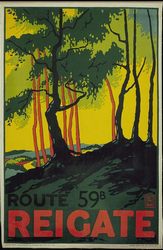
Edward Kauffer (the McKnight was added later) was an American artist from a relatively poor background in Montana USA who compensated for a lonely childhood by his interest in drawing and art. He was fortunate enough to see the famous 1913 Armory Show of contemporary European art in Chicago and shortly afterwards he left for a brief version of the Grand Tour in Munich and Paris. This was curtailed by the outbreak of war – so he ended up in England. Via a series of very fortunate connections he secured a position working for London Underground, and produced a series of posters advertising the pleasures of suburbia and the countryside at the end of the line. E. McKnight Kauffer Design is an elegantly illustrated introduction to the full range of his work.

E. McKnight KaufferThese images made him famous, and the style he developed is now reproduced as exemplars of both good design and instant nostalgia. He was influenced by his studies of Toulouse-Lautrec, Alphonse Mucha, and the Sachplakat style he had seen first hand in Germany. Strongly shaped design, flat colours, and bold outlines were the hallmarks of these works.

He was also influenced by geometry (“We live in a scientific age, an age of T-squares and compasses”) plus Cubism and Orphism (as propounded by Robert Delauney). Following the establishment of his reputation in England, he also produced bibliographic designs for the Nonesuch Press and the Hogarth Press.

E. McKnight Kauffer - British Rail posterWith the outbreak of the second world war however, these commissions dried up, so he returned to America. But because his reputation by that time was an English designer, he found it difficult to become established again in his homeland. As Peyton Skipwith explains in his introductory essay to this collection of Kauffer’s work, “Like many another expatriate, his reputation seems to have got stuck somewhere in mid-Atlantic”

But he designed book jackets for Alfred Knopf, Harcourt Brace, and Random House and his career did finish on something of a high note with a series of posters for American Airlines which definitely do have a more national style.

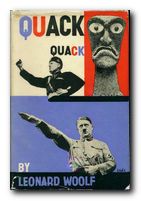
E. McKnight Kauffer - Hogarth Press book jacketSome of the English book illustrations become slightly bucolic and whimsical, but wherever he asserts his appreciation of modernism (and the influence of The New Typography and Russian constructivism) the results are very powerful. Kauffer lived at a time when the term used to describe such work was the rather slighting ‘commercial art’ – but we would now call it ‘graphic design’.

The series of design monographs of which this volume is part feature very high design and production values. They are slim but beautifully stylish productions, each with an introductory essay, and all the illustrative material is fully referenced.

E. McKnight Kauffer Design   Buy the book at Amazon UK

E. McKnight Kauffer Design   Buy the book at Amazon US

© Roy Johnson 2010


Brian Webb and Peyton Skipwith, E. McKnight Kauffer: Design, Suffolk: Antique Collectors Club, 2007, pp.96, ISBN: 1851495207


More on design
More on media
More on web design

Filed Under: Graphic design, Individual designers Tagged With: Design, E. McKnight Kauffer, Graphic design, Hogarth Press, Modernism

Edward Bawden design

December 4, 2016 by Roy Johnson

modern romantic design and illustrations

Edward Bawden (1903-1989) was a graphic designer and illustrator of the English romantic-nostalgic school. He is best known for his book jacket designs and murals in public buildings, but he worked in a number of different visual media – ranging from advertising posters to wallpaper design and the labels for beer bottles.

Edward Bawden

He was born in Braintree in Essex, going from local education to Cambridge School of Art. From there he went on a scholarship to the Royal College of Art where he met his lifelong friend and fellow illustrator, Eric Ravilious. They both studied under the supervision of painter Paul Nash.

Shortly after graduation he was fortunate enough to receive a number of commissions. First for decorative tiles for the London Underground, then a mural for the refectory at Morley College. He began to work one day a week as an illustrator (along with Ravilious and Nash) at the Curwen Press, which produced high-quality colour lithography and short runs of specialist publications. Bawden designed decorative borders, endpapers, and illustrations – a foundation which he continued into his later life with work for Faber and Faber.

Following his marriage to a fellow RCA student Charlotte Epton, he moved from London back to Essex, where he developed a strong attachment to the countryside and began to produce watercolour paintings. This led to one-man exhibitions at both the Zwemmer and the Leicester Galleries.

Edward Bawden

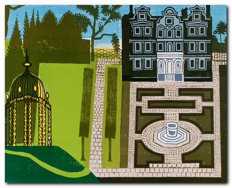
The Queen’s Garden – Kew

During the Second World War he served with the British army as an official war artist – first in France, then in the Middle East. Returning from Cairo, his ship was torpedoed and he spent several days in an open lifeboat before being picked up by the (Vichy) French navy. This resulted in his being held prisoner in an internment camp in Casablanca.

After the war he designed fabrics and murals for cruise ships, and he participated actively in designs for the Festival of Britain. These led to big public commissions for the BBC, the British Council, and London Transport.

It has to be said that part of Bawden’s success was his ability to work in any number of different visual media — linocuts, engraving, lithographic prints, watercolour, or line drawing. This supported his willingness to undertake the most humble commissions. His work includes not only large-scale public works, but dust jackets and illustrations for recipe books, and promotional materials for Fortnum and Mason – even down to the design for biscuit tins.

© Roy Johnson 2016

An Essay on Typography   Buy the book at Amazon UK

An Essay on Typography   Buy the book at Amazon US


Brian Webb and Peyton Skipworth, Edward Bawden Design, Suffolk: ACC Art Books, 2015, pp.96, ISBN: 1851498397


More on design
More on media
More on web design


Filed Under: Graphic design, Individual designers Tagged With: Design, Edward Bawden, Graphic design

El Lissitzky Design

June 26, 2010 by Roy Johnson

design , modernism, and Russian Suprematism

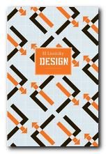
El Lissitzky (1890-1941) was one of the pioneers of the modernist movement in Russian art which flourished in the period 1915-1925. He was one of the most graphically radical of his era, and yet only a few years earlier he was painting rather conventional landscape paintings in the tradition of Russian realism. El Lissitzky’s earliest creative period was spent at Vitebsk working with Mark Chagall and Kasimir Malevich. With the latter he spearheaded to Suprematist movement. His geometric constructions developed from two to three dimensions and became a sort of theoretical architecture – shapes which float in space. He called the works ‘Proun’ – an invented word which means ‘Project for asserting the New’. El Lissitzky Design is an elegantly illustrated introduction to all this work.

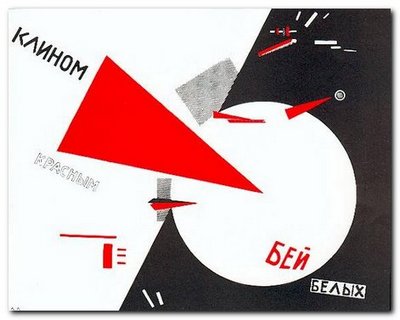
El Lissitzky He is best known for his propaganda painting ‘Beat the Whites with the Red Wedge’ of 1919 – a work which very typically for its time was geometric in form, non-representational, and included typographical elements in the same style as his contemporaries Alexander Rodchenko and Malevich. At the same time he also started producing abstract constructions in two and three dimensions which were (like Rodchenko’s) geometrically based, but more mature and developed than any works of this kind that had emerged up to this date.

El Lissitzky: Beat the Whites with the Red Wedge

His finest work seems to have been produced in an amazing creative outburst between 1917 and 1925 – just at the point where unfettered Russian modernist art theory was taking off alongside the political revolution in its positive and expansive phase.

When El Lissitzky crossed the line between art and work after 1917, he became an international social activist promoting a political message. Like the Russian Constructivists that he admired, he sought to use his creative energy to help design a new social structure in which the new engineer-architect-artist could erase old boundaries.

El Lissitzky was fortunate to be at his creative peak at a time when foreign travel was still possible in the USSR. He took exhibitions to Germany and mixed with other modernists such as Laszlo Moholy-Nagy and Kurt Schwitters. He had connection with the De Stijl group in Holland, and he taught at the Bahaus.

El LissitzkyBut it’s amazing to realise in how short a creative lifespan artists like El Lissitzky (and Rodchenko) had when they exerted such a powerful influence on the modernist movement. The images, paintings, typography, and ‘designs for projects’ illustrated in this collection are almost all from the 1920s. By the following decade El Lissitzky had become little more than an exhibition organiser. He was working for the State – but by the 1930s the dead hand of totalitarian control had stifled all originality from the arts, and his interesting designs for the Kremlin were replaced by the sort of drab architecture that became the norm under Stalin.

He lived until 1943, but there is very little that he produced after the mid 1920s that stands up to any degree of scrutiny today. What he produced before then was awe inspiring – and remains so to this day.

El Lissitzky Buy the book at Amazon UK

El Lissitzky Buy the book at Amazon US

© Roy Johnson 2010


John Milner, El Lissitzky – Design, Suffolk: Antique Collectors Club, 2009, pp.96, ISBN: 185149619X


More on art
More on media
More on design


Filed Under: Art, Design, Graphic design, Individual designers Tagged With: Design, El Lissitzky, Graphic design, Modernism, Russian modernism

Emotional Digital

May 26, 2009 by Roy Johnson

a sourcebook of contemporary typographics

If you are the slightest bit interested in font design – get hold of this book. It’s both a stylish introduction and a compendium of the best in modern typography. It’s a collection of designs from font companies and individual typographists. Designers from the most prestigious studios were invited to submit examples of their type in commercial use. These include traditional designers such as Gerard Unger, Sumner Stone, and Matthew Carter – but the main emphasis is on influential young typographists such as Neville Brody, Zuzana Liko, David Carson, and Erik van Blockland.

Emotional DigitalThere are potted accounts of each company, so you get an idea of the intellectual context out of which each set of designs arises. For instance, fonts such as Bitstream’s ‘Galaxy’ which was used for the StarTrek films. The designs are shown in use in a huge variety of forms – letterheads, posters, printed books, commercial stationery, and advertising flyers. It even includes examples of typographic jewellery.

[It’s a] snapshot of the current state of typography: it provides an overview of the international type scene … and serves as a history book and future-oriented reference work in one.

There are also mini-essays by prominent designers punctuating the entries. These vary from brief individual polemics to thorough technical articles such as Zuzana Liko’s account of designing a series of fonts for the Emigré website.

The axis is very much Germany, London, and both coasts of America, but en passant the collection also takes in Russia, France, and Spain.

All the fonts illustrated are meticulously identified by named designer and date, and full details of all the designers are given, including their email address and websites.

If you are interested in fonts, typography, or graphic design, this book is a treat from start to finish. Thames and Hudson specialise in good quality design manuals, but they have surpassed themselves with this one.

© Roy Johnson 2002

Emotional Digital   Buy the book at Amazon UK

Emotional Digital   Buy the book at Amazon US


Alexander Branczyk et al, Emotional Digital: A sourcebook of contemporary typographics, London: Thames & Hudson, 2001, pp.312, ISBN: 0500283109


More on design
More on media
More on web design
More on typography


Filed Under: Graphic design, Typography Tagged With: Emotional Digital, Graphic design, Typography

Envisioning Information

July 20, 2009 by Roy Johnson

best-selling illustrated essays on presenting information

Over the last twenty years, Edward Tufte has published three impressive volumes setting forth his ideas on information design. The first, The Visual Display of Quantitative Information was designated as ‘pictures of numbers’ and dealt with statistical charts, graphs, and tables. This second volume deals with ‘pictures of nouns’, which is his metaphorical way of describing the ‘strategies for high-dimensional data, and how to increase information depth on paper and computer’.

To envisage information…is to work at the intersection of image, word, number, art

Envisioning InformationHe makes a persuasive case for layering, colour, and separation as a means of clarifying information when it is rendered in two dimensions – principally on the printed page. What he calls an ‘escape from flatland’ is illustrated in a series of wonderfully complex diagrams: a Javanese railway timetable shows departures and arrivals, distance, altitude, and even facilities at each station.

He explores the interesting notion that in a world of marks on paper, good presentation is affected by the rule that ‘1 + 1 = 3 or more’. That is, even two simple lines become three visual units because of the space between them – and he provides plenty of information to prove his case, illustrated with such diverse materials as old maps, musical notation, and even medical records.

His argument that small multiple images are the best way to reveal differences is beautifully illuminated by photographs of Chinese calligraphy and nineteenth century engravings of fly fishing lures, but it doesn’t seem altogether convincing – and as in the other volumes of this trilogy, some of the bad examples are just as visually attractive as the good – which appears to spoil the point he’s trying to make.

He’s much more persuasive on the use of colour to impart information, although at some points, even if the prints and engravings are stunning, the reading is not easy:

Transparent and effective deployment of redundant signals requires, first, the need – an ambiguity or confusion in seeing data display that can in fact be diminished by multiplicity – and, second, the appropriate choice of design technique (from among all the various methods of signal reinforcement) that will work to minimize the ambiguity of reading.

For somebody who claims to be aiming for clarity in communication, this reads like a bad example out of a writer’s style manual.

He keeps coming back, as do many other theorists of two-dimensional spatial design, to one of the most interesting challenges of all – the notation of dance. Cue eighteenth-century engravings of dancing masters with fancy hats and weird hieroglyphics trailing out of their feet. Other examples in the book range from flight schedules from Czech airways to Japanese railway timetables, rowing contests, and even a diagram of Wagner’s operas.

If we want to take a robust line on someone who is obviously very successful, it’s possible to argue that Tufte designs more successfully than he writes. Much of the time, his text reads as if it has been badly translated from German; yet if ever he issues his books in paperback, they are so attractive he’ll be able to retire on the proceeds.

© Roy Johnson 2002

Envisioning Information   Buy the book at Amazon UK

Envisioning Information   Buy the book at Amazon US


Edward Tufte, Envisioning Information, Cheshire, CT: Graphics Press, 1990, pp.126, ISBN: 0961392118


More on information design
More on technology
More on digital media


Filed Under: Graphic design, Information Design Tagged With: Displaying information, Edward Tufte, Envisioning Information, Graphic design, Information design

Fresh Styles for Web Designers

June 8, 2009 by Roy Johnson

new web design strategies and techniques

So far, web design theory has been split between usability minimalism as urged by gurus such as Jakob Nielsen at one end of the spectrum, and the bandwidth-hogging graphic designs of David Siegel at the other. Now Curt Cloninger suggests we can combine the two approaches – and he shows how it can be done. This is one of those Web strategy guides which assume you know the details of designing pages.

Fresh Styles for Web Designers What it offers is a survey of new strategies in structure and graphic presentation – some of them on the edge of the avant garde. Cloninger takes the line that these are the early days of the Web, that there are severe limitations on what is possible, but that inventive designers will embrace the limitations and turn them into positives.

The reasons he offers are that not all sites are driven by e-commerce or a desire to maximise hits. Some are exhibition or display sites; galleries or individual portfolios of work – something like an elaborate visiting card. There is no reason why such sites shouldn’t indulge themselves with the sorts of glamorous graphics and ‘entry pages’ supported by designers such as David Siegel.

He categorises sites as ‘Gothic’, ‘Grid-based’, ‘Grunge’, ‘Mondrian poster’, ‘Paper Bag’, and ‘HTMinimaLism’ – and despite his post-hippy approach these distinctions do eventually make sense. Designers in these camps treat the page design, the Web strategy, and the visitor experience in significantly different ways.

One of my favourites was the minimalist style – sites from the competition www.the5K.org which feature pages of games, puzzles and art collections the total size which must come in under five kilobytes. [Try it!] The other was the sci-fi look of what he calls ‘Drafting/Table Transformer’ style led by Mike Young, whose work is featured in the recently published book of animated graphics.

Each chapter describes the features of one style. It then analyses examples, with well-produced screenshots of sites which are often private and experimental. Then he tells you how to achieve these effects. It’s a very good formula – no matter what you think of the sites.

He’s quite keen on distressed backgrounds and the grunge typography of designers such as David Carson – and he tells you how to create the effects. This will appeal to those who want to make a visual impact. He has favoured designers who he claims have been influential – Mike Cina, Miika Saksi, and a Chicago design group 37signals.

There’s a lot of detailed instruction on how to achieve special effects – most of them done in Photoshop. The general strategy is to maximise visual effects whilst minimising download time. And it has to be said that all the effects are beautifully illustrated, with full pages of elegantly presented coding.

© Roy Johnson 2004

web design   Buy the book at Amazon UK

web design   Buy the book at Amazon US


Curt Cloninger, Fresh Styles for Web Designers, Indianapolis IN: New Riders, 2001, pp.211, ISBN: 0735710740


More on design
More on media
More on web design


Filed Under: Graphic design, Web design Tagged With: Fresh Styles for Web Designers, Graphic design, HTML, Navigation, Usability, Web design

GPO Design

November 27, 2010 by Roy Johnson

posters and propaganda for the post office 1930-1970

GPO Design is a very stylishly produced collection of posters and information graphics commissioned for the postal services between 1930 and 1970. It’s supported by a well-informed essay on the relations between government, propaganda quangos, and the world of what was then called ‘commercial art’. It has always been a mystery to me why a monopoly should feel the need to advertise its services. Mrs Average of Pinner, Middlesex has until very recently had no alternative but to use Royal Mail to deliver her birthday cards and letters to friends. The same has also been true for gas, water, and electricity. Nobody had access to alternative services, so why bother to advertise their virtues?

GPO DesignBut the GPO has from its earliest years made a habit of commissioning artists to design posters to promote its services and reminding us to post early for Xmas. In fact there has been a quite deliberate campaign to both educate the public and promote an impression of efficient, modern technology driving communications at a national level. This has been coupled ideologically with folksy images of the village postman delivering letters in all weathers, and at the same time promoting an empire of connectivity that embraced the globe.
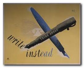
But not all the postal service’s posters and advertising campaigns were corporate vanity. The campaign to advertise postage stamps in little booklets was apparently an attempt to reduce the waiting time spent queuing to buy a single stamp.

It’s not surprising that all decision making in matters of acceptability was in the hands of establishment appointees who despite their efforts to employ modern artists, generated an output that was pretty near indistinguishable from Soviet propaganda posters of the same era

Hans SchlegerThe range of artists and designers they did use included E.McKnight Kauffer, Graham Sutherland, Duncan Grant, and Vanessa Bell. But the most artistically advanced was Hans (Zero) Schleger, one of the many European immigrants who fled to Britain during the inter-war years.
Paul Rennie suggests however in his contribution to the elegant Design series that their work was more successful politically and technologically than their Soviet and Nazi counterparts. He also points out that the GPO’s emphasis on the modern technology of communication – cars, boats, trains, telephones – was a distinctly progressive and modernist theme radiated into society by its educational and service-promoting publicity.

The examples in this collection from the award-winning series are drawn from the poster collection of the British Postal Museum and Archive in London. It sits very neatly alongside its recent fellow publications on David Gentleman, El Lissitzsky, and Alexander Rodchenko.

GPO Design   Buy the book at Amazon UK

GPO Design   Buy the book at Amazon US

© Roy Johnson 2010


Paul Rennie, GPO: Design, Suffolk: Antique Collectors Club, 2010, pp.96, ISBN: 1851495967


More on design
More on media
More on web design


Filed Under: Graphic design Tagged With: Art, Cultural history, Graphic design, Media

Graphic Design 1870-2000

July 23, 2009 by Roy Johnson

a century of poster and advertising design

Graphics 1870-2000 is a compact account of the history of commercial graphic design and image-making from the end of the nineteenth century to the present day. It covers graphic design in the UK, France, Germany, Holland, Belgium, Russia, and the USA. All the major movements are covered – from Art Nouveau, Dada, Constructivism, De Stijl, and Bauhaus, right up to the as-yet-unnamed movements at the end of the last century, with generous entries on Paul Rand, Neville Brody and David Carson, plus recent development in the digital age.

Graphic DesignEvery page is a visual treat: well-chosen graphics illustrate every point of the exposition. The examples are fresh and original. There are even page decoration elements on the supporting theoretical documents reproduced along with the index

What I particularly liked about Alain Weill’s account is that the graphic innovations he traces are related to developments in the products they are advertising or the methods by which they are manufactured.

He also has a good eye for detail and can spot a significant novelty which becomes a turning point in design history – such as Lucian Bernhard’s removal of all extraneous detail to focus on brand name and product in the Sachplakat.

sachplakat

He is the former director of the Musée de la Publicité in Paris, and it is quite obvious from this that he has a deep knowledge and love for his subject.

Two issues emerge as sub-themes here. The first is the close link between graphic design and architecture – another discipline which is trying to do several things at the same time. The second is the close relationship between commercial and fine art. This might have dwindled somewhat towards the end of the last century, but it is still present in the work of people such as David Hockney.

It’s a shame it’s in such a small pocket-book format, because I think the elegantly designed pages deserve to breathe in a larger format. But the upside of this is that it’s very good value at a knock-down price.

© Roy Johnson 2004

Graphic Design 1870-2000   Buy the book at Amazon UK

Graphic Design 1870-2000   Buy the book at Amazon US


Alain Weill, Graphics: A Century of Poster and Advertising Design, London Thames and Hudson, 2004, pp.160, ISBN: 0500301166


More on graphic design
More on web design
More on technology
More on digital media


Filed Under: Design history, Graphic design Tagged With: Graphic design, Graphics 1870-2000

  • « Previous Page
  • 1
  • 2
  • 3
  • 4
  • 5
  • 6
  • Next Page »

Reviews

  • Arts
  • Biography
  • Creative Writing
  • Design
  • e-Commerce
  • Journalism
  • Language
  • Lifestyle
  • Literature
  • Media
  • Publishing
  • Study skills
  • Technology
  • Theory
  • Typography
  • Web design
  • Writing Skills

Get in touch

info@mantex.co.uk

Content © Mantex 2016
  • About Us
  • Advertising
  • Clients
  • Contact
  • FAQ
  • Links
  • Services
  • Reviews
  • Sitemap
  • T & C’s
  • Testimonials
  • Privacy

Copyright © 2025 · Mantex

Copyright © 2025 · News Pro Theme on Genesis Framework · WordPress · Log in