Mantex

Tutorials, Study Guides & More

  • HOME
  • REVIEWS
  • TUTORIALS
  • HOW-TO
  • CONTACT
>> Home / Web design

Web design

web design skills, usability, tools, techniques, and styling

web design skills, usability, tools, techniques, and styling

High Performance Web Sites

July 18, 2009 by Roy Johnson

fourteen steps to faster loading web sites

Steve Souders calls himself a ‘frontend engineer’. He’s a designer at Yahoo responsible for making their site work faster. He explains fourteen strategies for making web pages appear more quickly in a browser. And they’re not overly-technical. In fact he reveals his basic purpose from the outset in what he calls his Performance Golden Rule: “Only 10-20% of the end user response time is spent in downloading the HTML document. The other 80-90% is spent downloading all the components of the page”. From this flows his objective: the book is devoted to showing you his favoured methods of reducing that 80-90% time deficit and speeding up your page delivery.

High Performance Web Sites First he suggests that all scripts and any stylesheets should be rolled up together into one sheet each. That means that the server only makes one HTTP request per page instead of several. All this shaves valuable milliseconds off delivery time. Second (if you’re a big organisation) he suggests that you use a content delivery network. This means placing your web content on a number of different geographically disparate servers. Visitors making requests for your pages will get them more quickly from the nearest available source. Amazingly, some companies offer this service free of charge.

You can Gzip your content and your stylesheets, which might result in a 70%+ saving in file size, and he recommends putting stylesheets in the header and scripts at the bottom of the page.

He illustrates every one of the suggestions he makes with ‘before and after’ examples on his own web site – so it’s possible to check the effects and see his code.

Some of his tips seem better suited to large scale rather than small scale sites, but he shows in each case how you can best judge the decision for adopting them on your own site.

A knowledge of JavaScript and style sheets would be useful for understanding the details of his explanations, particularly if you are going to follow him into the process of obfuscating and munging your code. As you can perhaps guess from this, he’s much given to inventing his own jargon:

This step could also be an opportunity to minify the files … [You should] analyze your pages and see whether the combinatorics is manageable.

In the last section of the book he analyses the construction and performance of ten large scale sites (rather as Jakob Nielsen does in his Homepage Usability). The entry pages of Amazon, YouTube, CNN, Wikipedia, eBay, and MySpace are all put through tests, and the results show. (Not surprisingly, Google is fastest of all.) He then shows you how they could speed up their page delivery by implementing those of his fourteen rules which are appropriate.

In fact as one of his pre-publicity supporters observes: “If everyone would implement just 20% of Steve’s guidelines, the Web would be a dramatically better place “.

© Roy Johnson 2007

Buy the book at Amazon UK

Buy the book at Amazon US


Steve Souders, High Performance Web Sites, Sebastopol (CA): O’Reilly, 2007, pp.146, ISBN: 0596529309


More on web design
More on digital media
More on technology

Filed Under: Web design Tagged With: High Performance Web Sites, Technology, Usability, Web design

Homepage Usability

July 12, 2009 by Roy Johnson

rigorous examination of 50 big commercial websites

This is the latest broadside from usability guru Jakob Nielsen – well known for his radical and uncompromising views on Web design. It’s a follow-up to his best-selling Designing Web Usability. What he does in Homepage Usability is spell out the basic principles of what makes a Web page efficient – then he applies these principles to fifty commercial sites.

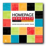
Homepage UsabilityThe first part of the book analyses the basic elements of a home page – its name, shape, content, links, navigation, and graphics. His statement of general principles (established with co-author Marie Tahir) includes information design, typography, and navigation, as well as consistency and logic of categorisation.

He makes all this seem perfectly reasonable and almost beyond doubt. This establishes Nielsen’s ‘Guidelines’ – which he then uses as a benchmark against which to dissect a collection of sites – ranging from amazon.com to yahoo.com. In other words, he aims high, and he doesn’t pull his punches.

The analysis is detailed and unsparing – and any Web designer who stays with him through the process will learn a lot. He is keen on simplicity, clarity, minimalism, overt navigation, and lack of visual clutter.

Everything is served up with Nielsen’s customary brio. If you score below 50% on his usability test, he shows no mercy. “Most likely, you should abandon [your] entire current site and start over from scratch”.

There have been criticisms of this approach – for instance, that he assumes an aggressive commercial model as the norm. But what if your site is a walk-through gallery, or a portfolio of work, rather than an e-Commerce site like Ford or Amazon. Surely the same ‘guidelines’ would not apply.

In each analysis he shows the client’s home page and describes it across a double page spread. Just occasionally he might even sprinkle a few words of praise. Then he pulls it apart bit by bit – showing where the designers are going wrong. The secret of his approach is attention to fine detail. He looks at the small print (literally and metaphorically) checking even the font, its size, its colour, and its position on the page.

I think you could argue with some parts of his methodology. For instance, in his statistical breakdown of screen real estate (how much space each topic occupies) he puts portal listings and niche product details into the same category. Then in some cases a list of category links might be rated lowly, whereas in others blatant advertising copy might be rated highly. I don’t think that is consistent, and it doesn’t correspond to the real user experience.

He’s good on conventions for naming. For instance, ‘site contents’ is not the same as ‘site map’ – because web users have quickly got used to certain conventions – the site name at top left, Help top right, and so on. Homepage links to ‘Forum’ for instance don’t mean much – even though the information beneath them might be quite valuable. These are valuable insights.

This is an attractive and well-illustrated book. Don’t be put off by the front cover – which makes it look like a home improvements catalogue. It’s is a serious workbook for Web designers at all levels. Anybody who wants to keep abreast of Web design and e-Commerce should read Nielsen – even if it’s to disagree with him.

© Roy Johnson 2003

Buy the book at Amazon UK

Buy the book at Amazon US


Jakob Nielsen and Marie Tahir, Homepage Usability: 50 websites deconstructed, Indianapolis, (Ind): New Riders, 2002, pp.315, ISBN: 073571102X


More on web design
More on digital media
More on technology


Filed Under: Web design Tagged With: e-Commerce, Homepage Usability, Jakob Nielsen, Usability, Web design

Information Architecture

July 16, 2009 by Roy Johnson

large-scale Web site structure, navigation, and usability

When it first appeared in 1998, Information Architecture became an instant classic amongst information architects. It now appears in its third edition, much enlarged and updated. The new edition reflects the rapid expansion and technical sophistication of large interactive web sites in the last few years. Rosenfeld and Morville deal with all the issues raised in organising information and navigational systems in the design of large-scale sites. Their important starting point is a recommendation that big sites should use three types of information organisation, which they identify as hierarchical, database, and hypertext.

Information Architecture Visitors to a site should have more than one possible route to the same piece of information. They ask some quite fundamental and interesting questions in their updated chapters. These cover issues of organisation, labelling, navigation, and searching – plus new chapters on thesauruses and meta-data.

The new edition has been given many more case studies, and lists of resources on IA have been added, many of which did not exist at the time of the first edition, and there’s a very good bibliography which painlessly blends print and web-based information. Navigation has been expanded into global, local, and contextual systems, and there is a lot more detail on search engines.

Another section which has been considerably expanded is that on classification systems and ‘knowledge management’. That is – where to put things, how to arrange, label and store information.

There’s also a much-enlarged section on the management of web development projects – from the initial strategy meetings through content analysis and mapping, to delivery and maintenance.

They present real life case studies, including one which details how a strategy report was written for Weather.com. Anybody who needs help with report writing will profit from reading this chapter. ‘Information Architecture’ was a relatively new term only a few years ago, but now as you can probably guess, it is of use to anybody who needs to organise information, ideas, or even physical objects – such as books in a library.

There’s an excellent account of how to draw up site maps and flow diagrams which help to explain the deep level architecture of sites to those who are going to populate them with content.

The same is true for page layout diagrams – which they call ‘wireframes’. These test the arrangement of items on main pages before they are passed on to a graphic designer. Architecture and usability are tested before the application of a graphic. It’s rather like designing the layout of a web page with table borders switched on – before setting them to zero.

They take an enthusiastic line on the use of navigational metaphors (the shop, the office, the library) about which other commentators such as Barbara Fleming and Jakob Nielsen are more cautious. The argument against this approach is that the metaphor of an office or a library will not mean much to people who are not familiar with them. And of course the same is true for icons and symbols.

This is a book for serious designers, project managers, and of course information architects. It is also a contribution to design theory which, en passant, makes librarians into the heroes of the information age. The valuable experience embedded within it will make useful reading for anybody organising information, designing a site, or providing content for it. If you read the first or second edition, it’s worth reading the third for the wealth of new material.

© Roy Johnson 2006

Information Architecture   Buy the book at Amazon UK

Information Architecture   Buy the book at Amazon US


Louis Rosenfeld and Peter Morville, Information Architecture for the World Wide Web, Sebastopol (CA): O’Reilly, third edition, 2006, pp.461, ISBN: 0596527349


More on information design
More on design
More on media
More on web design


Filed Under: Information Design, Web design Tagged With: Information architecture, Information design, Navigation, Structure, Usability, Web design

Information Dashboard Design

June 18, 2009 by Roy Johnson

effective visual communication of data

Dashboards have become popular in recent years as powerful tools for communicating important information at a glance. They tend to imitate motor car fascias or small airplane cockpit controls and they are used for displaying sales figures, statistics, business information (BI) and any sort of key performance indicators (KPIs). They can be used for all sorts of purposes – monitoring stock market prices, showing the weather, recording production output, or listing web site usage.

Information Dashboard Design My blog for instance is monitored by a service which shows me with maps, graphs, and bar charts who has been visiting, where in the world they are located, how many entries they viewed, and which browser they were using. Stephen Few begins by looking at some examples and defining the issue of dashboards – which is not as simple as you might imagine, Then he looks as some examples of bad design. These include dial gauges with no numbers; pie charts whose slices don’t add up to 100; graphs with distorted axes; meaningless colour coding; and results presented in two and three-dimensional forms which occlude anything that happens to be behind them (as my web site analyser does for instance).

Next he deals with the principles of visual perception – how and why we see things as we do. It’s interesting that he follows exactly the same design principles as Edward Tufte, which is to simplify everything as much as possible, remove all unnecessary chart junk, and let the data speak for itself.

He shows examples of good design, and more importantly how to improve it. The not-so-hidden secret all the time is ‘Less is more’.

Next comes ‘a taxonomy of dashboard media’ – that is, an exposition of all the different ways data can be shown on screen. He shows graphs, bar charts, dials and gauges, pie-charts, and Edward Tufte’s new invention, sparklines. The merits and disadvantages of each system are very well illustrated, and he argues quite persuasively that there’s hardly ever a good reason for using a pie-chart. Reasons? They take up too much room, are hard to read, yield little, and the same information could be delivered more efficiently in other ways.

He shows how all these principles can be brought together to produce good design principles – but then finishes with something very instructive. It’s a design for a business information dashboard, followed by several alternative designs and critiques of them. He shows why, even though they might look superficially attractive, they have design flaws and don’t do the job as effectively.

This is a handsomely designed and well produced book which follows its own principles of clear presentation and efficient communication.

© Roy Johnson 2006

Information Dashboard Design   Buy the book at Amazon UK
Information Dashboard Design   Buy the book at Amazon US


Stephen Few, Information Dashboard Design, Sebastopol, CA: O’Reilly, 2006, pp.211, ISBN: 0596100167


More on information design
More on design
More on media
More on web design


Filed Under: Information Design, Web design Tagged With: Control panels, Dashboards, Information design, Web design

InteractiveDesign2

July 14, 2009 by Roy Johnson

interactive web site pages sample book

This is a stylish – nay, glamorous portfolio of Web page design. InteractiveDesign2 collects the best in graphic creativity from interactive environments generated over the past two years. Two hundred illustrations are featured, including color reproductions of websites, CDROMs, kiosks, and other interactive media. The companies featured include big corporations such as Coca-Cola and Mercedes Benz, National Geographic magazine, film studios, plus IBM, Sony, and Adobe. The majority are saturated with art work and heavy graphic design. But the odd thing is that they are imitating magazine advertising and the cinema screen, rather than maximising the essence of the Web page.

web page designMost of these sites look very attractive printed out on the page – but they take an age to download. The level of interactivity varies. A lot of the sites, when I visited them, have homepages announcing that you need Shockwave and a Flash plug-in just to view what’s beyond the entry screen. These are obviously not businesses who want to make things easy to attract lots of visitors or clients.

Some crashed the browser, whilst others such as Gucci and San Francisco Museum of Modern Art – a rare case where horizontal scrolling seems to work – worked seamlessly, making a very stylish presentation.

Amazingly, none of the sites is credited with a URL. If you want to see the site live in action, you need to work out an address from the title bar or you could make a guess from the name.

There is no commentary or analysis. Designers are listed in an appendix, but it’s a bit of a fag matching names to their work, and there is no informative backup to any of this. You simply have the graphic images to inspect, plus some skimpy designer credits.

You’ll get lots of graphic design stimulation just from looking at the pages of the book. But for fuller value, you’ll need to work out those URLs and look at some of the stunning effects created on screen.

© Roy Johnson 2005

Buy the book at Amazon UK

Buy the book at Amazon US


B. Martin Pedersen (ed) InteractiveDesign2, New York; Graphis, nd, pp.256, ISBN: 1888001925


More on web design
More on digital media
More on technology


Filed Under: Web design Tagged With: Design, Graphic design, Interactive Design, Web design

Learn HTML in a Weekend

June 3, 2009 by Roy Johnson

step-by-step tutorials in HTML page design

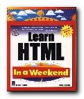
Can you really learn HTML in a weekend? Well, Steve Callihan doesn’t make any rash claims. He only sets out in this beginner’s guide to cover the basics – leaving you to fill in the finer details with later practice. The book is written with the assumption that you have a relatively free weekend. You do some preliminary reading on Friday evening with some basics about hypertext and the basics of a web site. Saturday morning is devoted to the elements of HTML tags, how to create headings, paragraphs, and breaks. It’s organised to teach you what each code does and to give you an overview of HTML.

Learn HTMLSaturday afternoon is described as optional. It deals with some of the refinements of aligning text on the page, wrapping text round images, and dealing with font sizes, colours, and faces. If you have the stamina to keep going, Saturday evening is a ‘bonus’ session covering tables. Don’t take this timetable too seriously. Anyone who can master tables in one evening should apply immediately to the Nobel Prize Foundation.

Sunday morning is devoted to frames – perhaps a section which beginners can skip, because frames are no longer even thought to be a good idea by most web design theorists. The afternoon session on forms is likely to be far more useful, and the evening ‘bonus’ session on graphics will be even more popular. I followed this in detail, since I’ve never been strong on graphics, and it proved to be a straightforward tour through making 3D buttons with Paint Shop Pro.

The book is well illustrated, and there’s a CD with the usual array of free and shareware editors and browsers, so you have all that’s required here to make a start. It truly could be done in a weekend – but why not take a little more time and get it right.

© Roy Johnson 2000

Buy the book at Amazon UK

Buy the book at Amazon US


Steve Callihan, Learn HTML in a Weekend, Rocklin, CA: Prima Publishing, 1999, pp.425, ISBN 0761518002


More on technology
More on digital media
More on web design
More on computers


Filed Under: HTML-XML-CSS, Web design Tagged With: HTML, Learn HTML in a Weekend, Technology, Web design

Learning Web Design

July 12, 2009 by Roy Johnson

Illustrated and comprehensive introduction to HTML

Jennifer Niederst is a specialist trainer in web design. Her last book, Web Design in a Nutshell, is a best-selling reference guide to the subject. Learning Web Design is her latest – a manual that covers all the basis of HTML design – from a detailed explanation of coding to the principles of good navigation and information design. So what makes this introductory guide any different to the dozens of others that are available?

Learning Web DesignWell, it’s a very handsome production, with every point well illustrated by screenshots and the appropriate code. She also shows how to achieve each major effect using three popular editors – Dreamweaver, GoLive, and FrontPage. But the main strength here is the attractive balance she has struck between tuition and visual presentation.

Her pages are surrounded by indented notes, sidebars, and pull-out boxes offering tips and special workarounds. This form of presentation makes learning lighter and easier. And she’s especially strong on explaining graphics.

I particularly like her approach of explaining details which don’t get mentioned in more official guides. For instance, if you wish to colour a link, the font colour tag must be placed inside the link, otherwise it won’t work.

She also reveals lots of tips, tricks, and workarounds for overcoming some of the frustrating limitations of HTML. I was very glad to pick up a neat trick for creating pop-up windows using a small JavaScript – which answered a current problem on quiz answers I have been designing.

The book ends with a very brief glimpse at advanced techniques using style sheets, and streaming audio and video files. This is one which will appeal to beginners and trainers. Work your way through the tutorials, and you could have a reasonable site up on the Web within a few days.

© Roy Johnson 2002

Buy the book at Amazon UK

Buy the book at Amazon US


Jennifer Niederst, Learning Web Design: A Beginner’s Guide to HTML, Graphics, and Beyond, Sebastopol (CA): O’Reilly, 2001, pp.388 ISBN: 0596000367


More on web design
More on digital media
More on technology


Filed Under: Web design Tagged With: Computers, CSS, HTML, Learning Web Design, Web design

Poor Richard’s Web Site

July 1, 2009 by Roy Johnson

web site design and maintenance on a budget

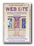
This publication has an interesting history. Peter Kent is an author of best-selling titles, yet when he wrote Poor Richard’s Web Site, a plain folk’s guide to the most rapidly expanding part of Information Technology, publishers didn’t want to touch it. He therefore released it himself in the form of Word files on disk. This fortunately led to print publication, in which form it now comes to us in a new second edition, swathed in well-deserved commendations.

Poor Richard's Web SitePart I offers four introductory chapters on choosing an Internet Service provider and domain name. This is very logical, but somehow I think its position at the front of the book might deter readers who want to more rapidly approach the meatier and less abstract matter of planning and designing their site. Part II on the creation of a site is where the book really comes to life. He covers the basics of the site and its purpose.

There’s an introduction to HTML; choosing authoring tools; making the site interactive; and how to use auto-responders and email to enhance commerce generated by your pages. He includes a brief guide to the many sources of information which are available free on line. Lots of resource centres are listed for HTML editors, scripts, and graphics. A beginner would save the price of the book in the space of two or three downloads.

Part III deals with the commercial aspects of registration and promotion. He offers multiple sites to check your pages for browser compatibility – an important feature during the on-going browser wars. The going gets a little complicated when discussing CGI scripts – but he does his best to be reassuring.

His approach is emphatically clear, logical, and (as his rum sub-title claims) full of common sense. At every stage of his exposition he points to examples. There’s a list of award-winning sites, and even a list of the worst – some of which are quite funny. He’s certainly done the spadework of analysing Web sites on behalf of the reader, and in this respect this publication is very good value as a guide and a source of reference. The inclusion of so many Web addresses is particularly useful for UK readers who (paying for local telephone calls) can’t afford to surf freely for this information like their US counterparts.

The first edition was written two years ago. Quite a bit has changed since then. There are better ways to connect, better and more software is available, and there are more services out there. This new edition covers the basics, but it also discusses newer issues like registering and modifying your domain name, the additional service offered by Web hosting companies, and how to use e-mail more effectively. It’s a shame that there’s no bibliography, because he mentions en passant a number of useful-sounding publications. However, by the time you read this they might have been added to the book’s own web site, where the 800 plus links are listed.

© Roy Johnson 2000

Buy the book at Amazon UK

Buy the book at Amazon US


Peter Kent, Poor Richard’s Web Site: Geek-free, Commonsense Advice on Building a Low Cost Web Site, Colorado: Top Floor, second edition, 2000, pp.418, ISBN 0966103203


More on web design
More on digital media
More on technology

Filed Under: Web design Tagged With: Business, e-Commerce, Poor Richard's Web Site, Web design

Secrets of Successful Web Sites

July 18, 2009 by Roy Johnson

business strategy and management of web design projects

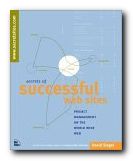
David Siegel is a Web design guru who made his name with the best-selling Creating Killer Web Sites. That was a manifesto on graphic presentation: this is his thesis on the organisation and management of web design projects. The first part of the book offers fifteen case studies; the second part is a methodology of web site design. This takes into account the business and strategic issues of making a site effective, as well as the technicalities of colour, page design, and navigation. The book will appeal to individual designers who want to create their own business – those people with ambition to move from the spare bedroom into their own office.

Secrets of Successful Web SitesThe case studies deal with companies such as Land Rover, National Geographic, Virgin, Porsche, a brewery, and a university. There’s also a fascinating account of the origins of Salon web magazine and how it functions. These are lively mini-essays which reveal the secrets of good business strategies – as well as some of its dangers and pitfalls.

The later chapters describe the planning and design strategies used on a typical web project. At its centre is the project or development web site – where prototypes, help files, and work in progress are posted for comment.

He takes his analysis right through to the launch of a web site, and even the fine details of whose names should appear in the credits. It’s full of interesting tips, such as getting clients to agree on structure and navigation before introducing colour – which is very subjective and almost always causes disagreements.

He’s very good on writing business proposals: how to work out what to charge, and what details to take into account when drawing up estimates for a job – as well as how to spot danger signs.

There are also some useful tips on contracts of agreement and copyright of work . These are backed up with downloadable template documents at the book’s own web site.

So, like his Killer Web Sites, this is full of thought-provoking ideas expressed in an energetic and ‘committed’ style. It’s also a beautifully designed and printed book. Anyone who is interested in e-commerce and web-based business will be interested in what he has to offer.

© Roy Johnson 2002

Buy the book at Amazon UK

Buy the book at Amazon US


David Siegel, Secrets of Successful Web Sites, Indianapolis (IN): Hayden Books, 1997, pp.304, ISBN: 1568303823


More on web design
More on digital media
More on technology


Filed Under: Web design Tagged With: Information architecture, Project management, Secrets of Successful Web Sites, Web design

Small Business Websites that Work

July 9, 2009 by Roy Johnson

practical guide to getting started in eCommerce

If you want to develop small business websites using eCommerce, this is an overview of all the things you will need to take into account. Sean McManus starts out by pointing to the new approaches required when doing business electronically. Your customers will expect instant responses; web sites must deliver up-to-date and accurate information; you need to make yourself and your products and services easily accessible. He doesn’t go into much technical detail – which is probably a good thing, given that so much is available elsewhere.

Small Business Websites that WorkInstead, he provides a strategy overview punctuated by thumbnail case studies. It’s a list of Good Ideas for maximising the relationship between you and your customers – actual and potential. Planning a site and creating the content; integrating the site with your business; and the advantages and disadvantages of trying to do it all yourself.

He puts a lot of store on learning from good examples, and there are detailed analyses of well designed ecommerce sites – pointing out how and why they are successful.

He points out free content and tools where they are available, covers the important details of domain names and hosting, and offers a checklist of what he calls the ‘sixteen crimes of Web design’. These include pointless animations and splash screens, cliched graphics, ‘under construction’ notices, and poor layout.

There’s not as much on affiliate programs and credit card handling as I would have expected, but he makes up for this with plenty on site promotion and search engine optimisation.

This will make a good primer for anybody who wants to make a serious bid in the world of eCommerce within the limited budget of a small enterprise. You will probably need additional help with the details, but this offers you an excellent overview.

© Roy Johnson 2003

Small Business Websites that Work   Buy the book at Amazon UK

Small Business Websites that Work   Buy the book at Amazon US


Sean McManus, Small Business Websites that Work, London: Prentice Hall, 2001, pp.202, ISBN: 0273654861


More on eCommerce
More on media
More on publishing
More on technology


Filed Under: e-Commerce, Web design Tagged With: Business, e-Commerce, Online selling, Small Business Websites that Work, Web design

  • « Previous Page
  • 1
  • 2
  • 3
  • 4
  • 5
  • 6
  • Next Page »

Reviews

  • Arts
  • Biography
  • Creative Writing
  • Design
  • e-Commerce
  • Journalism
  • Language
  • Lifestyle
  • Literature
  • Media
  • Publishing
  • Study skills
  • Technology
  • Theory
  • Typography
  • Web design
  • Writing Skills

Get in touch

info@mantex.co.uk

Content © Mantex 2016
  • About Us
  • Advertising
  • Clients
  • Contact
  • FAQ
  • Links
  • Services
  • Reviews
  • Sitemap
  • T & C’s
  • Testimonials
  • Privacy

Copyright © 2025 · Mantex

Copyright © 2025 · News Pro Theme on Genesis Framework · WordPress · Log in