best-selling introduction to type and good page design
This book appears regularly in the Top Ten list of typography manuals – and rightly so. Although The Manual of Typography began life as one in a series of general introductions to arts and crafts, it has established its reputation on the strength of its scholarship, clarity, and beautiful presentation. McLean covers all the basics. First comes a brief historical survey; then the issues of legibility; practical considerations of paper types and composition methods; book design; and what he modestly calls ‘jobbing typography’. There are notes, a list of material suppliers, a brief index, and an excellent list of further reading. It’s easy to see why this book has become one of the standard texts on its subject.
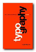 The design of the book is based on a simple three-column grid, with a subtle rhythm of graphic illustration. This varies from full page blow-ups of a single letter design to marginal examples of icons, logos and glyphs accompanied by explanations of a scholarly density.
Yet despite craft origins, it’s a text which unites a profoundly sophisticated sense of taste with the practical aspects of typography. He ranges from the balance of page layout in art-books, to the nuances of letterspacing in railway timetables. From the analysis of six versions of the same font, to recommendations for clear systems of book illustration captions. It stops short of the computer age – but the range of reference and the elegance of the illustrations make this a must for anyone in visual presentation.
Almost every page of this book is a visual delight. Do yourself a favour. If you want to discover the the delight, the subtlety, and the craft of typographical presentation – this is the place to start. Whilst fashions in grunge and distressed type styles have come and gone in the last ten years, this book has remained in print and become a classic.
© Roy Johnson 2003
Ruari McLean, The Thames and Hudson Manual of Typography, London: Thames and Hudson, 1980, pp.280, ISBN 0500680221
More on typography
More on technology
More on digital media
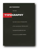
 There are chapters on the use of photographs; the standardisation of paper sizes [the origin of the DIN A4 we all use today] lots of carefully analysed examples of business stationery, and even film posters which evoke the visual ethos of the inter-war years. All this is illustrated by some crisp and still attractive reproductions of everyday graphics – letterheads, postcards, catalogues, and posters – in the red, black and white colour-scheme characteristic of the period.
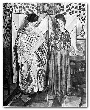
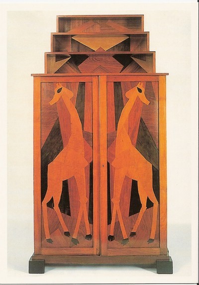
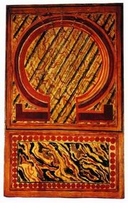 It opened in 1913 at the worst possible time in commercial terms, at 33 Fitzroy Square in the heart of Bloomsbury.
  At the launch of the project, artist and writer Wyndham Lewis was also a member; but he quickly split away from the group in a dispute over Omega’s contribution to the Ideal Homes Exhibition. Lewis circulated a letter to all shareholders, making accusations against the company and Roger Fry in particular, and pouring scorn on the products of Omega and its ideology. This subsequently led to his establishing the rival Vorticist movement and the publication in 1916 of its two-issue house magazine, BLAST.
 Spurred on by the success of the site in the last year or so, the owners have decided to publish a book which encapsulates all their best design principles. I immediately thought it would be a collection of the ‘best of’ articles they have published. But no, it’s more a condensation of their general wisdom – and is much better for that. A chapter on ‘Best Design Features 2009’ would be out of date before the book came into your hands. .