the basic principles of organising information
Books on Information Architecture are coming thick and fast at the moment. Christina Wodtke’s approach will appeal to anyone who wants to learn the main principles, without having to wade through lots of abstractions and jargon. Her written style is very much influenced by web-based writing. She is concise, straight to the point, and entertaining. She starts out by looking at the basics of navigation, screen layout, subject categorising, usability, and liquid pages.
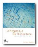 All the time, she keeps the site visitor in mind. It’s a friendly, practical approach, and she illustrates all her points with plenty of screenshots. The main novelty she has to offer is to puncture some of the common suppositions about web design. For instance she argues quite persuasively against a one-size-fits-all approach:
Beware of gurus peddling simple answers. Instead, seek better tools to help you think up better solutions. Think first. Design second.
As is common with good advice, a lot of it seems very obvious when spelled out – but it is useful to be reminded that on the homepage of a site you should ‘show people the range of your offerings’.
She also recommends ‘see also’ pages of the kind at which Amazon excel. If someone visits pages dealing in laptops and novels, there’s a good chance they will also be interested in software and magazine subscriptions.
There’s a particularly good chapter on meta-data where she explains the reason why ‘information about information’ is important. This also includes a clear account of controlled vocabularies – one of the latest issues in usability and Web promotion.
She explains the systems of what are called ‘global navigation systems’ – the links, buttons, and tabs which normally appear at the side(s) and top of every page.
The latter part of the book deals with the process of mapping out and designing a site. This is something that should be done with pencil and paper. She includes storyboarding techniques, sitemaps, content inventories, wireframes – and even illustrates how to conduct cheap, small-scale usability testing.
This is another top quality production from New Riders – who have almost cornered the market in books on this subject.
© Roy Johnson 2005
Christina Wodtke, Information Architecture: Blueprints for the Web, Indianapolis (IN): New Riders, 2002, pp.348, ISBN: 0735712506
More on digital media
More on information design
More on information design
More on design
More on media
More on web design
 Espen J. Aarseth, Cybertext: Perspectives on Ergodic Literature, Baltimore: Johns Hopkins University Press, 1997, ISBN: 0801855780.
