Mantex

Tutorials, Study Guides & More

  • HOME
  • REVIEWS
  • TUTORIALS
  • HOW-TO
  • CONTACT
>> Home / Typography

Typography

type design, page layout, and font technology

type design, page layout, and font technology

DSOS1: Designer Shock

June 16, 2009 by Roy Johnson

avant-garde downloadable fonts and design styles

Here’s an unusual idea – a book which is an introduction to a web site. Well, not exactly – because there’s more to it than that. The print version shows you what’s on offer, but the site allows you interactive connection with the software. This is what used to be called in the world of rock music, a ‘concept albumn’. Still confused? Read on. DesignerShock is a German-based collective of graphic design artists. They’ve come up with the idea of making design software available online.

Designer Shock This comes in the form of downloadable fonts, screensavers, wallpaper, product packaging, undsoweiter. You’re with it so far? But they also offer an additional element. You buy the book – which illustrates their designs – and it comes with a CD which gives you access to their web site. So, you have access to unlimited free use. You can download then change, stretch, and adapt the basic information to suit your own taste, using morphing software.

But the problem is that the book is quite hard to read. It’s difficult to know what is main text matter and what is extraneous page decoration and book navigation details. Sometimes the book’s own system of presenting graphics seems to overwhelm its contents.

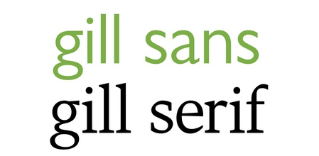
The examples they show are almost all avant-garde – that is, nearly unreadable. You’ve got to have a strong stomach to even take them seriously. There is one set of fonts in which the letters H and W are identical.

There are also examples of product package designs, icons, dingbats, and did I mention? – the book also doubles as a mousemat. It’s all wacky – but there is the germ of a good idea in here.

© Roy Johnson 2001

DSOS1: Designer Shock   Buy the book at Amazon UK

DSOS1: Designer Shock   Buy the book at Amazon US


Stefan Gandl, Alexander Dewhirst, Designershock, DSOS1 DesignerShock, Berlin: Die Gestalten Verlag, 2001, pp.180, ISBN: 3931126641


More on typography
More on design
More on media
More on web design


Filed Under: Graphic design, Typography Tagged With: DSOS1: Designer Shock, Fonts, Graphic design, Typography

Emotional Digital

May 26, 2009 by Roy Johnson

a sourcebook of contemporary typographics

If you are the slightest bit interested in font design – get hold of this book. It’s both a stylish introduction and a compendium of the best in modern typography. It’s a collection of designs from font companies and individual typographists. Designers from the most prestigious studios were invited to submit examples of their type in commercial use. These include traditional designers such as Gerard Unger, Sumner Stone, and Matthew Carter – but the main emphasis is on influential young typographists such as Neville Brody, Zuzana Liko, David Carson, and Erik van Blockland.

Emotional DigitalThere are potted accounts of each company, so you get an idea of the intellectual context out of which each set of designs arises. For instance, fonts such as Bitstream’s ‘Galaxy’ which was used for the StarTrek films. The designs are shown in use in a huge variety of forms – letterheads, posters, printed books, commercial stationery, and advertising flyers. It even includes examples of typographic jewellery.

[It’s a] snapshot of the current state of typography: it provides an overview of the international type scene … and serves as a history book and future-oriented reference work in one.

There are also mini-essays by prominent designers punctuating the entries. These vary from brief individual polemics to thorough technical articles such as Zuzana Liko’s account of designing a series of fonts for the Emigré website.

The axis is very much Germany, London, and both coasts of America, but en passant the collection also takes in Russia, France, and Spain.

All the fonts illustrated are meticulously identified by named designer and date, and full details of all the designers are given, including their email address and websites.

If you are interested in fonts, typography, or graphic design, this book is a treat from start to finish. Thames and Hudson specialise in good quality design manuals, but they have surpassed themselves with this one.

© Roy Johnson 2002

Emotional Digital   Buy the book at Amazon UK

Emotional Digital   Buy the book at Amazon US


Alexander Branczyk et al, Emotional Digital: A sourcebook of contemporary typographics, London: Thames & Hudson, 2001, pp.312, ISBN: 0500283109


More on design
More on media
More on web design
More on typography


Filed Under: Graphic design, Typography Tagged With: Emotional Digital, Graphic design, Typography

Eric Gill

August 29, 2015 by Roy Johnson

artist, engraver, typographist, stone carver, and more

Eric Gill (1882-1930) was a sculptor, a typographist, a wood engraver, and an influential artist-craftsman in the early years of the twentieth century. He is probably best known for his typeface Gill Sans which became ubiquitous from the 1920s onwards, but he was also famous in his own day for his radical views and eccentric appearance.. He took a highly moralistic, quasi- religious attitude to his work in art, but he has become the subject of bemused attention in recent years because of revelations about bizarre practices in his sexual life.

Eric Gill

Early years

He was born in Brighton in 1882, the second child of thirteen to a clergyman with a family background of missionary ‘work’ in the South Seas. The cultural atmosphere of Gill’s childhood was a combination of evangelical fervour and what became known as Muscular Christianity. He had a fairly undistinguished education, but he did meet a fellow day boy at school who introduced him to woodworking tools.

The even tenor of his youth was interrupted by the death of his favourite sister Cicely and his father’s conversion to Anglicanism and the family’s subsequent move to Chichester. More importantly for his future development, he discovered what he thought of as ‘the mystical power of the phallus’.

He enrolled at Chichester Art School and started drawing buildings in the town. The cathedral there played a big part in his personal life. It also introduced him to his first serious love affair – with Ethel Moore, the sacristan’s daughter whom he later married. But in 1900 he felt he had outgrown the town and set off to London to find his profession.

Apprenticeship

He entered a practice of church architects as a trainee, but his real intellectual development took flight when he enrolled at the Central School of Arts and Crafts and he encountered a world of radicalism, William Morris-inspired handicrafts, and the company of Edward Johnston, the calligraphist with whom he was to produce Gill Sans.

In London he also had his first sexual encounters (with prostitutes) which he characteristically related in detail to his girlfriend Ethel. By the time he was twenty-one he was sharing Johnston’s lodgings at Lincoln’s Inn Fields and participating in late night bachelor discussions on Truth, Religious Faith, and English hand-lettering. Almost by accident, he established a reputation as someone who could cut letters in stone, and commissions came to him regularly from this time onwards.

He obtained work contracts from Healds and W.H.Smith, the designs for the latter establishing what we would now call a corporate identity. His success led him to get married to Ethel, and they set up home in Battersea, where one of his first important patrons was Count Harry Kessler.

In 1905 he moved with Ethel to Hammersmith and joined a community of radical printers and craftsmen. Gill, plus his friends Johnston and Hilary Pepler were in the habit of writing letters late at night, then meeting at the local post box for the midnight collection, then carrying on their aesthetic debates until two and three o’clock in the morning.

The move left

He joined the Fabians the following year and lost no time on lecturing the Webbs and George Bernard Shaw on the inadequacy of their views on Art. He also joined in their enthusiasm for the idea of the New Woman by starting an open affair with Lillian Meacham, which his wife did her best to tolerate. What Ethel did not know was that at the same time he was also ‘fornicating’ with their domestic help Lizzie.

Eric Gill

In 1908 the family moved again to Ditchling, a country village near Lewes in Sussex. Here he advocated a life of rural simplicity – whilst spending much of his working week in London where he had kept on the flat at Lincoln’s Inn Fields. Artistically, he added two skills to his repertoire – wood engraving and sculpture in stone. In London he was mixing with Jacob Epstein, Roger Fry, Ottoline Morrell, and other fringe Bloomsbury Group figures. He also came under the influence of Ananda Coomaraswamy, an Indian aesthete. When he produced an erotic carving of a man and woman copulating (bizarrely entitled Votes for Women) it was bought by Maynard Keynes for five pounds.

Family fun

Around this time Gill began incestuous relationships with his sisters Angela and Gladys, recording the fact in his diary quite casually, with no recognition at all that he was breaking a social taboo. What is even more amazing is the fact that he maintained these relationships throughout the remainder of his adult life.

At the same time he was going through a religious conversion – rather surprisingly to Roman Catholicism. He and his wife were received into the church in Brighton, she changed her name to Mary, and they celebrated the event by having Leonard and Virginia Woolf as house guests for the weekend.

They moved to another house on the outskirts of Ditchling, and he was joined in the area by his old Hammersmith colleagues Johnston and Pepler. He cultivated a Spartan, almost medieval close-to-the-soil existence, and when the war came he more or less ignored it.

Religion

He also threw himself enthusiastically into the rituals and beliefs of the Dominican order of the church, and took to wearing ecclesiastical garments, including the belt of chastity, which he wore with no apparent sense of irony. The guild that he formed with Pepler took itself very seriously and issued propaganda leaflets arguing against birth control and the use of Bird’s Custard Powder.

Ditchling became famous as a place for spiritual retreat, and Gill was celebrated as its presiding religious genius. But beneath the homespun cassock and the stonemason’s paper toque, he had started having sex with his own daughters. He recorded the details of his ‘experiments’ in his diaries, admitted misgivings to his religious confessors, and rationalised his behaviour with a new theory of phallic ‘Godliness’.

Eric Gill

In 1924 he felt oppressed by the public attention he had generated at Ditchling and moved to an abandoned abbey in the Welsh Black Mountains. The move resulted in him turning his attention back to engraving and typography. He became the principal designer and illustrator for Robert Gibbings’ Golden Cockerel Press, whose publications now seem the most distinguished of between-the-wars private presses. The relationship with Gibbings was particularly warm – close enough to include weekend threesomes in Berkshire with the publisher and his wife Moira whilst his wife Mary kept the monastic abbey going in the Black Mountains.

Readers who may be thinking there was something homo-erotic (or polymorphous perverse) in all these shenanigans will be confirmed in their suspicions when he records his impressions (and celebrations) of the male member in his diaries::

A man’s penis and balls are very beautiful things and the power to see this beauty is not confined to the opposite sex. The shape of the head of a man’s erect penis is very excellent in the mouth. There is no doubt about this. I have often wondered – now I know.

When he returned to the abbey he busied himself showing his new secretary Elizabeth Bill slides of semen under the microscope and inviting her to measure the size of his own beautiful penis before demonstrating it at work on her. Elizabeth had an ageing fiance, but she also had money, and when she bought a villa in the Basque country Gill was very happy to go and live there.

He was also taken up by Stanley Morison, adviser to the Monotype Corporation, and the typefaces he designed for him – Perpetua (1925), Gill Sans (1927), and Solus (1929) – are probably his greatest claim to fame as a designer. Doing so gave him the urge to move on once again, so he uprooted his entire household from Wales and went to live on an estate called Pigotts, near High Wycombe.

Animal farm

There he had a sculpture workshop, an art studio, and a printing press all in their own buildings. At a private level he started an affair with Beatrice Warde, the glamorous American typographist who was the mistress of his champion (and employer) Stanley Morison. Then suddenly in 1930 he had a mysterious seizure and lost his memory. It took him quite some time to recover, but when back to normal he found new ways of amusing himself. He started having sex with the family dog. This is a man who celebrated holy mass twice a day at an altar in his own home.

But the medical interlude in no way diminished his creative energies. In the early 1930s he composed his famous Joanna typeface and he completed his public commission Prospero and Ariel over the entrance to BBC at Langham Place. It is generally thought that these large scale public carvings were not as successful as his smaller, more domestic works, and he has also been criticised for spreading his talents across so many varied forms of visual art.

As commissions proliferated, so he became more famous at a Daily Express level. People wanted to know if he wore underpants beneath his stonemason’s smock. Domestically he enlarged his entourage by moving his latest mistress May Reeves into a caravan on the site at Pigotts. This gave him the convenience of sex with May and his wife (sometimes on the same night) without as it were leaving the premises.

In the later years of his life two changes came over him, and these were typically contradictory. First of all he became far more bourgeois – accepting physical comforts, employing a chauffeur, installing a black marble bath. But at the same time he became more politically radical, and espoused many of the left wing causes of the late 1930s – including workers control and support for the Republicans in Spain.

He became increasingly frail in the latter years of his life (though he was only in his late fifties) yet he embarked on two large scale projects which consumed all his energies. The first was his debut as an architect. He designed and supervised the building of a simple church in Norfolk in which he radically placed the altar in the centre of the building. The second project was a new and extra intense affair with Daisy Hawkins, a nineteen year old servant at Pigotts. She was unusually attractive, and he both made drawings of her and had sex with her on almost a daily basis for nearly two years.

Not surprisingly, this did not go down well with his two other sexual partners – his wife (in the house) and May Reeves (in the caravan). There was eventually a showdown and Daisy was exiled to Capel in Wales. But Gill simply followed here there, pursuing her from one room to another for sexual couplings, the locations of which were all systematically recorded in his diaries. But this late satyriasis was the last gasp of an exhausted figure. In 1940 he suffered from a number of debilitating ailments and was then diagnosed with cancer of the lung. It was that which killed him – at the age of only fifty eight.

© Roy Johnson 2015

Eric Gill Buy the book at Amazon UK

Eric Gill Buy the book at Amazon US


Fiona MacCarthy, Eric Gill, London: Faber and Faber, 2003. pp.416, ISBN: 0571143024


More on typography
More on art
More on media
More on design


Filed Under: Art, Biography, Lifestyle, Typography Tagged With: Art, Bloomsbury Group, Cultural history, Eric Gill, Typography

Finer Points in the Spacing and Arrangement of Type

June 15, 2009 by Roy Johnson

advanced topics in type design and good page layout

As the title implies, this is not a beginner’s book on typography. Most of the techniques discussed by Geoffrey Dowding, although sound and well presented, may not be beneficial to the reader without a working knowledge of design and type. Experienced designers, be forewarned; Dowding is unavoidably influential in this tome – the result of his lifetime of experience in the typographic arts. At the same time, he cannot escape that experience. He is an unabashed traditionalist, a master of the craft.

Finer Points in the Spacing and Arrangement of TypeSo if you think you might already be too sensitive to type and layout, don’t read this book. I’m kidding, of course, but let me explain: illustrating with examples, Dowding discusses typographical layout solutions which often suffer from lack of attention to detail, then provides corrected versions for comparison. This method combined with a concise writing style and his authoritative voice, will undoubtedly heighten your typo-senses.

You will begin to see mistakes where you read in blissful ignorance before. You will know why a given passage is harder to read than another (and no, it’s not necessarily the writer’s fault). And you’ll begin to realize – there are lots of layouts floating around out there that could use more than a little tweaking.

I don’t think that everything he proposes is necessarily right. For example, in the context of setting type for text – the omission of spaces after full points when followed by the capitals A, J, T, V, and Y. Although this is still logically consistent with his other principles, a possible sacrifice of legibility for color defeats what he wanted to achieve.

Still, I enjoyed reading this book and can safely say I will never look at another paragraph, sentence, or word, quite the same again. Having never seen the previous editions of this book, I cannot compare them, but this revised edition suits me just fine. The pages were faithfully composed employing Dowding’s own principles, which makes ‘Finer Points’ a pleasure to behold.

© Roy Johnson 2000

Buy the book at Amazon UK

Buy the book at Amazon US


Geoffrey Dowding, Finer Points in the Spacing and Arrangement of Type (Revised edition), Vancouver: Hartley & Marks, 1995, pp.96, ISBN 0881791199


More on typography
More on technology
More on digital media


Filed Under: Typography Tagged With: Finer Points in the Spacing and Arrangement of Type, Fonts, Graphic design, Page layout, Typography

Graphic Design School

June 14, 2009 by Roy Johnson

basic design principles using all modern media

This is a structured self-teaching guide to the principles of graphic design which provides up-to-date information on computer aided design and the use of software applications. Graphic Design School itself is beautifully designed and printed – in full colour, with excellent design and layout fully illustrating the principles it espouses. First of all it deals with basic design principles – layout, space, colour, typography, and graphics.

Graphic Design SchoolEach topic is presented on one double-page spread in a stylish layout which shows off some of the best principles the book is designed to promote. The second part of the book looks in more detail at what effects are possible with detailed manipulation of typeface selection. It also looks at the secret ingredient which lies beneath most examples of good design – grids.

The last part looks at examples of professional design practice – magazines, corporate design, books, presentations, and of course web design.

It’s a visually exciting overview of what’s required in the increasingly complex and sophisticated word of graphic design. The illustrations are wonderfully fresh and well chosen. There wasn’t one I had seen in any publication before.

This will be suitable for people working in newspapers, magazines, books, packaging, advertising, web design, and digital media in general. It’s packed with practical guidance for students and practising designers.

It’s an introductory guide to a discipline with many facets. I imagine that readers will come across a topic that touches a creative nerve – layout, typography, animation, or image manipulation – then shoot off to follow up the subject elsewhere. That’s exactly as it should be – and there’s a glossary and bibliography to help too.

© Roy Johnson 2005

Graphic Design School   Buy the book at Amazon UK

Graphic Design School   Buy the book at Amazon US


David Dabner, Graphic Design School: The Principles and Practices of Graphic Design, London: Thames and Hudson, 2004, pp.192, ISBN: 0500285268


More on design
More on media
More on web design
More on typography


Filed Under: Graphic design, Typography, Web design Tagged With: Design, Graphic design, Graphic Design School, Web design

Handwriting of the Twentieth Century

July 17, 2009 by Roy Johnson

history and development of modern graphology

Rosemary Sassoon is a distinguished expert on handwriting, and a typographist celebrated for her font Sassoon Prima, which helps young school pupils learn to read and write. In her latest book, Handwriting of the Twentieth Century, she looks at the effects which various teaching methods and models of good practice have had in the period from 1900 to the present. She charts developments in the teaching and study of handwriting, showing how changing educational policies, economic forces and technological advance have combined to alter the priorities and form of handwriting.

Handwriting of the Twentieth Century Every page is suffused with a love of her subject and a concern for the people she is writing about. This ‘long and sometimes sorry story’ tells also of the sheer pain and hard work of children forced to follow the style of the day, and of the reformers who have sought to simplify the teaching and learning of handwriting.

What emerges very clearly is that handwriting styles pass through various fashions and styles – which is why we can put a rough date on examples – even including our own. The general process she illustrates is one of a gradual move from the ornate copperplate of the Victorian period, to various forms of cursive Italic which are common now.

The book is beautifully illustrated throughout with examples from copybooks and personal handwriting from across the world. She ends with a comparative study of developments in continental Europe and America during the same period – and where the lessons to be learned are exactly the same.

This book is a historical record of techniques, styles and methods. But it also a passionate study of everyday typography, informed by a deep knowledge of her subject. It will be of interest to educationalists, people in teacher training, plus cultural sociologists and historians – as well as typographists and graphologists.

© Roy Johnson 2007

Buy the book at Amazon UK

Buy the book at Amazon US


Rosemary Sassoon, Handwriting of the Twentieth Century, Bristol: Intellect, 2007, pp.208, ISBN: 0415178827


More on typography
More on theory
More on typography
More on digital media


Filed Under: Theory, Typography Tagged With: Education, Handwriting, Handwriting of the Twentieth Century, Typography, Writing, Writing Theory

Handwritten

June 26, 2009 by Roy Johnson

modern hand-produced lettering and typefaces

In an age which presents designers with the software to create any number of computer-generated fonts, design historian Steven Heller considers the lasting strength of typefaces produced by hand. He has a good track record in writing on graphic design, and Handwritten is an excellent example of his work. He divides his chapters into different hand-scripted styles – sleight of hand, scrawl (letterforms that are raw, splotchy, and untidy) scratch (scraped, cut, and gouged fonts) script (type that is sinuous and ornate) stitch (letters that have been sewn, sutured, and embroidered) shadow (dimensional, voluminous, and monumental letterforms).

HandwrittenThese are followed by suggestive (forms that imply the metaphorical, surreal, and symbolic) and sarcastic (the ironic, comical, and satirical in lettering). This seems a reasonable enough approach: these categories represent the attitudes of the designers, though sometimes there is overlap between them.

It’s also a handsomely designed and beautifully produced book – packed with hundreds of coloured, well-presented examples. The sources are amazingly wide-ranging: theatre posters, record albumn covers, comics and graphic novels, book designs, posters, ephemera, and original art works.

The visual range is also good – hand scrawled letters, painted typefaces, words scratched into surfaces, stitched into fabrics, or written onto surfaces (including Stefan Sagmeister’s body – an illustration which turns up everywhere these days).

He features and obviously has a soft spot for the work of Robert Crumb, the American freehand artist who designed lots of, ahem, alternative comics in the 1960s and 1970s. Crumb drove his sex-obsessed vision to very amusing and visually interesting limits – though it has to be said that although the subject matter of his cartoons is very radical, the essence of his visual style is essentially nostalgic. He gets its striking effects from linking psychologically modern subject matter with a quaint folksy visual idiom. This is what Heller categorises as ironic lettering.

There’s a fashion at the moment for adding hand-crafted type to digitally photo-realistic graphics, so as to play one off against the other. These are well represented here. However, I was surprised not to see more examples of freehand design translated into pixellated typography, but the book does end with examples of digital comic books which suggest that more is to come.

Having just taught on a course where students have to learn the discipline of writing descriptive picture captions, I was impressed by the manner in which his are consistently both succinct and imaginative. Each section of the book is prefaced by an essay, and the origins of the examples are meticulously sourced. Artist, designer, photographer, and client are all named on every example.

His explanation is all the more vigorous for being conducted across continents. There is nothing parochial about this compilation. Examples range from the UK and USA, to Mexico, the USSR, France, and Germany. The selections are witty, bitter, satirical, inventive, and sometimes quite violent.

If you are at all interested in typography, graphic design, or even print production values, this is well worth seeing. Serious students and professionals will want to own it.

© Roy Johnson 2004

Handwritten   Buy the book at Amazon UK

Handwritten   Buy the book at Amazon US


Stephen Heller and Mirko Ilic, Handwritten: expressive lettering in the digital age, London: Thames and Hudson, 2004, pp.192, ISBN: 0500511713


More on typography
More on design
More on media
More on web design


Filed Under: Graphic design, Typography Tagged With: Calligraphy, Graphic design, Handwritten, Typography

Indie Fonts

July 15, 2009 by Roy Johnson

compendium of digital type from independent foundries

This is a wonderful collection of over 2000 fonts from eighteen of the most innovative independent type designers. It’s essentially a typographic sample book, but some top class design and innovative presentation make it much more than that. Indie Fonts itself is an amazingly stylish production. It’s well designed, beautifully printed on good quality paper, and laid out in a way which displays full font sets without every page ending up the same. They don’t do the usual thing of simply showing the alphabet in upper and lower case over and over again. Every page is different, and the text often describes what the font is attempting to do.

Indie FontsThe font styles include serif, sans serif, script, display, non-Latin, and ornaments. They also include all sorts of page decorations, swashes, figures, icons, and dingbats. Another interesting feature is that almost all these fonts are actually usable for practical day-to-day applications. There are none of the scribbles, distortions, and virtually unreadable grunge fonts that sometimes wish to pass as clever modern typography. Even the wacky and avant-garde Chank studio of Minneapolis produces font sets that can be read and used commercially.

The foundries represented range from Letterror, PSY/OPS, and Test Pilot Collective, to P22 type foundry, Font Diner, and Astigmatic One Eye Typographic Institute. Each of them is introduced with the print equivalent of a colour splash page. There are also introductory notes on each foundry, and the entries for Matthew Carter for instance offer mini-essays in typeface construction and the practical reasoning behind design decisions.

Type styles range from the best of Carter’s classic designs to the latest irreverence of Chank Diesel. Any designer searching for unique typefaces will find what they are looking for, from historical revivals to futuristic techno faces.

The book comes with a CD-ROM which features a selection of thirty-three font sets which are free for you to use – but not distribute. Anybody who is interested in typography ought to see this book. Serious designers will want to own it.

© Roy Johnson 2002

Buy the book at Amazon UK

Buy the book at Amazon US


IndieFonts, Buffalo, NY: P-Type Publications, 2002, pp.408, ISBN: 0963108220


More on typography
More on technology
More on digital media


Filed Under: Typography Tagged With: Digital type, Fonts, Graphic design, Indie Fonts, Typography

Just My Type

April 11, 2011 by Roy Johnson

essays on the appreciation of fonts and their history

Just My Type is a book about fonts – an appreciation of their aesthetics and an explanation of how they come to be designed and used. It’s also a work of deep love and homage to humanitarian craftsmanship. Simon Garfield starts with the observation (which might be a surprise to anyone under forty) that prior to the introduction of the Apple Mac, computer users had no choice of fonts at all, except for the barest minimum, which almost always included the much reviled Courier. This is a font some people claim was designed for deep-sea divers to be legible under water.

Just My TypeThe book is a series of wittily written sketches on typographical history and principles, The main pieces are essays on the stories of the people behind fonts – the typographists who shape them, and the graphic designers who use them. These stories are underpinned by an amazingly wide-ranging and deep sense of printing history, and they are punctuated by shorter pieces celebrating individual fonts such as Gill Sans, Frutiger, Optima, and Vendôme. They also include potted studies of famous designers such as Paul Renner, Hermann Zapf, and Neville Brody.

The book itself pulls off a very dangerous strategy of printing every mention of a typeface name in that font itself, as well as varying the body text between a serif and a sans-serif font for alternate chapters (Sabon and Univers Light). This could easily have resulted in a visual mess – but the book has a strong and consistent design which helps make it visually interesting and coherent.

Garfield’s topics are amazingly diverse. He deals with font classification, variations on the ampersand, and Mrs Eaves – an Australian girl typographist who displays elegantly written letterforms on her own body, and he offers all sorts of amusing gossip and oblique items – such as Eric Gill having sex with his pet dog.

There are fascinating tales such as a beautiful typeface (Doves) which was lost by drowning, thrown into the Thames by its owner to spite his business partner. Garfield is also well informed on the background stories , the economics, and the design studio politics behind fonts which have become recently popular – such as Luc de Groot’s very successful Calibri, designed for Microsoft.

Just My TpeHis in-depth analyses come into their own when distinguishing between the very similar Helvetica, Univers, and Frutiger – all of which have become internationally popular, particularly for the signage in major travel systems such as railways and airports. You might not think that font selection could breed serious conflicts, but the choice of typeface for Britain’s motorway system in the 1960s led to angry letters to the Times and a ‘fonts duel’ between the two principal contenders for the commission.

Garfield has a loving and nostalgic chapter on what might be called ‘intermediate technology’ – the systems of home-made printing which preceded digital type, including the John Bull Printing Outfit, Dyno-Tape, and Letraset. It’s strange (for those of a certain age) to be reminded just how recent these make-do systems were. Also covered are font plagiarism and piracy, a type and printing museum in Lambeth, and a selection of the worst possible fonts.

The font designers are meticulously given credit in the appendices, and there’s a useful selection of further reading plus a list of videos, blogs, typefaces libraries, and font discussion sites. It’s a wonderfully entertaining read. However, here’s a word of warning. The book is best sampled one short chapter at a time. If you read it continuously you’ll get font-indigestion and forget where Giambattista Bodoni ends and Frederick Goudy begins.

Buy the book at Amazon UK

Buy the book at Amazon US

© Roy Johnson 2011


Simon Garfield, Just My Type, London: Profile Books, 2010, pp.352, ISBN: 1846683025


More on typography
More on technology
More on digital media


Filed Under: Typography Tagged With: Graphic design, Just My Type, Simon Garfield, Typography

Letterforms

July 10, 2009 by Roy Johnson

essays on type classification, history, and bibliography

Stanley Morison (1889-1967) was an English typographer, designer and historian of printing. Self-taught, having left school after his father abandoned his family, Morison became an editorial assistant on Imprint magazine in 1913. As a conscientious objector he was imprisoned during the First World War but became design supervisor at the Pelican Press in 1918. In 1922 he founded the Fleuron Society dedicated to typographical matters and edited the society’s journal The Fleuron from 1925 to 1930. Letterforms contains two of his scholarly essays on the classification of type designs.

Letterforms The quality of the publication’s artwork and printing was considered exceptional. From 1923 to 1967 Morison was typographic consultant for the Monotype Corporation where his research and adaptation of historic typefaces in the 1920s and 1930s, including the revival of the Baskerville and Bembo types. He pioneered the great expansion of the company’s range of typefaces and hugely influenced the field of typography to the present day.

Morison was also typographical consultant to The Times from 1929 to 1960 and in 1931 he was commissioned by the newspaper to produce a new easy to read typeface for the publication. The typeface Morison developed with graphic artist Victor Lardent, Times New Roman was first used by the newspaper in 1932 and was published by Monotype in 1933.

He edited the History of the Times from 1935 to 1952 and was editor of the Times Literary Supplement between 1945 and 1948, and he was a member of the editorial board of Encyclopaedia Britannica from 1961 until his death.

This slender and beautifully produced volume contains two of his essays. The first, from 1961, is on the classification of typographical variations and was written as the introduction to a collection of type examples which is not yet complete. The second is from 1962 and concerns fifteenth and sixteenth century Italian scripts.

It’s a pity that the first longer essay is not (yet) illustrated by examples, because it forms a magisterial introduction to its subject. Morison’s writing is spare, compressed, and authoritative – and he moves effortlessly between texts in Italian, French, German, and Latin to make his argument.

What he traces is not only the history of type design, but also writing on it as a subject worthy of study. For it was almost two centuries after the advent of printing with moveable type that people began to take it seriously as an art rather than just a technical process of transferring writing into print.

He traces all the important names – Aldus, Caslon, Fournier, Baskerville, Boldoni, Clarke, Blades, Hart (of Hart’s Rules fame) and Updike, up to his own work on Fleuron. It’s an odd text – an introduction to a set of typographical examples which does not yet exist. But it is of obvious historical significance, giving as it does a synoptic view of a whole discipline.

The second essay is also an introduction – but this time to a set of writing books which had been produced in 1962. This essay too traces the state of what could and could not be known about typography in the fifteenth and sixteenth century – but in this case there are excellent illustrations from the works in question.

He inspects the history and development of chancery cursive writing and the roman capital lettering in Italy with a scholarship with is at once astonishingly modest and breathtakingly thorough. This is a book for typography specialists from publishers who specialise in such works. Thank goodness they exist.

© Roy Johnson 2001

Buy the book at Amazon UK

Buy the book at Amazon US


Stanley Morison, Letterforms, Montreal: Hartley and Marks, 1997, pp.128, ISBN 0881791369


More on typography
More on technology
More on digital media


Filed Under: Typography Tagged With: Fonts, Graphic design, Letterforms, Typography

  • « Previous Page
  • 1
  • 2
  • 3
  • 4
  • Next Page »

Reviews

  • Arts
  • Biography
  • Creative Writing
  • Design
  • e-Commerce
  • Journalism
  • Language
  • Lifestyle
  • Literature
  • Media
  • Publishing
  • Study skills
  • Technology
  • Theory
  • Typography
  • Web design
  • Writing Skills

Get in touch

info@mantex.co.uk

Content © Mantex 2016
  • About Us
  • Advertising
  • Clients
  • Contact
  • FAQ
  • Links
  • Services
  • Reviews
  • Sitemap
  • T & C’s
  • Testimonials
  • Privacy

Copyright © 2025 · Mantex

Copyright © 2025 · News Pro Theme on Genesis Framework · WordPress · Log in