Mantex

Tutorials, Study Guides & More

  • HOME
  • REVIEWS
  • TUTORIALS
  • HOW-TO
  • CONTACT
>> Home / Archives for Design

The Russian Experiment in Art

March 8, 2010 by Roy Johnson

the rise of Russian modernism 1863-1922

Camilla Gray was a young and pioneering scholar of Russian modernist art. She was a former ballet dancer, with no academic background. She married Oleg Prokoviev (the composer’s son) and died tragically young at the age of only thirty-five. And yet she established a body of work on Russian art in 1962 which was quickly appreciated in other European countries. Her original impulse, fuelled by admiration for the modernist work of Malevich and Tatlin, was to look into the tradition out of which such revolutionary art had grown. The Russian Experiment in Art was the culmination of her life’s work.
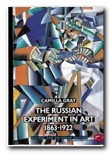
The Russian Experiment in Art There was little information around in the 1960s when she began her research, which is what makes her achievement so remarkable. The first part of the cultural process she documents is the development of a Russian middle class in the late nineteenth century. Mamontov, who made his money builidng the railway from Archangel to Murmansk, established an artists’ colony based in Slavophile Moscow (not europhile St Petersburgh). From this many artistic themes were developed, including the connection between painting and the theatre, and a desire to make aesthetics socialy useful. The standout character she highlights from this period (of whom I had not heard before) is Mikhail Vrubel.

Meanwhile, towards the end of the nineteenth century, a group centred in St Petersburg focussed their desires for a new Russian art around the production of a magazine, called ‘World of Art’. Like most avant gard magazines it was short-lived, but it included work by Leon Bakst, Sergei Diaghilev, and Alexander Benois. They had allowed themselves to be influenced by the latest developments in France, Germany, and Italy and thus represented a cosmopolitanism which was common in much of modernist art.

Following the 1905 revolution there was a vigorous period of art collecting by wealthy patrons which resulted in Russian artists having direct contact with the work of post-impressionists – and Matisse and Picasso in particular made a big impression on the Russian avant garde.

Her study then moves on to two seminal figures who helped to bridge the gap between traditional Russian folk art and modernism – Mikhail Larionov and Natalia Goncharova. They both went on to become stage designers, working for Sergei Diaghilev. It’s interesting to note as an aside that it was quite common for artists to design scale model sets and costumes for stage productions which had not taken place, and often never would.
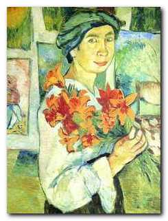
Natalia Goncharova

Natalia Goncharova 1910

Many of the individual movements in Russian art were taking place at the same time, and being developed at a dizzying pace. Larionov’s experiments in Rayonnism (the Russian equivalent of Italian Futurism) were painted alongside his neo-primitivist pictures of peasant life. When Larionov and Goncharova left to tour Europe with The Ballets Russe, the baton of further developments seemed to be taken up by the next two major figures to emerge – Malevich and Tatlin.

Malevich went from paintings in a Cubo-Futurist style in 1912-1913 to his totally abstract compositions in Suprematism only two years later. And in roughly the same period Vladimir Tatlin progressed from stylised but conventional paintings to the abstract three-dimensional constructions, of which his Monument to the Third International is the most famous. (It should be remembered that this was only ever a model for a building intended to be twice the height of the Empire State building.)

The artistic dynamics which created these many styles didn’t prevent factional disputes between rival tendencies, and at the ‘Last Futurist Painting Exhibition’ Malevich and Tatlin actually held up the opening by having a fist-fight brawl until they were separated by Alexandra Exter.

In 1917 the Revolution gave artists both a political impetus and an opportunity to link their art to socially useful purposes, which many of them did with great enthusiasm – particularly leftists such as Alexander Rodchenko and El Lissitzky.

It is with their pioneering work in typography and photo-montage that the book ends. Too soon, I felt – but perhaps mercifully so, because within a few years of their fresh and optimistic work of the early 1920s, the whole of the heroic phase of Soviet communism was crushed under the stifling diktats of centralist ideology, and all ‘art’ was reduced to the drab banalities of Socialist Realism.

Camilla Gray does her best to persuade us that the Russian versions of Cubism and Futurism were quite different than their French and Italian counterparts. The visual evidence in this richly illustrated volume suggest otherwise. She also has the naive critical habit of taking what artists say about themselves and their work at face value.

However, it’s easy to see why this pioneering study The Russian Experiment in Art is so highly regarded. She gives specific names and dates to artists, individual works of art, and exhibitions almost as if she was present whilst they were taking place. There is a full critical apparatus attached to the work, and this has been updated and expanded by Marion Burleigh-Motley, a specialist in Russian art at New York University. In short, this is a serious update of a major work of art history – available for the price of a couple of drinks.

Russian Experiment in Art Buy the book at Amazon UK

Russian Experiment in Art Buy the book at Amazon US

© Roy Johnson 2010


Camilla Gray, The Russian Experiment in Art 1863-1922, London: Thames and Hudson, 2007, pp.324, ISBN 0500202079


More on art
More on media
More on design

Filed Under: Art, Theory Tagged With: Art, Art history, Cultural history, Design, Modernism

The Smashing Book

January 22, 2010 by Roy Johnson

glamorous illustrated guide to modern web design

The Smashing Book is an offshoot of a web site that offers daily, sometimes twice daily articles on the very latest trends in web design. Some are about graphics and getting the best visual effects; some are tutorials on the latest developments in cascading style sheets; and others are on the golden rules for success as a freelance web designer. In other words, if you want to keep abreast of what’s happening in web design, it’s a site you should have on your favourites list.

The Smashing BookSpurred on by the success of the site in the last year or so, the owners have decided to publish a book which encapsulates all their best design principles. I immediately thought it would be a collection of the ‘best of’ articles they have published. But no, it’s more a condensation of their general wisdom – and is much better for that. A chapter on ‘Best Design Features 2009’ would be out of date before the book came into your hands. .
As the authors say ‘The book contains no lists of links or aggregated content. It has ten carefully prepared, written, and edited stories that are based upon topic suggestions and wishes of Smashing Magazine’s readers’. All the links and resources are available online.

The advice is pitched at what I would call intermediate-to-advanced level. It’s aimed at web designers, doesn’t include any coding details, and focuses on notions of good practice. Elegant solutions for common problems are offered on almost every page. The book has also been written by a group of professional designers – so they know what they’re talking about.

The first chapter deals with the subtleties of interface design, then the next does the same thing with style sheets. They cover fundamental topics such as page size, base fonts, interactivity via links, and best screen colours. It reminded me of Yale University’s excellent Web Style Guide which takes a similar approach of concentrating on general design principles.

the smashing bookThey cover fixed page width versus fluid pages and even fluid grid layout systems. Some of these techniques (such as ‘text-zooming’) require both a knowledge of CSS and some mathematical calculations to get the proportions right. There’s a rock-solid chapter on typography which goes through all the basic details of presenting text on screen and ends by showing how good typography in page layout can be seen as a form of user interface design.

On usability the point is made again and again that everything should be subordinated to the user’s needs – and these might not be the same as the designer’s preferences. The chapter on colour profits from the book’s high quality production values, and site optimization has plenty of free downloadable software listed to analyse your site and improve its performance.

The later sections on branding and marketing are full of advanced promotional strategies, some of which will cost you money or time – or both. Even blogging or Twittering take time if you hope to develop a regular following.

The last part of the book is in many ways the most fascinating. It’s a forum of specialist web designers answering questions on day-to-day business strategies – how to get started, what they see as the latest developments, what software to use, and favourite approaches to design. I was delighted to read that so many of them recommended the .same content management system I have just chosen for my latest project (WordPress) and speaking as both a designer and a client of agencies, their advice struck me as sound.

Smashing Magazine is an interesting success story in its own right, and I was glad to see that the co-owners included a chapter on its genesis. There was no magic formula for its success. They stuck to design principles in which they believed, expected little, and worked hard. The site succeeded because they delivered high quality content on a regular basis – meaning an essay length illustrated tutorial almost every day.

The only thing they seem to have done wrong is not make their book available via Amazon – but you can order it directly here.

© Roy Johnson 2010


Sven Lennartz and Vitaly Friedman, The Smashing Book, Smashing Media: Lubeck, 2009, pp.311, ISBN: B003CH11BU


More on web design
More on digital media
More on technology


Filed Under: Web design Tagged With: Design, e-Commerce, Graphic design, The Smashing Book, Web design

The Tradition of Constructivism

December 2, 2009 by Roy Johnson

documents, manifestos, and artistic policy statements

The tradition of constructivism began in Russia in 1920 following the Bolshevik revolution, as an attempt to define a new art for a new age and New Man. It spread to Germany, attaching itself to the Bauhaus movement, and then moved in the 1930s to France and Switzerland. In theory it continued after the second world war, but it was more evident in practice than in theoretical form, and it now finds modern reflections in the work of designers such as Neville Brody. The Tradition of Constructivism is a study of the entire moevement.

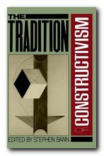
The Tradition of ConstructivismThis collection of manifestos, articles, and agit-prop documents represents the theoretical and propagandist side of the movement – and it must be said that it captures well the exuberance and desire to create something new which erupted from artists such as Naum Gabo, Vladimir Tatlin, El Lissitzsky, and Laszlo Moholy-Nagy. Editor Stephen Bann offers a prefatory essay, putting the documents into a historical context, and he supplies biographical notes to introduce each document, tracing the various intersections of the principle figures.

This was a movement which embraced many forms of art – painting, sculpture, typography, architecture, and photography – as well as what we would now call ‘mixed media’. The artists were keen to break with the romantic past, keen to embrace new technologies, new functionalism (useful art) and new abstractions. Many of them also held left-wing political views that harmonised well with the tenor of the early 1920s.

However, their theoretical writings are of a different order than the art works they produced. Many of their artistic manifestos and declarations of intent are couched in terribly abstract generalisations. Naum Gabo and Antoine Pevsner declare quite baldly in The Realistic Manifesto of 1920:

No new artistic system will withstand the pressure of a growing new culture until the very foundation of Art will be erected on the real laws of life.

And Alexei Gann is even more uncompromising in his proclamation Constructivism of 1922:

DEATH TO ART!

It arose NATURALLY

It developed NATURALLY

And disappeared NATURALLY

MARXISTS MUST WORK IN ORDER TO ELUCIDATE ITS DEATH SCIENTIFICALLY AND TO FORMULATE NEW PHENOMENA OF ARTISTIC LABOUR WITHIN THE NEW HISTORIC ENVIRONMENT OF OUR TIME.

Ironically, these radical attitudes gave the artists problems as soon as the official line in the Soviet Union changed abruptly from pro- to anti-modernism only a few years later under the rise of Stalin. It’s interesting to reflect that this form of argument in abstract generalisations, with no detailed examination of concrete examples, is precisely the rhetorical method which was to be used against these modernists by the apparatchicks of the Ministry of Culture from the late 1920s onwards.

The Zhdanhovs of this world didn’t sully their proclamations against ‘formalists’ and ‘decadents’ by anything so simple as the analysis of real works. For them, naming names or even just dropping hints was enough to send typographists, poets, and artists to the Gulag.

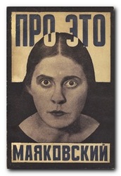
Rodchenko - photo designHowever, it should perhaps be remembered that many visual artists, from art-college onwards, come badly unstuck when it comes to expressing their ideas in words. That’s why theories of constructivism and any other movement should be founded on what is produced, not what is said. This is one of the weaknesses of extrapolating aesthetic theories from documents such as those reproduced here. Much huffing and puffing can be expended on whatever artists said about their art, rather than what they produced. But these are theories based on opinions rather than material practice.
This is a publication that is wonderfully rich in scholarly reference and support. There are full attributions for all the illustrations used, notes to the text, a huge bibliography, and full attributions for the sources of all the original documents reproduced. There are also some rather grainy black and white images of constructivist art, typography, and architecture which illustrate the fact that the imaginative products of these artists (irrespective of their sloganeering) was genuinely revolutionary.

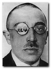
Osip Brik - portrait by RodchenkoTaking a sympathetic attitude to the early efforts of these artists to develop a revolutionary approach to art, it’s interesting to note that they thought subjective individual expression ought to be replaced by collective works. They also fondly imagined that the working class would unerringly prefer the most imaginative and original works over traditional offerings. This was a period in which the term ‘easel painting’ was used in a tone of sneering contempt. The fact that they were largely ignored by the class for whom they thought they were fighting this aesthetic war in no way diminishes their achievements.
And occasionally nuggets of genuine insight emerge from all the generalizing dreck – as in Osip Brik’s observation regarding Rodchenko’s approach to constructivism:

The applied artist has nothing to do if he can’t embellish an object; for Rodchenko a complete lack of embellishment is a necessary condition for a proper construction of the object.

The documents span the period from the birth of constructivism in 1920 up to the post-war remnants of the movement. This is something of a special interest publication, but it’s well worth studying to understand the political and theoretical notions that provided the impetus behind an artistic endeavour which is still influential today. The theory might be dated, but constuctivist works of art are certainly not.

Constructivism Buy the book at Amazon UK

Constructivism Buy the book at Amazon US

© Roy Johnson 2009


Stephen Bann (ed), The Tradition of Constructivism, Da Capo Press, 1990, pp.334, ISBN 0306803968


More on architecture
More on technology
More on design


Filed Under: Architecture, Art, Design history Tagged With: Alexander Rodchenko, Constructivism, Cultural history, Design, Modernism, Russian modernism, The Tradition of Constructivism

Tricia Guild Pattern

June 26, 2009 by Roy Johnson

interior design and furnishing with style and colour

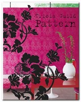
Tricia Guild is an interior designer and the brand name behind a successful company which features a vivid array of fabrics and furnishings – all of which feature striking colours, bold pattern, and luxurious textures. To live with this style you have to be confident enough to choose wallpapers with huge floral designs, curtains which are multi-coloured and decorated with magnificent swags, and be prepared to upholster your three piece suites with fabrics which grab you by the lapels. You need to put turquoise silk next to hot red damask, and if you want to achieve some of the effects illustrated here your house needs to be spotlessly clean and full of marble.

Tricia Guild PatternOrnate gold mirrors, and fresh-cut flowers which offset the decor in every room would be a help too. She is inspired by fabrics, techniques, motifs and designs from all over the world and from every period of history – brocades and damasks from the Far East; the rich history of botanical illustration and flower painting; checks, plaids and stripes from northern Europe; vibrant ethnic prints from India and Central America; painterly designs from Chinese and European porcelain; the bold abstracts and geometric patterns of contemporary painters.

Not that it’s all entirely in-your-face colour and bold pattern. She also has some subtle and restrained examples of ticking used to create a cool, contemporary atmosphere. But those are the exception. Most of the book is filled with hot, passionate colours, and rich textures emphasised by extreme close-up photographs. There’s a whole chapter on the use of flowers in fabric patterns – tulips, poppies, roses, and chrysanthemums.

I feel a bit sorry for the people who supply the text for these books. They are competing for the reader’s attention against overwhelming odds. The visuals drown out everything. And yet Elspeth Thompson has some interesting things to say about the nature of pattern and she offers thoughtful analyses of the interiors illustrated in the examples shown.

Many of the pages are like Howard Hodgkin paintings. It’s difficult not to be seduced by the visual texture of it all. My recipe for these interior design style books is to look at the overall effect, then choose one element on each page which you could incorporate into your own home. It could be the colour scheme, the positioning of furniture, the lighting, or (in this case) the use of patterned fabrics to breathe life into a room.

The book itself is a bibliographic reflection of this torrid style. It’s printed on thick paper, with occasional translucent inserts, beautifully photographed and illustrated – and has a cover jacket that’s like flock wallpaper from an Indian restaurant.

© Roy Johnson 2006

Tricia Guild   Buy the book at Amazon UK

Tricia Guild   Buy the book at Amazon US


Tricia Guild and Elspeth Thompson, Pattern, London: Quadrille, 2006, pp.208, ISBN: 1844003264


More on design
More on media
More on web design


Filed Under: Individual designers, Lifestyle Tagged With: Decorative arts, Design, Interior design, Lifestyle, Tricia Guild: Pattern, Trisha Guild

Type in Motion

May 24, 2009 by Roy Johnson

typography in graphic animations for Web and video

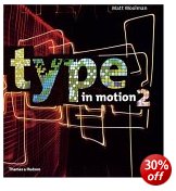
This book sets itself an ambitious target – to depict graphic animations of typography on the static, printed page. Bellantoni and Woollman do reasonably well under these circumstances. It’s is a high-energy, brilliantly coloured coffee-table book [with a fairly dreadful cover] – but also a serious exploration of the latest trends in type design in commercial and fine art. Double-page spreads are devoted to the work of individual artists or design agencies in this field. They cover film credits, promotions, conceptual video, early TV ads, and cinema presentations.

Graphic AnimationThe collection starts with stills from the work of film title animator Saul Bass. [Remember ‘Psycho’ and ‘The Man with a Golden Arm’? – there’s a new site for him at www.saulbass.tv]. Unfortunately, even though some pages are covered in thumbnails of the sequences, the animation element has to be spelled out in words, which somewhat defeats the object.

Some cinema animations could just as easily have been illustrated with a single frame. The examples which look most interesting on the page are the shots of orthodox typography on promotional CDs (described in artsy-hype-speak as ‘interactive press kits’) and one page of ‘Shakespeare in 3D’ where text and footnotes intersect each other at ninety degrees.

Some of the video and TV sequences on the other hand are very difficult to follow because they are reproduced in small black and white thumbnails, and the pages in general are so crowded that we are not drawn in to contemplate the typeface. Perhaps the most surprising feature of all in a study of this kind is that the typefaces used in the examples are not explored in any technical detail, but are described in generic terms – ‘sans-serif, bold, outlined’.

This is an art book, with some of the pretentiousness which often goes with this genre – for instance: “270% Confessional explores the concept of multiple linearities, functioning at several levels simultaneously. The type sequence is an exploration of memory, verbal communication, and the visualization of a conscience.”

It’s a book which in fact deserves to be a film, or at least a website with .MPGs of the effects they discuss. Nevertheless, I imagine that those people working in graphic animation will welcome this as a convenient survey and a print resource. It’s a pity that there’s no index or bibliography, which might have given it more chance of being taken seriously.

© Roy Johnson 2005

Type in Motion   Buy the book at Amazon UK

Type in Motion   Buy the book at Amazon US


Jeff Bellantoni and Matt Woollman, Type in Motion: Innovations in Digital Graphics, 2nd edn, London: Thames and Hudson, 2005, pp.176, ISBN: 0500512434


More on typography
More on digital media
More on technology
More on theory


Filed Under: Media, Typography Tagged With: Animated graphics, Design, Media, Multimedia, Typography

Typography bibliography

October 30, 2009 by Roy Johnson

Typography bibliography   Gavin Ambrose & Paul Harris, The Fundamentals of Typography, Lausanne: AVA, 2006, pp.176, ISBN 2940373450.

Typography bibliography   Tom Arah, Web Type: Start Here!, Lewes: ILEX, 2004, pp.192, ISBN: 1904705189.

Typography bibliography   Jeff Bellantoni and Matt Woollman, Type in Motion: Innovations in Digital Graphics, 2nd edn, London: Thames and Hudson, 2005, pp.176, ISBN 0500512434

Typography bibliography   John D. Berry, dot-font: talking about fonts, New York: Mark Batty Publishing, 2006, pp.126, ISBN: 0977282708

Typography bibliography   Charles Bigelow, Paul Hayden Duensing, and Linnea Gentry (eds) Best of Fine Print on Type and Typography, San Francisco: Fine Print/Bedford Arts, 1988.

Typography bibliography   Lewis Blackwell, Twentieth Century Type, Rizzoli International Publications/Calmann & King, 1992, pp.256, ISBN 084781596X

Typography bibliography   Lewis Blackwell, 20th Century Type: Remix, London: Lawrence King, 1998, pp.191, ISBN 1856691160. New edition of a historical survey of 100 years of innovation in typographic design – presented in elegantly publication which has become a favourite amongst designers.

Typography bibliography   Lewis Blackwell and David Carson, The End of Print: The Graphic Design Of David Carson, Chronicle, 1995, pp.160, ISBN: 0811811999. California dreaming. Father of ultra-distressed type. Carson came to fame by designing Raygun and has remained popular with the avant garde ever since.

Typography bibliography   Lewis Blackwell and David Carson, David Carson: 2nd Sight: Grafik Design After the End of Print, Universe Books, 1997, pp.176, ISBN: 0789301288. Follow-up to best-selling title above. More of Carson’s influential work – where type and graphics begin to merge with each other.

Typography bibliography   Joseph Blumenthal, The Printed Book in America, Boston: David R. Gondine, 1997.

Typography bibliography   Alexander Branczyk et al, Emotional Digital: A sourcebook of contemporary typographics, London: Thames & Hudson, 2001, pp.312, ISBN 0500283109. Showcase presentation of modern type design from the best of today’s studios – both traditional and avant-gard. Examples shown in wide range of applications. Beautifully produced book.

Typography bibliography   Robert Bringhurst, The Elements of Typographic Style (2nd edn), Vancouver: Hartley & Marks, 1996, pp.351, ISBN 0881791326. The Bible of typography. Beautifully designed and poetically written encyclopedia of all things typographic. Impossible to recommend this book too highly.

Typography bibliography   Christopher Burke, Paul Renner: the art of typography, London: Hyphen Press, 1999, pp.223, ISBN 1568981589. Scholarly biography of the designer of the Futura typeface. Mixes graphic design issues with politics and social history. Elegantly produced and well illustrated.

Typography bibliography   Sebastian Carter, Twentieth Century Type Designers, New York: W.W.Norton, (new edition) 1995.

Typography bibliography   Warren Chappell, A Short History of the Printed Word, New York: Alfred A. Knopf, 1970.

Typography bibliography   Carl Dair, Design With Type, Toronto: University of Toronto Press, 1982.

Typography bibliography   Geoffrey Dowding, Finer Points in the Spacing and Arrangement of Type, (Revised edition), Vancouver: Hartley & Marks, 1995, pp.96, ISBN 0881791199. Does what it says on the tin. Dowding reflects on the more subtle points of punctuation and letter spacing. Elegant, restrained, and well-produced.

Typography bibliography   William Addison Dwiggins, Layout in Advertising, New York: Harper and Brothers, 1948.

Typography bibliography   James Felici, The Complete Manual of Typography, Berkeley (CA): Peachpit Press, 2003, pp.360, ISBN 0321127307.

Typography bibliography   Adrian Frutiger, Type, Sign, Symbol, Zurich: ABC Verlag, 1980.

Typography bibliography   Simon Garfield, Just My Type, London: Profile Books, 2010, pp.352, ISBN: 1846683025

Typography bibliography   Eric Gill, An Essay on Typography, London, 1936, reissued Boston: David R. Godine 1993, pp.144, ISBN: 0879239506. Gill’s essay is a slightly quirky plea for the aesthetics and morals of good design principles. This has become a design classic. Produced in Gill’s own typeface – Johanna.

Typography bibliography   Bob Gordon and Maggie Gordon, The Complete Guide to Digital Graphic Design, London: Thames and Hudson, 2002, pp.224, ISBN 050028315X. Typography is only one part of this survey of contemporary design – but the book is so beautifully illustrated and produced, it acts as an excellent example of page structure and layout.

Typography bibliography   Bob Gordon, Making Digital Type Look Good, London: Thames and Hudson, 2001, pp.192, ISBN 0500283133. Beautifully designed and elegantly printed study. Includes the anatomy of type, rendering, technology, and fine tuning. Clarifies all the complexities of font technology in a very straightforward manner – showing how tracking, kerning, and hyphenation can be used to good effect.

Typography bibliography   Nicolette Gray, A History of Lettering: Creative Experiment and Letter Identity, Boston: David R. Gondine, 1986.

Typography bibliography   Robert Harling, The Letter Forms and Type Designs of Eric Gill, Boston: David R. Gondine, 1977.

Typography bibliography   New Hart’s Rule for Compositors and Readers, London: Oxford University Press, 1999, pp.182, ISBN 019212983X. Compact style guide to typographical and presentational niceties – from punctuation and spacing, to hyphenation, foreign words, symbols, and proof-correction.

Typography bibliography   Oldrich Hlavsa, A Book of Type and Design, New York: Tudor Publishing, 1960.

Typography bibliography   Richard Hollis, Graphic Design: a concise history, London: Thames and Hudson, 1994, pp.224, ISBN: 0500202702. Compact, well-illustrated, and good-value history of twentieth century design – including graphics and typography.

Typography bibliography Sally Hughes, Design and Typography, Computer Step, 1998, pp.193, ISBN 1840780045. Well-illustrated and simple introduction to typography and desk top publishing – every point illustrated by examples.

Typography bibliography   Indie Fonts, Buffalo, NY: P-Type Publications, 2002, pp.408, ISBN: 0963108220. Beautifully produced collection of over 2000 fonts from eighteen of the most innovative independent type designers.

Typography bibliography   W. Pincus Jaspert, W. Turner Berry, and A.F. Johnson, The Encyclopaedia of Type Faces, New York: Blandford Press, 1986.

Typography bibliography   Rob Roy Kelly, American Wood Type, New York: Van Nostrand Rheinhold, 1969.

Typography bibliography   Robin Kinross, Modern Typography: An Essay in Critical History, Chronicle Books/Princeton Architectural Press, 1996, pp.208, ISBN 0907259057.

Typography bibliography   Alexander Lawson, Anatomy of a Typeface, London: Hamish Hamilton, 1990, pp.428, ISBN 0241132673.

Typography bibliography   Alexander Lawson, Printing Types: An Introduction, Boston: Beacon Press, 1971.

Typography bibliography   Ellen Lupton, Thinking with Type: A critical guide for designers, editors, and students, New York: Princeton Architectural Press, 2004, pp.176, ISBN 1568984480

Typography bibliography   Mac McGrew, American Metal Typefaces of the Twentieth Century, New Castle Delaware: Oak Knoll Press, 1993.

Typography bibliography   Ruari McLean, The Thames and Hudson Manual of Typography, Thames and Hudson, 1980, ISBN 0500680221. Popular, good-value, and well illustrated general introduction to typography. Covers all aspects of the craft, but ends with focus on book design.

Typography bibliography   Ruari McLean, Jan Tschichold: Typographer, Boston: David R. Gondine, 1975.

Typography bibliography   Stanley Morison, Letterforms, Montreal: Hartley and Marks, 1997, pp.128, ISBN 0881791369

Typography bibliography   Stanley Morrison, First Principles of Typography, New York: The Macmillan Company, 1936.

Typography bibliography   Stanley Morrison, A Tally of Types, Cambridge: Cambridge University Press, 1973.

Typography bibliography   Robert Norton, Types Best Remembered/Types Best Forgotten, Parsimony Press, 1993, ISBN 1884606008. Collection of well-known typefaces, complemented by negative and positive criticism.

Typography bibliography   Bruce Rogers, Paragraphs on Printing, New York: Dover Publications, 1979.

Typography bibliography   Julian Rothenstein and Mel Gooding (eds), 130 Alphabets and Other Signs, London: Thames and Hudson, 1993, pp.183, ISBN 0500277419. A charming sample book of signs, symbols, alphabets, rules, swashes, and pictograms. Highly recommended.

Typography bibliography   Julian Rothenstein and Mel Gooding (eds), A B Z: More Alphabets and Other Signs, London: Redstone Press, 2003, pp.221, ISBN:1870003330. Another charming sample book of font sets, signs, symbols, alphabets, rules, swashes, and pictograms. Highly recommended.

Typography bibliography   Rosemary Sassoon, Computers and Typography, Oxford: Intellect, 1993, pp.164, ISBN 1871516234. Articles on text massage; layout and readability; new alphabets using bitmapped fonts; the history of typography and its effects; the visual analysis of a page of text; and Sassoon’s essay on perception and type design related to writing for children.

Typography bibliography   Rosemary Sassoon, Handwriting of the Twentieth Century, London: Routledge, 1999, pp.208, ISBN 0415178827. Developments in the teaching and study of handwriting over the course of the 20th century. A historical record of techniques, styles and methods. Beautifully illustrated with examples – from guidance manuals, schoolbooks, clerks’ registry entries, and personal handwriting.

Typography bibliography   Erik Spiekermann & E.M. Ginger, Stop Stealing Sheep and find out how type works, Adobe Press/Hayden Books, 1993, ISBN 0672485435. Very popular introduction to the general principles of typography. Well designed and illustrated.

Typography bibliography   Walter Tracy, Letters of Credit: A View of Type Design, Boston: David R. Godine, 1986, ISBN 0879236361.

Typography bibliography   Jan Tschichold, Asymmetric Typography, London: Faber & Faber, 1967.

Typography bibliography   Jan Tschichold, The Form of the Book: Essays on the Morality of Good Design, Vancouver: Hartley & Marks, 1991, pp.181, ISBN 0881791164. Short essays from Tschichold’s ‘late’ period on some of the most fundamental issues of arranging type on paper. Eloquent opinions on page shape, margins, text spacing, and even blank pages.

Typography bibliography   Jan Tschichold, The New Typography: A Handbook for Modern Designers, Berkeley: University of California Press, 1995, pp.236, ISBN: 0520071476. Manifesto of the modernist movement. Tschichold’s ‘early’ period, politically committed argument for ‘form follows function’. Original illustrations, and printed in period style.

Typography bibliography   Jan Tschichold, Treasury of Alphabets and Lettering: A Source Book, W.W. Norton, 1995, pp.236, ISBN 0393701972.

Typography bibliography   D.B. Updike, Printing Types: Their History, Forms and Use, New York: Dover Publications, 1980.

Typography bibliography   Hugh Williamson, Methods of Book Design: The Practice of an Industrial Craft, New haven: Yale University Press, 1985.

Typography bibliography   Adrian Wilson, The Design of Books, San Francisco: Chronicle Books, 1995, pp.159, ISBN 081180304X.

Typography bibliography   Jon Wozencroft, The Graphic Language of Neville Brody, London: Thames & Hudson, 1988, pp.160, ISBN 0500274967. Comprehensive survey of Brody’s graphics and typography – in two very popular and well-illustrated volumes. Best-seller.

© Roy Johnson 2009


More on typography
More on technology
More on digital media


Filed Under: How-to guides, Typography Tagged With: Bibliographies, Design, Fonts, Typography

Understanding Comics

July 8, 2009 by Roy Johnson

the techniques, philosophy, and interpretation of comics

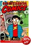
Whenever there is a discussion or an exchange of messages concerning comics or visual narratives, one name crops up again and again – Scott McCloud. Understanding Comics is his now classic work on the comic designer’s art. It’s presented in the form of a comic itself – but don’t let that fool you. He could just as easily given his book the sub-title ‘The Philosophy of Graphic Narratives’. He starts with a chapter defining what comics are (sequential visual art) and shows something of their history, going back as far as Egyptian wall paintings in 1300 BC.

Understanding ComicsIf at first this seems rather obvious or over-simplified, two or three pages into chapter two, he is discussing the theory of visual perception and the nature of iconic language. Next comes the sequencing of action and the decision of what goes into (and what can be left out of) each visual panel of a comic. There’s a very interesting comparison of American and Japanese techniques in which he argues that some of the special effects of the Manga comics arise from different traditions of perception in the East.

He explains the depiction of time and motion via the panel or frame. In fact after doing the same thing for emotion by the use of symbols, he extends his argument to claim that we are in an age where a whole new visual language is in the process of being invented.

The traditional modes of dealing with narrative via showing and telling are demonstrated by the same story being related via pictures and words, then re-combined to show the comic creator’s skill in offsetting one medium against the other to avoid tautology and maximise expressive density.

This is a book which will entrance any comic lovers or anybody who has an interest in media studies or how ideas and stories are transmitted.

Quite a lot of these issues of graphics, narrative, point of view, and are now an active part of online, web-based information. I’m sure he will be aware of that, and I’m sure he will take it into account in any future editions.

He ends with what is obviously a heartfelt plea that comics should be taken seriously as a cultural genre, and he extends this to claim that they haven’t yet even scratched the surface of what they are capable of expressing.

© Roy Johnson 2000

Understanding Comics Buy the book at Amazon UK

Understanding Comics Buy the book at Amazon US


Scott McCLoud, Understanding Comics, New York: HarperCollins, 1994, pp.217, ISBN 006097625X


More on art
More on media
More on design


Filed Under: Art, Graphic design, Media Tagged With: Comics, Design, Graphic design, Media, Media theory, Narratives, Theory, Understanding Comics

Wordless Books

May 24, 2009 by Roy Johnson

the original graphic novels

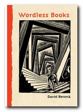
Wood engravings, linocuts, and, copperplate engravings have all existed for centuries, but it wasn’t until the early years of the 1900s that artists began to use them for creating book-length ‘stories without words’ which aspired to be the equivalent of novels. These are what we now call graphic novels. These illustrators were closely associated with the visual world of German expressionism, particularly that of Oskar Kokoshka and Ernst Kirchner. The two most prominent figures in this movement were Frans Masereel and Lynd Ward, though David Berona, in this thoughtful and well-informed work of homage to the genre also includes examples by Otto Nuckell, and the more recent Willam Gropper, the American Milt Gross, Giacomo Patri, and Laurence Hyde.

Graphic NovelsHe quotes the celebrated comic-book theorist Scott McCloud as observing that these woodcut stories were an important bridge between the nineteenth century and the modern day comic. He includes extracts from a number of Masereel’s wordless books – almost all of them dealing with the de-humanising effect of capitalism on the common man. His best-known work, The Passionate Journey (1919) was the nearest Masereel came to creating a novel in pictures – a story of Everyman at the start of the last century. It’s a tale very close in both substance and mood to Doblin’s later Berlin Alexanderplatz (1929).

Berona gives an account of Masereel’s other wordless novels, illustrating their somber black and white pages and describing their stories. He doesn’t go in for any profound analysis, which given the youthfulness of this art form at the time might even be a good thing.

The American artist Lynd Ward actually used the graphic novel form to explore issues of slavery and race in US culture, as well as the oppression that common people felt as a result of the Great Depression.

It has to be said that many of these ‘novels’ are often not much more than extended adolescent fantasies of the kind that are thrown up time and again in ‘creative writing’ classes. But what makes them very different is that they are executed dramatically and with visual finesse via these authors’ control of a two-dimensional visual medium.

It’s a world of tilting skyscrapers, menacing shadows, vertiginous perspectives, drink and debauchery, children born out of wedlock, and people set against sunrises with outstretched arms.

Almost all of these illustrators were on the side of the small, common man, and against the might of the capitalist, the owners of the means of production.

Some of the later examples, produced in the late 1920s and 1930s by American artists such as Milt Gross and Myron Waldman are very close to the comic book tradition which was emerging around the same time.

There are also lots of original book jacket covers reproduced here, as well as fully documented details of the artists, their works, and other publications related to this neglected niche of visual narratives.

It’s strange to note that apart from minor differences which arose from working with wood, lino, or even lead, the styles adopted by these artists were all remarkably similar. The graphic novel is now a thriving genre in its own right, with many distinguished illustrators working in the medium. But this is a valuable collection of the work of pioneers.

© Roy Johnson 2008

Wordless Books   Buy the book at Amazon UK

Wordless Books   Buy the book at Amazon US


David A. Berona, Wordless Books: The Original Graphic Novels, New York: Abrams, 2008, pp.255, ISBN: 0810994690


More on design
More on media
More on web design


Filed Under: Graphic design, Media Tagged With: Design, Graphic design, Graphic novel, Literary studies, Wordless Books

Working at Home

June 7, 2009 by Roy Johnson

combining your office with your home – elegantly

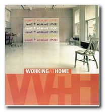
Working at Home is the second book on the interior design of home office space I have recently consulted as research for a move to new office premises. Like the first, Working Spaces, it offers a powerfully stimulating set of examples, generated by people with imagination, flair, and in some cases, courage. If the selection of examples are typical of interior design today, the cities pushing this trend are New York, London, Berlin, Barcelona, and Tokyo.

Working at Home And the fashion is for old industrial spaces preserved for their high ceilings, big room spaces, and vast windows. In each case they have been transformed by adding luxury furnishings, yet the original features have been preserved – so that there at first appears to be a tension between domestic and commercial purposes. The examples show interior design solutions for writers, artists, musicians, architects, graphic designers, a printers, business people, and a textile designer. And in most cases the usual clutter which blights commercial offices has been purged – to good effect.

It has to be said that most of the samples illustrated are examples of minimalist design – plain walls and floors, no decoration, wood in teak or beech, lots of opaque tinted green glass, polished chrome fittings, simple halogen downlighters, chairs with tubular chrome legs, and giant settees in black leather.

There are architectural plans reproduced in each case which illustrate how the overall space has been used and how the parts relate to the whole.

One of the recurring features I spotted here was floors covered in epoxy resin – which results in a hard, shiny surface which is practical and easily cleaned. Not everybody would wish to settle down for a cozy evening in such surroundings – but the results look great.

What conclusions can be drawn from the examples on display? In almost all cases there are few decorations in the rooms: no pictures or shelves or decorative brackets. The rooms, with their pale walls and clutter-free surfaces are left to speak for themselves.

You might imagine that people working in the creative industries would want to decorate every inch of their surroundings with objects which expressed their tastes and cultural values. But the opposite appears to be the case. And these might indeed be shining examples illustrating Mies van der Rohe’s mantra – Less is More.

© Roy Johnson 2005

Home office Buy the book at Amazon UK

Home office Buy the book at Amazon US


Aurora Cuito, Working at Home, New York: Loftpublications, 2000, pp.175, ISBN 0823058700


More on architecture
More on technology
More on design


Filed Under: Architecture, Lifestyle Tagged With: Architecture, Design, Home office, Home working, Interior design, Lifestyle, Working at Home

  • « Previous Page
  • 1
  • …
  • 3
  • 4
  • 5

Get in touch

info@mantex.co.uk

Content © Mantex 2016
  • About Us
  • Advertising
  • Clients
  • Contact
  • FAQ
  • Links
  • Services
  • Reviews
  • Sitemap
  • T & C’s
  • Testimonials
  • Privacy

Copyright © 2025 · Mantex

Copyright © 2025 · News Pro Theme on Genesis Framework · WordPress · Log in