Mantex

Tutorials, Study Guides & More

  • HOME
  • REVIEWS
  • TUTORIALS
  • HOW-TO
  • CONTACT
>> Home / Archives for Graphic design

Bloomsbury Art and Design

August 6, 2009 by Roy Johnson

painting, illustration, ceramics, interior design

The Bloomsbury Group included a number of painters and designers who had an important influence on the visual and decorative arts during the period of English modernism (1905—1930). The group included artists Vanessa Bell and her husband Clive Bell; the artist and critic (and Vanessa Bell’s lover) Roger Fry; the artist (and Vanessa Bell’s lifetime companion) Duncan Grant, plus painters Dora Carrington and Mark Gertler. Bloomsbury art and design was never a coherent movement with an agreed set of theories: it was a close-knit group of friends who shared an interest in aesthetics.

The following publications deal with the amazingly wide range of their art in its pure and applied manifestations. These range from easel paintings, public commissions, interior designs, book illustrations, furniture and tapestries, plus the celebrated wall decorations at Charleston.

Bloomsbury Art and DesignThe Art of Bloomsbury features the paintings and drawings of artists Roger Fry, Vanessa Bell, and Duncan Grant – three of the central figures of the Bloomsbury Group. There are entries on two hundred works of art, all illustrated in colour, which bring out the chief characteristics of Bloomsbury painting – domestic, contemplative, sensuous, and essentially pacific. These are seen in landscapes, portraits, and still lifes set in London, Sussex, and the South of France. The volume also features the abstract painting and applied art that placed these artists at the forefront of the avant-garde before the First World War. There are portraits of family and friends – from Virginia Woolf and Maynard Keynes to Aldous Huxley and Edith Sitwell. Essays by leading scholars provide further insights into the works and the changing critical reaction to them.
Bloomsbury Group Buy the book from Amazon UK
Bloomsbury Group Buy the book from Amazon US


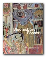
Bloomsbury Art and DesignBloomsbury Rooms: Modernism, Subculture, and Domesticity is a scholarly study which traces the development of Bloomsbury’s domestic aesthetic from the group’s influential Post-Impressionism in Britain around 1910 through to the 1930s. Christopher Reed makes detailed studies of rooms and environments created by Virginia Woolf’s sister Vanessa Bell, Duncan Grant, and Roger Fry, and he puts them into the context of aesthetic debates of the period. His study challenges the accepted notion that these artists drifted away from orthodox modernism. Whatever you think of the book’s theoretical arguments, it’s a beautifully illustrated production, full of fascinating paintings, fabrics, decoration, interior design, and original graphics.
Bloomsbury Group Buy the book from Amazon UK
Bloomsbury Group Buy the book from Amazon US


Bloomsbury Art and DesignThe Art of Dora Carrington At the age of 38, Dora Carrington (1893-1932) committed suicide, unable to contemplate living without her companion, Lytton Strachey, who had died a few weeks before. The association with Lytton and his Bloomsbury friends, combined with her own modesty have tended to overshadow Carrington’s contribution to modern British painting. She hardly exhibited at all during her own lifetime, and didn’t even bother signing her own works. This book aims to redress the balance by looking at the immense range of her work. She produced portraits, landscapes, glass paintings, letter illustrations and decorative work – all illustrated here in full colour. It also acts as an introduction to the artist herself, with rare photographs helping form a fuller picture of this fascinating woman.
Bloomsbury Group Buy the book from Amazon UK
Bloomsbury Group Buy the book from Amazon US


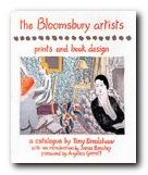
Bloomsbury Art and DesignThe Bloomsbury Artists: Prints and Book Designs This volume catalogues the woodcuts, lithographs, etchings and other prints created by Vanessa Bell, Dora Carrington, Roger Fry and Duncan Grant – with various colour and black and white reproductions. Of particular interest are the many book jackets designed for the Hogarth Press, the publishing company established by Leonard Woolf and Virginia Woolf. Also included are ephemera such as social invitations, trade cards, catalogue covers, and bookplates. Many of these were produced as part of the movement for modern design established by the Omega Workshops.
Bloomsbury Group Buy the book from Amazon UK
Bloomsbury Group Buy the book from Amazon US


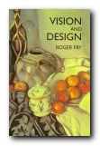
Bloomsbury Art and DesignVision and Design is a collection of Roger Fry’s best articles and writings. It had a significant impact on the art world in the 1920s and 1930s. Unlike many critics and scholars of the time, Fry expanded his discussion on art outside of the Western world, even to the degree of contending that primitive sculpture surpasses that of the West. As well as Western art, the book examines the use of form and aesthetics in ethnic art from Africa, America and Asia. It reinforced his position as a critic and it is still recognised as an extremely influential work in the development of modernist theory.
Bloomsbury Group Buy the book from Amazon UK
Bloomsbury Group Buy the book from Amazon US


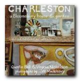
Bloomsbury Art and DesignCharleston: A Bloomsbury House and Garden by Quentin Bell and Virginia Nicolson encapsulates the artistic sensibility of the Bloomsbury Group. It is an illustrated record of the farmhouse at Charleston in Sussex which Vanessa Bell and Duncan Grant treated as a blank canvas in interior design. In doing so, they created a treasury of Bloomsbury art. The book provides family memories and anecdotes drawn from a lifetime’s experience. Each room links the interiors with some of the leading cultural figures of the 20th century, plus guests such as Vanessa’s sister Virginia Woolf and Lytton Strachey. Specially commissioned photographs portray the essence of the Bloomsbury style both throughout the house, with its painted furniture and walls, plus decorative items, paintings, and objects in the garden.
Bloomsbury Group Buy the book from Amazon UK
Bloomsbury Group Buy the book from Amazon US


Bloomsbury Art and DesignThe Art of Duncan Grant In addition to being a central figure in the Bloomsbury group, Duncan Grant played a leading role in the establishment of modernist art in Britain. His principal works were easel paintings, but he also produced murals, fabric designs, theatre and ballet work, illustration and print-making, and commercial interior decoration. Throughout a long life Duncan Grant continued to experiment with and adapt to new styles and techniques, and this book offers an opportunity to grasp the extent of his achievement. It examines the influence that people and places had on him and demonstrates, with more than a hundred illustrations of his work, the range of his talent. It’s been said that he was as polymorphous in his work as he was in his much-discussed private life.
Bloomsbury Group Buy the book from Amazon UK
Bloomsbury Group Buy the book from Amazon US


Bloomsbury Group – web links

Hogarth Press first editions
Annotated gallery of original first edition book jacket covers from the Hogarth Press, featuring designs by Vanessa Bell, Roger Fry, and others.

The Omega Workshops
A brief history of Roger Fry’s experimental Omega Workshops, which had a lasting influence on interior design in post First World War Britain.

The Bloomsbury Group and War
An essay on the largely pacifist and internationalist stance taken by Bloomsbury Group members towards the First World War.

Tate Gallery Archive Journeys: Bloomsbury
Mini web site featuring photos, paintings, a timeline, sub-sections on the Omega Workshops, Roger Fry, and Duncan Grant, and biographical notes.

Bloomsbury: Books, Art and Design
Exhibition of paintings, designs, and ceramics at Toronto University featuring Hogarth Press, Vanessa Bell, Dora Carrington, Quentin Bell, and Stephen Tomlin.

Blogging Woolf
A rich enthusiast site featuring news of events, exhibitions, new book reviews, relevant links, study resources, and anything related to Bloomsbury and Virginia Woolf

Hyper-Concordance to Virginia Woolf
Search the texts of all Woolf’s major works, and track down phrases, quotes, and even individual words in their original context.

A Mrs Dalloway Walk in London
An annotated description of Clarissa Dalloway’s walk from Westminster to Regent’s Park, with historical updates and a bibliography.

Women’s History Walk in Bloomsbury
Annotated tour of literary and political homes in Bloomsbury, including Gordon Square, University College, Bedford Square, Doughty Street, and Tavistock Square.

Virginia Woolf Society of Great Britain
News of events, regular bulletins, study materials, publications, and related links. Largely the work of Virginia Woolf specialist Stuart N. Clarke.

BBC Audio Essay – A Eulogy to Words
A charming sound recording of a BBC radio talk broadcast in 1937 – accompanied by a slideshow of photographs of Virginia Woolf.

A Family Photograph Albumn
Leslie Stephens’ collection of family photographs which became known as the Mausoleum Book, collected at Smith College – Massachusetts.

Bloomsbury at Duke University
A collection of book jacket covers, Fry’s Twelve Woodcuts, Strachey’s ‘Elizabeth and Essex’.

© Roy Johnson 2000-2014


More on art
More on design
More on lifestyle
More on biography
More on the Bloomsbury Group


Filed Under: Art, Bloomsbury Group, Lifestyle Tagged With: Art, Bloomsbury Group, Bloomsbury rooms, Charleston, Dora Carrington, Duncan Grant, Graphic design, Interior design

Complete Guide to Digital Design

June 19, 2009 by Roy Johnson

This is a beautifully designed and an elegantly produced book. It’s an excellent counterpart to Bob Gordon’s other recent publication – Making Digital Type Look Good. First he offers a brief introduction which illustrates contemporary digital design in a variety of media – print, packaging, signage, exhibitions, Internet, and Multimedia. The rest of the book is in four sections. The first deals with basic design principles. That is, issues such as shape, line, colour, type, layout, images, and the dynamics of emphasis, contrast, and shade.

Complete Guide to Digital DesignThe next sections look in detail at the latest developments in design for print publications, public signage, exhibitions, for the computer screen, and for multimedia. If any of this sounds rather abstract, it has to be said that these principles are illustrated in a wonderful series of double-page spreads, orchestrated in a beautifully rhythmic series of variations on a five column grid. The book itself lives up to the high design values it is presenting.

The supposition is that many designers will be migrating from the world of print to that of the digital interface – and I think that is reasonable – since the Web gets some of its most efficient and elegant designs from the influences of print design.

There’s an account of the best software programs [QuarkXPress and PageMaker] and how they are used in print preparation. This is followed by a series of illustrated case histories and interesting details of what is now called ‘surface design’ used in instances as varied as cardboard engineering and multimedia exhibitions.

On designing for the screen, there are useful tips on coping with the frustrations of Web page composition – such as browser download times and display uncertainties. There’s an introduction to Flash, Web editors, and graphics packages such as Fireworks.

The section on multimedia concentrates on designing for CD-ROM and DVD using software such as Macromedia Director and Adobe After Effects – all of which are now within budget price range. The big advantage of this increasingly popular form of delivery is that the author can control the appearance of the finished design on screen.

This is a very elegant production which is worth owning as a stunning example of graphic design in its own right. But it will also form an excellent overview of what is current in the field of digital graphics.

© Roy Johnson 2003

Digital Design   Buy the book at Amazon UK

Digital Design   Buy the book at Amazon US


Bob Gordon and Maggie Gordon, The Complete Guide to Digital Graphic Design, London: Thames and Hudson, 2002, pp.224, ISBN: 050028315X


More on design
More on media
More on web design


Filed Under: Graphic design Tagged With: Complete Guide to Digital Design, Digital design, Graphic design, Typography

Creating Killer Web Sites

July 18, 2009 by Roy Johnson

best-selling web design guide with graphics emphasis

Design guru David Siegel posits the notion that web sites exist in three ‘generations’. First generation sites, created in the mad rush of the early 1990s, were not much more than text files with hyperlinks – and they were inescapably linear:

most had edge-to-edge text that ran on for pages, separated by meaningless blank lines. At best, they looked like slide presentations shown on a cement wall.

Creating Killer Web SitesSecond generation sites were basically the same, but with with icons replacing words, tiled images replacing the ubiquitous grey background, and banners replacing headlines. His claim for the idea of third generation sites is that they offer a new visual experience in which the visitor is ‘pulled’ through the pages using metaphors and “well-know models of consumer psychology”.

For instance, he’s in favour of ‘splash screens’ – entry pages which act as an advert for the sites they introduce. Then he wants sites to offer an ‘experience’ rather than effective data-sharing. The site maps he reproduces in the latest edition of Creating Killer Web Sites have pages on which there is only one link to anything else. He even promotes the idea of ‘exit’ pages which tell the site visitor that this web experience is over.

Having visited his personal site with its splash screen of the Andy Warhol ‘Marilyn’ prints several times, I find them simply an unnecessary impediment to accessing the valuable advice he makes available beyond. None of this sits easily with the idea that any page should be no more than two or three clicks away from any given point. And why introduce an extra stage in the navigational process which yields no real information? This ‘guided tour’ approach to the web experience works directly against the sprit of hypertext, which should give people the freedom to follow whatever links they choose. Why then has he been such a powerful influence in the last few years?

Well, the truth is that apart from this rather idiosyncratic notion, he has a lot of very useful advice to offer on the practical aspects of site design. Not only is his book elegantly produced, it’s packed with tips and tricks which have proved enduringly popular. Much of his success as a designer is founded on his background in typography and graphics, and he makes no bones about the fact that he wants more control of layout on screen.

His most useful guidance, it seems to me, is focused on the aesthetics of page elements and the visual experience of reading on a monitor. For instance, he maintains his crusade against the horizontal rule <HR> but has abandoned advocacy of the single-pixel gif trick to control white space. He’s now in favour of the non-breaking space <&nbsp;> and he has the honesty to admit that many of these devices are ‘hacks’ to achieve effects denied us by the browser.

Text should be held in a narrow column [like this one] and should be limited to what can be read in about a minute, or four to six screens, before offering a new page. He’s against the use of bullets: “They are ugly, identical, and convey little meaning…design around them in all cases” – and he produces plenty of elegant screen shots and page makeovers which support his arguments.

He’s equally adamant on the use of indents to separate paragraphs – “no matter what it takes to make them” and the use of the <P> tag is designated as Deadly Sin number one. I think he’s just a little quirky in this, because this strategy is clearly striving to imitate the appearance of the printed page where it may not always be appropriate – on screen.

He deals with the most fundamental issues of page layout using clear language, and he illustrates the HTML techniques to achieve each effect in a way which anybody could follow. There’s no tricky programming or Java script to be mastered. My notebook was full in no time of coding tips, URLs, and bibliographic recommendations which I’m itching to follow up.

It’s slightly disappointing that the admirable clarity of his approach in early sections of the book is not extended to those on typography and ‘site makeover’. Here he assumes that all the manipulation will be via graphics, and some chapters are dense with PhotoShop techniques which are not as general as his advice on page layout. There is nothing on choice of fonts or the use of the <FONT> tag, which is still controversial enough to warrant comment. He assumes you’ll already know a lot about the creation and manipulation of images. Yet how many readers outside design studios would be able to make much of advice such as “I flatten this entire page and use adaptive color reduction with no dithering”?

Fortunately, there are full-page reproductions of the HTML code for his designs, which is helpful for analysing and understanding the effects he is discussing. He also has an honest and breezy style – “Hang on. This is going to get messy” – and he spells out the truth of rapid and uneven development:

Designers are facing new challenges: how to design sites during the awkward transition from version 3.0 and 4.0 browsers to the version 5.0 and [more important] 6.0 browsers to come. The limitations of 3.0 browsers require designers to resort to workarounds and tricks

This frankness is one of his key strengths. He admits that he doesn’t know how to write his own cgi scripts, and en passant like a young enthusiast he recommends interesting free services and software – such as Gif Wizard, which will optimise your images – as well as very clever tricks for pre-loading the image for a page in advance of its appearance.

In the latter part of the book he offers predictions for the future – cascading style sheets, then XML will predominate – plus some rash promises on details: “I predict that in late 1998, PNG [a graphic format] will take over. With any luck, GIF will be eradicated like the SmallPox virus by the end of 1999”. We’ll wait and see.

I think it’s clear why Creating Killer Web Sites has become a best-seller. Apart from the fact that it’s very stylishly designed and printed, it concentrates on reproducing the sort of graphically advanced page designs which many people would like to create. Strictly speaking, this is really for site builders who wish to maximise the visual novelties of their design whilst minimising the strain put on bandwidth resources. However, it has so many fascinating insights and practical tips to offer, it’s a design manual you can’t really afford to miss.

© Roy Johnson 2002

Buy the book at Amazon UK

Buy the book at Amazon US


David Siegel, Creating Killer Web Sites: The Art of Third-Generation Site Design (2nd edn) Indianapolis: Hayden, 1997, pp.306, ISBN: 1568304331


More on web design
More on digital media
More on technology


Filed Under: Web design Tagged With: Creating Killer Web Sites, David Siegel, Graphic design, Web design

Dada: The Revolt of Art

June 14, 2009 by Roy Johnson

Modernism 1915&mdash;1925

Dada is one of those movements in modern art which had an amazingly short life but a lasting influence. It flourished for not much more than the decade between 1915 and 1925, yet some of its legacy is still with us. It’s amazing to think that this influential movement sprang up in the middle of the first world war – though there were pre-echoes of it in the work of abstract expressionism and Russian futurism which just preceded it.

DadaTristan Tzara might have thought up the name Dada, but I doubt that anyone reads a word of what he wrote these days. However, the work of visual artists such as Jean Arp and Sophie Taeuber still speaks as something of lasting value, almost 100 years later. Dadaism was certainly what we would now call a multimedia phenomenon. It involved painting and sculpture, poetry, typography, theatre, and performance art. At one point it even included a boxing match between Jack Johnson – first black world champion – and Arthur Cravan, a poet-boxer Dadist who was the nephew of Oscar Wilde.

What came out of it that will be of enduring value? Well, certainly the use of montage in graphic design is still with us, as is production in what we now call ‘mixed media’. The work of Raoul Hausmann, Georg Groz, John Heartfield, and Kurt Schwitters still seems fresh today – though Schwitters was actually refused membership of the ‘official’ Dada group, to which he responded by setting up his own one-man movement, called Merz.

As a ‘movement’ (though it was never coherent) it spread quickly from its birthplace in Zurich to Berlin, Paris, and even New York. But its principal adherents were forever disagreeing with each other or even repudiating their own former beliefs. By the early 1920s Dada was ready to be swept up by the much stronger forces of surrealism.

This monograph is beautifully illustrated and it ends with a collection of the key declarations and manifestos of the period for those who want a taste of what was thought to be radical protest in art at the time. There’s also a very good bibliography. Pocket size in format and price, it’s an excellent introduction to the subject.

© Roy Johnson 2007

Dada Buy the book at Amazon UK

Dada Buy the book at Amazon US


Marc Dachy, Dada: The Revolt of Art, London: Thames and Hudson, 2006, pp.127, ISBN 0500301190


More on art
More on media
More on design


Filed Under: Art Tagged With: Art, Dada, Decorative arts, Graphic design, Modernism

David Carson: 2nd Sight

June 8, 2009 by Roy Johnson

Grafik Design After the End of Print

There is a product which food companies use to make their products thicker. It’s the gum agent you can read about on an ordinary bottle of syrup or a jar of not-so-authentic salsa. The thickener doesn’t really have a flavor, it’s just there to add content when all other things fail to blend or aren’t full enough to make that product enticing. No one likes to have thin and runny syrup on their waffles or salsa that doesn’t stick to their chips. David Carson: 2nd Sight: Grafik Design After the End of Print is a mouthful and more of what you’d expect from a graphic designer on a quest to clarify his methods and intentions, though it seemed spicier the first time around.

David Carson: 2nd SightThere’s a sea of graphic designers who either love Carson’s methods or dislike them. For those who love his methods, you have another book to smile about. Another book to discuss with your fellow designers, another book to justify your methods. In fact, you now have another book that tells you why you do the things that you do. For those who dislike his methods, this is another book to mock. Another book to further your own theories on design.

Intuition played a key roll in the development of the second book by Carson and Blackwell. Those four syllables seem to be the reason behind a lot of what David Carson does in life. Unlike The End of Print, 2nd Sight is more about text than it is about pretty images (although there are plenty of images). There are no popups, but there are a few quotes which serve as some sort of artistic justification or reasoning behind what he and others in the decontructionalist movement supposedly feels deep within.

2nd Sight isn’t trying to intellectualize anything – well it is, but it doesn’t succeed. It’s kind of like a second course in an eight course meal. It’s handing out a little bit of insight into the designers’ creative explorations and it’s putting David Carson’s life into yet another round of syndication. How many times do we need to read about the fact that he was a surfer and has no classical training in graphic design or typography?

In fact, if I had to make a guess, I’d say that by the end of this book Carson was a little bored. The popularity of this subject has dwindled and much of the content of 2nd Sight should have been said in Carson’s first book, The End of Print.

But laying all of that aside, the book hits upon an important point – that intuition plays a crucial role in what any good designer or artist does. You can be classically trained, but if you haven’t got the intuition to go along with that training, then you’ve got nothing. To put it bluntly, you’ve got skills in desktop publishing rather than skills in graphic design.

Visually, 2nd Sight is appealing. There are vistas from hotel rooms at sunset, Carson expounding at workshops, chic and trendy warehouse gigs, and yet more over-populated lectures. The book hangs together well. Unfortunately, the text is not as fully baked. Carson, the pied piper of intuition, fails to realize that not all intuition is good, nor is it enough. In 2nd Sight there is plenty of scenery but no roadmap.

Nonetheless, I’m glad I read this book and am pleased to see its spine on my bookshelf. Anything bearing Carson’s name, whether chunky or smooth, thick or runny, is likely to stimulate your own creative juices. On that basis, I can recommend 2nd Sight to any designer or typographer.

© Tracy Pickle 2000

David Carson: 2nd Sight   Buy the book at Amazon UK

David Carson: 2nd Sight   Buy the book at Amazon US


Lewis Blackwell and David Carson, Carson, David: 2nd Sight: Grafik Design After the End of Print, Universe Publishing, 1997, pp.176, ISBN: 0789301288


More on typography
More on design
More on media
More on web design


Filed Under: Individual designers, Typography Tagged With: 2nd Sight, David Carson, Design, Graphic design, Typography

David Gentleman Design

May 17, 2010 by Roy Johnson

portfolio of illustrations, engravings, posters, and designs

David Gentleman is a very English artist and designer. He studied with Edward Bawden and John Nash at the Royal College of Art, London, and has established an international reputation from his work in engraving, lithographs, book illustration, posters, and a number of high-profile public design commissions. This monograph comes from a new series on individual designers published by the Antique Collectors Club. David Gentleman Design is a beautifully designed and well illustrated portfolio of his work from the 1950s to the present, with an introductory biographical and critical essay that outlines the wide range of his work. The rest of the book is devoted to showing examples which range from small private designs to large scale public commissions.

David GentlemanHe was just too young to make a major contribution to the Festival of Britain in 1951, but well-enough connected with its major graphic designers to help him launch a successful career.
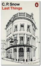
His work for the covers of Penguin Classics in the 1950s and 1960s will be very recognisable to anyone who remembers the originals or who has haunted second-hand bookshops since. He is particularly good at capturing the texture and details of buildings, even in small scale watercolour drawings – from humble rural cottages to grand country houses.

The engravings and woodcuts cling somewhat unappetizingly to a sort of late-Victorian attitude to design, whereas his watercolour drawings (executed at the same time) all seem modern and fresh. There is usually more blank space left in the design, which lets the object breathe, and there is more contrast between fine lines and washes of colour.

David Gentleman - book cover designThere’s an overall feeling of softness and a deep feeling for English traditions. But this isn’t to say that his work is feeble or nostalgic. Indeed, some of his most striking graphics are the posters designed to support radical social causes, such as his opposition to the war in Iraq.
It’s interesting to note that as a young artist he set himself the twin goals of ‘never to teach and never to commute’ – and to his credit that he managed both. Instead, he seems to have accepted commissions from all and sundry. These range from designs for coins and postage stamps, book illustrations, lithographs, designs for fabrics and crockery, book dust-jacket covers, illustrated travel books from France, Italy, and India, commercial logos, colophons, and even the covers of company reports,

It might be a matter of personal taste, but it seems to me that his finest works are the architectural studies and the coloured landscape drawings. Certainly this attractive little selection generates the taste for seeing more.

The series of design monographs of which this volume is part feature very high design and production values. They are slim but beautifully stylish productions, each with an introductory essay, and all the illustrative material is fully referenced.

David Gentleman Design   Buy the book at Amazon UK

David Gentleman Design   Buy the book at Amazon US

© Roy Johnson 2010


Brian Webb and Peyton Skipwith, David Gentleman: Design, Suffolk: Antique Collectors’ Club, 2009, pp.96, ISBN: 1851495959


More on design
More on media
More on web design


Filed Under: Graphic design, Individual designers Tagged With: Art, David Gentleman, Design, Graphic design, Illustration

Design Since 1900

June 30, 2009 by Roy Johnson

encyclopedia of modern design and designers

This is a comprehensive guide to all aspects of modern design. It covers graphics, consumer products, interior decor, furniture, print, advertising, plus industrial and architectural design. Entries run from the Finnish designer Alvar Aalto (who for obvious reasons always comes first in such listings) through Rene Lalique (glassware) and the multi-talented Hungarian Laszlo Moholy-Nagy, to typographist Hermann Zapf and Piet Zwart (who for the same reason always comes last).

Design Since 1900Most entries are illustrated by thumbnail graphics. It’s a shame they are not in colour, but you can’t expect everything in such a good-value production. The entries are either brief biographical sketches of individual designers (Saul Bass, Charles Eames, Raymond Loewy, Alexandr Rodchenko) with notes on why they have been so influential. There are also short histories of companies famous for their emphasis on design (Bauhaus, General Motors, Olivetti, Wiener Werkstatte).

Others include influential artistic movements (art deco, constructivism, neo-plasticism, and post-modernism) and individual products which have become icons of modern design (the Citroen DS19, Dyson vacuum cleaners, Tatlin’s Monument to the Third International).

There are notes on materials of manufacture (aluminium, formica, MDF, polyurethane) movements and schools (Deutsche Werkbund, Omega, and Black Mountain College) and explanations of technical terms such as anthropometrics, bit mapping, deconstruction, and third age design (which isn’t quite what you might think).

He even includes individual shops such as Biba, Habitat, and the Body Shop; typographists such as Neville Brody, Eric Gill, and Jan Tschichold. The only thing missing is Information Technology. There are a couple of mentions of computer games, but curiously enough not a single reference to Web design.

The text incorporates extensive cross-referencing, suggestions for further reading, and a chronological chart of design highlights since 1900.

© Roy Johnson 2004

Design Since 1900   Buy the book at Amazon UK

Design Since 1900   Buy the book at Amazon US


Guy Julier, Design Since 1900, London: Thames and Hudson, 2004, pp.224, ISBN: 0500203792


More on design
More on media
More on web design


Filed Under: Design history, Graphic design, Product design Tagged With: Decorative arts, Design, Design Since 1900, Graphic design, Product design

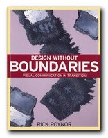
Design Without Boundaries

July 15, 2009 by Roy Johnson

visual communication in transition

Design Without Boundarie is a collection of articles on visual communication produced between the 1980s and the mid-1990s. That was a period that saw an unprecedented development in graphic design in the USA and Europe, but Rick Poyner observes that there was no corresponding critical analysis of what was going on. This is his contribution to rectifying the matter. The pieces are exhibition and book reviews, profiles of designers, essays, and interviews. He is energetic and passionate about his subject, which is the relationship between design, illustration, and art – all of which he treats at both a theoretical and commercial level. And he’s truly international in his reach of vision. He interviews April Greiman in America, reports from Dutch and Swiss design studios, and searches out UK designers in their workshops and even their homes.

Design Without BoundariesHis approach is combative and challenging. He doesn’t give up looking for theoretical rigour and method, and he certainly doesn’t pull any punches with quite well-established figures. Jan Tschichold and Paul Rand both come under fire in the early pages of the book. It’s a pity there aren’t more illustrations (and some colour) because he spends a lot of time describing designers’ work which would come alive better with graphics. However, there is an up side to this. Because of his pursuit of rigour and clear analysis, he’s forced to describe works in a way which (where there are illustrations) turn out to be accurate and objective – certainly not the sloppy, self-oriented impressionism which passes for much of art criticism.

He really comes into his own on the ground of UK-based design. There are not one but two articles on Neville Brody in which he characteristically praises him for his design and challenges his theoretical assumptions. [In my experience, graphic artists are rarely gifted in articulating ideas about their own production. Go to any art school finals show to see the pretentious nonsense they write about their work.]

Peter Saville has interesting revelations to make about surviving early celebrity. It’s amazing how insecure these famous designers can still feel beneath their apparent success. This might be caused by the rapidly changing styles of the businesses that employ them – music, fashion, popular magazines, and the arty end of commercial advertising.

Other designers he discusses include Vaughan Oliver, Why Not Associates, Cartlidge Levene, Tomato, and Jonathan Barnbrook. Then he does the same thing for a group he classifies as illustrators – Russell Mills, Dan Fern, Andrzej Klimowski, and the American Milton Glaser.

There’s a section on magazines covering Nova, Oz, Modern Painters, David Carson’s Ray Gun, and Emigre. These analyses are very impressive indeed. For Poynor not only captures the graphic spirit of these publications; he offers as well their background commercial histories, their successions of editors, changes of policy, and in most cases the reasons for their demise.

I liked the fact that the essays were fairly short – three or four pages at most. Because he gets straight down to business with no padding. And yet it’s a huge book. If you’re looking for a survey of contemporary design issues written by an extremely well-informed insider – this is it.

© Roy Johnson 2002

Design Without Boundaries   Buy the book at Amazon UK

Design Without Boundaries   Buy the book at Amazon US


Rick Poynor, Design Without Boundaries, London: Booth-Clibborn, 1998, pp.296, ISBN: 186154006X


More on design
More on media
More on web design


Filed Under: Graphic design Tagged With: Design Without Boundaries, Graphic design, Rick Poynor, Theory

Design Writing Research

July 5, 2009 by Roy Johnson

illustrated essays on design, graphics, and typography

Design Writing Research is the name given to the combined work of Ellen Lupton and Abbott Miller, who are curator at Cooper-Hewitt design museum and director of a New York design agency. This elegant compilation brings together their writings on a wide variety of design-related topics – from the graphic presentation of numbers; contemporary hieroglyphs; the choice of body text in printed books; advertising; racial presentations in journalism; the seductiveness of commercial advertising; and newspaper layout and design – to a brief history of graphic design in America. This splendid variety in content is also matched by the design of the book itself.

Design Writing ResearchThey start with an essay on Deconstruction in design history – tracing the influence of French critical theory in the US and eventually settling on notions of typographical presentation. There’s also an essay on the history of punctuation and spacing which is wittily illustrated with a visual paraphrase of punctuation styles – from Latin monumental inscriptions to email emoticons in one short essay. This is a perfect use of the print medium, and an excellent fusion of form and content.

Some of the essays are no more than a sketch over a double page spread, but all of them are interesting – even one on the representation of numbers in print which inexplicably comes to an abrupt stop after the abacus.

They ambitiously tackle structuralist typography – an attempt to apply cultural theory to the realm of type design. Whilst this is not altogether convincing, it’s consistently thought-provoking and like all the other essays in the compilation, skillfully illustrated in a manner which is reminiscent of the work of Edward Tufte.

There are some indications of old-fashioned political correctness. They use the term ‘progressive’ as a blanket marker of approval reminiscent of the Old Left. When this is combined with an essay extolling the technical skills of Andy Warhol, the effect seems naive and rather whimsical. And yet the essay itself, a study of the relationship between advertising and graphic design, is essentially quite interesting. It looks at the work of illustrators such as Ben Shan, Paul Glaser, and David Stone Martin – pointing out that many of their works ‘were sold in galleries soon after they were published’.

The essays in the centre of the book are longer, detailed, and well researched, looking at the practice of graphic design in the context of twentieth century art. A study of McLuhan’s The Medium is the Message argues the case for the groundbreaking contribution of his co-author, Quentin Fiore. This is followed by an in-depth study of the relationship between race and advertising; then the use of stock photographic archive materials in journalism; and subliminal messages in advertising.

The book ends with a synoptic account of graphic design in the USA between 1829 and 1993 – which just stops short of the Internet explosion. If they ever get round to analysing Web pages in the way they treat their material here, it will be truly something to look out for.

This is a beautifully designed and exquisitely illustrated book which is a Must for anyone interested in graphics, information design, typography, or media studies – and it’s amazingly cheap. I bought my copy at full price, just in case the bookshop had made a mistake.

© Roy Johnson 2000

Design Writing Research   Buy the book at Amazon UK

Design Writing Research   Buy the book at Amazon US


Ellen Lupton and Abbott Miller, Design Writing Research: Writing on Graphic Design, London: Phaidon, 1996, pp.211, ISBN: 0714838519


More on design
More on media
More on web design


Filed Under: Graphic design Tagged With: Design Writing Research, Graphic design, Research, Theory, Typography

Designing Interfaces

July 20, 2009 by Roy Johnson

navigation, interactivity, and graphic design techniques

O’Reilly have recently taken to adding colour to their publications – and it works. The pages are more visually interesting, and the reader gets a more accurate picture of what will appear on screen. This book is attempting to get down to the fundamentals of interface design – How many clicks, how many screens do you need to see before you get to what you want? In fact Jenifer Tidwell starts of with usability issues, showing what real users do and ask of interfaces. Then she starts considering design, starting from the top and most general level – the organisation of content, or information architecture. This also includes consideration of the user interface or screen.

Designing InterfacesThe main strength of her approach is that she is very thorough. Her examples include different types of software and hardware. A design that works on a computer screen will have to be adapted if it’s going to be read on a mobile phone, and if viewed on a TV screen, you won’t have a mouse for navigation. She deals with web pages, installation programs, spreadsheets, and even graphic design packages – but keeps these issues in mind at all times.

Next comes navigation which deals with methods for leading the user through the contents. These include navigation panels, sequence maps, breadcrumb trails, and colour coding.

The next level down in terms of detail is page layout. This introduces elements of graphic design in arranging both content and navigation. This where the going can get rough. The layout part is easy if you’ve got a reasonable eye for design, but after that you need to choose between columns and tabs, and fixed width and liquid pages. She explains all the options, with the advantages and drawbacks of each.

Then comes what she calls the ‘verbs’ of the interface – objects such as buttons, action panels, and menus which make things happen. I was pleased to see that she gave as an example of bad design just how difficult it is to cancel a print job in Windows.

It’s fairly obvious that her principal interest is in information graphics – maps, tables, and graphs plus all their variants. Here she covers the ground which Edward Tufte has made his own – but you’ll find her prose easier to understand. She covers tooltips, expandable views, and what she calls ‘data brushing’ whereby the user can select which part(s) of a collection of information to view on screen.

Then comes a section on the much trickier issue of designing interactive choice lists. There are all sorts of possibilities here – forms, checkboxes, toggle buttons, dropdown lists, and so on – but the important point is that she illustrates them all, pointing to their advantages and weaknesses.

She even covers the design of interfaces for editors – such as text and image editing programs. Not many people outside a technological elite few will need to know these matters, but I found it instructive to see the general principles behind so many of the drag and drop or click and resize functions we come across all the time.

She finishes with a chapter any designer will enjoy – dealing with the graphic design of what appears on screen. This involves colour, spacing, typography, balance, and every other facet of visual rhetoric to make a visitor wish to stay on the site. I picked up some useful tips on hairlines and rounded corners here.

It’s a handsome, well-designed book – as befits its subject – and she includes a generous bibliography. O’Reilly have done her proud.

© Roy Johnson 2005

Designing Interfaces   Buy the book at Amazon UK

Designing Interfaces   Buy the book at Amazon US


Jenifer Tidwell, Designing Interfaces, Sebastopol, CA: O’Reilly, 2005, pp.331, ISBN: 0596008031


More on design
More on media
More on web design


Filed Under: Graphic design, Information Design Tagged With: Computers, Designing Interfaces, Graphic design, Information design, Navigation, Web design

  • « Previous Page
  • 1
  • 2
  • 3
  • 4
  • …
  • 13
  • Next Page »

Get in touch

info@mantex.co.uk

Content © Mantex 2016
  • About Us
  • Advertising
  • Clients
  • Contact
  • FAQ
  • Links
  • Services
  • Reviews
  • Sitemap
  • T & C’s
  • Testimonials
  • Privacy

Copyright © 2025 · Mantex

Copyright © 2025 · News Pro Theme on Genesis Framework · WordPress · Log in