Mantex

Tutorials, Study Guides & More

  • HOME
  • REVIEWS
  • TUTORIALS
  • HOW-TO
  • CONTACT
>> Home / Archives for Graphic design

Fyodor Dostoyevski – Stavrogin’s Confession

October 4, 2009 by Roy Johnson

Hogarth Press first edition book jacket designs
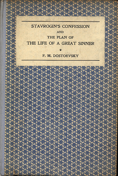
 

Stavrogin's Confession - first edition

 
Fyodor Dostoyevski, Stavrogin’s Confession, (1922)

This unpublished material from The Possessed was translated by S.S.Koteliansky with Virginia Woolf. The financial success of these Russian translations enabled the press to transform itself from a handpress cottage industry into an established commercial publisher. The origins of the text were explained in their ‘Translator’s note’:

“The Russian government has recently published a small paper-covered book containing Stavrogin’s Confession, unpublished chapters of Dostoyevski’s novel The Possessed, and Dostoyevski’s plan or sketch of a novel which he never actually wrote but which he called The Life of a Great Sinner.”

J.H. Willis Jr, Leonard and Virginia Woolf as Publishers: The Hogarth Press 1917-1941

Leonard Woolf provides an account of the book as a physical object with his customary attention to fine detail:

“These books, which I still think to be beautifully printed and bound, were very carefully designed by Virginia and me, and they were unlike the books published by other publishers in those days. They were bound in paper over boards and we took an immense amount of trouble to find gay, striking, and beautiful papers. The Dostoyevski and Bunin were bound in very gay patterned paper which we got from Czechoslovakia … We printed, I think, 1,000 of each and [sold] the Dostoyevski at 6s. [They] sold between 500 and 700 copies in twelve months and made us a small profit, and they went on selling until we reprinted or they went out of print.”

Leonard Woolf, An Autobiography

previousnext


Hogarth Press studies

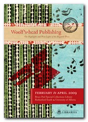
Woolf's-head Publishing Woolf’s-head Publishing is a wonderful collection of cover designs, book jackets, and illustrations – but also a beautiful example of book production in its own right. It was produced as an exhibition catalogue and has quite rightly gone on to enjoy an independent life of its own. This book is a genuine collector’s item, and only months after its first publication it started to win awards for its design and production values. Anyone with the slightest interest in book production, graphic design, typography, or Bloomsbury will want to own a copy the minute they clap eyes on it.

Woolf's-head Publishing Buy the book at Amazon UK
Woolf's-head Publishing Buy the book at Amazon US

The Hogarth Press Leonard and Virginia Woolf as Publishers: Hogarth Press, 1917-41 John Willis brings the remarkable story of Leonard and Virginia Woolf’s success as publishers to life. He generates interesting thumbnail sketches of all the Hogarth Press authors, which brings both them and the books they wrote into sharp focus. He also follows the development of many of its best-selling titles, and there’s a full account of the social and cultural development of the press. This is a scholarly work with extensive footnotes, bibliographies, and suggestions for further reading – but most of all it is a very readable study in cultural history.

The Hogarth Press Buy the book at Amazon UK
The Hogarth Press Buy the book at Amazon US

© Roy Johnson 2005

Filed Under: Hogarth Press Tagged With: Art, Bloomsbury, Dostoyevski, Graphic design, Literary studies, Stavrogin's Confession

George Rylands – Poems

October 5, 2009 by Roy Johnson

Hogarth Press first edition book jacket designs

 
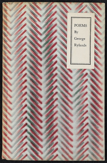
Poems by George Rylands - first edition

 
George Rylands, Poems (1931)

“George (“Dadie”) Rylands as an undergraduate moved in the Cambridge Apostles circuit of young men who caught the attention of Maynard Keynes and Lytton Strachey. He became the Woolfs’ short-term but beloved assistant from July to December 1924 and then returned to Cambridge where he became a fellow of King’s College in 1927. The Woolfs published two volumes of Rylands’s poetry, Russet and Taffeta (1925), people by Perditas and Corydons, and Poems (1931) about Chloe and Flora amid the flowers and hay-scented farmlands. The Woolfs also published his fellowship dissertation, Words and Poetry (1928). For all their skillful lyricism, Rylands’s Poems are like pressed flowers, nosegays colourless and dry, preserved from change. Only one year older than William Plomer and two years older than Christopher Isherwood, Rylands wrote not of his generation but of a generation before the FirstWorld War.”

J.H. Willis Jr, Leonard and Virginia Woolf as Publishers: The Hogarth Press 1917-1941

There is generous use of white space in this, the second book of Rylands’ poetry hand printed by the Woolfs… There is a typo in the imprint, placing a comma rather than a period after Leonard’s initial.

Elizabeth Willson Gordon, Woolf’s-head Publishing: The Highlights and New Lights of the Hogarth Press

previousnext


Hogarth Press studies

Woolf's-head Publishing Woolf’s-head Publishing is a wonderful collection of cover designs, book jackets, and illustrations – but also a beautiful example of book production in its own right. It was produced as an exhibition catalogue and has quite rightly gone on to enjoy an independent life of its own. This book is a genuine collector’s item, and only months after its first publication it started to win awards for its design and production values. Anyone with the slightest interest in book production, graphic design, typography, or Bloomsbury will want to own a copy the minute they clap eyes on it.

Woolf's-head Publishing Buy the book at Amazon UK
Woolf's-head Publishing Buy the book at Amazon US

The Hogarth Press Leonard and Virginia Woolf as Publishers: Hogarth Press, 1917-41 John Willis brings the remarkable story of Leonard and Virginia Woolf’s success as publishers to life. He generates interesting thumbnail sketches of all the Hogarth Press authors, which brings both them and the books they wrote into sharp focus. He also follows the development of many of its best-selling titles, and there’s a full account of the social and cultural development of the press. This is a scholarly work with extensive footnotes, bibliographies, and suggestions for further reading – but most of all it is a very readable study in cultural history.

The Hogarth Press Buy the book at Amazon UK
The Hogarth Press Buy the book at Amazon US

© Roy Johnson 2005

Filed Under: Hogarth Press Tagged With: Art, Bloomsbury, Graphic design, Hogarth Press, Literary studies, Poems

Goodbye to Berlin – Christopher Isherwood

October 5, 2009 by Roy Johnson

Hogarth Press first edition book jacket designs

 
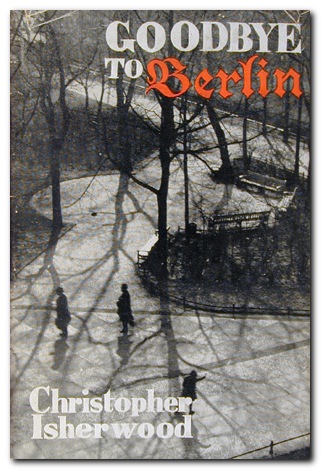
Goodbye to Berlin - first edition

 
Christopher Isherwood, Goodbye to Berlin (1939)

“Before leaving for China, Isherwood had completed “The Landauers”, “On Ruegen Island”, and “A Berlin Diary (Winter 1932-33)” and given them to John Lehmann, who was beginning his negotiations with the Woolfs to become managing director of the press. Lehmann collected the various stories from the first Berlin diary to the last and arranged them in novel form as Goodbye to Berlin (1939), and the novel was published by the Hogarth Press under Lehmann’s supervision in March.

Goodbye to Berlin, thanks in part to the audacious spirit of Sally Bowles, became another fast-selling, popular success for Isherwood and the Hogarth Press. Reviewers were generally enthusiastic, although troubled by the fragmented structure and the omnipresent narrator Christopher Isherwood who bore the author’s name. Few of them saw at the time the irony, art, and control with which Isherwood had shaped his characters and assembled his episodes. Edmund Wilson, almost alone, saw Goodbye to Berlin in terms that would become obvious to later more observant critics. Reviewing the American edition by Random House, Wilson noted that Isherwood was a master of social observation whose eye was “accurate, lucid and cool; and it is a faculty which brings its own antidote to the hopelessness and horror he describes”. Isherwood’s prose, added Wilson, was “a perfect medium for his purpose”, allowing the reader “to look right through Isherwood and to see what he sees”.

J.H. Willis Jr, Leonard and Virginia Woolf as Publishers: The Hogarth Press 1917-1941

previousnext


Hogarth Press studies

Woolf's-head Publishing Woolf’s-head Publishing is a wonderful collection of cover designs, book jackets, and illustrations – but also a beautiful example of book production in its own right. It was produced as an exhibition catalogue and has quite rightly gone on to enjoy an independent life of its own. This book is a genuine collector’s item, and only months after its first publication it started to win awards for its design and production values. Anyone with the slightest interest in book production, graphic design, typography, or Bloomsbury will want to own a copy the minute they clap eyes on it.

Woolf's-head Publishing Buy the book at Amazon UK
Woolf's-head Publishing Buy the book at Amazon US


The Hogarth Press
Leonard and Virginia Woolf as Publishers: Hogarth Press, 1917-41 John Willis brings the remarkable story of Leonard and Virginia Woolf’s success as publishers to life. He generates interesting thumbnail sketches of all the Hogarth Press authors, which brings both them and the books they wrote into sharp focus. He also follows the development of many of its best-selling titles, and there’s a full account of the social and cultural development of the press. This is a scholarly work with extensive footnotes, bibliographies, and suggestions for further reading – but most of all it is a very readable study in cultural history.

The Hogarth Press Buy the book at Amazon UK
The Hogarth Press Buy the book at Amazon US

© Roy Johnson 2005


Filed Under: Hogarth Press Tagged With: Art, Bloomsbury, Goodbye to Berlin, Graphic design, Hogarth Press, Literary studies

GPO Design

November 27, 2010 by Roy Johnson

posters and propaganda for the post office 1930-1970

GPO Design is a very stylishly produced collection of posters and information graphics commissioned for the postal services between 1930 and 1970. It’s supported by a well-informed essay on the relations between government, propaganda quangos, and the world of what was then called ‘commercial art’. It has always been a mystery to me why a monopoly should feel the need to advertise its services. Mrs Average of Pinner, Middlesex has until very recently had no alternative but to use Royal Mail to deliver her birthday cards and letters to friends. The same has also been true for gas, water, and electricity. Nobody had access to alternative services, so why bother to advertise their virtues?

GPO DesignBut the GPO has from its earliest years made a habit of commissioning artists to design posters to promote its services and reminding us to post early for Xmas. In fact there has been a quite deliberate campaign to both educate the public and promote an impression of efficient, modern technology driving communications at a national level. This has been coupled ideologically with folksy images of the village postman delivering letters in all weathers, and at the same time promoting an empire of connectivity that embraced the globe.

But not all the postal service’s posters and advertising campaigns were corporate vanity. The campaign to advertise postage stamps in little booklets was apparently an attempt to reduce the waiting time spent queuing to buy a single stamp.

It’s not surprising that all decision making in matters of acceptability was in the hands of establishment appointees who despite their efforts to employ modern artists, generated an output that was pretty near indistinguishable from Soviet propaganda posters of the same era

Hans SchlegerThe range of artists and designers they did use included E.McKnight Kauffer, Graham Sutherland, Duncan Grant, and Vanessa Bell. But the most artistically advanced was Hans (Zero) Schleger, one of the many European immigrants who fled to Britain during the inter-war years.
Paul Rennie suggests however in his contribution to the elegant Design series that their work was more successful politically and technologically than their Soviet and Nazi counterparts. He also points out that the GPO’s emphasis on the modern technology of communication – cars, boats, trains, telephones – was a distinctly progressive and modernist theme radiated into society by its educational and service-promoting publicity.

The examples in this collection from the award-winning series are drawn from the poster collection of the British Postal Museum and Archive in London. It sits very neatly alongside its recent fellow publications on David Gentleman, El Lissitzsky, and Alexander Rodchenko.

GPO Design   Buy the book at Amazon UK

GPO Design   Buy the book at Amazon US

© Roy Johnson 2010


Paul Rennie, GPO: Design, Suffolk: Antique Collectors Club, 2010, pp.96, ISBN: 1851495967


More on design
More on media
More on web design


Filed Under: Graphic design Tagged With: Art, Cultural history, Graphic design, Media

Graphic Design 1870-2000

July 23, 2009 by Roy Johnson

a century of poster and advertising design

Graphics 1870-2000 is a compact account of the history of commercial graphic design and image-making from the end of the nineteenth century to the present day. It covers graphic design in the UK, France, Germany, Holland, Belgium, Russia, and the USA. All the major movements are covered – from Art Nouveau, Dada, Constructivism, De Stijl, and Bauhaus, right up to the as-yet-unnamed movements at the end of the last century, with generous entries on Paul Rand, Neville Brody and David Carson, plus recent development in the digital age.

Graphic DesignEvery page is a visual treat: well-chosen graphics illustrate every point of the exposition. The examples are fresh and original. There are even page decoration elements on the supporting theoretical documents reproduced along with the index

What I particularly liked about Alain Weill’s account is that the graphic innovations he traces are related to developments in the products they are advertising or the methods by which they are manufactured.

He also has a good eye for detail and can spot a significant novelty which becomes a turning point in design history – such as Lucian Bernhard’s removal of all extraneous detail to focus on brand name and product in the Sachplakat.

sachplakat

He is the former director of the Musée de la Publicité in Paris, and it is quite obvious from this that he has a deep knowledge and love for his subject.

Two issues emerge as sub-themes here. The first is the close link between graphic design and architecture – another discipline which is trying to do several things at the same time. The second is the close relationship between commercial and fine art. This might have dwindled somewhat towards the end of the last century, but it is still present in the work of people such as David Hockney.

It’s a shame it’s in such a small pocket-book format, because I think the elegantly designed pages deserve to breathe in a larger format. But the upside of this is that it’s very good value at a knock-down price.

© Roy Johnson 2004

Graphic Design 1870-2000   Buy the book at Amazon UK

Graphic Design 1870-2000   Buy the book at Amazon US


Alain Weill, Graphics: A Century of Poster and Advertising Design, London Thames and Hudson, 2004, pp.160, ISBN: 0500301166


More on graphic design
More on web design
More on technology
More on digital media


Filed Under: Design history, Graphic design Tagged With: Graphic design, Graphics 1870-2000

Graphic Design for the 21st Century

June 18, 2009 by Roy Johnson

contemporary world graphic design and designers

This is another block-busting visual compendium from Taschen publishing regulars Charlotte and Peter Fiell which maps out the very latest trends in contemporary graphic design. The commentary is in English, German, and French. Each artist gets a full credit with contact details, plus a list of recent exhibitions, awards, and clients. They are given just three or four pages to demonstrate their work. First a cryptic statement opposite a full page spread; then there’s a short biography, a list of recent exhibitions, and a list of clients.

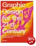
Graphic Design for the 21st CenturyThe importance of these details is that you can follow up those designers who interest you most, check out their web sites, and track down further examples of their work. And it’s amazing, given these constraints, how so many of them come up with work which is visually arresting. Like most of these giant compendiums, the content is ‘mixed’, but I have to say that the longer I pored over these pictures, the richer the work seemed.

Work which is clearly experimental and even anti-commercial is given just as much space as adverts for Nike. There are entries for Stefan Sagmeister, Peter Saville, and other modern design studios such as Ames Brothers, the Pentagram Group, and Research Studios (all of whom have great web sites too).

The collection comes with an introductory essay by the editors which looks over the developments of the last hundred years – and the examples they have chosen come from all over the world: UK, US, Japan, France, Norway, Holland. This is a huge, value-packed compendium of contemporary graphic design, from professionals at the sharp end of what is happening right now.

It’s also a visually rich collection which is doing its best to look ahead to what might happen next. Like most of Taschen’s other publications it’s well designed, well printed and produced, and amazingly good value.

© Roy Johnson 2000

Graphic Design   Buy the book at Amazon UK

Graphic Design   Buy the book at Amazon US


Charlotte and Peter Fiell, Graphic Design for the 21st Century, Cologne: Taschen, pp.638, ISBN: 3822816051


More on design
More on media
More on web design


Filed Under: Graphic design Tagged With: Graphic design, Graphic Design for the 21st Century

Graphic Design School

June 14, 2009 by Roy Johnson

basic design principles using all modern media

This is a structured self-teaching guide to the principles of graphic design which provides up-to-date information on computer aided design and the use of software applications. Graphic Design School itself is beautifully designed and printed – in full colour, with excellent design and layout fully illustrating the principles it espouses. First of all it deals with basic design principles – layout, space, colour, typography, and graphics.

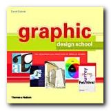
Graphic Design SchoolEach topic is presented on one double-page spread in a stylish layout which shows off some of the best principles the book is designed to promote. The second part of the book looks in more detail at what effects are possible with detailed manipulation of typeface selection. It also looks at the secret ingredient which lies beneath most examples of good design – grids.

The last part looks at examples of professional design practice – magazines, corporate design, books, presentations, and of course web design.

It’s a visually exciting overview of what’s required in the increasingly complex and sophisticated word of graphic design. The illustrations are wonderfully fresh and well chosen. There wasn’t one I had seen in any publication before.

This will be suitable for people working in newspapers, magazines, books, packaging, advertising, web design, and digital media in general. It’s packed with practical guidance for students and practising designers.

It’s an introductory guide to a discipline with many facets. I imagine that readers will come across a topic that touches a creative nerve – layout, typography, animation, or image manipulation – then shoot off to follow up the subject elsewhere. That’s exactly as it should be – and there’s a glossary and bibliography to help too.

© Roy Johnson 2005

Graphic Design School   Buy the book at Amazon UK

Graphic Design School   Buy the book at Amazon US


David Dabner, Graphic Design School: The Principles and Practices of Graphic Design, London: Thames and Hudson, 2004, pp.192, ISBN: 0500285268


More on design
More on media
More on web design
More on typography


Filed Under: Graphic design, Typography, Web design Tagged With: Design, Graphic design, Graphic Design School, Web design

Graphic Design: a concise history

June 27, 2009 by Roy Johnson

popular potted history of 19th and 20th century graphics

This is an introduction to graphic design in a series from Thames and Hudson which offers very good value for money. Richard Hollis takes as a starting point the idea that graphic design begins in the late nineteenth century with the development of the poster which combined word and image. If you are happy to ignore what went before, what he presents is thought provoking and a visual treat.

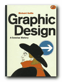
Graphic Design: a concise historyThe main feature of the book is that each point of his argument is illustrated by small marginal pictures which function like a lecture slide show (which I suspect is their origin). It’s not quite clear if he is following a chronological, a thematic, or a national structure – but this isn’t really important, as the main pleasure of his account is the exuberant variety of illustrative examples he discusses. These act as a fascinating introduction to the subject.

It’s rather like a very entertaining series of illustrated undergraduate lectures. He starts with the poster in the nineteenth century, then goes on to chart the development of word and image in brochures and magazines, advertising, television and electronic media, and the impact of technical innovations such as photography and the computer.

The strength of his approach is his internationalism and excellent choice of materials. He covers the main figures in Swiss, Dutch, French, American, and British design, and en route there are special features on movements such as Italian futurism, Soviet constructivism, and German expressionism.

His exposition and analysis of the various movements is handled with a light touch, which makes the subject accessible to non-specialists. The most successful parts of the book are his detailed tracing of artistic influences and his arguments for the relation between design and function.

He knows the names, the products, and the businesses which produced the commissions. Maybe the book should have been called ‘Twentieth Century Graphic Design’, but this is excellent value, and always in print.

© Roy Johnson 2000

Graphic Design   Buy the book at Amazon UK

Graphic Design   Buy the book at Amazon US


Richard Hollis, Graphic Design: a concise history, London: Thames and Hudson, 1994, pp.224, ISBN: 0500202702


More on design
More on media
More on web design


Filed Under: Graphic design Tagged With: Art, Design history, Graphic design, Modernism

Grid Systems

June 17, 2009 by Roy Johnson

the principles of organising type on page and screen

Well-designed pages – on screen or in print – are built on the structural basis of grid systems. That’s the hidden network or mesh underlying the page design which helps to keep all its parts in close and logical relationship. This book tells you how to understand and create grids. The approach is that of a tutorial – showing the good and not-so-good results of arranging a set of basic elements on a 3 x 3 grid.

Grid Systems There’s a lot of visual repetition, and the writing is rather stiff, but the upside is thoroughness. The same page is shown over and over again, with endless variations in layout, text position, alignment, and reading direction. These tutorial sections are punctuated by analyses of successful and famous examples of the use of grids.

The illustrations come from classics such as Jan Tschichold’s advertising brochure for his revolutionary study Die Neue Typographie, a Bauhaus catalogue designed by Herbert Bayer, and modern designs such as a an architectural web site and a Nike product catalogue.

The really interesting feature of this book is that the pages used to illustrate its ideas are prefaced by a semi-transparent skin which shows the grid on which the base design has been built. It’s a superb use of modern print technology.

This is a well-produced book which illustrates its point very clearly and is a very attractive production in its own right. It comes from the same series as Ellen Lupton’s Thinking with Type which we also reviewed recently.

© Roy Johnson 2005

Grid Systems   Buy the book at Amazon UK

Grid Systems   Buy the book at Amazon US


Kimberly Elam, Grid Systems, New York: Princeton Architectural Press, 2004, pp.130, ISBN: 1568984650


More on design
More on media
More on web design


Filed Under: Graphic design Tagged With: Graphic design, Grid systems, Information design

Handwritten

June 26, 2009 by Roy Johnson

modern hand-produced lettering and typefaces

In an age which presents designers with the software to create any number of computer-generated fonts, design historian Steven Heller considers the lasting strength of typefaces produced by hand. He has a good track record in writing on graphic design, and Handwritten is an excellent example of his work. He divides his chapters into different hand-scripted styles – sleight of hand, scrawl (letterforms that are raw, splotchy, and untidy) scratch (scraped, cut, and gouged fonts) script (type that is sinuous and ornate) stitch (letters that have been sewn, sutured, and embroidered) shadow (dimensional, voluminous, and monumental letterforms).

HandwrittenThese are followed by suggestive (forms that imply the metaphorical, surreal, and symbolic) and sarcastic (the ironic, comical, and satirical in lettering). This seems a reasonable enough approach: these categories represent the attitudes of the designers, though sometimes there is overlap between them.

It’s also a handsomely designed and beautifully produced book – packed with hundreds of coloured, well-presented examples. The sources are amazingly wide-ranging: theatre posters, record albumn covers, comics and graphic novels, book designs, posters, ephemera, and original art works.

The visual range is also good – hand scrawled letters, painted typefaces, words scratched into surfaces, stitched into fabrics, or written onto surfaces (including Stefan Sagmeister’s body – an illustration which turns up everywhere these days).

He features and obviously has a soft spot for the work of Robert Crumb, the American freehand artist who designed lots of, ahem, alternative comics in the 1960s and 1970s. Crumb drove his sex-obsessed vision to very amusing and visually interesting limits – though it has to be said that although the subject matter of his cartoons is very radical, the essence of his visual style is essentially nostalgic. He gets its striking effects from linking psychologically modern subject matter with a quaint folksy visual idiom. This is what Heller categorises as ironic lettering.

There’s a fashion at the moment for adding hand-crafted type to digitally photo-realistic graphics, so as to play one off against the other. These are well represented here. However, I was surprised not to see more examples of freehand design translated into pixellated typography, but the book does end with examples of digital comic books which suggest that more is to come.

Having just taught on a course where students have to learn the discipline of writing descriptive picture captions, I was impressed by the manner in which his are consistently both succinct and imaginative. Each section of the book is prefaced by an essay, and the origins of the examples are meticulously sourced. Artist, designer, photographer, and client are all named on every example.

His explanation is all the more vigorous for being conducted across continents. There is nothing parochial about this compilation. Examples range from the UK and USA, to Mexico, the USSR, France, and Germany. The selections are witty, bitter, satirical, inventive, and sometimes quite violent.

If you are at all interested in typography, graphic design, or even print production values, this is well worth seeing. Serious students and professionals will want to own it.

© Roy Johnson 2004

Handwritten   Buy the book at Amazon UK

Handwritten   Buy the book at Amazon US


Stephen Heller and Mirko Ilic, Handwritten: expressive lettering in the digital age, London: Thames and Hudson, 2004, pp.192, ISBN: 0500511713


More on typography
More on design
More on media
More on web design


Filed Under: Graphic design, Typography Tagged With: Calligraphy, Graphic design, Handwritten, Typography

  • « Previous Page
  • 1
  • …
  • 3
  • 4
  • 5
  • 6
  • 7
  • …
  • 13
  • Next Page »

Get in touch

info@mantex.co.uk

Content © Mantex 2016
  • About Us
  • Advertising
  • Clients
  • Contact
  • FAQ
  • Links
  • Services
  • Reviews
  • Sitemap
  • T & C’s
  • Testimonials
  • Privacy

Copyright © 2025 · Mantex

Copyright © 2025 · News Pro Theme on Genesis Framework · WordPress · Log in