Mantex

Tutorials, Study Guides & More

  • HOME
  • REVIEWS
  • TUTORIALS
  • HOW-TO
  • CONTACT
>> Home / Archives for Graphic design

Virginia Woolf – The Waves

October 5, 2009 by Roy Johnson

Hogarth Press first edition book jacket designs
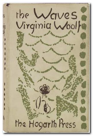
 

The Waves - first edition

Virginia Woolf, The Waves (1931) Cover design by Vanessa Bell.

“Customarily, Virginia Woolf composed in longhand, writing in ink with an old-fashioned straight pen on the right-hand page of a manuscript book bound for her by the press. She reworked each page as she went, writing for two hours or more in the mornings. In the afternoons she would type up the morning’s work, usually making only minor corrections or changes. When she had completed the first draft of the novel, represented by a holograph and a slightly edited typescript, she would then retype the book from the beginning, making whatever revisions she felt necessary, sometimes scrapping whole sections and rewriting them in markedly different ways. The final shaping of the book took place in this stage. The resulting typescript, probably bearing the marks of further revisions in ink, was given to Leonard for his critical reading.

After this, Virginia would sometimes, as she did with The Waves, have a press secretary retype the text into a copy which she corrected for errors before sending it to R. & R. Clark to be set and printed. At some point either after the proofs were corrected or after each book was published, Virginia would destroy her typescripts, saving only the holograph copy, probably feeling … that it best represented her initial creative impulses and so was important to keep as a record of her artistic struggles. The Waves, however, is unique among her novels because she completely rewrote it from scratch, starting over with a new holograph version and resulting typescript. The two existing holographs … total 399 and 347 pages respectively.”

J.H. Willis Jr, Leonard and Virginia Woolf as Publishers: The Hogarth Press 1917-1941

previousnext


Hogarth Press studies

Woolf's-head Publishing Woolf’s-head Publishing is a wonderful collection of cover designs, book jackets, and illustrations – but also a beautiful example of book production in its own right. It was produced as an exhibition catalogue and has quite rightly gone on to enjoy an independent life of its own. This book is a genuine collector’s item, and only months after its first publication it started to win awards for its design and production values. Anyone with the slightest interest in book production, graphic design, typography, or Bloomsbury will want to own a copy the minute they clap eyes on it.

Woolf's-head Publishing Buy the book at Amazon UK
Woolf's-head Publishing Buy the book at Amazon US

The Hogarth Press Leonard and Virginia Woolf as Publishers: Hogarth Press, 1917-41 John Willis brings the remarkable story of Leonard and Virginia Woolf’s success as publishers to life. He generates interesting thumbnail sketches of all the Hogarth Press authors, which brings both them and the books they wrote into sharp focus. He also follows the development of many of its best-selling titles, and there’s a full account of the social and cultural development of the press. This is a scholarly work with extensive footnotes, bibliographies, and suggestions for further reading – but most of all it is a very readable study in cultural history.

The Hogarth Press Buy the book at Amazon UK
The Hogarth Press Buy the book at Amazon US

© Roy Johnson 2005

Filed Under: Hogarth Press Tagged With: Art, Bloomsbury, Graphic design, Literary studies, The Waves, Virginia Woolf

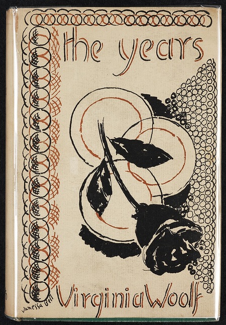
Virginia Woolf – The Years

October 4, 2009 by Roy Johnson

Hogarth Press first edition book jacket designs


The Years cover - first edition

 
Virginia Woolf, The Years (1937) Cover design by Vanessa Bell.

“Leonard Woolf and many critics of the time considered The Years badly flawed in characterization and structure. Recent critics, however, mostly feminist, have opened up the novel in interesting ways, making virtues out of what were thought vices. Among other points, they have argued that The Years offers compelling evidence of Virginia Woolf’s courage and genius in confronting and remaking herself as a woman in a sexist world, in focusing her frustrations to expose traditional masculine myths of marriage and sex. Such criticism and the textual studies of her revisions have made the novel seem one of the more interesting and ambitious of Woolf’s books, its very ambiguities and muted anger part of its qualities. Leonard Woolf and the early male critics though it inferior to Virginia’s great modernist novels, but the average reader in 1937 had no such qualms, flocking to it with relief after the difficulties of The Waves.

In spite of his reservations about its literary virtues, Leonard anticipated its popularity and ordered over 18,000 copies of The Years for publication on March 15, 1937. Its commercial success completely overshadowed Virginia’s other novels. It sold over 13,000 copies in the first six months. In America, Harcourt Brace printed 10,000 copies for the first edition and quickly reprinted, as The Years sold over 30,000 copies in six months. It became an authentic American best-seller for 1937, ranking sixth on a list led by such heady company as Margaret Mitchell’s Gone With the Wind and Kenneth Roberts’ Northwest Passage and outranking John Steinbeck’s Of Mice and Men. One check alone from Harcourt Brace on January 5, 1938 total led over $5,000.”

J.H. Willis Jr, Leonard and Virginia Woolf as Publishers: The Hogarth Press 1917-1941

In 1937 Virginia Woolf appeared on the cover of Time magazine: she had achieved a remarkable level of critical recognition and esteem that was now translated into more popular acclaim and fame. The initial print run of The Years was the largest of any of Woolf’s novels to that date. The focus of the novel is the passage of time as it traces the Pargiter family from 1880 up to the ‘Present Day’. The novel met with high praise. David Garnett said the book “marks her as the greatest master of English” and is “the finest novel she has ever written” (New Statesman & Nation). Subsequent critical assessments have been more mixed. The novel sold very well in England and America making its way on to American best-seller lists. Vanessa Bell’s jacket for the book features a rose surrounded by geometric patterns and is signed with her full name.

Elizabeth Willson Gordon, Woolf’s-head Publishing: The Highlights and New Lights of the Hogarth Press

previousnext


Hogarth Press studies

Woolf's-head Publishing Woolf’s-head Publishing is a wonderful collection of cover designs, book jackets, and illustrations – but also a beautiful example of book production in its own right. It was produced as an exhibition catalogue and has quite rightly gone on to enjoy an independent life of its own. This book is a genuine collector’s item, and only months after its first publication it started to win awards for its design and production values. Anyone with the slightest interest in book production, graphic design, typography, or Bloomsbury will want to own a copy the minute they clap eyes on it.

Woolf's-head Publishing Buy the book at Amazon UK
Woolf's-head Publishing Buy the book at Amazon US

The Hogarth Press Leonard and Virginia Woolf as Publishers: Hogarth Press, 1917-41 John Willis brings the remarkable story of Leonard and Virginia Woolf’s success as publishers to life. He generates interesting thumbnail sketches of all the Hogarth Press authors, which brings both them and the books they wrote into sharp focus. He also follows the development of many of its best-selling titles, and there’s a full account of the social and cultural development of the press. This is a scholarly work with extensive footnotes, bibliographies, and suggestions for further reading – but most of all it is a very readable study in cultural history.

The Hogarth Press Buy the book at Amazon UK
The Hogarth Press Buy the book at Amazon US

© Roy Johnson 2005

Filed Under: Hogarth Press Tagged With: Art, Bloomsbury, Graphic design, Hogarth Press, Literary studies, The Years, Virginia Woolf

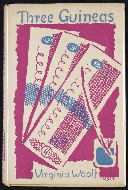
Virginia Woolf – Three Guineas

October 4, 2009 by Roy Johnson

Hogarth Press first edition book jacket designs


Three Guineas - first edition

 
Virginia Woolf, Three Guineas (1938) Cover design by Vanessa Bell.

This is the second of Virginia Woolf’s overtly feminist polemics. In it, she develops the ideas first put forward in A Room of One’s Own and launches an incisive critique of the English establishment – concentrating on its principal bases of power – the House of Lords, the military establishment, the Church, and the educational system.

“Virginia Woolf’s reading notebooks and scrapbooks [reveal] how much labour went into [her] gathering of facts: twelve volumes of notes, including three scrapbooks compiled between 1931 and 1937. In the power, anger, wit, and satire of her attack on repressive masculine institutions, Woolf chose not to write in the discourse of a traditional historian, sociologist, politician, suffragist, or guildswoman. She developed her arguments, cited her examples, digressed through provocative and unorthodox footnotes, to flail the misogyny and militarism of the patriarchal establishment with all the craft of the essayist and novelist. If she took little notice of the feminist history or the sociopolitical status of women in the 1930s as documented by Strachey and others, her book proved so welcome an offensive against enduring male sexist attitudes that her sisters in the trenches overlooked her lapses. They gleefully applauded her achievement.”

J.H. Willis Jr, Leonard and Virginia Woolf as Publishers: The Hogarth Press 1917-1941

Three Guineas considers women’s role in society, and more particularly, what they might do to prevent war.Woolf traces fascist elements within England’s education system and professions, highlighting monetary and material inequities of class and gender. She argues that “the public and the private worlds are insperably connected; that the tyrannies and servilities of the one are the tyrannies and servilities of the other”.

Elizabeth Willson Gordon, Woolf’s-head Publishing: The Highlights and New Lights of the Hogarth Press

previousnext


Hogarth Press studies

Woolf's-head Publishing Woolf’s-head Publishing is a wonderful collection of cover designs, book jackets, and illustrations – but also a beautiful example of book production in its own right. It was produced as an exhibition catalogue and has quite rightly gone on to enjoy an independent life of its own. This book is a genuine collector’s item, and only months after its first publication it started to win awards for its design and production values. Anyone with the slightest interest in book production, graphic design, typography, or Bloomsbury will want to own a copy the minute they clap eyes on it.

Woolf's-head Publishing Buy the book at Amazon UK
Woolf's-head Publishing Buy the book at Amazon US

The Hogarth Press Leonard and Virginia Woolf as Publishers: Hogarth Press, 1917-41 John Willis brings the remarkable story of Leonard and Virginia Woolf’s success as publishers to life. He generates interesting thumbnail sketches of all the Hogarth Press authors, which brings both them and the books they wrote into sharp focus. He also follows the development of many of its best-selling titles, and there’s a full account of the social and cultural development of the press. This is a scholarly work with extensive footnotes, bibliographies, and suggestions for further reading – but most of all it is a very readable study in cultural history.

The Hogarth Press Buy the book at Amazon UK
The Hogarth Press Buy the book at Amazon US

© Roy Johnson 2005

Filed Under: Hogarth Press Tagged With: Art, Bloomsbury, Graphic design, Hogarth Press, Literary studies, Three Guineas, Virginia Woolf

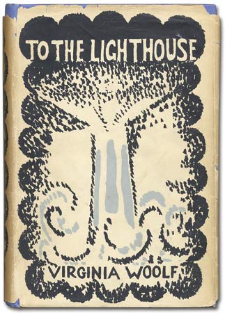
Virginia Woolf – To the Lighthouse

October 5, 2009 by Roy Johnson

Hogarth Press first edition book jacket designs


To the Lighthouse cover - first edition

 
Virginia Woolf, To the Lighthouse (1927) Cover design by Vanessa Bell.

“Advance sales totaled over 1,600 copies, more than twice the number for Mrs Dalloway. Virginia’s mood at the time expressed itself in her gaily ironic joke with Vita Sackville-West. When Vita returned from her second trip to Persia, she found a copy of To the Lighthouse waiting for her, inscribed by Virginia, “In my opinion the best novel I have ever written”. It was a bound dummy copy, with blank pages. Leonard Woolf, anticipating both an artistic and a commercial success for To the Lighthouse, ordered 3,000 copies printed by R. & R. Clark (a thousand more than Mrs Dalloway) and quickly ordered another 1,000 copies in a second impression. The novel outsold her previous fiction. The American publisher of Hogarth Press books, Harcourt Brace, printed 4,000 copies initially (almost twice the number of copies for Mrs Dalloway). American readers had begun to take notice of Woolf’s novels.”

J.H. Willis Jr, Leonard and Virginia Woolf as Publishers: The Hogarth Press 1917-1941

previousnext


Hogarth Press studies

Woolf's-head Publishing Woolf’s-head Publishing is a wonderful collection of cover designs, book jackets, and illustrations – but also a beautiful example of book production in its own right. It was produced as an exhibition catalogue and has quite rightly gone on to enjoy an independent life of its own. This book is a genuine collector’s item, and only months after its first publication it started to win awards for its design and production values. Anyone with the slightest interest in book production, graphic design, typography, or Bloomsbury will want to own a copy the minute they clap eyes on it.

Woolf's-head Publishing Buy the book at Amazon UK
Woolf's-head Publishing Buy the book at Amazon US

The Hogarth Press Leonard and Virginia Woolf as Publishers: Hogarth Press, 1917-41 John Willis brings the remarkable story of Leonard and Virginia Woolf’s success as publishers to life. He generates interesting thumbnail sketches of all the Hogarth Press authors, which brings both them and the books they wrote into sharp focus. He also follows the development of many of its best-selling titles, and there’s a full account of the social and cultural development of the press. This is a scholarly work with extensive footnotes, bibliographies, and suggestions for further reading – but most of all it is a very readable study in cultural history.

The Hogarth Press Buy the book at Amazon UK
The Hogarth Press Buy the book at Amazon US

© Roy Johnson 2005

Filed Under: Hogarth Press Tagged With: Art, Bloomsbury, Graphic design, Hogarth Press, Literary studies, To the Lighthouse, Virginia Woolf

Visual Explanations

July 20, 2009 by Roy Johnson

best-selling illustrated essays on presenting information

Visual Explanations is Edward Tufte’s passionate manifesto for intelligent information design. He is concerned with the need for scale, accuracy, and truthful proportion in the visualisation of data. The book derives much of its charm from the beautiful reproduction of its illustrative materials. He includes engravings, photographs, maps, computer-generated images, and even built-in flaps showing motion and before-after effects. The diversity of his examples is just as impressive.

Clarity and excellence in thinking is very much like clarity and excellence in the display of data. When principles of design replicate principles of thought, the act of arranging information becomes an act of insight.

Visual ExplanationsThey are drawn from scientific papers, conjurors’ manuals, and even books designed to be read under water. In one stunning example, he uses video snapshots of his own two-dimensional yet dynamic visualisation of a thunderstorm. Tufte [pronounced “TUFF-tee”] makes his central argument in a chapter which has now become famous.

This discusses the mis-representation of data related to the 1986 Challenger space shuttle which resulted in a disastrous explosion and the death of all the cosmonauts on board. His dense technical analysis of data-presentation and bad practice is used to argue that the fatal accident could have been averted if charts and diagrams had been presented more intelligently, more accurately.

A chapter on conjuring tricks focuses on the clever representation of temporal progression in single illustrations from how-to-do-it books. However, it has to be said that sometimes it’s not quite clear what point he’s making, and he seems to be struggling with what is obvious: that it’s difficult to represent fluid motion in static, two-dimensional images.

Eventually it emerges that he wishes to compare magic with it’s opposite – teaching. One amazes by concealment, the other should inform by revelation. “Your audience should know beforehand what you’re going to do.” That’s a useful insight for some of us.

His attitude is enormously confident and persuasive. Yet if you can brace yourself as a reader, it sometimes seems that he doesn’t always follow his own theories in the presentation of materials – and this in a book which he wrote, designed, and published himself. On some pages, it’s difficult to link illustration to argument; some reproductions are disproportionately large for the point they are making; and he pursues the odd habit of crowding the generous page margins with bibliographic minutiae which would normally be reserved for chapter endnotes.

He writes in a cryptic, elliptical manner, and is much given to compressed generalisations and gnomic claims such as “to make verbs visible, is at the heart of information design” – though this approach can also be quite witty, as when he dismisses one of the bad examples as “better than nothing ([but] that’s all it’s better than”.

Despite these occasional oddities, there are thought-provoking ideas on almost every page. For instance, the idea that the public health warnings on US billboard cigarette advertisements are less effective because they are difficult to read, crammed as they are into boxed text, sans-serif fonts, in continuous capitals, and underlined – which makes four typographical solecisms in one.

SURGEON GENERAL’S WARNING: SMOKING CAUSES LUNG CANCER, HEART DISEASE, EMPHYSEMA, AND MAY COMPLICATE PREGNANCY.

Despite the graphic variety of his presentations, many of his arguments are amazingly orchestrated onto single or double-page spreads, and the book is an almost irresistibly beautiful production. What he’s actually talking about is visual rhetoric: “by establishing a structure of rhythm and relationships, [graphic] parallelism becomes the poetry of visual information”. We might wish to query some of his theoretical claims, but it’s very hard to be critically detached from such a seductive presentation of evidence – which paradoxically is the very point he’s warning us about.

© Roy Johnson 2002

Visual Explanations   Buy the book at Amazon UK

Visual Explanations   Buy the book at Amazon US


Edward Tufte, Visual Explanations, Cheshire, CT: Graphics Press, 1997, pp.156, ISBN: 0961392126


More on information design
More on technology
More on digital media


Filed Under: Graphic design, Information Design Tagged With: Displaying information, Edward Tufte, Graphic design, Information design

Web Design: Tools and Techniques

July 1, 2009 by Roy Johnson

design with emphasis on graphics and advanced effects

This is the second edition of a very successful Web design manual. It spells out the basics of good design, but then concentrates on the graphic design elements of building good pages and effective sites. Peter Kentie begins by outlining the principles of HTML and Web design. Then he explains the basics of coding – starting from text and graphics, then forms and tables, frames and style sheets. Those who wish to take the route of using a text editor will be glad to know that he discusses Front Page, HotMetal, BBEdit, PageMaker, and even Word. The later two thirds of the book are taken up with what is obviously his forte – ‘creative Web design’.

Web Design: Tools and TechniquesThis involves using intermediate graphics techniques and ‘advanced’ multimedia effects such as Flash, sound, video, 3-D, and Java Programming. All of which makes it very much a book which will appeal to graphic designers. He deals with colour adjustment, Gif and Jpg image manipulation, background effects, image maps, shadows, and 3-D effects. There’s lots of use of Adobe Illustrator and Photoshop, as well as the Macromedia Web tool programs.

The advanced section deals with making animated Gifs. He’s very enthusiastic about Flash, which allows you to create animations which are amazingly small in terms of file size. And if you feel very adventurous, you can even try his suggestions for Shockwave movies, Virtual Reality, or streaming video. He ends with the advanced possibilities now possible using XML, WAP, Java, and Active Server Pages.

These effects are explained clearly but quickly – so this book is most suitable for intermediate users. I think it will be most useful for those people with an existing web site who want to improve and develop it using the latest technologies. Those who are in the beginner stages of web design should try checking out a free website at webstarts.com. The book is very elegantly produced, and packed with both coding and screen shots, showing you what can be done.

© Roy Johnson 2002

web design   Buy the book at Amazon UK

web design   Buy the book at Amazon US


Peter Kentie, Web Design: Tools and Techniques, Berkeley (CA) Pearson/Peachpit Press, (second edition) 2002, pp.485, ISBN: 0201717123


More on design
More on media
More on web design


Filed Under: Graphic design, Web design Tagged With: Graphic design, Web design, Web graphics

Web Pages that Suck

June 18, 2009 by Roy Johnson

principles of good design – shown by critiques of bad sites

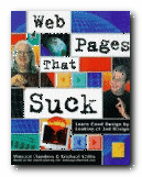
This is a web design guide with a twist: it teaches by negative example. Yet it works – and has become a best-seller. The subtitle tells all: ‘Learn good design by looking at bad design’. The idea of learning how to make a nice website by looking at naff aspects of existing websites, and avoiding their sucky techniques, is a good one. The book is fun to read, but you get a lot out of it too. Flanders and Willis have no wish to impress you with their understanding of difficult, techie aspects of web design. Their line is that you should avoid getting carried away and keep things simple

Web Pages that SuckThis book shows that you can start a website yourself and watch it grow into a big and successful thing – because that’s exactly how Web Pages That Suck came to be a best-selling book. It’s based on a website made by Vincent Flanders that got listed as a Yahoo! Pick of the Week and became very popular. For that reason, it’s very well illustrated – and the idea of critical analysis of bad examples is one which has also been proved to be effective by Web guru Jakob Nielsen in his recent Designing Web Usability.

But be warned – it doesn’t set out to teach you HTML from scratch, if that’s what you want. It comes with a free CD full of useful things – but then so do lots of magazines. You also have to put up with lots of photos of the authors in ‘comic’ poses. But as writers, they are what the cover says: ‘Funny, opinionated, and always to-the-point [with] a reputation for being the Web’s leading critics’.

© David Gauntlett 2000

Buy the book at Amazon UK

Buy the book at Amazon US


Vincent Flanders and Michael Willis, Web Pages That Suck, San Francisco (CA): Sybex International, 1998, pp.384, ISBN 078212187X


More on web design
More on digital media
More on technology


Filed Under: Web design Tagged With: Graphic design, HTML, Web design, Web Pages that Suck

William Plomer – Sado

October 5, 2009 by Roy Johnson

Hogarth Press first edition book jacket designs


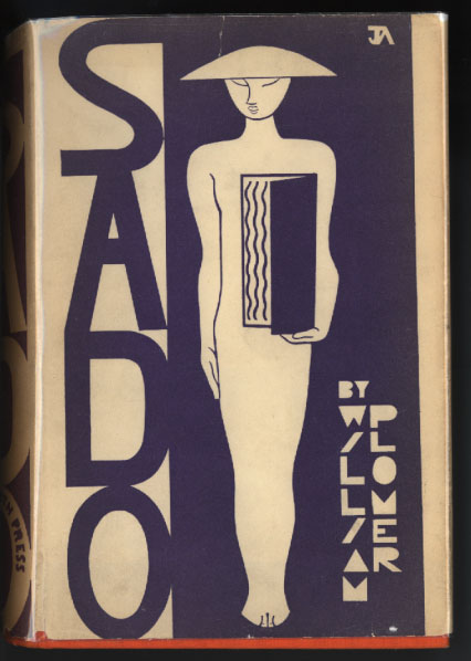
Sado - first edition

 
William Plomer, Sado (1931) Cover design by John Armstrong.

“The first version of Sado ran to some 170,000 words, as Plomer wrote to Woolf in February, but he soon boiled it down to half that length. He sent the revised typescript to the Woolfs two months later just as they returned to London after driving through western France for two weeks on their annual outing. Refreshed from their trip, the Woolfs read Plomer’s novel immediately, Leonard writing to him five days later on Friday that both he and Virginia liked the book very much. They were struck by Plomer’s writing and his psychological insights, finding the theme [of homo-eroticism] “extraordinarily interesting” and his prose less uneven than his previous writing, with “fewer, if any, air pockets”. With the publication of Sado, Plomer reached maturity as a writer. Leonard had over 1,500 copies of the novel printed and issued with a handsomely stylized dust jacket in white and blue designed by John Armstrong. In spite of its promising send-off, Sado disappointed by selling only 837 copies in the first six months and by going in the red over £64 in the first year.”

J.H. Willis Jr, Leonard and Virginia Woolf as Publishers: The Hogarth Press 1917-1941

previousnext


Hogarth Press studies

Woolf's-head Publishing Woolf’s-head Publishing is a wonderful collection of cover designs, book jackets, and illustrations – but also a beautiful example of book production in its own right. It was produced as an exhibition catalogue and has quite rightly gone on to enjoy an independent life of its own. This book is a genuine collector’s item, and only months after its first publication it started to win awards for its design and production values. Anyone with the slightest interest in book production, graphic design, typography, or Bloomsbury will want to own a copy the minute they clap eyes on it.

Woolf's-head Publishing Buy the book at Amazon UK
Woolf's-head Publishing Buy the book at Amazon US

The Hogarth Press Leonard and Virginia Woolf as Publishers: Hogarth Press, 1917-41 John Willis brings the remarkable story of Leonard and Virginia Woolf’s success as publishers to life. He generates interesting thumbnail sketches of all the Hogarth Press authors, which brings both them and the books they wrote into sharp focus. He also follows the development of many of its best-selling titles, and there’s a full account of the social and cultural development of the press. This is a scholarly work with extensive footnotes, bibliographies, and suggestions for further reading – but most of all it is a very readable study in cultural history.

The Hogarth Press Buy the book at Amazon UK
The Hogarth Press Buy the book at Amazon US

© Roy Johnson 2005


Filed Under: Hogarth Press Tagged With: Art, Bloomsbury, Graphic design, Hogarth Press, Literary studies, Sado, William Plomer

Woolf’s-head Publishing

August 9, 2009 by Roy Johnson

The Highlights and Newlights of the Hogarth Press

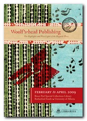
Woolf’s-head Publishing was produced to coincide with the exhibition of Hogarth Press publications which ran from February to April 2009 at the library of the University of Alberta, Canada. It’s not only a wonderful collection of cover designs, book jackets, and illustrations – but a beautiful example of book production in its own right. It’s typeset in Caslon Old Face, which Leonard Woolf and Virginia Woolf used when they first set up the Hogarth Press on a table in their dining room in 1917.

Hogarth Press The book’s dust jacket is printed on thick, richly textured paper with some of the exuberantly patterned papers originally used by the Press. It also features both of the woolf’s-head logos used by the Press, designed by Vanessa Bell and E. McKnight Kauffer. Even the interior pages of the book are coloured, using tints and washes which are a tonal echo of the original designs.

Many of the book jacket illustrations by Vanessa Bell are already quite well known. But there are others by John Banting, Kauffer, and Trekkie Parsons (Leonard Woolf’s ‘lover’ after Virginia’s death) which illustrate the wide and imaginative range of visual approaches the Woolfs took for the presentation of their publications.

However, it’s difficult for book jackets of this kind not to look rather dated today, almost a hundred years after their first appearance. But what definitely do not look dated are the richly patterned papers Leonard imported from Czechoslovakia and Japan for the volumes of poetry. These look as visually fresh today as they did at the time.

The authors represented stretch from the famous names who made the Press such a commercially successful venture – T.S.Eliot, Freud, Woolf, Vita Sackville-West – to people who have since disappeared into literary obscurity – Ena Limebeer, R.C.Trvelyan, and Virginia’s sixteen-year-old discovery Joan Adeney Easdale.

There are also what author and exhibition curator Elizabeth Gordon describes as ‘surprises’ – books ‘less commonly associated with the Hogarth Press’. These include a Canadian poet, a Bengali biography, translations of German poetry, (reflecting Leonard’s internationalism) and even a diet book.

Quack! Quack!The other Press publications upon which the collection focuses are those by Virginia Woolf herself – all illustrated by her sister Vanessa Bell. There are also examples of the polemical essays published in the 1930s, which included arguments against Imperialism and in favour of feminism (of which Leonard was a champion). A short series of public letters even included ‘A Letter to Adolf Hitler’ by Louis Golding.

Best-sellers include Vita Sackville-West’s The Edwardians (1930) and All Passion Spent (1931), William Plomer’s detective thriller The Case is Altered (1932) and Christopher Isherwood’s Goodbye to Berlin (1939).

This book is a genuine collector’s item, and only months after its first publication it has started to win awards for its design and production values. Anyone with the slightest interest in book production, graphic design, typography, or Bloomsbury will want to own a copy the minute they clap eyes on it.

Hogarth Press Buy the book at Amazon UK

Hogarth Press Buy the book at Amazon US

© Roy Johnson 2009


Elizabeth Willson Gordon, Woolf’s-head Publishing: The Highlights and Newlights of the Hogarth Press, Alberta (CA): University of Alberta, 2009, pp.144, ISBN: 9781551952406


More on biography
More on the Bloomsbury Group
Twentieth century literature


Filed Under: Bloomsbury Group, Hogarth Press Tagged With: Bibliography, Bloomsbury, Graphic design, Hogarth Press, Leonard Woolf, Publishing, Virginia Woolf, Woolf's Head Publishing

Wordless Books

May 24, 2009 by Roy Johnson

the original graphic novels

Wood engravings, linocuts, and, copperplate engravings have all existed for centuries, but it wasn’t until the early years of the 1900s that artists began to use them for creating book-length ‘stories without words’ which aspired to be the equivalent of novels. These are what we now call graphic novels. These illustrators were closely associated with the visual world of German expressionism, particularly that of Oskar Kokoshka and Ernst Kirchner. The two most prominent figures in this movement were Frans Masereel and Lynd Ward, though David Berona, in this thoughtful and well-informed work of homage to the genre also includes examples by Otto Nuckell, and the more recent Willam Gropper, the American Milt Gross, Giacomo Patri, and Laurence Hyde.

Graphic NovelsHe quotes the celebrated comic-book theorist Scott McCloud as observing that these woodcut stories were an important bridge between the nineteenth century and the modern day comic. He includes extracts from a number of Masereel’s wordless books – almost all of them dealing with the de-humanising effect of capitalism on the common man. His best-known work, The Passionate Journey (1919) was the nearest Masereel came to creating a novel in pictures – a story of Everyman at the start of the last century. It’s a tale very close in both substance and mood to Doblin’s later Berlin Alexanderplatz (1929).

Berona gives an account of Masereel’s other wordless novels, illustrating their somber black and white pages and describing their stories. He doesn’t go in for any profound analysis, which given the youthfulness of this art form at the time might even be a good thing.

The American artist Lynd Ward actually used the graphic novel form to explore issues of slavery and race in US culture, as well as the oppression that common people felt as a result of the Great Depression.

It has to be said that many of these ‘novels’ are often not much more than extended adolescent fantasies of the kind that are thrown up time and again in ‘creative writing’ classes. But what makes them very different is that they are executed dramatically and with visual finesse via these authors’ control of a two-dimensional visual medium.

It’s a world of tilting skyscrapers, menacing shadows, vertiginous perspectives, drink and debauchery, children born out of wedlock, and people set against sunrises with outstretched arms.

Almost all of these illustrators were on the side of the small, common man, and against the might of the capitalist, the owners of the means of production.

Some of the later examples, produced in the late 1920s and 1930s by American artists such as Milt Gross and Myron Waldman are very close to the comic book tradition which was emerging around the same time.

There are also lots of original book jacket covers reproduced here, as well as fully documented details of the artists, their works, and other publications related to this neglected niche of visual narratives.

It’s strange to note that apart from minor differences which arose from working with wood, lino, or even lead, the styles adopted by these artists were all remarkably similar. The graphic novel is now a thriving genre in its own right, with many distinguished illustrators working in the medium. But this is a valuable collection of the work of pioneers.

© Roy Johnson 2008

Wordless Books   Buy the book at Amazon UK

Wordless Books   Buy the book at Amazon US


David A. Berona, Wordless Books: The Original Graphic Novels, New York: Abrams, 2008, pp.255, ISBN: 0810994690


More on design
More on media
More on web design


Filed Under: Graphic design, Media Tagged With: Design, Graphic design, Graphic novel, Literary studies, Wordless Books

  • « Previous Page
  • 1
  • …
  • 10
  • 11
  • 12
  • 13
  • Next Page »

Get in touch

info@mantex.co.uk

Content © Mantex 2016
  • About Us
  • Advertising
  • Clients
  • Contact
  • FAQ
  • Links
  • Services
  • Reviews
  • Sitemap
  • T & C’s
  • Testimonials
  • Privacy

Copyright © 2025 · Mantex

Copyright © 2025 · News Pro Theme on Genesis Framework · WordPress · Log in