Mantex

Tutorials, Study Guides & More

  • HOME
  • REVIEWS
  • TUTORIALS
  • HOW-TO
  • CONTACT
>> Home / Archives for Graphic design

On Being Ill

October 5, 2009 by Roy Johnson

Hogarth Press first edition book jacket designs
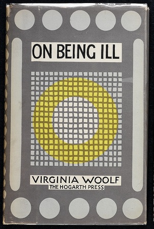
 

On Being Ill cover - first edition

 
Virginia Woolf, On Being Ill (1930) Cover design by Vanessa Bell.

“Not until 1930 did [Virginia and Leonard Woolf] hand print another of Virginia’s works, a small essay On Being Ill. To possible critics of the slightly botched printing of On Being Ill Virginia composed a tongue-in-cheek form letter which she never sent. Such a charming disclaimer could well serve as a summing up of the Woolf’s hand printing over the years. Beginning “Dear Madam,” Virginia agreed that “the colour is uneven, the letters not always clear, the spacing inaccurate, and the word ‘campion’ should read ‘companion””. Her defense was that she and Leonard were amateur printers without formal training, who fit in their hobby amid busy lives. But, she added, the volume was already worth more than it cost because of over-subscription, so that although “we have not satisfied your taste, we hope that we have not robbed your purse”.

J.H. Willis Jr, Leonard and Virginia Woolf as Publishers: The Hogarth Press 1917-1941

One of the last books hand printed by the Woolfs, On Being Ill is a fairly short essay by Woolf that explores not only illness, but also solitude, sympathy, and reading. Woolf writes, for example, that in illness “It is to the poets that we turn. Illness makes us disinclined for the long campaigns that prose exacts” The words of On Being Ill are both written and printed by Woolf. The book shows a greater sophistication than some of the earlier books, though there are still some errors that remind one that humans rather than machines created the book.

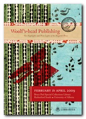
Elizabeth Willson Gordon, Woolf’s-head Publishing: The Highlights and New Lights of the Hogarth Press

previousnext


Hogarth Press studies

Woolf's-head Publishing Woolf’s-head Publishing is a wonderful collection of cover designs, book jackets, and illustrations – but also a beautiful example of book production in its own right. It was produced as an exhibition catalogue and has quite rightly gone on to enjoy an independent life of its own. This book is a genuine collector’s item, and only months after its first publication it started to win awards for its design and production values. Anyone with the slightest interest in book production, graphic design, typography, or Bloomsbury will want to own a copy the minute they clap eyes on it.

Woolf's-head Publishing Buy the book at Amazon UK
Woolf's-head Publishing Buy the book at Amazon US

The Hogarth Press Leonard and Virginia Woolf as Publishers: Hogarth Press, 1917-41 John Willis brings the remarkable story of Leonard and Virginia Woolf’s success as publishers to life. He generates interesting thumbnail sketches of all the Hogarth Press authors, which brings both them and the books they wrote into sharp focus. He also follows the development of many of its best-selling titles, and there’s a full account of the social and cultural development of the press. This is a scholarly work with extensive footnotes, bibliographies, and suggestions for further reading – but most of all it is a very readable study in cultural history.

The Hogarth Press Buy the book at Amazon UK
The Hogarth Press Buy the book at Amazon US

© Roy Johnson 2005


Filed Under: Hogarth Press Tagged With: Art, Bloomsbury, Graphic design, Hogarth Press, Literary studies, On Being Ill

Open Here: instructional design

July 24, 2009 by Roy Johnson

illustrated and amusing instruction design graphics

Have you ever tried to erect a wardrobe from the instructions in a self-assembly pack? Or followed the printed notes for programming your VCR? Open Here presents an entertaining collection of diagrams, graphics, and visual instructions for tackling the problems of everyday life which baffle us all. It includes such tricky examples as how to tie a bow tie whilst looking in a mirror, and what instructions to give people for the emergency evacuation of an aeroplane.

Open Here: instructional designMijksenaar and Westendorp achieve much of their effect from the vibrant colour reproductions of instructional design with which the book is packed. Every page is a visual treat. The examples they give are so wide-ranging that I often wished they had stayed longer on any one, providing a more extended analysis, rather than flitting so swiftly onto the next after a few comments.

There’s also an interesting historical overview which shows the presentation of instructions going from realistic photos or drawings of whole objects in the nineteenth century, to more recent depictions which tend to focus on specific parts or functions.

However, applying the principles they espouse to the book itself reveals a weakness as far as the serious sector of their potential market is concerned. Some pictures have explanatory captions, whilst others do not; and on the whole, rather too much space is devoted to visuals and too little to their textual commentary, which for the most part is tantalisingly cryptic.

In addition, they don’t always make a clear distinction between the good and bad examples, and I was disappointed that they didn’t provide a bibliography, because the book is obviously based on a lot of research. They also make little distinction between simple diagrams produced for the lay user and those expanded technical illustrations of cross-sections through a car engine which are produced for engineers. But then, this variety adds to the book’s visual appeal. I was yearning for more analysis, but read it with a permanent smile on my face.

This is a lively and refreshing publication which will make anyone reading it intensely conscious of instructional design. The text suggests that their examples are drawn from an archive of materials which has been built up over thirty years, so I hope that their next publication provides a more extended analysis using similar examples, but without sacrificing any of the graphic zest which makes this book so attractive.

© Roy Johnson 2000

Open Here   Buy the book at Amazon UK
Open Here   Buy the book at Amazon US


Paul Mijksenaar and Piet Westendorp, Open Here: the art of instructional design, New York: Joost Elffers Books, 1999, pp.144, ISBN: 1556709625


More on web design
More on technology
More on digital media
More on study skills
More on information design


Filed Under: Graphic design Tagged With: Graphic design, Information design, instructional design, Open Here

Paul Rand

June 26, 2009 by Roy Johnson

illustrated study of influential graphic designer

Paul Rand (1914 -1996) was one of the most successful figures in corporate American graphic design. He is best known for his IBM logo, which helped to resurrect the company in the 1970s, and led to its dominant position in computer manufacture. His early success in New York was founded – quite apart from his natural talent as an illustrator – on his appreciation of European modernism. He absorbed its influences quickly and, combining them with his precocious technical skills, produced a distinctive ‘American’ style. His basic approach is founded on photo-montage, collage, and elements of surrealism. But it’s a style which manages to look permanently modern.

Paul RandHe seems to have been particularly strongly influenced – as were many others at that time – by Jan Tschichold’s classic study of the relationship between politics and design in Die Neue Typografie. By the 1940s and 1950s, his combination of simple, abstracted forms contrasted with handwritten text came to be the template for many US book jacket and LP albumn designers – such as Milton Glaser and David Stone Martin. He coined the phrase ‘less is more’ – perhaps a summary of modernism in graphic design. He worked seven days a week, did all his own technical work, and he even designed his own house.

This beautifully illustrated biography traces his early work, which still looks fresh today; it covers the book jackets which set design pace in the 1950s and 1960s; and then the centre of the study is taken up with the development of the IBM corporate image and its famous Venetian blind logo. The conclusion is an illustrated gallery tour of his best commercial contracts – Westinghouse, United Parcels Service, ABC, and even re-designs such as Ford for which he was not actually awarded the contract.

Steven Heller, his biographer, is art director of The New York Times and the author of several influential books on graphic design. His account is even-handed on the whole, though it becomes a little whimsical in places – such as when describing Rand’s illustrations for children’s books written by his wife Anne. However, this book is exquisitely designed and elegantly printed from first page to last – which is why it is already a best-seller. The new paperback edition should help to bring the vivacity of Rand’s work to a wider audience.

© Roy Johnson 2002

Paul Rand   Buy the book at Amazon UK

Paul Rand   Buy the book at Amazon US


Steven Heller, Paul Rand, London: Phaidon, 2000, pp.255, ISBN: 0714839949


More on design
More on media
More on web design
More on typography


Filed Under: Individual designers, Typography Tagged With: Design, Graphic design, Paul Rand, Typography

Paul Renner: the art of typography

July 16, 2009 by Roy Johnson

illustrated critical biography of modernist typographer

German typographer Paul Renner is best known as the designer of the typeface Futura, which stands as a landmark of modern graphic design. This title is the first study in any language of Renner’s typographic career. It details his life and work to reveal the breadth of his accomplishment and influence. Renner was a central figure in the German artistic movements of the 1920s and 1930s, becoming an early and prominent member of the Deutscher Werkbund while creating his first book designs for various Munich-based publishers. As the author of numerous texts such as Typografie als Kunst (Typography as Art) and Die Kunst der Typographie (The Art of Typography) he created a new set of guidelines for balanced book design.

Paul Renner: the art of typographyRenner taught with Jan Tschichold in the 1930s and was a key participant in the heated ideological and artistic debates of that time. Arrested and dismissed from his post by the Nazis, he eventually emerged as a voice of experience and reason in the postwar years. Throughout this tumultuous period he produced a body of work of the highest distinction.

Christopher Burke’s biography is a PhD thesis which has been transformed into an elegant commercial publication – designed and typeset by the author himself. It follows a chronological structure, tracing the relationship between the history of Germany and Renner’s theories and practice as an artist. He helped lead German print out of the conservative Gothic or Blackletter tradition into the use of modern fonts such as his own best-selling Futura. His life also parallels German cultural history in the twentieth century.

Burke is very good at revealing the political, economic, and social forces which influenced the development of the new aesthetic movements of the period. For instance, he details the post-inflation shortages of the 1920s which gave the Bauhaus its impetus to link art and technology to produce machine-made objects. (Renner participated actively in this movement, developing alongside people such as Mies van der Rohe and Walter Gropius.)

Another wonderfully revealing instance is his discussion of the Nazis’ 1941 ban on the use of gothic script. What was once part of national identity was suddenly denounced as a ‘Jewish abomination’ – when in fact the truth was that the Germans had occupied much of France, Netherlands, Belgium, Denmark, and Norway, and they needed to make their propaganda understandable to people in these countries.

Burke sometimes seems to bury Renner’s theoretical and aesthetic work under lots of historical data. I was amazed that he gives so little attention to Typografie als Kunst (1922). But fortunately he traces the development of Futura in great detail, complete with reproductions of preliminary sketches of the letter forms and their variants.

He discusses the interesting notion that this essentially modernist font actively suppressed the differences between lower and upper case in the pursuit of a purely ‘rational’ design. Yet a weighted stroke emerged as it developed – because it was quite clear that the purely geometric form looked ugly.

Sometimes the politics and typography are not so comfortably integrated. After forty pages of letter forms, we’re suddenly jerked back into the political crises of the time – though it has to be said that part of Burke’s argument is to rescue Renner from the taint of Nazism which might be attached to any survivors of the period who stayed within Germany. Renner maintained a humanitarian stance against the Nazis, which he expressed significantly in his Kulturbolschewismus?, for which he as arrested in 1933 and then went into a period of ‘internal exile’.

Renner was obviously a survivor. The book ends with his post-war contributions to a debate between typographic modernisers and conservatives, in which he characteristically took the middle ground. He even saw a relationship between book design and political ideology:

In Renner’s view, the taste for large volumes, which equated weight with prestige, betrayed a potential flaw in the German character: ‘the “fatal desire for greatness”, by which Hitler was also notoriously motivated

This is a very attractive book which will appeal to both typographists and cultural historians. It will also have a passing attraction for bibliophiles who will appreciate the sheer pleasure of a beautifully illustrated and carefully designed book printed on high quality paper. If this is the level of work done in the department of typography and graphic communication at Reading University, then Christopher Burke is a very good advert for it.

© Roy Johnson 2002

Paul Renner   Buy the book at Amazon UK

Paul Renner   Buy the book at Amazon US


Christopher Burke, Paul Renner: the art of typography, London: Hyphen Press, 1999, pp.223, ISBN: 1568981589


More on typography
More on design
More on media
More on web design


Filed Under: Individual designers, Typography Tagged With: Biography, Fonts, Graphic design, Paul Renner, Typography

Penguin by Design

May 21, 2009 by Roy Johnson

a history of Penguin’s typography and graphic designs

If you’re interested in typography, graphic design, bibliography, collecting books, or just cultural nostalgia, this book is an absolute treat. It’s a beautifully illustrated history of the graphic design used for the Penguin imprint book jackets from its creation in 1935 to the present. Penguins were first sold for sixpence (2.5p) which was the price of a packet of ten cigarettes. That’s cheap by today’s standards when ten fags cost £2.70 but a typical Penguin costs twice that. Right from the start, Penguins were marketed via the elegance and consistency of their cover designs, with their easily recognisable orange covers and their perky logo. Its founder Allen Lane employed some of the most gifted graphic designers and typographists of the day.

Penguin DesignSo it’s no accident that Penguin was (and still is) such a successful imprint. Cover designs changed subtly to keep up with modern fashion, and even the famous penguin logo itself has changed shape, size, and even posture during its seventy year lifespan. It also morphed into the puffin for children and the pelican for the non-fiction series, the best-seller of which my father once urged on to me as a birthday present. Metals in the Service of Man was my bedtime reading as a child – which might explain a lot.

In the 1930s there were lots of polemical titles – not unlike Gollancz’s Left Book Club – and there were also lots of special ventures which are well presented here – children’s books during the war, American titles shortly after it, and books on art in the lead up to the Festival of Britain.

Jan Tschichold helped to bring the cover designs into the post-war world. He worked on the covers for a couple of years, but his attention to small details and his tight, conservative designs established a convention via a house style manual Penguin Composition Rules, which was a precursor to his essays in The Form of the Book.

The book is elegantly designed, set in Adobe Sabon and Monotype Gill Sans Display Bold, and laid out in what are largely double-page spreads. In addition to fiction, Penguin titles covered poetry, science, current affairs, architecture, the history of art, and even music scores – though these were dropped because they didn’t make enough money. The same was true of Pevsner’s famous Buildings of England, despite the fact that he waived his royalty payments.

Anyone who has been closely associated with the world of books during the last fifty years will feel that reading this book is like watching a moving picture of their own intellectual history. What’s more, it is difficult to imagine anybody not being overcome with an almost overwhelming desire to start their own collection – something quite easy with second-hand copies available for pennies in charity shops and online bookstores. And if you want to see an online gallery of cover designs, have a look at the collection Joe Kral has started in his picture collection at Flickr.

Phil Baines also traces the history progression of Penguin’s modern designers – Germano Facetti, Romek Marber, Alan Aldridge, and David Pelham, revealing en passant that all was not necessarily sweetness and light in the offices where design policies were made.

It is interesting to note that most of the designs look more attractive when viewed in groups – because this emphasises the unity of design, the form of the page, and the texture of patterns – such as the wallpapers and fabrics used in the poetry series.

There are some weak patches in the 1970s and 1980s, and I don’t think many of the current fiction cover designs will be remembered affectionately. But the downward trend has been reversed in two recent series: the reference books with their rounded corners, and the classics, which feature black covers and centred titles. In both cases there has been a return to two key elements of the classic Penguin: the horizontal division of the cover page into three distinct bands; and the reintroduction of the plucky little penguin itself – which had almost been sent to extinction in the previous decade.

© Roy Johnson 2006

Penguin by Design   Buy the book at Amazon UK

Penguin by Design   Buy the book at Amazon US


Phil Baines, Penguin by Design , London: Penguin, 2006, pp.256, ISBN: 0713998393


More on typography
More on technology
More on digital media


Filed Under: Graphic design, Typography Tagged With: Bibliography, Book jackets, Graphic design, Penguin Books, Penguin by Design, Typography

R.C.Trevelyan – Beelzebub

October 5, 2009 by Roy Johnson

Hogarth Press first edition book jacket designs


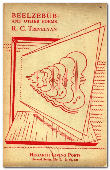
Beelzebub - first edition

 
R.C. Trevelyan, Beelzebub and other poems, Hogarth Living Poets, second series, Number 3.

“R.C. Trevelyan, member of a distinguished Victorian family and brother of the Cambridge historian G.M. Trelyan, had been an Apostle at Trinity College, friend of the Woolfs for years, and by the 1920s was a classical scholar, a translator (Sophocles, Aeschylus, Lucretius, Theocritus), and a poet. He would eventually publish over twenty volumes of poetry.”

J.H. Willis Jr, Leonard and Virginia Woolf as Publishers: The Hogarth Press 1917-1941

previousnext


Hogarth Press studies

Woolf's-head Publishing Woolf’s-head Publishing is a wonderful collection of cover designs, book jackets, and illustrations – but also a beautiful example of book production in its own right. It was produced as an exhibition catalogue and has quite rightly gone on to enjoy an independent life of its own. This book is a genuine collector’s item, and only months after its first publication it started to win awards for its design and production values. Anyone with the slightest interest in book production, graphic design, typography, or Bloomsbury will want to own a copy the minute they clap eyes on it.

Woolf's-head Publishing Buy the book at Amazon UK
Woolf's-head Publishing Buy the book at Amazon US

The Hogarth Press Leonard and Virginia Woolf as Publishers: Hogarth Press, 1917-41 John Willis brings the remarkable story of Leonard and Virginia Woolf’s success as publishers to life. He generates interesting thumbnail sketches of all the Hogarth Press authors, which brings both them and the books they wrote into sharp focus. He also follows the development of many of its best-selling titles, and there’s a full account of the social and cultural development of the press. This is a scholarly work with extensive footnotes, bibliographies, and suggestions for further reading – but most of all it is a very readable study in cultural history.

The Hogarth Press Buy the book at Amazon UK
The Hogarth Press Buy the book at Amazon US

© Roy Johnson 2005


Filed Under: Hogarth Press Tagged With: Art, Bloomsbury, Graphic design, Hogarth Press, Literary studies, R.C.Trevelyan

Rebecca West – A Letter to a Grandfather

October 5, 2009 by Roy Johnson

Hogarth Press first edition book jacket designs


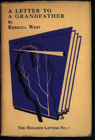
A Letter to a Grandfather - first edition

Rebecca West, A Letter to a Grandfather (1933) Hogarth Letters, Number 7. Cover design by John Banting.

“In spite of his financially cautious recruitment of Margaret West for Hogarth manager in February 1933 and his by-now-familiar claim that he did not want to publish books merely because they might be profitable, Leonard Woolf did not neglect to pump up the press income when he could. In that very month he tried to rescue the Hogarth Letters series after twelve titles by binding together eleven of the letters into a single volume with a new title page as The Hogarth Letters. The effort was not successful, and he terminated the series after publishing the last one in March, Rebecca West’s Letter to a Grandfather.”

J.H. Willis Jr, Leonard and Virginia Woolf as Publishers: The Hogarth Press 1917-1941

previousnext


Hogarth Press studies

Woolf's-head Publishing Woolf’s-head Publishing is a wonderful collection of cover designs, book jackets, and illustrations – but also a beautiful example of book production in its own right. It was produced as an exhibition catalogue and has quite rightly gone on to enjoy an independent life of its own. This book is a genuine collector’s item, and only months after its first publication it started to win awards for its design and production values. Anyone with the slightest interest in book production, graphic design, typography, or Bloomsbury will want to own a copy the minute they clap eyes on it.

Woolf's-head Publishing Buy the book at Amazon UK
Woolf's-head Publishing Buy the book at Amazon US

The Hogarth Press Leonard and Virginia Woolf as Publishers: Hogarth Press, 1917-41 John Willis brings the remarkable story of Leonard and Virginia Woolf’s success as publishers to life. He generates interesting thumbnail sketches of all the Hogarth Press authors, which brings both them and the books they wrote into sharp focus. He also follows the development of many of its best-selling titles, and there’s a full account of the social and cultural development of the press. This is a scholarly work with extensive footnotes, bibliographies, and suggestions for further reading – but most of all it is a very readable study in cultural history.

The Hogarth Press Buy the book at Amazon UK
The Hogarth Press Buy the book at Amazon US

© Roy Johnson 2005


Filed Under: Hogarth Press Tagged With: Art, Bloomsbury, Graphic design, Hogarth Press, Literary studies, Rebecca West

Robert Graves – The Feather Bed

October 5, 2009 by Roy Johnson

Hogarth Press first edition book jacket designs


The Feather Bed - first edition

 
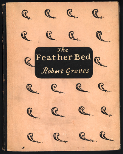
Robert Graves, The Feather Bed (1923)

Cover design by William Nicholson. Number 210 of 250 copies signed by the author.

“As the books and pamphlets on political subjects grew in number and importance, the Woolfs continued to publish more volumes of poetry, fiction, and literary criticism in 1926 than in any other areas. A significant event was the publication of another book in 1926 by Robert Graves. He published a pamphlet on poetry and brought with him Laura Riding. Graves met Laura Riding Gottschalk in 1926 after he had published his first Hogarth Press essay on modern poetry.”

J.H. Willis Jr, Leonard and Virginia Woolf as Publishers: The Hogarth Press 1917-1941

The Hogarth Press published a total of seven works by Graves, the first of which was The Feather Bed. This book consists of an “Introductory Letter” to John Crowe Ransom (his name misspelled “Ransome”) and an unconventional poem: a young man’s monologue that focussed on “internal debate about the nature of love, sexuality, and the religious calling of nuns and priests”. The book generated interest and sold quite well, though no subsequent edition of the poem was issued. The painter William Nicholson, Graves’s father-in-law, provided the cover for the book.

Elizabeth Willson Gordon, Woolf’s-head Publishing: The Highlights and New Lights of the Hogarth Press

previousnext


Hogarth Press studies

Woolf's-head Publishing Woolf’s-head Publishing is a wonderful collection of cover designs, book jackets, and illustrations – but also a beautiful example of book production in its own right. It was produced as an exhibition catalogue and has quite rightly gone on to enjoy an independent life of its own. This book is a genuine collector’s item, and only months after its first publication it started to win awards for its design and production values. Anyone with the slightest interest in book production, graphic design, typography, or Bloomsbury will want to own a copy the minute they clap eyes on it.

Woolf's-head Publishing Buy the book at Amazon UK
Woolf's-head Publishing Buy the book at Amazon US

The Hogarth Press Leonard and Virginia Woolf as Publishers: Hogarth Press, 1917-41 John Willis brings the remarkable story of Leonard and Virginia Woolf’s success as publishers to life. He generates interesting thumbnail sketches of all the Hogarth Press authors, which brings both them and the books they wrote into sharp focus. He also follows the development of many of its best-selling titles, and there’s a full account of the social and cultural development of the press. This is a scholarly work with extensive footnotes, bibliographies, and suggestions for further reading – but most of all it is a very readable study in cultural history.

The Hogarth Press Buy the book at Amazon UK
The Hogarth Press Buy the book at Amazon US

© Roy Johnson 2005


Filed Under: Hogarth Press Tagged With: Art, Bloomsbury, Graphic design, Hogarth Press, Literary studies, Robert Graves, The Feather Bed

Roger Fry – Twelve Original Woodcuts

October 3, 2009 by Roy Johnson

Hogarth Press first edition book jacket designs


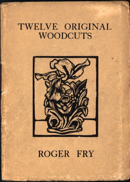
Roger Fry - Twelve Original Woodcuts - first edition

 
150 copies were printed. Squarish octavo, unpaginated, title page + 12 original woodcuts, each printed on a separate sheet.

A copy of the third impression, printed in 1922 is currently described as: “Internally the pages are bright and clean, and the woodcuts are good impressions. The original wrapper has a small closed tear along the front top edge, and a bit of light soiling, otherwise in very good condition. Very scarce in any of the impressions. Price $3,000.00”

See digital slide show of this publication at Duke University Library

previousnext


Hogarth Press studies

Woolf's-head Publishing Woolf’s-head Publishing is a wonderful collection of cover designs, book jackets, and illustrations – but also a beautiful example of book production in its own right. It was produced as an exhibition catalogue and has quite rightly gone on to enjoy an independent life of its own. This book is a genuine collector’s item, and only months after its first publication it started to win awards for its design and production values. Anyone with the slightest interest in book production, graphic design, typography, or Bloomsbury will want to own a copy the minute they clap eyes on it.

Woolf's-head Publishing Buy the book at Amazon UK
Woolf's-head Publishing Buy the book at Amazon US

The Hogarth Press Leonard and Virginia Woolf as Publishers: Hogarth Press, 1917-41 John Willis brings the remarkable story of Leonard and Virginia Woolf’s success as publishers to life. He generates interesting thumbnail sketches of all the Hogarth Press authors, which brings both them and the books they wrote into sharp focus. He also follows the development of many of its best-selling titles, and there’s a full account of the social and cultural development of the press. This is a scholarly work with extensive footnotes, bibliographies, and suggestions for further reading – but most of all it is a very readable study in cultural history.

The Hogarth Press Buy the book at Amazon UK
The Hogarth Press Buy the book at Amazon US

© Roy Johnson 2005

Filed Under: Hogarth Press Tagged With: Art, Bloomsbury, Graphic design, Literary studies, Roger Fry, Woodcuts

Sigmund Freud – The Ego and the Id

October 5, 2009 by Roy Johnson

Hogarth Press first edition book jacket designs


The Ego and the Id - first edition

 
Sigmund Freud, The Ego and the Id (1927) The International Psycho-Analytic Library, No.12

“From 1922 to 1939 the International Psycho-Analytic Library offered nine of Freud’s books and two Epitomes. Joan Riviere translated two of the nine books, James Strachey two books (Group Psychology and the Analysis of the Ego, 1922, and An Autobiographical Study, 1935), and Alix Strachey one book (Inhibitions, Symptoms, and Anxiety, 1936). Only four other translators were entrusted with translating Freud’s books in the series: C.M.J. Hubback (Beyond the Pleasure Principle, 1922), W.D Robson-Scott (The Future of an Illusion, 1928). W.J.H. Sprott (New Introductory Lectures on Psycho-Analysis, 1933), and Katherine Jones (Moses and Monotheism, 1939).”

J.H. Willis Jr, Leonard and Virginia Woolf as Publishers: The Hogarth Press 1917-1941

It was James Strachey, Lytton Strachey’s brother, who arranged to have the Hogarth Press become the publisher for the books of the International Psycho-Analytic Library in 1924. The Press bought the rights to the previously published titles in the ILP series, inheriting the already printed volumes (bearing the International Psycho-Analytic Press imprint) along with the rights to Freud’s Collected Papers for £800. Thus the Hogarth Press became the publisher of Freud in English, making a major contribution to twentieth-century thought and increasing the international importance of the Press. Freud’s Collected Papers also became one of the Press’s most successful publications. Freud’s reputation grew tremendously in the 1920s and 1930s. The Ego and the Id, along with other works by Freud, were an important part of the Press list for decades.

Elizabeth Willson Gordon, Woolf’s-head Publishing: The Highlights and New Lights of the Hogarth Press

previousnext


Hogarth Press studies

Woolf's-head Publishing Woolf’s-head Publishing is a wonderful collection of cover designs, book jackets, and illustrations – but also a beautiful example of book production in its own right. It was produced as an exhibition catalogue and has quite rightly gone on to enjoy an independent life of its own. This book is a genuine collector’s item, and only months after its first publication it started to win awards for its design and production values. Anyone with the slightest interest in book production, graphic design, typography, or Bloomsbury will want to own a copy the minute they clap eyes on it.

Woolf's-head Publishing Buy the book at Amazon UK
Woolf's-head Publishing Buy the book at Amazon US

The Hogarth Press Leonard and Virginia Woolf as Publishers: Hogarth Press, 1917-41 John Willis brings the remarkable story of Leonard and Virginia Woolf’s success as publishers to life. He generates interesting thumbnail sketches of all the Hogarth Press authors, which brings both them and the books they wrote into sharp focus. He also follows the development of many of its best-selling titles, and there’s a full account of the social and cultural development of the press. This is a scholarly work with extensive footnotes, bibliographies, and suggestions for further reading – but most of all it is a very readable study in cultural history.

The Hogarth Press Buy the book at Amazon UK
The Hogarth Press Buy the book at Amazon US

© Roy Johnson 2005

Filed Under: Hogarth Press Tagged With: Art, Bloomsbury, Graphic design, Hogarth Press, Literary studies, Sigmund Freud, The Ego and the Id

  • « Previous Page
  • 1
  • …
  • 6
  • 7
  • 8
  • 9
  • 10
  • …
  • 13
  • Next Page »

Get in touch

info@mantex.co.uk

Content © Mantex 2016
  • About Us
  • Advertising
  • Clients
  • Contact
  • FAQ
  • Links
  • Services
  • Reviews
  • Sitemap
  • T & C’s
  • Testimonials
  • Privacy

Copyright © 2025 · Mantex

Copyright © 2025 · News Pro Theme on Genesis Framework · WordPress · Log in