Mantex

Tutorials, Study Guides & More

  • HOME
  • REVIEWS
  • TUTORIALS
  • HOW-TO
  • CONTACT
>> Home / Archives for Graphic design

Leonard & Virginia Woolf – Two Stories

July 27, 2009 by Roy Johnson

Hogarth Press bibliographic designs
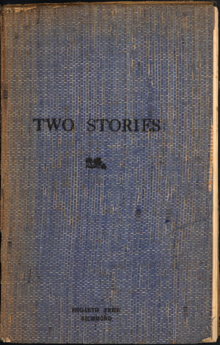
Two Stories

 
Leonard and Viginia Woolf, Two Stories (1917)

This was the first publication of the Hogarth Press. It contains the story Three Jews by Leonard Woolf and the essay The Mark on the Wall by Virginia Woolf, with four small woodcuts by Dora Carrington. 150 copies were printed. It had 34 pages and sold for 1s. 6d.

We decided to print a paper-covered pamphlet containing a story by each of us and try to sell it by subscription to a limited number of people … We set to work and printed a thirty-two page pamphlet, demy octavo … We bound it ourselves by stitching it into paper covers.

The total number finally sold was 134, and all but five or six of them were friends or acquaintances … The total cost of production was £3 7s. 0d., which included the noble sum of 15s to Carrington for the woodcuts, 12s. 6d. for paper, and 10s. for the cover paper. The two authors were not paid any royalty. The total receipts turned out to be £10 8s. 0d., so that the net profit was £7 1s. 0d.

Leonard Woolf, An Autobiography

previousnext


Hogarth Press studies

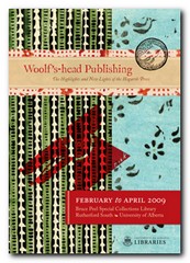
Woolf's-head Publishing Woolf’s-head Publishing is a wonderful collection of cover designs, book jackets, and illustrations – but also a beautiful example of book production in its own right. It was produced as an exhibition catalogue and has quite rightly gone on to enjoy an independent life of its own. This book is a genuine collector’s item, and only months after its first publication it started to win awards for its design and production values. Anyone with the slightest interest in book production, graphic design, typography, or Bloomsbury will want to own a copy the minute they clap eyes on it.

Woolf's-head Publishing Buy the book at Amazon UK
Woolf's-head Publishing Buy the book at Amazon US

The Hogarth Press Leonard and Virginia Woolf as Publishers: Hogarth Press, 1917-41 John Willis brings the remarkable story of Leonard and Virginia Woolf’s success as publishers to life. He generates interesting thumbnail sketches of all the Hogarth Press authors, which brings both them and the books they wrote into sharp focus. He also follows the development of many of its best-selling titles, and there’s a full account of the social and cultural development of the press. This is a scholarly work with extensive footnotes, bibliographies, and suggestions for further reading – but most of all it is a very readable study in cultural history.

The Hogarth Press Buy the book at Amazon UK
The Hogarth Press Buy the book at Amazon US


Bloomsbury Group links

Red button Bloomsbury Group – tutorials, critical studies, resources

Red button Bloomsbury Group – portraits and biographies

Red button The Bloomsbury Group – Who Were They?

Red button Hogarth Press book jacket cover designs

© Roy Johnson 2005

Filed Under: Hogarth Press Tagged With: Art, Bloomsbury, Graphic design, Hogarth Press, Leonard Woolf, Literary studies, Two Stories, Virginia Woolf

Leonard Woolf – Fear and Politics

October 4, 2009 by Roy Johnson

Hogarth Press first edition book jacket designs


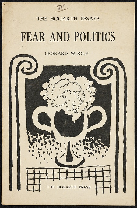
Fear and Politics - first edition

 
Leonard Woolf, Fear and Politics (1925) Cover design by Vanessa Bell

This is number 7 in the first series of Hogarth Essays, which began in 1924. It was the first of Leonard Woolf’s political contributions to the press. Cover design by Vanessa Bell. In his essay, Leonard writes from the point of view of the animals in a zoo:

“Human beings delude themselves that a League of Nations or Protection or armies and navies are going to give them security and civilization in their jungle.” According to the narrator, who is an elephant, humans “are the savagest race of carnivora known in the jungle, and they will never be happy and civilized, and the world will never be safe for democracy or for any other animal, until each human animal is confined in a separate cage.”

J.H. Willis Jr, Leonard and Virginia Woolf as Publishers: The Hogarth Press 1917-1941

previousnext


Hogarth Press studies

Woolf's-head Publishing Woolf’s-head Publishing is a wonderful collection of cover designs, book jackets, and illustrations – but also a beautiful example of book production in its own right. It was produced as an exhibition catalogue and has quite rightly gone on to enjoy an independent life of its own. This book is a genuine collector’s item, and only months after its first publication it started to win awards for its design and production values. Anyone with the slightest interest in book production, graphic design, typography, or Bloomsbury will want to own a copy the minute they clap eyes on it.

Woolf's-head Publishing Buy the book at Amazon UK
Woolf's-head Publishing Buy the book at Amazon US

The Hogarth Press Leonard and Virginia Woolf as Publishers: Hogarth Press, 1917-41 John Willis brings the remarkable story of Leonard and Virginia Woolf’s success as publishers to life. He generates interesting thumbnail sketches of all the Hogarth Press authors, which brings both them and the books they wrote into sharp focus. He also follows the development of many of its best-selling titles, and there’s a full account of the social and cultural development of the press. This is a scholarly work with extensive footnotes, bibliographies, and suggestions for further reading – but most of all it is a very readable study in cultural history.

The Hogarth Press Buy the book at Amazon UK
The Hogarth Press Buy the book at Amazon US

© Roy Johnson 2005


Filed Under: Hogarth Press Tagged With: Art, Bloomsbury, Fear and Politics, Graphic design, Hogarth Press, Leonard Woolf, Literary studies

Leonard Woolf – Quack! Quack!

October 5, 2009 by Roy Johnson

Hogarth Press first edition book jacket designs


Quack! Quack! - first edition
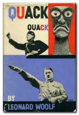
Leonard Woolf, Quack, Quack! (May, 1935) 2,000 copies, Printed by R & R Clark, 7s.6d.

“In his next two Hogarth Press books after the disappointment of After the Deluge (1931), Leonard Woolf published what he thought about Mussolini and his Fascist ambitions in Quack, Quack! (1935) and The League and Abyssinia (1936). The title of Quack, Quack! suggests the barnyard sounds of the orating Hitler and MUssolini. With devastating effect, Woolf matched photographs of the eye-bulging Hawaiian war god Kukailimoku to those of the gesticulating bellicose dictators. Woolf’s two-hundred page attack on fascism concentrated on the savage quackery of modern totalitarianism but also discussed the intellectual sources he found in Carlyle, Nietzsche, and Spengler. Woolf’s list of heroes who battled against the totalitarians for the light of civilization began with Erasmus and Montaigne and included Thomas More, Giordano Bruno, Spinoza, Descartes, Voltaire, Rousseau, Kant, and Goethe.”

J.H. Willis Jr, Leonard and Virginia Woolf as Publishers: The Hogarth Press 1917-1941

The striking, boldly-coloured dust jacket for this book was designed by E.McKnight Kauffer. A cheap edition of the book was published in 1936, priced at 2s.6d; it was reprinted again in 1937.

Elizabeth Willson Gordon, Woolf’s-head Publishing: The Highlights and New Lights of the Hogarth Press

previousnext


Hogarth Press studies

Woolf's-head Publishing Woolf’s-head Publishing is a wonderful collection of cover designs, book jackets, and illustrations – but also a beautiful example of book production in its own right. It was produced as an exhibition catalogue and has quite rightly gone on to enjoy an independent life of its own. This book is a genuine collector’s item, and only months after its first publication it started to win awards for its design and production values. Anyone with the slightest interest in book production, graphic design, typography, or Bloomsbury will want to own a copy the minute they clap eyes on it.

Woolf's-head Publishing Buy the book at Amazon UK
Woolf's-head Publishing Buy the book at Amazon US

The Hogarth Press Leonard and Virginia Woolf as Publishers: Hogarth Press, 1917-41 John Willis brings the remarkable story of Leonard and Virginia Woolf’s success as publishers to life. He generates interesting thumbnail sketches of all the Hogarth Press authors, which brings both them and the books they wrote into sharp focus. He also follows the development of many of its best-selling titles, and there’s a full account of the social and cultural development of the press. This is a scholarly work with extensive footnotes, bibliographies, and suggestions for further reading – but most of all it is a very readable study in cultural history.

The Hogarth Press Buy the book at Amazon UK
The Hogarth Press Buy the book at Amazon US

© Roy Johnson 2005


Filed Under: Hogarth Press Tagged With: Art, Bloomsbury, Graphic design, Hogarth Press, Literary studies, Quack! Quack!

Leonard Woolf – Stories of the East

October 3, 2009 by Roy Johnson

Hogarth Press first edition book jacket designs


Stories of the East - first edition

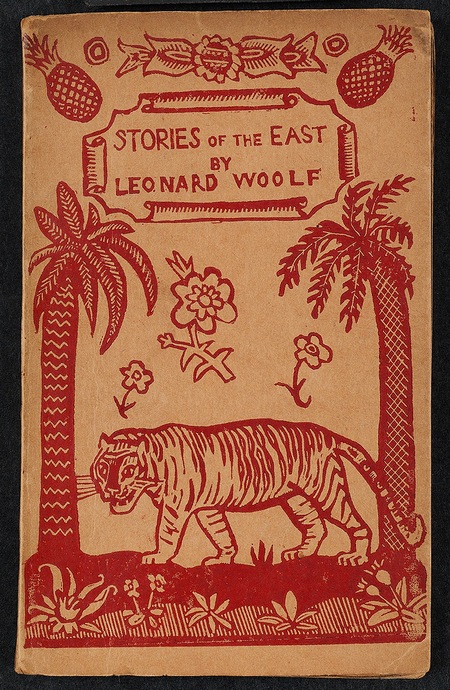
Leonard Woolf, Stories of the East (1919)

This publication contained three short stories – ‘Pearls and Swine’, ‘A Tale Told by Midnight’, and ‘The Two Brahmans’, with a cover illustration by Dora Carrington.

These three pieces are of vital importance in understanding Leonard Woolf’s mistrust of and dislike for colonialism. The stories provide disturbing commentaries about the disintegration of the colonial process and the uncomfortable moral ground occupied by the servants of the British Government in Ceylon prior to the Great War.

“Stories of the East was published in April 1921 in 300 copies and very nearly sold out. At the end of the first year, the Hogarth Press had sold over 230 copies, to realise a profit of £6 11s. 5d. When Leonard Woolf closed the account in January 1924, Stories of the East had sold 267 copies. Of the six books published by Hogarth in 1925, Leonard’s stories outsold all but Gorky’s second book, The Notebooks of Tchekhov and Virginia’s Monday or Tuesday, and in the scale of press operations it was a successful venture.”

J.H. Willis Jr, Leonard and Virginia Woolf as Publishers: The Hogarth Press 1917-1941


This book had a yapp binding, as does Prelude, and Eliot’s Poems. Dating from the nineteenth century, the yapp binding is limp, with “overlapping flaps or edges on three sides” and was originally used for binding Bibles meant to be carried in the pocket.

Elizabeth Willson Gordon, Woolf’s-head Publishing: The Highlights and New Lights of the Hogarth Press

previousnext


Hogarth Press studies

Woolf's-head Publishing Woolf’s-head Publishing is a wonderful collection of cover designs, book jackets, and illustrations – but also a beautiful example of book production in its own right. It was produced as an exhibition catalogue and has quite rightly gone on to enjoy an independent life of its own. This book is a genuine collector’s item, and only months after its first publication it started to win awards for its design and production values. Anyone with the slightest interest in book production, graphic design, typography, or Bloomsbury will want to own a copy the minute they clap eyes on it.

Woolf's-head Publishing Buy the book at Amazon UK
Woolf's-head Publishing Buy the book at Amazon US

The Hogarth Press Leonard and Virginia Woolf as Publishers: Hogarth Press, 1917-41 John Willis brings the remarkable story of Leonard and Virginia Woolf’s success as publishers to life. He generates interesting thumbnail sketches of all the Hogarth Press authors, which brings both them and the books they wrote into sharp focus. He also follows the development of many of its best-selling titles, and there’s a full account of the social and cultural development of the press. This is a scholarly work with extensive footnotes, bibliographies, and suggestions for further reading – but most of all it is a very readable study in cultural history.

The Hogarth Press Buy the book at Amazon UK
The Hogarth Press Buy the book at Amazon US

© Roy Johnson 2005


Filed Under: Hogarth Press Tagged With: Art, Bloomsbury, Graphic design, Leonard Woolf, Literary studies, Stories of the East

Letterforms

July 10, 2009 by Roy Johnson

essays on type classification, history, and bibliography

Stanley Morison (1889-1967) was an English typographer, designer and historian of printing. Self-taught, having left school after his father abandoned his family, Morison became an editorial assistant on Imprint magazine in 1913. As a conscientious objector he was imprisoned during the First World War but became design supervisor at the Pelican Press in 1918. In 1922 he founded the Fleuron Society dedicated to typographical matters and edited the society’s journal The Fleuron from 1925 to 1930. Letterforms contains two of his scholarly essays on the classification of type designs.

Letterforms The quality of the publication’s artwork and printing was considered exceptional. From 1923 to 1967 Morison was typographic consultant for the Monotype Corporation where his research and adaptation of historic typefaces in the 1920s and 1930s, including the revival of the Baskerville and Bembo types. He pioneered the great expansion of the company’s range of typefaces and hugely influenced the field of typography to the present day.

Morison was also typographical consultant to The Times from 1929 to 1960 and in 1931 he was commissioned by the newspaper to produce a new easy to read typeface for the publication. The typeface Morison developed with graphic artist Victor Lardent, Times New Roman was first used by the newspaper in 1932 and was published by Monotype in 1933.

He edited the History of the Times from 1935 to 1952 and was editor of the Times Literary Supplement between 1945 and 1948, and he was a member of the editorial board of Encyclopaedia Britannica from 1961 until his death.

This slender and beautifully produced volume contains two of his essays. The first, from 1961, is on the classification of typographical variations and was written as the introduction to a collection of type examples which is not yet complete. The second is from 1962 and concerns fifteenth and sixteenth century Italian scripts.

It’s a pity that the first longer essay is not (yet) illustrated by examples, because it forms a magisterial introduction to its subject. Morison’s writing is spare, compressed, and authoritative – and he moves effortlessly between texts in Italian, French, German, and Latin to make his argument.

What he traces is not only the history of type design, but also writing on it as a subject worthy of study. For it was almost two centuries after the advent of printing with moveable type that people began to take it seriously as an art rather than just a technical process of transferring writing into print.

He traces all the important names – Aldus, Caslon, Fournier, Baskerville, Boldoni, Clarke, Blades, Hart (of Hart’s Rules fame) and Updike, up to his own work on Fleuron. It’s an odd text – an introduction to a set of typographical examples which does not yet exist. But it is of obvious historical significance, giving as it does a synoptic view of a whole discipline.

The second essay is also an introduction – but this time to a set of writing books which had been produced in 1962. This essay too traces the state of what could and could not be known about typography in the fifteenth and sixteenth century – but in this case there are excellent illustrations from the works in question.

He inspects the history and development of chancery cursive writing and the roman capital lettering in Italy with a scholarship with is at once astonishingly modest and breathtakingly thorough. This is a book for typography specialists from publishers who specialise in such works. Thank goodness they exist.

© Roy Johnson 2001

Buy the book at Amazon UK

Buy the book at Amazon US


Stanley Morison, Letterforms, Montreal: Hartley and Marks, 1997, pp.128, ISBN 0881791369


More on typography
More on technology
More on digital media


Filed Under: Typography Tagged With: Fonts, Graphic design, Letterforms, Typography

Los Logos

July 2, 2009 by Roy Johnson

international  logos, trademarks, and typography

Los Logos is arranged in four main sections: Pictorial Logos, Lettering, Typograms and Combinations. As well as hundreds of pages of beautifully laid out images, it also contains an interesting and informative introduction about the evolution of the logo. All the materials are presented in both English and German. It’s a collection of around 3500 logos from a wide range of contemporary designers including the likes of Buro-destruct, DED associates, Eboy, Rinzen and Woodtli. In terms of colour it’s interesting to note that the predominant choices fall into two groups. Pink, lime green, and peppermint blue crop up again and again for a twenty first-century hippy look. Orange, grey, and black do the same for the post-modern techno look.

Los LogosThere are lots and lots of company logos – though surprisingly few that I recognised. For me, the best part of the book was the section on typography as a logo design element. There are some very attractive typefaces one would like to see in more detail. For instance, there’s a very inventive font (reminiscent of Neville Brody’s work) illustrated simply by the slogan ‘mexico 686’ which has been sprayed on a brick wall.

It’s a very handsome publication, beautifully produced on good quality paper and top class printing. If there’s a weakness, it’s that we don’t get to see the logos in any context. It would be useful to see the products to which some of these logos were attached, or the materials on which they were printed.

This is the sort of compilation which provides a rich source of visual stimulation for designers, and it’s strongest point is the amazingly wide range of examples shown. There are attributions for all designs at the back of the book, but in keeping with the publisher’s persistent habit of information minimalism, it’s not easy to track them down.

© Roy Johnson 2004

los logos   Buy the book at Amazon UK

los logos   Buy the book at Amazon US


Los Logos, Berlin: Die Gestalten Verlag, 2004, pp.416, ISBN: 3931126927


More on typography
More on design
More on media
More on web design


Filed Under: Graphic design, Typography Tagged With: Graphic design, Icons, Logos, Logotypes, Los Logos, Typography

Making Digital Type Look Good

June 19, 2009 by Roy Johnson

illustrated guide to new digital typography techniques

This is a stunningly attractive book. It jumped off the shelf first time I saw it, and after reading it, I’m more in love than ever. Part One offers a history of digital typography and shows how it works. Bob Gordon discusses the features that go into the design of type – the anatomy, rendering, technology, and fine tuning. This is a quick history lesson and a valuable tutorial in basic typography. He gets through the basics quickly, then concentrates on type in the digital age – how it is rendered on screen, in print, and even how it is created, down to pixel level.

Making Digital Type Look GoodThis part also explains those terms you have seen mentioned but never quite understood – such as bitmap, antialiasing, and rasterization. He clarifies all the complexities of font technology in a very straightforward manner – showing how tracking, kerning, and hyphenation can be used to good effect.

What makes this book such a visual treat is that every double-page spread is a work of exquisite design in its own right. The pages are designed on a consistent grid; they are deeply ‘layered’ and colour-coded by subject; the colouring is elegantly restrained; and every detail is illustrated with beautifully-chosen examples.

Part Two shows a a range of classic and contemporary font designs. These range from Bembo and Bodoni to Rotis and ITC Stone. Each font is described, illustrated, and shown with hundreds of examples of styles and setting values. There are also tips on how to set each font to best advantage, using tracking and kerning.

Making Digital Type Look GoodPart Three looks at display type – both on the printed page and the computer screen. He discusses customised font design – making your own font sets using software such as Fontographer and Pyrus. There is a thorough round-up of how the latest font technology is being used on the Web. This involves font-embedding, which is now much more easily achieved than it used to be. Then he concludes with a review of the most innovative font foundries and contemporary designers – such as Neville Brody, Matthew Carter, Zuzana Licko, and Adrian Frutiger.

The really successful feature of this book is that it will appeal to beginners and professionals alike. For those new to typography it offers a visual masterclass of design examples, and for the seasoned practitioner, it is a technical guide to the latest techniques. For anybody interested in good design, it is an example of book production raised to the level of an art form.

NB: The UK and the US editions have different jacket designs and different ISBNs.

© Roy Johnson 2001

Digital Type   Buy the book at Amazon UK

Digital Type   Buy the book at Amazon US


Bob Gordon, Making Digital Type Look Good, London: Thames and Hudson, 2001, pp.192, ISBN: 0500283133


More on typography
More on design
More on media
More on web design


Filed Under: Graphic design, Typography Tagged With: Digital type, Graphic design, Making Digital Type Look Good, Typography, Web design

Maurice Dobb – Russia To-day and To-morrow

October 5, 2009 by Roy Johnson

Hogarth Press first edition book jacket designs


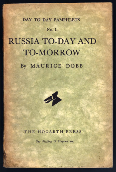
Russia Today and Tomorrow - first edition

 
Maurice Dobb, Russia Today and Tomorrow (1930) Hogarth Day to Day pamphlets, Number 1.

The colophon design was by the American artist E.McKnight Kauffer. It was used on many other Hogarth publications as an alternative to the original dog’s head design by Vanessa Bell. Price 1s. 6d.

“Reporting on his second trip to Russia in 1929, Dobb provided in six chapters a perceptive, generally approving, but not uncritical survey of Soviet history, politics, economics, industrial development, and cultural revolution. His visit came just after the relaxed and stimulating New Economic Policy period (1921—28) had been controverted by the Five Year Plan and the Russian Association of Proletarian writers. While Dobb recognised the increasing pressure for conformity to Marxist ideology, he still reported finding tolerance for experimentation in the arts.”

J.H. Willis Jr, Leonard and Virginia Woolf as Publishers: The Hogarth Press 1917-1941

previousnext


Hogarth Press studies

Woolf's-head Publishing Woolf’s-head Publishing is a wonderful collection of cover designs, book jackets, and illustrations – but also a beautiful example of book production in its own right. It was produced as an exhibition catalogue and has quite rightly gone on to enjoy an independent life of its own. This book is a genuine collector’s item, and only months after its first publication it started to win awards for its design and production values. Anyone with the slightest interest in book production, graphic design, typography, or Bloomsbury will want to own a copy the minute they clap eyes on it.

Woolf's-head Publishing Buy the book at Amazon UK
Woolf's-head Publishing Buy the book at Amazon US

The Hogarth Press Leonard and Virginia Woolf as Publishers: Hogarth Press, 1917-41 John Willis brings the remarkable story of Leonard and Virginia Woolf’s success as publishers to life. He generates interesting thumbnail sketches of all the Hogarth Press authors, which brings both them and the books they wrote into sharp focus. He also follows the development of many of its best-selling titles, and there’s a full account of the social and cultural development of the press. This is a scholarly work with extensive footnotes, bibliographies, and suggestions for further reading – but most of all it is a very readable study in cultural history.

The Hogarth Press Buy the book at Amazon UK
The Hogarth Press Buy the book at Amazon US

© Roy Johnson 2005


Filed Under: Hogarth Press Tagged With: Art, Bloomsbury, Graphic design, Hogarth Press, Literary studies, Maurice Dobb

Milton Glaser: Art is Work

June 19, 2009 by Roy Johnson

graphic design, interiors, objects and illustration

Don’t be put off by the cover design – this is a wonderful book. Milton Glaser is one of the most influential design and illustration gurus of the late 20th century in the USA. He was responsible for the “I love NY” logo and the poster of Bob Dylan with psychedelic hair which became a symbol of the 1980s. This is one of the few design books I have come across where the text is just as interesting as the graphics. Milton Glaser has thought a lot about the fundamentals of good design, and his ideas come through here via a series of interviews, plus his own commentary on the work illustrated.

Milton Glaser: Art is Work And there’s a big bonus. He doesn’t just show his finished designs, but includes his preliminary drafts and early attempts which lead up to a successful outcome. So it’s like being invited to sit in his studio whilst he thinks and works out loud. He’s astonishingly versatile. The book contains examples of poster design, record covers, freehand drawings (amazingly similar to David Hockney in style) book illustrations, interior design, product design, typography, and publicity materials.

His observations focus on the aesthetics of creativity – and yet he keeps his eye on the commercial and professional aspects of his work. He’s frank enough to admit that if the client’s budget is not big enough, he is prepared to discriminate between a ‘one hour’ idea and a ‘six hour’ design.

He’s a great believer in the idea that designers must continue to draw to develop their ideas, and he believes in creation as a form of work and process:

When you’re thinking you do a sketch and it’s fuzzy. You have to keep it fuzzy so that the brain looks at it and imagines another iteration that is clearer. Then you do another sketch that advances it again. It may take a number of these intermediate solutions before you arrive.

It’s a very instructive experience to see his rough sketches develop as he stretches and changes an idea until he comes up with what looks a fresh and spontaneous picture. That’s what he means by his book title. These designs do not just happen spontaneously: they are the result of hard work

He is very aware of modern painters – Klee, Mondrian, the much under-rated Sonia Delauney, Klimt, and Max Ernst. There’s also a portrait of Duke Ellington which has elements of Francis Bacon in its colouring and handling of paint, and a series of posters for the Venice Biennale which combine images of the city’s emblematic lion with ink spattering reflecting his appreciation of the work of Jackson Pollock

I found his book illustrations less successful, his restaurant designs inspired in terms of lighting, and his product design superb. There’s a whole page of sketches for a cocktail glass, any one of which you would be pleased to hold. But the finished product – complete with double-sided conical bowl with a vacuum to keep your Martini cold, fluted stem, and Art Deco collar uniting the two – well, my knees went weak when I turned the page, and I would pay substantial money to own a set.

© Roy Johnson 2003

Milton Glaser Buy the book at Amazon UK

Milton Glaser Buy the book at Amazon US


Milton Glaser, Art is Work, London: Thames and Hudson, 2000, pp.272, ISBN 0500510288


More on art
More on media
More on design


Filed Under: Art, Individual designers, Product design Tagged With: Art, Graphic design, Milton Glaser, Milton Glaser: Art is Work, Product design

New Systems in Design

July 2, 2009 by Roy Johnson

contemporary international web design

This portfolio presents a body of new systems in design work for the Web that is seeking to redefine the nature and scope of design practice. It is based on the productions of more than thirty-five international studios, and is presented in three categories.

New systems in DesignThe first – Code – shows how designers are using the computer as a tool to become creative programmers. The second – Generic – shows designers manipulating objects from the ordinary and everyday world to produce projects that are off-beat and refreshing. The third part – Disjunction – features work that aims to provoke, to question, and to advance a designer’s particular agenda, whether political, social, or even personal.

It is mainly composed of screenshots from avant guard web sites, samples of distressed modern typography, and reproductions from the pages of contemporary graphics display books. You may not be surprised to hear that this often means banal subjects, retro styling, and unreadable text.

There are also examples of architectural plans and sketches, maps, street signs, posters, fashion photography, book design and public signage, commercial advertising, and photography.

It represents what seems to me like a masochistic school of graphic design. In most cases, every effort seems to be made to alienate rather than to charm or please the viewer.

And yet just occasionally a gem shines through – such as the pictures of beautiful pleated garments created by the Japanese designer Issey Miyake, and the examples of public signage in Rotterdam.

It will probably appeal to young designers and those people who want something provocative for the coffee table.

© Roy Johnson 2001

New Systems in Design   Buy the book at Amazon UK

New Systems in Design   Buy the book at Amazon US


Christian Kusters and Emily King, Restart: New systems in graphic design, London: Thames & Hudson, 2001, pp. 176, ISBN: 0500282978


More on design
More on media
More on web design


Filed Under: Graphic design Tagged With: Graphic design, New Systems in Design, Web design

  • « Previous Page
  • 1
  • …
  • 5
  • 6
  • 7
  • 8
  • 9
  • …
  • 13
  • Next Page »

Get in touch

info@mantex.co.uk

Content © Mantex 2016
  • About Us
  • Advertising
  • Clients
  • Contact
  • FAQ
  • Links
  • Services
  • Reviews
  • Sitemap
  • T & C’s
  • Testimonials
  • Privacy

Copyright © 2025 · Mantex

Copyright © 2025 · News Pro Theme on Genesis Framework · WordPress · Log in