Mantex

Tutorials, Study Guides & More

  • HOME
  • REVIEWS
  • TUTORIALS
  • HOW-TO
  • CONTACT
>> Home / Archives for Art

Duncan Grant & the Bloomsbury Group

July 22, 2009 by Roy Johnson

richly illustrated biography and social study

Duncan Grant came from a privileged upper class family in Scotland where he spent childhood holidays with his cousins the Stracheys (including Lytton Strachey who later became his lover) amidst a family whose eccentric behaviour reads like the events of a PG Wodehouse story. He went to Rugby School with Rupert Brooke and then lived with Lytton Strachey at Lancaster Gate. Duncan Grant and the Bloomsbury Group concentrates on his life and work amidst this illustrious collection of aesthetes.

Duncan Grant & the Bloomsbury GroupDouglas Turnbaugh’s narrative weaves in an out of his many affaires as a young man – Strachey, Arthur Hobhouse, John Maynard Keynes – but also emphasises his hard work in trying to become a successful artist, studying the old masters, copying them, and attending art schools in London and Paris. Grant’s life merged with that of the Bloomsbury set when he took up residence with the Stephens in Gordon Square. He and Keynes lived on the ground floor; Adrian Stephen on the first floor; Virginia Woolf on the second; and Leonard Woolf on the top floor.

He joined the Omega workshop which was organised by Roger Fry, subsequently replacing him as Vanessa Bell’s lover – despite the fact that he was her brother’s lover at the time. Then during the war he was like most of the Bloomsberries a conscientious objector. He became the father of Vanessa Bell’s daughter Angelica, who was passed off as the daughter of Clive Bell – to whom Vanessa was still married.

In the 1920s Vanessa learned to tolerate his affairs with a succession of younger men. In fact the whole family became involved in this sexual ambiguity when Julian Bell, Vanessa’s son, studying at Cambridge, began sleeping with Anthony Blunt – who later turned out to be simultaneously Keeper of the Queen’s pictures and a Soviet spy.

The cruelty of concealing the true identity of Angelica Bell’s father came home to roost in the late 1930s when she discovered the truth, and reacted to it by marrying another of her father’s ex-lover, David Garnett – which caused a rift in the family. [She gives her own account of these events, plus a picture of her Bloomsbury childhood, in Deceived with Kindness.]

In 1946, at the age of 60, he met the young Paul Roche, who was to be the main love of his late life and a serious threat to Vanessa. His work in the immediate post war period was considered unfashionable, but he continued working, mainly on decorative projects and private commissions. In the 1960s and 70s however, his reputation revived and he continued painting and pursuing young men with a remarkable degree of success until his death at the age of ninety-three.

This is a rather uncritical biography, but it captures the spirit of the ages in which Duncan Grant lived quite well, and it is rich in anecdote. The book is generously illustrated with Grant’s work and portraits of the Bloomsberries, and it has a good bibliography. I bought my copy second hand on Amazon to flesh out my collection of Bloomsbury materials, and although it is a little dated it turned out to be really good value.

© Roy Johnson 2002

Duncan Grant Buy the book at Amazon UK

Duncan Grant Buy the book at Amazon US


Douglas Turnbaugh, Duncan Grant and the Bloomsbury group, London: Bloomsbury, 1987, pp.192, ISBN 0747501033


More on biography
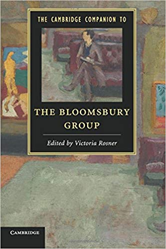
More on the Bloomsbury Group
Twentieth century literature


Filed Under: Art, Bloomsbury Group Tagged With: Art, Biography, Bloomsbury Group, Duncan Grant, Painting

Duncan Grant biography

September 18, 2009 by Roy Johnson

Bloomsbury painter and interior designer

Duncan Grant - portraitDuncan Grant (full name Duncan James Corrowr Grant) was born in Inverness, Scotland in 1885. He was brought up until the age of nine in India and Burma where his father was posted as an army officer. He returned to England in 1894 to attend school. While at St Paul’s school, London, he was brought up by his uncle and aunt Sir Richard and Lady Strachey (the parents of Lytton Strachey. He was encouraged by his art teacher and also his aunt, who organised private drawing lessons for him. Eventually, he was allowed to follow his desire to become an artist, rather than joining the army as his father wished, and he attended Westminster School of Art in 1902.
Grant’s cousins the Stracheys, with whom he had spent summer holidays as a schoolboy, played an important part in his life during this period. He spent the summer of 1905 with Lytton Strachey, and around the same time Pippa Strachey took Duncan to a meeting of the Friday Club where he first met the artists in the Bloomsbury Group.

At the beginning of 1906 he went to Paris, taking with him a letter of introduction from the French artist Simon Bussy and £100 from an aunt sympathetic to Grant’s artistic interests. He rented an attic room in a cheap hotel and enrolled at Jacques Emile Blanche’s new art school, La Palette. While in Paris he copied paintings in the Louvre.


The Art of Duncan GrantThe Art of Duncan Grant is a visual record of Grant’s easel painting and murals. He also did fabric design, theatre and ballet work, illustration and print-making, and commercial interior decoration. Throughout a long life Duncan Grant continued to experiment with new styles and techniques. This book offers an opportunity to grasp the extent of his achievement.


During his year in Paris, Grant developed a number of other important connections. He met the British artists Wyndham Lewis, Henry Lamb and Augustus John, and made friends with the American writer Gertrude Stein. He was also visited by the newly married Vanessa Bell and her husband Clive Bell, along with Vanessa’s sister Virginia Woolf, and their brother Adrian

Returning to London, Duncan Grant formed relationships over the next few years that were to affect the course of his life and work. In 1908, he became the lover of John Maynard Keynes, a university friend of his cousin Lytton Strachey. They travelled to Italy, Greece, and Turkey, seeing much that would influence Grant’s artistic style.

In 1909 he moved to 21 Fitzroy Square and became a regular visitor at Virginia and Adrian Stephen’s Thursday evening gatherings which formed the nucleus of the Bloomsbury Group. He also became a co-director of the Omega Workshops in 1913, along with Roger Fry and Vanessa Bell. All of them shared an interest in the decorative arts as well painting on canvas.

In 1911 he worked on his first major commission, collaborating with other artists on a series of murals for the refectory of what is now South Bank University. The art critic of The Times thought that his murals Bathing and Football could have a “degenerative influence on the children of the working classes” – though both panels are now in the Tate Gallery.

Duncan Grant and the Bloomsbury GroupFrom 1914 Duncan lived and worked with Vanessa Bell, moving to Charleston with her and his lover David Garnett. Vanessa was married to Clive Bell, but he had moved on to an affair with someone else and only visited at weekends. Despite Grant’s homosexuality, he and Vanessa remained together for fifty years, and they had a daughter Angelica who was born in 1918. Angelica was led to believe that her father was Clive Bell, and she only discovered the truth as an adult. She gives her version of all this in her memoir, Deceived with Kindness where she describes her reaction of marrying her father’s former lover, David Garnett, who was twenty-six years older than her, much to the disapproval of her mother.

Like most of the members of the Bloomsbury group, Grant was a pacifist. In order to be exempted from military service during World War I, he and David Garnett moved to Wissett in the Suffolk countryside to become farm labourers. Although they were at first refused exemption by a tribunal, they appealed and were eventually recognised as conscientious objectors.

He had his first one-man exhibition in 1920 and his work was exhibited regularly until the end of his life. Grant and Bell were in great demand to paint murals and decorations. Duncan Grant enjoyed a reputation as one of the most important British Artists until the late 1930s, after which period the influence of pre-war Bloomsbury was eclipsed by the second world war.

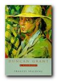
Duncan Grant: A BiographyVanessa and Grant also travelled widely in Europe and spent much of their time living in Cassis in the South of France. After Vanessa Bell’s death he continued painting, dividing his time between Charleston and London and also travelling to Turkey, Morocco and France. The last great love of his life was the poet Paul Roche, whose daughter the actress and artist Mitey Roche he taught to paint. He died of pneumonia at Aldermaston in 1978 at the age of ninety-three.

Francis Spalding’s Duncan Grant: A Biography is the standard account of his life, which stretched from the Victorian age well into the modern era. It is based on his unpublished memoirs, letters and diaries, and it meticulously documents Grant’s daily life, his travels from Seville to Cyprus, and his encounters with everyone from E.M. Forster to Andre Gide and D.H. Lawrence.

Duncan Grant biography Buy the book at Amazon UK
Duncan Grant biography Buy the book at Amazon US


Clive Bell


Bloomsbury Group – web links

Bloomsbury Group - web links Hogarth Press first editions
Annotated gallery of original first edition book jacket covers from the Hogarth Press, featuring designs by Vanessa Bell, Roger Fry, and others.

Bloomsbury Group - web links The Omega Workshops
A brief history of Roger Fry’s experimental Omega Workshops, which had a lasting influence on interior design in post First World War Britain.

Bloomsbury Group - web links The Bloomsbury Group and War
An essay on the largely pacifist and internationalist stance taken by Bloomsbury Group members towards the First World War.

Bloomsbury Group web links Tate Gallery Archive Journeys: Bloomsbury
Mini web site featuring photos, paintings, a timeline, sub-sections on the Omega Workshops, Roger Fry, and Duncan Grant, and biographical notes.

Bloomsbury Group - web links Bloomsbury: Books, Art and Design
Exhibition of paintings, designs, and ceramics at Toronto University featuring Hogarth Press, Vanessa Bell, Dora Carrington, Quentin Bell, and Stephen Tomlin.

Bloomsbury Group - web links Blogging Woolf
A rich enthusiast site featuring news of events, exhibitions, new book reviews, relevant links, study resources, and anything related to Bloomsbury and Virginia Woolf

Bloomsbury Group - web links Hyper-Concordance to Virginia Woolf
Search the texts of all Woolf’s major works, and track down phrases, quotes, and even individual words in their original context.

Bloomsbury Group - web links A Mrs Dalloway Walk in London
An annotated description of Clarissa Dalloway’s walk from Westminster to Regent’s Park, with historical updates and a bibliography.

Bloomsbury Group - web links Women’s History Walk in Bloomsbury
Annotated tour of literary and political homes in Bloomsbury, including Gordon Square, University College, Bedford Square, Doughty Street, and Tavistock Square.

Bloomsbury Group - web links Virginia Woolf Society of Great Britain
News of events, regular bulletins, study materials, publications, and related links. Largely the work of Virginia Woolf specialist Stuart N. Clarke.

Bloomsbury Group - web links BBC Audio Essay – A Eulogy to Words
A charming sound recording of a BBC radio talk broadcast in 1937 – accompanied by a slideshow of photographs of Virginia Woolf.

Bloomsbury Group - web links A Family Photograph Albumn
Leslie Stephens’ collection of family photographs which became known as the Mausoleum Book, collected at Smith College – Massachusetts.

Bloomsbury Group - web links Bloomsbury at Duke University
A collection of book jacket covers, Fry’s Twelve Woodcuts, Strachey’s ‘Elizabeth and Essex’.

© Roy Johnson 2000-2014


More on biography
More on the Bloomsbury Group
Twentieth century literature


Filed Under: Bloomsbury Group Tagged With: Art, Biography, Bloomsbury Group, Duncan Grant

E.M.Forster – What I Believe

October 4, 2009 by Roy Johnson

Hogarth Press first edition book jacket designs


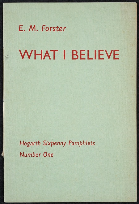
What I Believe - original pamphlet

 
E.M. Forster, What I Believe (1939)

previousnext


Hogarth Press studies

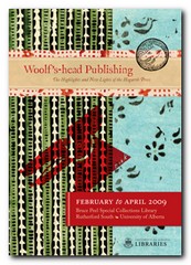
Woolf's-head Publishing Woolf’s-head Publishing is a wonderful collection of cover designs, book jackets, and illustrations – but also a beautiful example of book production in its own right. It was produced as an exhibition catalogue and has quite rightly gone on to enjoy an independent life of its own. This book is a genuine collector’s item, and only months after its first publication it started to win awards for its design and production values. Anyone with the slightest interest in book production, graphic design, typography, or Bloomsbury will want to own a copy the minute they clap eyes on it.

Woolf's-head Publishing Buy the book at Amazon UK
Woolf's-head Publishing Buy the book at Amazon US

The Hogarth Press Leonard and Virginia Woolf as Publishers: Hogarth Press, 1917-41 John Willis brings the remarkable story of Leonard and Virginia Woolf’s success as publishers to life. He generates interesting thumbnail sketches of all the Hogarth Press authors, which brings both them and the books they wrote into sharp focus. He also follows the development of many of its best-selling titles, and there’s a full account of the social and cultural development of the press. This is a scholarly work with extensive footnotes, bibliographies, and suggestions for further reading – but most of all it is a very readable study in cultural history.

The Hogarth Press Buy the book at Amazon UK
The Hogarth Press Buy the book at Amazon US

© Roy Johnson 2005


Filed Under: Hogarth Press Tagged With: Art, Bloomsbury, E.M.Forster, Graphic design, Literary studies, What I Believe

Eric Gill

August 29, 2015 by Roy Johnson

artist, engraver, typographist, stone carver, and more

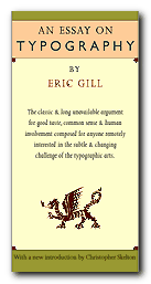
Eric Gill (1882-1930) was a sculptor, a typographist, a wood engraver, and an influential artist-craftsman in the early years of the twentieth century. He is probably best known for his typeface Gill Sans which became ubiquitous from the 1920s onwards, but he was also famous in his own day for his radical views and eccentric appearance.. He took a highly moralistic, quasi- religious attitude to his work in art, but he has become the subject of bemused attention in recent years because of revelations about bizarre practices in his sexual life.

Eric Gill

Early years

He was born in Brighton in 1882, the second child of thirteen to a clergyman with a family background of missionary ‘work’ in the South Seas. The cultural atmosphere of Gill’s childhood was a combination of evangelical fervour and what became known as Muscular Christianity. He had a fairly undistinguished education, but he did meet a fellow day boy at school who introduced him to woodworking tools.

The even tenor of his youth was interrupted by the death of his favourite sister Cicely and his father’s conversion to Anglicanism and the family’s subsequent move to Chichester. More importantly for his future development, he discovered what he thought of as ‘the mystical power of the phallus’.

He enrolled at Chichester Art School and started drawing buildings in the town. The cathedral there played a big part in his personal life. It also introduced him to his first serious love affair – with Ethel Moore, the sacristan’s daughter whom he later married. But in 1900 he felt he had outgrown the town and set off to London to find his profession.

Apprenticeship

He entered a practice of church architects as a trainee, but his real intellectual development took flight when he enrolled at the Central School of Arts and Crafts and he encountered a world of radicalism, William Morris-inspired handicrafts, and the company of Edward Johnston, the calligraphist with whom he was to produce Gill Sans.

In London he also had his first sexual encounters (with prostitutes) which he characteristically related in detail to his girlfriend Ethel. By the time he was twenty-one he was sharing Johnston’s lodgings at Lincoln’s Inn Fields and participating in late night bachelor discussions on Truth, Religious Faith, and English hand-lettering. Almost by accident, he established a reputation as someone who could cut letters in stone, and commissions came to him regularly from this time onwards.

He obtained work contracts from Healds and W.H.Smith, the designs for the latter establishing what we would now call a corporate identity. His success led him to get married to Ethel, and they set up home in Battersea, where one of his first important patrons was Count Harry Kessler.

In 1905 he moved with Ethel to Hammersmith and joined a community of radical printers and craftsmen. Gill, plus his friends Johnston and Hilary Pepler were in the habit of writing letters late at night, then meeting at the local post box for the midnight collection, then carrying on their aesthetic debates until two and three o’clock in the morning.

The move left

He joined the Fabians the following year and lost no time on lecturing the Webbs and George Bernard Shaw on the inadequacy of their views on Art. He also joined in their enthusiasm for the idea of the New Woman by starting an open affair with Lillian Meacham, which his wife did her best to tolerate. What Ethel did not know was that at the same time he was also ‘fornicating’ with their domestic help Lizzie.

Eric Gill

In 1908 the family moved again to Ditchling, a country village near Lewes in Sussex. Here he advocated a life of rural simplicity – whilst spending much of his working week in London where he had kept on the flat at Lincoln’s Inn Fields. Artistically, he added two skills to his repertoire – wood engraving and sculpture in stone. In London he was mixing with Jacob Epstein, Roger Fry, Ottoline Morrell, and other fringe Bloomsbury Group figures. He also came under the influence of Ananda Coomaraswamy, an Indian aesthete. When he produced an erotic carving of a man and woman copulating (bizarrely entitled Votes for Women) it was bought by Maynard Keynes for five pounds.

Family fun

Around this time Gill began incestuous relationships with his sisters Angela and Gladys, recording the fact in his diary quite casually, with no recognition at all that he was breaking a social taboo. What is even more amazing is the fact that he maintained these relationships throughout the remainder of his adult life.

At the same time he was going through a religious conversion – rather surprisingly to Roman Catholicism. He and his wife were received into the church in Brighton, she changed her name to Mary, and they celebrated the event by having Leonard and Virginia Woolf as house guests for the weekend.

They moved to another house on the outskirts of Ditchling, and he was joined in the area by his old Hammersmith colleagues Johnston and Pepler. He cultivated a Spartan, almost medieval close-to-the-soil existence, and when the war came he more or less ignored it.

Religion

He also threw himself enthusiastically into the rituals and beliefs of the Dominican order of the church, and took to wearing ecclesiastical garments, including the belt of chastity, which he wore with no apparent sense of irony. The guild that he formed with Pepler took itself very seriously and issued propaganda leaflets arguing against birth control and the use of Bird’s Custard Powder.

Ditchling became famous as a place for spiritual retreat, and Gill was celebrated as its presiding religious genius. But beneath the homespun cassock and the stonemason’s paper toque, he had started having sex with his own daughters. He recorded the details of his ‘experiments’ in his diaries, admitted misgivings to his religious confessors, and rationalised his behaviour with a new theory of phallic ‘Godliness’.

Eric Gill

In 1924 he felt oppressed by the public attention he had generated at Ditchling and moved to an abandoned abbey in the Welsh Black Mountains. The move resulted in him turning his attention back to engraving and typography. He became the principal designer and illustrator for Robert Gibbings’ Golden Cockerel Press, whose publications now seem the most distinguished of between-the-wars private presses. The relationship with Gibbings was particularly warm – close enough to include weekend threesomes in Berkshire with the publisher and his wife Moira whilst his wife Mary kept the monastic abbey going in the Black Mountains.

Readers who may be thinking there was something homo-erotic (or polymorphous perverse) in all these shenanigans will be confirmed in their suspicions when he records his impressions (and celebrations) of the male member in his diaries::

A man’s penis and balls are very beautiful things and the power to see this beauty is not confined to the opposite sex. The shape of the head of a man’s erect penis is very excellent in the mouth. There is no doubt about this. I have often wondered – now I know.

When he returned to the abbey he busied himself showing his new secretary Elizabeth Bill slides of semen under the microscope and inviting her to measure the size of his own beautiful penis before demonstrating it at work on her. Elizabeth had an ageing fiance, but she also had money, and when she bought a villa in the Basque country Gill was very happy to go and live there.

He was also taken up by Stanley Morison, adviser to the Monotype Corporation, and the typefaces he designed for him – Perpetua (1925), Gill Sans (1927), and Solus (1929) – are probably his greatest claim to fame as a designer. Doing so gave him the urge to move on once again, so he uprooted his entire household from Wales and went to live on an estate called Pigotts, near High Wycombe.

Animal farm

There he had a sculpture workshop, an art studio, and a printing press all in their own buildings. At a private level he started an affair with Beatrice Warde, the glamorous American typographist who was the mistress of his champion (and employer) Stanley Morison. Then suddenly in 1930 he had a mysterious seizure and lost his memory. It took him quite some time to recover, but when back to normal he found new ways of amusing himself. He started having sex with the family dog. This is a man who celebrated holy mass twice a day at an altar in his own home.

But the medical interlude in no way diminished his creative energies. In the early 1930s he composed his famous Joanna typeface and he completed his public commission Prospero and Ariel over the entrance to BBC at Langham Place. It is generally thought that these large scale public carvings were not as successful as his smaller, more domestic works, and he has also been criticised for spreading his talents across so many varied forms of visual art.

As commissions proliferated, so he became more famous at a Daily Express level. People wanted to know if he wore underpants beneath his stonemason’s smock. Domestically he enlarged his entourage by moving his latest mistress May Reeves into a caravan on the site at Pigotts. This gave him the convenience of sex with May and his wife (sometimes on the same night) without as it were leaving the premises.

In the later years of his life two changes came over him, and these were typically contradictory. First of all he became far more bourgeois – accepting physical comforts, employing a chauffeur, installing a black marble bath. But at the same time he became more politically radical, and espoused many of the left wing causes of the late 1930s – including workers control and support for the Republicans in Spain.

He became increasingly frail in the latter years of his life (though he was only in his late fifties) yet he embarked on two large scale projects which consumed all his energies. The first was his debut as an architect. He designed and supervised the building of a simple church in Norfolk in which he radically placed the altar in the centre of the building. The second project was a new and extra intense affair with Daisy Hawkins, a nineteen year old servant at Pigotts. She was unusually attractive, and he both made drawings of her and had sex with her on almost a daily basis for nearly two years.

Not surprisingly, this did not go down well with his two other sexual partners – his wife (in the house) and May Reeves (in the caravan). There was eventually a showdown and Daisy was exiled to Capel in Wales. But Gill simply followed here there, pursuing her from one room to another for sexual couplings, the locations of which were all systematically recorded in his diaries. But this late satyriasis was the last gasp of an exhausted figure. In 1940 he suffered from a number of debilitating ailments and was then diagnosed with cancer of the lung. It was that which killed him – at the age of only fifty eight.

© Roy Johnson 2015

Eric Gill Buy the book at Amazon UK

Eric Gill Buy the book at Amazon US


Fiona MacCarthy, Eric Gill, London: Faber and Faber, 2003. pp.416, ISBN: 0571143024


More on typography
More on art
More on media
More on design


Filed Under: Art, Biography, Lifestyle, Typography Tagged With: Art, Bloomsbury Group, Cultural history, Eric Gill, Typography

F.L.Lucas – Tragedy

October 4, 2009 by Roy Johnson

Hogarth Press first edition book jacket designs

 
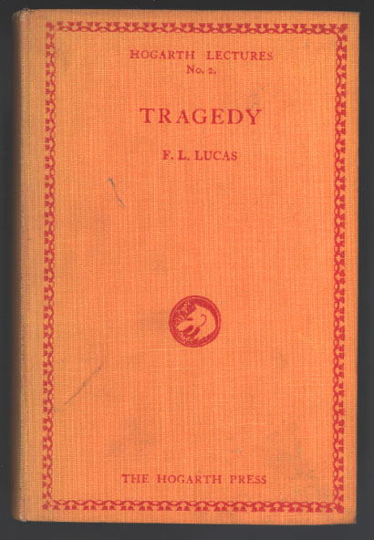
F.L.Lucas - Tragedy - first edition

F.L. Lucas,Tragedy in Relation to Aristotle’s ‘Poetics’ (1927) The Hogarth Lectures on Literature, First Series, No. 2.

F.L. (Peter) Lucas was a former Apostle and classical scholar at King’s College Cambridge. The Woolfs also published his unsuccessful novel The River Flows (1926).

previousnext


Hogarth Press studies

Woolf's-head Publishing Woolf’s-head Publishing is a wonderful collection of cover designs, book jackets, and illustrations – but also a beautiful example of book production in its own right. It was produced as an exhibition catalogue and has quite rightly gone on to enjoy an independent life of its own. This book is a genuine collector’s item, and only months after its first publication it started to win awards for its design and production values. Anyone with the slightest interest in book production, graphic design, typography, or Bloomsbury will want to own a copy the minute they clap eyes on it.

Woolf's-head Publishing Buy the book at Amazon UK
Woolf's-head Publishing Buy the book at Amazon US

The Hogarth Press Leonard and Virginia Woolf as Publishers: Hogarth Press, 1917-41 John Willis brings the remarkable story of Leonard and Virginia Woolf’s success as publishers to life. He generates interesting thumbnail sketches of all the Hogarth Press authors, which brings both them and the books they wrote into sharp focus. He also follows the development of many of its best-selling titles, and there’s a full account of the social and cultural development of the press. This is a scholarly work with extensive footnotes, bibliographies, and suggestions for further reading – but most of all it is a very readable study in cultural history.

The Hogarth Press Buy the book at Amazon UK
The Hogarth Press Buy the book at Amazon US

© Roy Johnson 2005


Filed Under: Hogarth Press Tagged With: Art, Bloomsbury, F.L.Lucas, Graphic design, Hogarth Press, Literary studies

Fyodor Dostoyevski – Stavrogin’s Confession

October 4, 2009 by Roy Johnson

Hogarth Press first edition book jacket designs


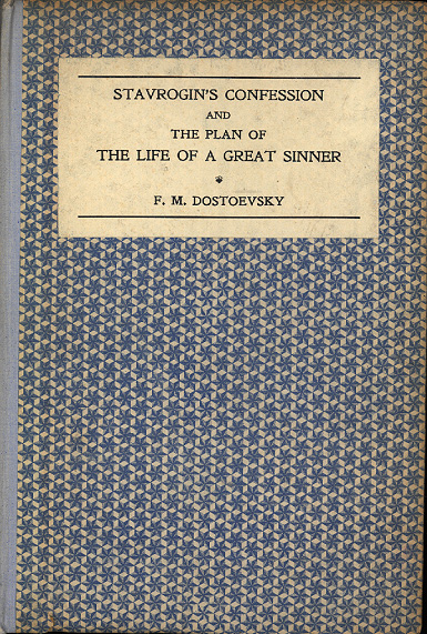
Stavrogin's Confession - first edition

 
Fyodor Dostoyevski, Stavrogin’s Confession, (1922)

This unpublished material from The Possessed was translated by S.S.Koteliansky with Virginia Woolf. The financial success of these Russian translations enabled the press to transform itself from a handpress cottage industry into an established commercial publisher. The origins of the text were explained in their ‘Translator’s note’:

“The Russian government has recently published a small paper-covered book containing Stavrogin’s Confession, unpublished chapters of Dostoyevski’s novel The Possessed, and Dostoyevski’s plan or sketch of a novel which he never actually wrote but which he called The Life of a Great Sinner.”

J.H. Willis Jr, Leonard and Virginia Woolf as Publishers: The Hogarth Press 1917-1941

Leonard Woolf provides an account of the book as a physical object with his customary attention to fine detail:

“These books, which I still think to be beautifully printed and bound, were very carefully designed by Virginia and me, and they were unlike the books published by other publishers in those days. They were bound in paper over boards and we took an immense amount of trouble to find gay, striking, and beautiful papers. The Dostoyevski and Bunin were bound in very gay patterned paper which we got from Czechoslovakia … We printed, I think, 1,000 of each and [sold] the Dostoyevski at 6s. [They] sold between 500 and 700 copies in twelve months and made us a small profit, and they went on selling until we reprinted or they went out of print.”

Leonard Woolf, An Autobiography

previousnext


Hogarth Press studies

Woolf's-head Publishing Woolf’s-head Publishing is a wonderful collection of cover designs, book jackets, and illustrations – but also a beautiful example of book production in its own right. It was produced as an exhibition catalogue and has quite rightly gone on to enjoy an independent life of its own. This book is a genuine collector’s item, and only months after its first publication it started to win awards for its design and production values. Anyone with the slightest interest in book production, graphic design, typography, or Bloomsbury will want to own a copy the minute they clap eyes on it.

Woolf's-head Publishing Buy the book at Amazon UK
Woolf's-head Publishing Buy the book at Amazon US

The Hogarth Press Leonard and Virginia Woolf as Publishers: Hogarth Press, 1917-41 John Willis brings the remarkable story of Leonard and Virginia Woolf’s success as publishers to life. He generates interesting thumbnail sketches of all the Hogarth Press authors, which brings both them and the books they wrote into sharp focus. He also follows the development of many of its best-selling titles, and there’s a full account of the social and cultural development of the press. This is a scholarly work with extensive footnotes, bibliographies, and suggestions for further reading – but most of all it is a very readable study in cultural history.

The Hogarth Press Buy the book at Amazon UK
The Hogarth Press Buy the book at Amazon US

© Roy Johnson 2005


Filed Under: Hogarth Press Tagged With: Art, Bloomsbury, Dostoyevski, Graphic design, Literary studies, Stavrogin's Confession

George Rylands – Poems

October 5, 2009 by Roy Johnson

Hogarth Press first edition book jacket designs

 
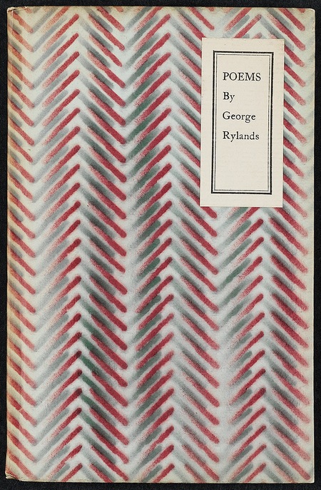
Poems by George Rylands - first edition

 
George Rylands, Poems (1931)

“George (“Dadie”) Rylands as an undergraduate moved in the Cambridge Apostles circuit of young men who caught the attention of Maynard Keynes and Lytton Strachey. He became the Woolfs’ short-term but beloved assistant from July to December 1924 and then returned to Cambridge where he became a fellow of King’s College in 1927. The Woolfs published two volumes of Rylands’s poetry, Russet and Taffeta (1925), people by Perditas and Corydons, and Poems (1931) about Chloe and Flora amid the flowers and hay-scented farmlands. The Woolfs also published his fellowship dissertation, Words and Poetry (1928). For all their skillful lyricism, Rylands’s Poems are like pressed flowers, nosegays colourless and dry, preserved from change. Only one year older than William Plomer and two years older than Christopher Isherwood, Rylands wrote not of his generation but of a generation before the FirstWorld War.”

J.H. Willis Jr, Leonard and Virginia Woolf as Publishers: The Hogarth Press 1917-1941

There is generous use of white space in this, the second book of Rylands’ poetry hand printed by the Woolfs… There is a typo in the imprint, placing a comma rather than a period after Leonard’s initial.

Elizabeth Willson Gordon, Woolf’s-head Publishing: The Highlights and New Lights of the Hogarth Press

previousnext


Hogarth Press studies

Woolf's-head Publishing Woolf’s-head Publishing is a wonderful collection of cover designs, book jackets, and illustrations – but also a beautiful example of book production in its own right. It was produced as an exhibition catalogue and has quite rightly gone on to enjoy an independent life of its own. This book is a genuine collector’s item, and only months after its first publication it started to win awards for its design and production values. Anyone with the slightest interest in book production, graphic design, typography, or Bloomsbury will want to own a copy the minute they clap eyes on it.

Woolf's-head Publishing Buy the book at Amazon UK
Woolf's-head Publishing Buy the book at Amazon US

The Hogarth Press Leonard and Virginia Woolf as Publishers: Hogarth Press, 1917-41 John Willis brings the remarkable story of Leonard and Virginia Woolf’s success as publishers to life. He generates interesting thumbnail sketches of all the Hogarth Press authors, which brings both them and the books they wrote into sharp focus. He also follows the development of many of its best-selling titles, and there’s a full account of the social and cultural development of the press. This is a scholarly work with extensive footnotes, bibliographies, and suggestions for further reading – but most of all it is a very readable study in cultural history.

The Hogarth Press Buy the book at Amazon UK
The Hogarth Press Buy the book at Amazon US

© Roy Johnson 2005


Filed Under: Hogarth Press Tagged With: Art, Bloomsbury, Graphic design, Hogarth Press, Literary studies, Poems

Goodbye to Berlin – Christopher Isherwood

October 5, 2009 by Roy Johnson

Hogarth Press first edition book jacket designs

 
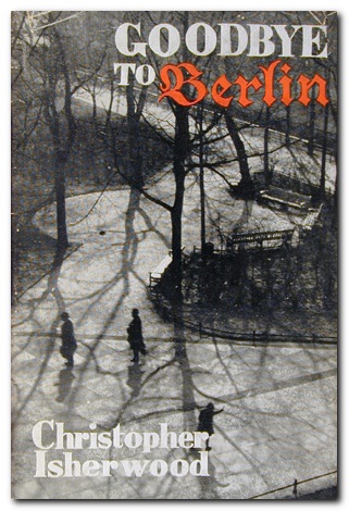
Goodbye to Berlin - first edition

 
Christopher Isherwood, Goodbye to Berlin (1939)

“Before leaving for China, Isherwood had completed “The Landauers”, “On Ruegen Island”, and “A Berlin Diary (Winter 1932-33)” and given them to John Lehmann, who was beginning his negotiations with the Woolfs to become managing director of the press. Lehmann collected the various stories from the first Berlin diary to the last and arranged them in novel form as Goodbye to Berlin (1939), and the novel was published by the Hogarth Press under Lehmann’s supervision in March.

Goodbye to Berlin, thanks in part to the audacious spirit of Sally Bowles, became another fast-selling, popular success for Isherwood and the Hogarth Press. Reviewers were generally enthusiastic, although troubled by the fragmented structure and the omnipresent narrator Christopher Isherwood who bore the author’s name. Few of them saw at the time the irony, art, and control with which Isherwood had shaped his characters and assembled his episodes. Edmund Wilson, almost alone, saw Goodbye to Berlin in terms that would become obvious to later more observant critics. Reviewing the American edition by Random House, Wilson noted that Isherwood was a master of social observation whose eye was “accurate, lucid and cool; and it is a faculty which brings its own antidote to the hopelessness and horror he describes”. Isherwood’s prose, added Wilson, was “a perfect medium for his purpose”, allowing the reader “to look right through Isherwood and to see what he sees”.

J.H. Willis Jr, Leonard and Virginia Woolf as Publishers: The Hogarth Press 1917-1941

previousnext


Hogarth Press studies

Woolf's-head Publishing Woolf’s-head Publishing is a wonderful collection of cover designs, book jackets, and illustrations – but also a beautiful example of book production in its own right. It was produced as an exhibition catalogue and has quite rightly gone on to enjoy an independent life of its own. This book is a genuine collector’s item, and only months after its first publication it started to win awards for its design and production values. Anyone with the slightest interest in book production, graphic design, typography, or Bloomsbury will want to own a copy the minute they clap eyes on it.

Woolf's-head Publishing Buy the book at Amazon UK
Woolf's-head Publishing Buy the book at Amazon US


The Hogarth Press
Leonard and Virginia Woolf as Publishers: Hogarth Press, 1917-41 John Willis brings the remarkable story of Leonard and Virginia Woolf’s success as publishers to life. He generates interesting thumbnail sketches of all the Hogarth Press authors, which brings both them and the books they wrote into sharp focus. He also follows the development of many of its best-selling titles, and there’s a full account of the social and cultural development of the press. This is a scholarly work with extensive footnotes, bibliographies, and suggestions for further reading – but most of all it is a very readable study in cultural history.

The Hogarth Press Buy the book at Amazon UK
The Hogarth Press Buy the book at Amazon US

© Roy Johnson 2005


Filed Under: Hogarth Press Tagged With: Art, Bloomsbury, Goodbye to Berlin, Graphic design, Hogarth Press, Literary studies

GPO Design

November 27, 2010 by Roy Johnson

posters and propaganda for the post office 1930-1970

GPO Design is a very stylishly produced collection of posters and information graphics commissioned for the postal services between 1930 and 1970. It’s supported by a well-informed essay on the relations between government, propaganda quangos, and the world of what was then called ‘commercial art’. It has always been a mystery to me why a monopoly should feel the need to advertise its services. Mrs Average of Pinner, Middlesex has until very recently had no alternative but to use Royal Mail to deliver her birthday cards and letters to friends. The same has also been true for gas, water, and electricity. Nobody had access to alternative services, so why bother to advertise their virtues?

GPO DesignBut the GPO has from its earliest years made a habit of commissioning artists to design posters to promote its services and reminding us to post early for Xmas. In fact there has been a quite deliberate campaign to both educate the public and promote an impression of efficient, modern technology driving communications at a national level. This has been coupled ideologically with folksy images of the village postman delivering letters in all weathers, and at the same time promoting an empire of connectivity that embraced the globe.

But not all the postal service’s posters and advertising campaigns were corporate vanity. The campaign to advertise postage stamps in little booklets was apparently an attempt to reduce the waiting time spent queuing to buy a single stamp.

It’s not surprising that all decision making in matters of acceptability was in the hands of establishment appointees who despite their efforts to employ modern artists, generated an output that was pretty near indistinguishable from Soviet propaganda posters of the same era

Hans SchlegerThe range of artists and designers they did use included E.McKnight Kauffer, Graham Sutherland, Duncan Grant, and Vanessa Bell. But the most artistically advanced was Hans (Zero) Schleger, one of the many European immigrants who fled to Britain during the inter-war years.
Paul Rennie suggests however in his contribution to the elegant Design series that their work was more successful politically and technologically than their Soviet and Nazi counterparts. He also points out that the GPO’s emphasis on the modern technology of communication – cars, boats, trains, telephones – was a distinctly progressive and modernist theme radiated into society by its educational and service-promoting publicity.

The examples in this collection from the award-winning series are drawn from the poster collection of the British Postal Museum and Archive in London. It sits very neatly alongside its recent fellow publications on David Gentleman, El Lissitzsky, and Alexander Rodchenko.

GPO Design   Buy the book at Amazon UK

GPO Design   Buy the book at Amazon US

© Roy Johnson 2010


Paul Rennie, GPO: Design, Suffolk: Antique Collectors Club, 2010, pp.96, ISBN: 1851495967


More on design
More on media
More on web design


Filed Under: Graphic design Tagged With: Art, Cultural history, Graphic design, Media

Graphic Design: a concise history

June 27, 2009 by Roy Johnson

popular potted history of 19th and 20th century graphics

This is an introduction to graphic design in a series from Thames and Hudson which offers very good value for money. Richard Hollis takes as a starting point the idea that graphic design begins in the late nineteenth century with the development of the poster which combined word and image. If you are happy to ignore what went before, what he presents is thought provoking and a visual treat.

Graphic Design: a concise historyThe main feature of the book is that each point of his argument is illustrated by small marginal pictures which function like a lecture slide show (which I suspect is their origin). It’s not quite clear if he is following a chronological, a thematic, or a national structure – but this isn’t really important, as the main pleasure of his account is the exuberant variety of illustrative examples he discusses. These act as a fascinating introduction to the subject.

It’s rather like a very entertaining series of illustrated undergraduate lectures. He starts with the poster in the nineteenth century, then goes on to chart the development of word and image in brochures and magazines, advertising, television and electronic media, and the impact of technical innovations such as photography and the computer.

The strength of his approach is his internationalism and excellent choice of materials. He covers the main figures in Swiss, Dutch, French, American, and British design, and en route there are special features on movements such as Italian futurism, Soviet constructivism, and German expressionism.

His exposition and analysis of the various movements is handled with a light touch, which makes the subject accessible to non-specialists. The most successful parts of the book are his detailed tracing of artistic influences and his arguments for the relation between design and function.

He knows the names, the products, and the businesses which produced the commissions. Maybe the book should have been called ‘Twentieth Century Graphic Design’, but this is excellent value, and always in print.

© Roy Johnson 2000

Graphic Design   Buy the book at Amazon UK

Graphic Design   Buy the book at Amazon US


Richard Hollis, Graphic Design: a concise history, London: Thames and Hudson, 1994, pp.224, ISBN: 0500202702


More on design
More on media
More on web design


Filed Under: Graphic design Tagged With: Art, Design history, Graphic design, Modernism

  • « Previous Page
  • 1
  • 2
  • 3
  • 4
  • 5
  • …
  • 9
  • Next Page »

Get in touch

info@mantex.co.uk

Content © Mantex 2016
  • About Us
  • Advertising
  • Clients
  • Contact
  • FAQ
  • Links
  • Services
  • Reviews
  • Sitemap
  • T & C’s
  • Testimonials
  • Privacy

Copyright © 2025 · Mantex

Copyright © 2025 · News Pro Theme on Genesis Framework · WordPress · Log in