Mantex

Tutorials, Study Guides & More

  • HOME
  • REVIEWS
  • TUTORIALS
  • HOW-TO
  • CONTACT
>> Home / Archives for Graphic design

Harold Nicolson – Jeanne de Henaut

October 5, 2009 by Roy Johnson

Hogarth Press first edition book jacket designs
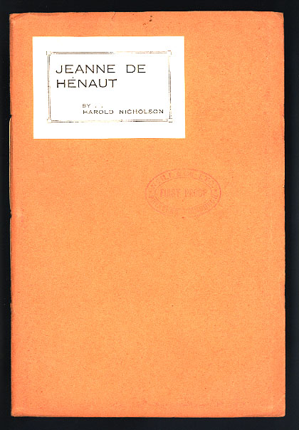
 

Jeanne de Henaut - first edition

 
Harold Nicolson, Jeanne de Hénaut (1924)

Only 55 copies were printed. This copy has the printer’s “First Proof” stamp and the date “8 Nov. 1924” on the front cover. The author’s name is spelled “Nicholson” on the proof, but this was corrected before publication. This is the only known copy of the First Proof.

previousnext


Hogarth Press studies

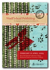
Woolf's-head Publishing Woolf’s-head Publishing is a wonderful collection of cover designs, book jackets, and illustrations – but also a beautiful example of book production in its own right. It was produced as an exhibition catalogue and has quite rightly gone on to enjoy an independent life of its own. This book is a genuine collector’s item, and only months after its first publication it started to win awards for its design and production values. Anyone with the slightest interest in book production, graphic design, typography, or Bloomsbury will want to own a copy the minute they clap eyes on it.

Woolf's-head Publishing Buy the book at Amazon UK
Woolf's-head Publishing Buy the book at Amazon US

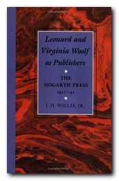
The Hogarth Press Leonard and Virginia Woolf as Publishers: Hogarth Press, 1917-41 John Willis brings the remarkable story of Leonard and Virginia Woolf’s success as publishers to life. He generates interesting thumbnail sketches of all the Hogarth Press authors, which brings both them and the books they wrote into sharp focus. He also follows the development of many of its best-selling titles, and there’s a full account of the social and cultural development of the press. This is a scholarly work with extensive footnotes, bibliographies, and suggestions for further reading – but most of all it is a very readable study in cultural history.

The Hogarth Press Buy the book at Amazon UK
The Hogarth Press Buy the book at Amazon US

© Roy Johnson 2005

Filed Under: Hogarth Press Tagged With: Art, Bloomsbury, Graphic design, Harold Nicolson, Hogarth Press, Jeanne de Henaut, Literary studies

Hogarth Press – Book Jackets

October 3, 2009 by Roy Johnson

Hogarth Press - Book Jackets - colophon - Bell

Hogarth Press first edition book jacket designs

1917.   Leonard & Virginia Woolf,   Two Stories

1918.   Katherine Mansfield,   Prelude

1918.   T.S. Eliot,   Poems

1918.   Virginia Woolf,   Kew Gardens

1921.   Leonard Woolf,   Stories of the East

1921.   Roger Fry,   Twelve Original Woodcuts

1921.   Virginia Woolf,   Monday or Tuesday

1922.   Fyodor Dostoyevski,   Stavrogin’s Confession

1922.   Virginia Woolf,   Jacob’s Room

1923.   T.S. Eliot,   The Waste Land

1923.   Robert Graves,   The Feather Bed

1924.   Virginia Woolf,   Mr Bennett and Mrs Brown

1924.   Harold Nicolson,   Jeanne de Hénaut

1924.   Leonard Woolf,   Fear and Politics

1925.   Virginia Woolf,   The Common Reader

1926.   Virginia Woolf,   Mrs Dalloway

1927.   F.L. Lucas,   Tragedy

1927.   Virginia Woolf,   To the Lighthouse

1927.   Sigmund Freud,   The Ego and the Id

1929.   Virginia Woolf,   A Room of One’s Own

1930.   Maurice Dobb,   Russia To-Day and To-Morrow

1930.   Virginia Woolf,   On Being Ill

1931.   Virginia Woolf,   The Waves

1931.   George Rylands,   Poems

1931.   William Plomer,   Sado

1932.   Virginia Woolf,   The Common Reader – II

1933.   Rebecca West,   Letter to a Grandfather

1934.   L.B. Pekin,   Darwin

1935.   R.C. Trevelyan,   Beelzebub and Other Poems

1935.   Leonard Woolf,   Quack, Quack!

1937.   Virginia Woolf,   The Years

1938.   Virginia Woolf,   Three Guineas

1939.   Hogarth Press,   Hogarth Sixpenny Pamphlets

1939.   E.M. Forster,   What I Believe

1939.   Virginia Woolf,   Reviewing

1939.   Christopher Isherwood,   Goodbye to Berlin

1940.   Virginia Woolf,   Roger Fry

1941.   Virginia Woolf,   Between the Acts

1942.   Virginia Woolf,   The Death of the Moth


Hogarth Press studies

Woolf's-head Publishing Woolf’s-head Publishing is a wonderful collection of cover designs, book jackets, and illustrations – but also a beautiful example of book production in its own right. It was produced as an exhibition catalogue and has quite rightly gone on to enjoy an independent life of its own. This book is a genuine collector’s item, and only months after its first publication it started to win awards for its design and production values. Anyone with the slightest interest in book production, graphic design, typography, or Bloomsbury will want to own a copy the minute they clap eyes on it.

Woolf's-head Publishing Buy the book at Amazon UK
Woolf's-head Publishing Buy the book at Amazon US

The Hogarth Press Leonard and Virginia Woolf as Publishers: Hogarth Press, 1917-41 John Willis brings the remarkable story of Leonard and Virginia Woolf’s success as publishers to life. He generates interesting thumbnail sketches of all the Hogarth Press authors, which brings both them and the books they wrote into sharp focus. He also follows the development of many of its best-selling titles, and there’s a full account of the social and cultural development of the press. This is a scholarly work with extensive footnotes, bibliographies, and suggestions for further reading – but most of all it is a very readable study in cultural history.

The Hogarth Press Buy the book at Amazon UK
The Hogarth Press Buy the book at Amazon US

© Roy Johnson 2005

Filed Under: Hogarth Press Tagged With: Art, Bloomsbury, First editions, Graphic design, Hogarth Press, Literary studies

Hogarth Sixpenny Pamphlets

October 4, 2009 by Roy Johnson

Hogarth Press first edition book jacket designs


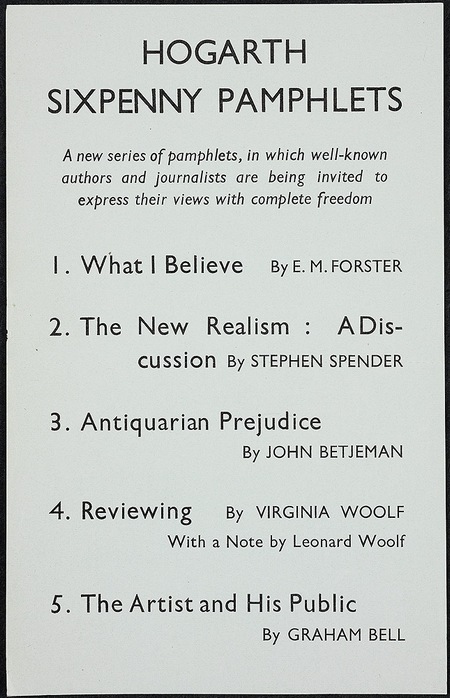
Hogarth Sixpenny Pamphlets - original advertising flyer
Hogarth Sixpenny Pamphlets 1940 – advertising flyer

previousnext


Hogarth Press studies

Woolf's-head Publishing Woolf’s-head Publishing is a wonderful collection of cover designs, book jackets, and illustrations – but also a beautiful example of book production in its own right. It was produced as an exhibition catalogue and has quite rightly gone on to enjoy an independent life of its own. This book is a genuine collector’s item, and only months after its first publication it started to win awards for its design and production values. Anyone with the slightest interest in book production, graphic design, typography, or Bloomsbury will want to own a copy the minute they clap eyes on it.

Woolf's-head Publishing Buy the book at Amazon UK
Woolf's-head Publishing Buy the book at Amazon US

The Hogarth Press Leonard and Virginia Woolf as Publishers: Hogarth Press, 1917-41 John Willis brings the remarkable story of Leonard and Virginia Woolf’s success as publishers to life. He generates interesting thumbnail sketches of all the Hogarth Press authors, which brings both them and the books they wrote into sharp focus. He also follows the development of many of its best-selling titles, and there’s a full account of the social and cultural development of the press. This is a scholarly work with extensive footnotes, bibliographies, and suggestions for further reading – but most of all it is a very readable study in cultural history.

The Hogarth Press Buy the book at Amazon UK
The Hogarth Press Buy the book at Amazon US

© Roy Johnson 2005

Filed Under: Hogarth Press Tagged With: Art, Bloomsbury, Graphic design, Hogarth Press, Literary studies

How to create good page layout

September 15, 2009 by Roy Johnson

basic principles of effective page design

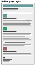
Good Page LayoutGood page layout
More and more people today are using computers for essay and project writing. The advantages for improved presentation are dramatic. Once most people have started to enjoy the facilities computers offer for editing, rewriting, and presentation, they often wonder how they ever managed without them. Typewriters become a thing of the past.

Editing
The main advantage of the computer is that you can rewrite and edit what you produce. You might start out with just a sketchy outline, but you can add extra examples, delete mistakes, and move paragraphs around. You can build up to the finished product in as many stages as you wish.

First drafts
At first you might want to carry on producing the first draft of your work in hand-written form. You type it into the computer’s memory or onto disk. Then you can edit what you have produced, either on screen or by printing out your document. This is quite common for beginners. Most people abandon the handwriting stage in a gradual manner.

On-screen editing
At first, you will probably want to see what you have written printed out as soon as possible. As you gain experience however, you will probably edit on screen and only print out the finished version of your work. WYSIWYG word-processors (What You See Is What You Get) allow you to see on screen what the finished document will look like.

Presentation
The most important element of presentation is the layout of the page. No matter what the content of your work, it will look better if is given plenty of space in which to ‘breathe’. You should leave plenty of blank space around what you write. Do not attempt to cram the maximum amount of text onto each page. If you are using any sort of pictures, tables or visually quoted material, let it stand well clear of the text.

Margins
Learn how to set generously wide margins. One inch minimum at the top and bottom of the page is normal. One inch or more at each side. If your work is going to be presented in a folder or binder, you should also allow at least 0.25″ ‘binding offset’ (also called a ‘gutter’).

Columns
If your piece of work is anything like a newsletter, a magazine, or a popular report, you might wish to use multi-column layout. On A4-sized paper, two columns will probably be appropriate, but you might choose three if you reduce the size of the left and right margins. If you find working in columns difficult, prepare your text separately first. Your final task will then simply be one of laying out the page.

Line spacing
The computer and printer will produce your work very neatly, but will probably do so by using single line spacing. Even though you are likely to be pleased by the neatness, learn how to set for one-and-a-half or double line spacing. This will give you more opportunity to create good layout.

Fonts
For the main text of your work, choose a font with serifs such as Times New Roman or Garamond. Avoid the use of sans-serif fonts such as Arial or Helvetica. These make continuous reading difficult. Unless your work is connected with fine arts, advertising, or graphic design, avoid using fancy display fonts (such as Poster or ShowTime) altogether: these are designed for advertising and shopfront display.

Display fonts

Fontsize
In general, the size of your chosen font should be eleven or twelve points. This will make your work easy to read, and the font will appear proportionate to its use when printed out on A4 paper. You might wish to use large font sizes of fourteen-point size for subheadings, and sixteen or eighteen point for main headings. Long quotations (where necessary) are normally set in eleven or ten-point size.

Font variety
Although you may have a wide range of fonts at your disposal, you should keep the number you use to a minimum. Two or at the very most three different fonts will be enough for most pieces of work. On this issue, graphic designers have an expression – “More is less” – which means that the greater the number of different fonts used on a document, so the less effective they become.

Justification
Most word-processors will produce your work with the text ‘fully justified’ – that is, with both left and right hand edges aligned. This will produce a neat overall impression. However, it can cause ‘rivers’ of white space to appear in the text, caused by irregular spaces between the words. You may wish to choose left-justification (like this paragraph). This will leave the right-hand edge ragged, but the spaces between the words will be regular. If in doubt, full justification usually offers more overall neatness on the page.

Indentation
If your work contains items such as numbered lists, columns of figures, or anything else which is set off from the left hand margin, always use the TAB key or the INDENT command to position the item. Never use the spacebar: this will not help you to achieve precise alignment. ‘The word-processor is not a typewriter’. Take full advantage of any facilities for indenting to regularise your presentation of quotations. Double indentation is for those longer quotations that would otherwise occupy more than two or three lines of the text in your work. Try to be consistent throughout.

Quotations
Long quotations (where necessary) should normally be set in the same font as the body of your essay. The size however may be reduced by one or two points. This draws attention to the fact that it is a quotation from a secondary source. Alternatively (and in addition) it may be set in a slightly different font – but don’t use too many different fonts.

Paragraphs
If you use double spaces between each paragraph, you do not need to indent the first line. [This is only necessary when there are no spaces between the paragraphs.] One good reason for having the double spaces, apart from its looking more attractive, is that it will help you to ‘see’ each paragraph as a separate part of your argument or discussion.

Page numbering
Learn how to switch on automatic page numbering for all your essays and projects. The numbers should normally be placed at the bottom of the page, either in the middle or in the right-hand corner. You may also place page numbers in page ‘footers’ – that is a piece of text which occurs at the bottom of every page.

Spelling
If your word-processor has a spell-checking facility, then use it before you print out your document. But remember that it is unlikely to recognise specialist terms and unusual names such as Schumacher, Derrida, or Nabokov. These will not be in the processor’s memory. You will have to check the correct spelling of these yourself, as you will any other unusual words. Remember too that a spell-checker will not make any distinction between They washed their own clothes and They washed there own clothes, because the word there is spelt correctly even though it is being used ungrammatically.

Grammar-checkers
If your word-processor has a grammar checker, use it before you finalise your document. These devices are very useful for spotting over-long sentences, awkward syntax, missing verbs, and all sorts of grammatical errors. You might find them annoying to use at first, but the best of them will offer you advice and potted lessons as well as corrections of any errors. Persist, but be careful: even machines can sometimes be wrong.

Book titles
Use the italics or the bold commands of a word processor to indicate the titles of books – but remember to be consistent throughout your document. A.J.P. Taylor’s The Origins of the Second World War is just as acceptable as Margaret Mead’s Coming of Age in Samoa though the former is more usual and preferable.

Footnoting
Advanced users may well be tempted to take advantage of automatic footnoting facilities. Word-processors can certainly remove all the headaches from this procedure. However, do not clutter your text with them just for the sake of showing off your command of the technology. Numbered endnotes are much easier to use and to control.

Hyphenation
If your word-processor automatically hyphenates words at the end of a line, take care to read through the work before you make your final print-out. Eliminate any howlers such as ‘the-rapist’ and ‘thin-king’. This needs to be done with extra care if you are using newspaper columns.

Widows and orphans
In laying out your pages, avoid creating paragraphs which start on the last line of a page or which finish on the first of the next. These are called, in the jargon of word-processing, ‘Widows and Orphans’. The solution to this problem is to control the number of lines on a page so as to push the text forward. An extra-large gap at the bottom of a page looks better than an isolated single (or even double) line of text.

Titles
Titles, main headings, or essay questions may be presented in either a slightly larger font size than the body of the text. They may also be given emphasis by the use of bold. You should not use continuous capital letters in a title, heading, or question. This looks typographically ugly. Do not underline headings: this makes them more difficult to read.

Emphasis
Although many people think it is good idea, there should be no need to underline something to give it emphasis. If you have a title, heading or a question at the head of a piece of work, then a larger font, and the use of bold and double spacing will be enough to give it emphasis and importance. Underlining any text makes it harder to read.

Italics
Italics are normally used to show emphasis – when something is very important. They are also used to indicate a word of foreign origin, such as ouvrier (French – workman) or nihil (Latin – nothing). Book titles should be shown in italics – such as War and Peace. Smaller pieces of work such as stories, articles, and poems are shown by putting the title in single quotation marks. For instance, ‘The Fall of the House of Usher’.

Print-preview
Use the print-preview facility to help you lay out the contents of a page before you print it. Get used to the practice of switching between draft mode and print-preview. In draft mode, you view the text in detail and you can make fine adjustments to what you have written. In print-preview, you have a one-page overview of your text. Make sure that your text is properly aligned and laid out on the page. Check the spacing of paragraphs and the appearance of your text. Ensure that your titles, subtitles, and any section headings are set at the correct fontsize and weight.

© Roy Johnson 2004


More on How-To
More on literary studies
More on writing skills


Filed Under: How-to guides, Study Skills Tagged With: Graphic design, Page layout, Page presentation, Presentation, Study skills, Text presentation

Indie Fonts

July 15, 2009 by Roy Johnson

compendium of digital type from independent foundries

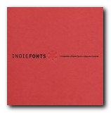
This is a wonderful collection of over 2000 fonts from eighteen of the most innovative independent type designers. It’s essentially a typographic sample book, but some top class design and innovative presentation make it much more than that. Indie Fonts itself is an amazingly stylish production. It’s well designed, beautifully printed on good quality paper, and laid out in a way which displays full font sets without every page ending up the same. They don’t do the usual thing of simply showing the alphabet in upper and lower case over and over again. Every page is different, and the text often describes what the font is attempting to do.

Indie FontsThe font styles include serif, sans serif, script, display, non-Latin, and ornaments. They also include all sorts of page decorations, swashes, figures, icons, and dingbats. Another interesting feature is that almost all these fonts are actually usable for practical day-to-day applications. There are none of the scribbles, distortions, and virtually unreadable grunge fonts that sometimes wish to pass as clever modern typography. Even the wacky and avant-garde Chank studio of Minneapolis produces font sets that can be read and used commercially.

The foundries represented range from Letterror, PSY/OPS, and Test Pilot Collective, to P22 type foundry, Font Diner, and Astigmatic One Eye Typographic Institute. Each of them is introduced with the print equivalent of a colour splash page. There are also introductory notes on each foundry, and the entries for Matthew Carter for instance offer mini-essays in typeface construction and the practical reasoning behind design decisions.

Type styles range from the best of Carter’s classic designs to the latest irreverence of Chank Diesel. Any designer searching for unique typefaces will find what they are looking for, from historical revivals to futuristic techno faces.

The book comes with a CD-ROM which features a selection of thirty-three font sets which are free for you to use – but not distribute. Anybody who is interested in typography ought to see this book. Serious designers will want to own it.

© Roy Johnson 2002

Buy the book at Amazon UK

Buy the book at Amazon US


IndieFonts, Buffalo, NY: P-Type Publications, 2002, pp.408, ISBN: 0963108220


More on typography
More on technology
More on digital media


Filed Under: Typography Tagged With: Digital type, Fonts, Graphic design, Indie Fonts, Typography

InteractiveDesign2

July 14, 2009 by Roy Johnson

interactive web site pages sample book

This is a stylish – nay, glamorous portfolio of Web page design. InteractiveDesign2 collects the best in graphic creativity from interactive environments generated over the past two years. Two hundred illustrations are featured, including color reproductions of websites, CDROMs, kiosks, and other interactive media. The companies featured include big corporations such as Coca-Cola and Mercedes Benz, National Geographic magazine, film studios, plus IBM, Sony, and Adobe. The majority are saturated with art work and heavy graphic design. But the odd thing is that they are imitating magazine advertising and the cinema screen, rather than maximising the essence of the Web page.

web page designMost of these sites look very attractive printed out on the page – but they take an age to download. The level of interactivity varies. A lot of the sites, when I visited them, have homepages announcing that you need Shockwave and a Flash plug-in just to view what’s beyond the entry screen. These are obviously not businesses who want to make things easy to attract lots of visitors or clients.

Some crashed the browser, whilst others such as Gucci and San Francisco Museum of Modern Art – a rare case where horizontal scrolling seems to work – worked seamlessly, making a very stylish presentation.

Amazingly, none of the sites is credited with a URL. If you want to see the site live in action, you need to work out an address from the title bar or you could make a guess from the name.

There is no commentary or analysis. Designers are listed in an appendix, but it’s a bit of a fag matching names to their work, and there is no informative backup to any of this. You simply have the graphic images to inspect, plus some skimpy designer credits.

You’ll get lots of graphic design stimulation just from looking at the pages of the book. But for fuller value, you’ll need to work out those URLs and look at some of the stunning effects created on screen.

© Roy Johnson 2005

Buy the book at Amazon UK

Buy the book at Amazon US


B. Martin Pedersen (ed) InteractiveDesign2, New York; Graphis, nd, pp.256, ISBN: 1888001925


More on web design
More on digital media
More on technology


Filed Under: Web design Tagged With: Design, Graphic design, Interactive Design, Web design

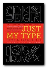
Just My Type

April 11, 2011 by Roy Johnson

essays on the appreciation of fonts and their history

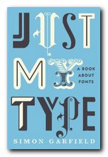
Just My Type is a book about fonts – an appreciation of their aesthetics and an explanation of how they come to be designed and used. It’s also a work of deep love and homage to humanitarian craftsmanship. Simon Garfield starts with the observation (which might be a surprise to anyone under forty) that prior to the introduction of the Apple Mac, computer users had no choice of fonts at all, except for the barest minimum, which almost always included the much reviled Courier. This is a font some people claim was designed for deep-sea divers to be legible under water.

Just My TypeThe book is a series of wittily written sketches on typographical history and principles, The main pieces are essays on the stories of the people behind fonts – the typographists who shape them, and the graphic designers who use them. These stories are underpinned by an amazingly wide-ranging and deep sense of printing history, and they are punctuated by shorter pieces celebrating individual fonts such as Gill Sans, Frutiger, Optima, and Vendôme. They also include potted studies of famous designers such as Paul Renner, Hermann Zapf, and Neville Brody.

The book itself pulls off a very dangerous strategy of printing every mention of a typeface name in that font itself, as well as varying the body text between a serif and a sans-serif font for alternate chapters (Sabon and Univers Light). This could easily have resulted in a visual mess – but the book has a strong and consistent design which helps make it visually interesting and coherent.

Garfield’s topics are amazingly diverse. He deals with font classification, variations on the ampersand, and Mrs Eaves – an Australian girl typographist who displays elegantly written letterforms on her own body, and he offers all sorts of amusing gossip and oblique items – such as Eric Gill having sex with his pet dog.

There are fascinating tales such as a beautiful typeface (Doves) which was lost by drowning, thrown into the Thames by its owner to spite his business partner. Garfield is also well informed on the background stories , the economics, and the design studio politics behind fonts which have become recently popular – such as Luc de Groot’s very successful Calibri, designed for Microsoft.

Just My TpeHis in-depth analyses come into their own when distinguishing between the very similar Helvetica, Univers, and Frutiger – all of which have become internationally popular, particularly for the signage in major travel systems such as railways and airports. You might not think that font selection could breed serious conflicts, but the choice of typeface for Britain’s motorway system in the 1960s led to angry letters to the Times and a ‘fonts duel’ between the two principal contenders for the commission.

Garfield has a loving and nostalgic chapter on what might be called ‘intermediate technology’ – the systems of home-made printing which preceded digital type, including the John Bull Printing Outfit, Dyno-Tape, and Letraset. It’s strange (for those of a certain age) to be reminded just how recent these make-do systems were. Also covered are font plagiarism and piracy, a type and printing museum in Lambeth, and a selection of the worst possible fonts.

The font designers are meticulously given credit in the appendices, and there’s a useful selection of further reading plus a list of videos, blogs, typefaces libraries, and font discussion sites. It’s a wonderfully entertaining read. However, here’s a word of warning. The book is best sampled one short chapter at a time. If you read it continuously you’ll get font-indigestion and forget where Giambattista Bodoni ends and Frederick Goudy begins.

Buy the book at Amazon UK

Buy the book at Amazon US

© Roy Johnson 2011


Simon Garfield, Just My Type, London: Profile Books, 2010, pp.352, ISBN: 1846683025


More on typography
More on technology
More on digital media


Filed Under: Typography Tagged With: Graphic design, Just My Type, Simon Garfield, Typography

Katherine Mansfield – Prelude

October 3, 2009 by Roy Johnson

Hogarth Press first edition book jacket designs


Katherine Mansfield - Prelude - first edition

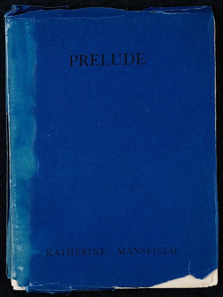
Katherine Mansfield, Prelude (1918)

This was the second publication of the Hogarth Press. It was a re-write of her long short story The Aloe which she had begun in 1915. 300 copies were printed.

“It is a sixty-eight-page book and we printed and bound it entirely with our own hands. The edition must have consisted of nearly 300 copies for, when it went out of print, we had sold 257 copies. Virginia did most of the setting and I did all the machining.”

Leonard Woolf, An Autobiography


“Prelude was published by the Hogarth Press in July 1918, an edition of 300 copies selling at 3s. 6d. It was a book of 68 pages, 19 X 14.5 cm, set in Caslon and bearing the dedication “To L.H.B. and J.M.M.” The early pages had been set by Barbara Hiles, a former student at the Slade who now worked for the Press, then mostly by Virginia Woolf, who recorded that her top speed at hand-setting was one page in an hour and a quarter. The book finally was not run off on the hand press at Hogarth House, but at a jobbing printer’s in Richmond, with Leonard himself working the machine.

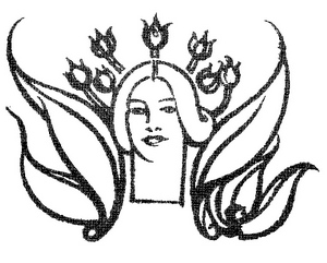
The book was clearly the work of amateurs, but cleanly done and unpretentious. The Woolfs misnamed the story The Prelude in both the heading preceding section I, and in the running head as far as p.19. After the first few copies, they removed from the front of the dark blue paper jacket the line block of a woman’s head, surrounded by the spiky leaves and the flowers of the aloe and from the back cover another head, with the leaves now fallen into rather a Medusa-like severity, which had been designed by Mansfield’s friend, the Scottish painter J.D.Fergusson.”

Aloe - colophon

Vincent O’Sullivan (ed), The Aloe

previousnext


Hogarth Press studies

Woolf's-head Publishing Woolf’s-head Publishing is a wonderful collection of cover designs, book jackets, and illustrations – but also a beautiful example of book production in its own right. It was produced as an exhibition catalogue and has quite rightly gone on to enjoy an independent life of its own. This book is a genuine collector’s item, and only months after its first publication it started to win awards for its design and production values. Anyone with the slightest interest in book production, graphic design, typography, or Bloomsbury will want to own a copy the minute they clap eyes on it.

Woolf's-head Publishing Buy the book at Amazon UK
Woolf's-head Publishing Buy the book at Amazon US

The Hogarth Press Leonard and Virginia Woolf as Publishers: Hogarth Press, 1917-41 John Willis brings the remarkable story of Leonard and Virginia Woolf’s success as publishers to life. He generates interesting thumbnail sketches of all the Hogarth Press authors, which brings both them and the books they wrote into sharp focus. He also follows the development of many of its best-selling titles, and there’s a full account of the social and cultural development of the press. This is a scholarly work with extensive footnotes, bibliographies, and suggestions for further reading – but most of all it is a very readable study in cultural history.

The Hogarth Press Buy the book at Amazon UK
The Hogarth Press Buy the book at Amazon US

© Roy Johnson 2005


Filed Under: Hogarth Press Tagged With: Art, Bloomsbury, Graphic design, Hogarth Press, Katherine Mansfield, Literary studies, Prelude

L.B.Perkin – Darwin

October 5, 2009 by Roy Johnson

Hogarth Press first edition book jacket designs


L.B.Perkin - Darwin - first edition

 
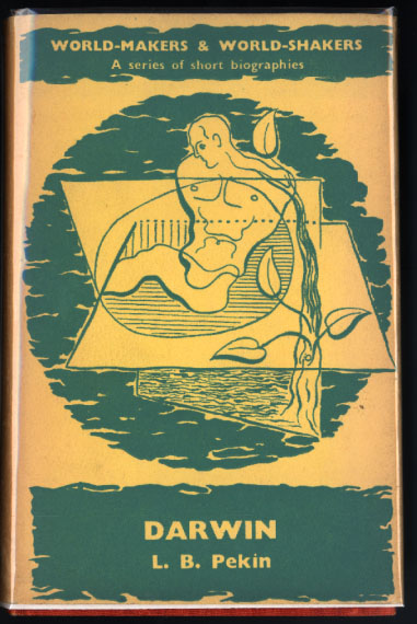
L.B. Pekin, Darwin (1934) World-Makers and World-Shakers: a series of short biographies.

“L.B. Pekin was the pseudonym of Reginald Snell, who wrote “two Hogarth pamphlets expanding on subjects he had introduced in [earlier] books: The Military Training of Youth: An Enquiry into the Aims and Effects of the O.T.C. (1937) and Co-education (1939). As the titles of his books and pamphlets suggest, Pekin was an innovative educator, highly critical of public schools (the British private boarding school) and in favour of progressive educational reform, including the efforts to broaden the curriculum with more science and mathematics and to introduce sex education and manual training. He strongly opposed the Officer Training Corps and supported coeducation enthusiastically.

The newly formed pacifist organization the Peace Pledge Union (with luminaries Canon Dick Sheppard, Julian Huxley, Rose Macaulay, Arthur Ponsonby, Bertrand Russell, and Vera Brittain among the early sponsors) was so impressed by Pekin’s OTC pamphlet that it ordered several hundred copies from Leonard Woolf for distribution to its members.”

J.H. Willis Jr, Leonard and Virginia Woolf as Publishers: The Hogarth Press 1917-1941

previousnext


Hogarth Press studies

Woolf's-head Publishing Woolf’s-head Publishing is a wonderful collection of cover designs, book jackets, and illustrations – but also a beautiful example of book production in its own right. It was produced as an exhibition catalogue and has quite rightly gone on to enjoy an independent life of its own. This book is a genuine collector’s item, and only months after its first publication it started to win awards for its design and production values. Anyone with the slightest interest in book production, graphic design, typography, or Bloomsbury will want to own a copy the minute they clap eyes on it.

Woolf's-head Publishing Buy the book at Amazon UK
Woolf's-head Publishing Buy the book at Amazon US

The Hogarth Press Leonard and Virginia Woolf as Publishers: Hogarth Press, 1917-41 John Willis brings the remarkable story of Leonard and Virginia Woolf’s success as publishers to life. He generates interesting thumbnail sketches of all the Hogarth Press authors, which brings both them and the books they wrote into sharp focus. He also follows the development of many of its best-selling titles, and there’s a full account of the social and cultural development of the press. This is a scholarly work with extensive footnotes, bibliographies, and suggestions for further reading – but most of all it is a very readable study in cultural history.

The Hogarth Press Buy the book at Amazon UK
The Hogarth Press Buy the book at Amazon US

© Roy Johnson 2005


Filed Under: Hogarth Press Tagged With: Art, Bloomsbury, Darwin, Graphic design, Hogarth Press, L.B.Pekin, Literary studies

Left to Right

June 13, 2009 by Roy Johnson

the cultural shift from words to pictures

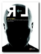
This is a dream production in terms of graphic design – a lavishly illustrated and beautifully produced book which cuts no corners in delivering a luxury product. But it also has a serious argument explored in the text. The thesis is that the modern world has witnessed a shift away from the written word towards the visual image as a form of communication. In other words a shift from left to right of the cerebral cortex in our way of thinking.

graphic designThe book takes a historical survey from the early years of the last century to the present to prove the point, and the theoretical claims are supported by quotes from cultural theorists such as Susan Sontag, Roland Barthes, and Marshall McLuhan. It’s a very lavish production, with thick matte paper; huge page margins; full colour; acres of blank space; colour-coded chapter dividers; and well-selected graphics given all the breathing space they need.

However, I’m not sure that David Crow’s central argument is proven. We communicate a great deal these days with logos, symbols, and icons it’s true, but compared with the daily avalanche of words, the proportion is trivial.

He’s arguing that visual culture is replacing literary culture, but the examples he cites are of magazines which have merely increased the percentage of graphics they use. Commercial companies have to make their advertising act quickly – hence the use of pictures rather than words – but that is not the same as graphics replacing language as a cultural influence.

Lots of bold theoretical claims are made, in a way which somehow don’t need to be made. The examples shown are simply new and interesting visual images: they are not displacing words as an influence or introducing new cultural paradigms: they are simply fresh visual inventions.

The second part of the book deals with the history and development of writing systems – though his source for this is the rather self-confessedly lightweight Story of Writing, rather than the far more scholarly Henri-Jean Martin’s The History and Power of Writing or Walter Ong’s Orality and Literacy. This leads into an encomium on the work of Otto Neurath, who proposed a ‘language’ of symbols, then the work of Charles K. Bliss doing a similar kind of thing.

Next he moves on to typographic experimentation on 1970s and 1980s UK. There are some interesting details on the way new effects were created technically, and we’re introduced to graphically innovative designers of the digital age such as Neville Brody, Peter Saville, and Malcolm Garrett. All the left-cortex right-cortex nonsense is left behind, and the study really comes to life. I would be happy to read a book-length study of this period alone if he chose to write one.

The latter part of the book is a celebration of digital possibilities – for as he rightly claims, the computer is

at once a typewriter, a retrieval device, a page layout engine, a photo retouching tool, an edit suite, a recording studio, a television and a radio.

The same is increasingly true of the mobile phone, with which he concludes. I was quite relieved to leave all the left-brain right-brain and language/visuals dichotomy argument behind and concentrate on graphic design and digital technology, which is where his heart obviously lies – and where he would be best employed concentrating his attention in future publications of this quality.

© Roy Johnson 2006

Left to Right   Buy the book at Amazon UK

Left to Right   Buy the book at Amazon US


David Crow, Left to Right: the cultural shift from words to pictures, Lausanne: AVA Publishing SA, 2006, pp.192, ISBN: 2940373361


More on design
More on media
More on web design


Filed Under: Graphic design Tagged With: Design, Design theory, Graphic design, Theory

  • « Previous Page
  • 1
  • …
  • 4
  • 5
  • 6
  • 7
  • 8
  • …
  • 13
  • Next Page »

Get in touch

info@mantex.co.uk

Content © Mantex 2016
  • About Us
  • Advertising
  • Clients
  • Contact
  • FAQ
  • Links
  • Services
  • Reviews
  • Sitemap
  • T & C’s
  • Testimonials
  • Privacy

Copyright © 2025 · Mantex

Copyright © 2025 · News Pro Theme on Genesis Framework · WordPress · Log in